基本图表绘制
图表类别:线形图、柱状图、密度图,以横纵坐标两个维度为主
同时可延展出多种其他图表样式

plt.plot(kind='line', ax=None, figsize=None, use_index=True, title=None, grid=None, legend=False,
style=None, logx=False, logy=False, loglog=False, xticks=None, yticks=None, xlim=None, ylim=None,
rot=None, fontsize=None, colormap=None, table=False, yerr=None, xerr=None, label=None, secondary_y=False, **kwds)
import numpy as np
import pandas as pd
import matplotlib.pyplot as plt
%matplotlib inline
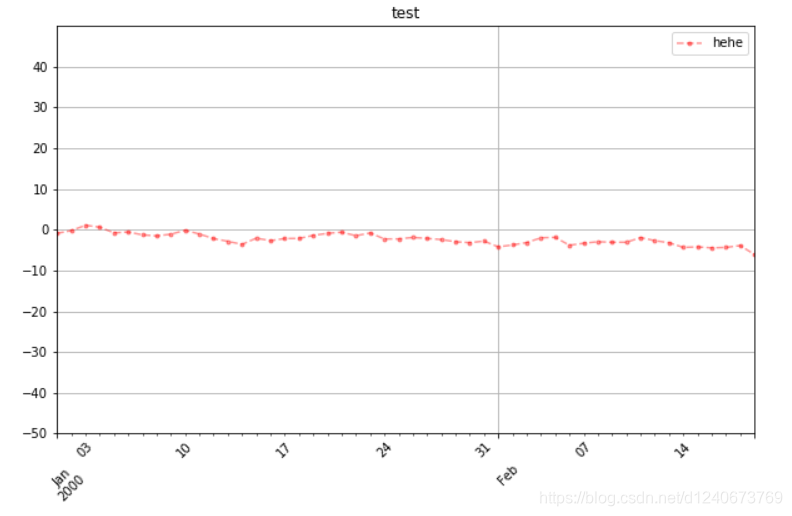
Series直接生成图表
ts = pd.Series(np.random.randn(50), index=pd.date_range('1/1/2000', periods=50))
ts = ts.cumsum()
ts.plot(kind='line',
label = 'hehe',
style = '--.',
color = 'red',
alpha = 0.4,
use_index = True,
rot = 45,
grid = True,
ylim = [-50,50],
yticks = list(range(-50,50,10)),
figsize = (10,6),
title = 'test',
legend = True)
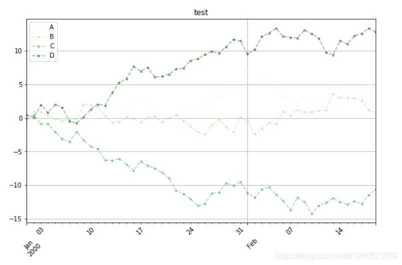
Dataframe直接生成图表
df = pd.DataFrame(np.random.randn(50, 4), index=ts.index, columns=list('ABCD'))
df = df.cumsum()
df.plot(kind='line',
style = '--.',
alpha = 0.4,
use_index = True,
rot = 45,
grid = True,
figsize = (10,6),
title = 'test',
legend = True,
subplots = False,
colormap = 'Greens')
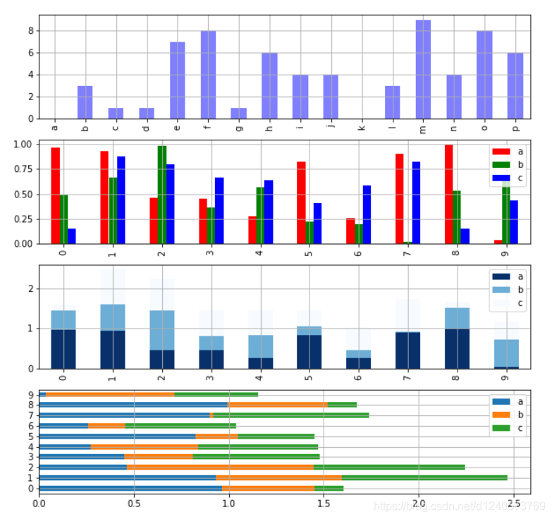
柱状图与堆叠图
fig,axes = plt.subplots(4,1,figsize = (10,10))
s = pd.Series(np.random.randint(0,10,16),index = list('abcdefghijklmnop'))
df = pd.DataFrame(np.random.rand(10,3), columns=['a','b','c'])
s.plot(kind='bar',color = 'b',grid = True,alpha = 0.5,ax = axes[0])
df = pd.DataFrame(np.random.rand(10,3), columns=['a','b','c'])
df.plot(kind='bar',ax = axes[1],grid = True,color=['red','green','blue'])
df.plot(kind='bar',ax = axes[2],grid = True,colormap='Blues_r',stacked=True)
df.plot.barh(ax = axes[3],grid = True,stacked=True)
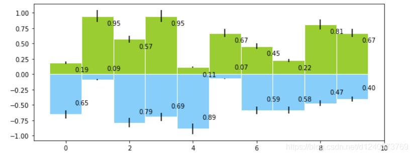
柱状图 plt.bar()
plt.figure(figsize=(10,4))
x = np.arange(10)
y1 = np.random.rand(10)
y2 = -np.random.rand(10)
plt.bar(x,y1,width = 1,facecolor = 'yellowgreen',edgecolor = 'white',yerr = y1*0.1)
plt.bar(x,y2,width = 1,facecolor = 'lightskyblue',edgecolor = 'white',yerr = y2*0.1)
for i,j in zip(x,y1):
plt.text(i+0.3,j-0.15,'%.2f' % j, color = 'k')
for i,j in zip(x,y2):
plt.text(i+0.3,j+0.15,'%.2f' % -j, color = 'k')
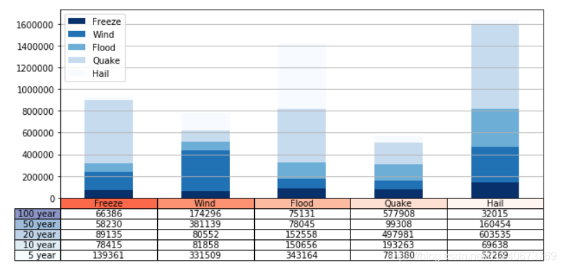
外嵌图表plt.table()
data = [[ 66386, 174296, 75131, 577908, 32015],
[ 58230, 381139, 78045, 99308, 160454],
[ 89135, 80552, 152558, 497981, 603535],
[ 78415, 81858, 150656, 193263, 69638],
[139361, 331509, 343164, 781380, 52269]]
columns = ('Freeze', 'Wind', 'Flood', 'Quake', 'Hail')
rows = ['%d year' % x for x in (100, 50, 20, 10, 5)]
df = pd.DataFrame(data,columns = ('Freeze', 'Wind', 'Flood', 'Quake', 'Hail'),
index = ['%d year' % x for x in (100, 50, 20, 10, 5)])
print(df)
df.plot(kind='bar',grid = True,colormap='Blues_r',stacked=True,figsize=(10,4))
plt.table(cellText = data,
cellLoc='center',
cellColours = None,
rowLabels = rows,
rowColours = plt.cm.BuPu(np.linspace(0, 0.5,5))[::-1],
colLabels = columns,
colColours = plt.cm.Reds(np.linspace(0, 0.5,5))[::-1],
rowLoc='right',
loc='bottom')
plt.xticks([])


 415
415

 被折叠的 条评论
为什么被折叠?
被折叠的 条评论
为什么被折叠?
 到【灌水乐园】发言


