


上篇文章,我们已经理解了线性回归
现根据线性回归去理解梯度下降
初始化数据
import numpy as np

np.random.seed(42)  # to make this code example reproducible
m = 100  # number of instances
X = 2 * np.random.rand(m, 1)  # column vector
y = 4 + 3 * X + np.random.randn(m, 1)  # column vector
可视化
import matplotlib.pyplot as plt

plt.figure(figsize=(6, 4))
plt.plot(X, y, "b.")
plt.xlabel("x")
plt.ylabel("y")
plt.axis([0, 2, 0, 15])
plt.grid()
plt.show()
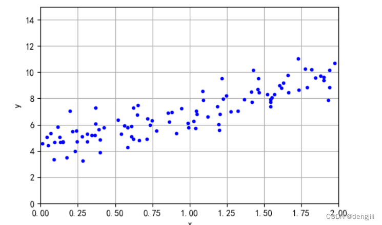
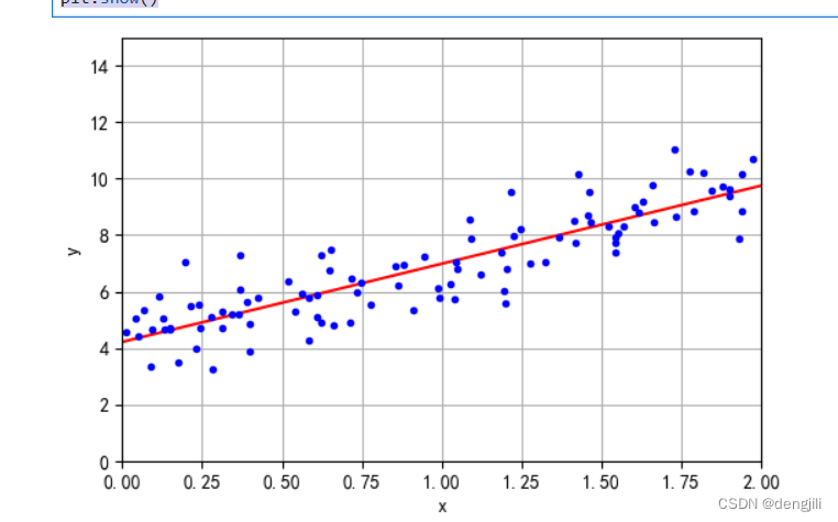
由文章线性回归可知,我们要得到线性模型,就是想画出一条预测线,如图
也就是说,我们要得到两个参数,对应y=ax+b中的a,b
梯度下降就是随便假设a,b,通过不断的计算,去逼近a,b真实值
梯度下降计算方法
几个概念
- 学习率eta,每次调整多少,逼近值
- theta = np.random.randn(2, 1),这里对应对应
y=ax+b中的a,b,随便设置 - n_epochs 迭代次数
- 计算方法不用管,矩阵点积相关的计算,不重要(因为方法可以多种多样)
from sklearn.preprocessing import add_dummy_feature

X_b = add_dummy_feature(X)  # add x0 = 1 to each instance

eta = 0.1  # learning rate
n_epochs = 1000
m = len(X_b)  # number of instances

np.random.seed(42)
theta = np.random.randn(2, 1)  # randomly initialized model parameters

for epoch in range(n_epochs):
    gradients = 2 / m * X_b.T @ (X_b @ theta - y)
    theta = theta - eta * gradients
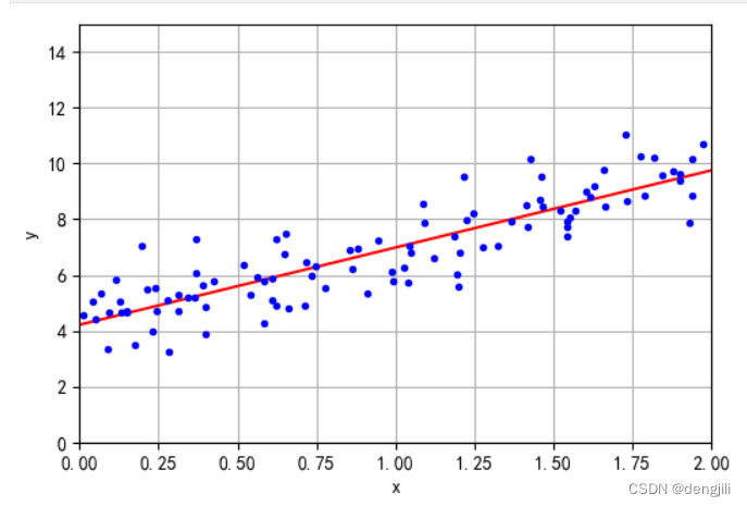
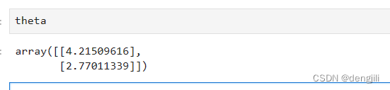
这里直接输出theta ,通过计算,我们已经得到了y=ax+b中的a,b,就是这么神奇
画出理解梯度预测线
X_new = np.array([[0], [2]])
X_new_b = add_dummy_feature(X_new)  # add x0 = 1 to each instance
y_predict = X_new_b @ theta
y_predict
输出
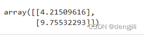
我们得到两个坐标,(0, 4.21509616),(2, 9.75532293),根据这两个点,我们就可以画出一条线
import matplotlib.pyplot as plt

plt.figure(figsize=(6, 4))

plt.plot(X_new, y_predict, "r-")
plt.plot(X, y, "b.")

plt.xlabel("x")
plt.ylabel("y")
plt.axis([0, 2, 0, 15])
plt.grid()
plt.show()
学习率理解
# extra code – generates and saves Figure 4–8

import matplotlib as mpl

def plot_gradient_descent(theta, eta):
    m = len(X_b)
    plt.plot(X, y, "b.")
    n_epochs = 50
    theta_path = []
    for epoch in range(n_epochs):
        y_predict = X_new_b @ theta
        color = mpl.colors.rgb2hex(plt.cm.OrRd(epoch / 50.15))
        plt.plot(X_new, y_predict, linestyle="solid", color=color)
        gradients = 2 / m * X_b.T @ (X_b @ theta - y)
        theta = theta - eta * gradients
        theta_path.append(theta)
    plt.xlabel("$x_1$")
    plt.axis([0, 2, 0, 15])
    plt.grid()
    plt.title(fr"$\eta = {eta}$")
    return theta_path

np.random.seed(42)
theta = np.random.randn(2, 1)  # random initialization

plt.figure(figsize=(10, 4))
plt.subplot(131)
plot_gradient_descent(theta, eta=0.02)
plt.ylabel("$y$", rotation=0)
plt.subplot(132)
theta_path_bgd = plot_gradient_descent(theta, eta=0.1)
plt.gca().axes.yaxis.set_ticklabels([])
plt.subplot(133)
plt.gca().axes.yaxis.set_ticklabels([])
plot_gradient_descent(theta, eta=0.5)
plt.show()
输出图
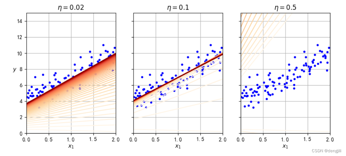
如图所示,学习率设置分别有:0.02,0.1, 0.5也就是逼近真实值a, b的速度,也就是收敛速度,如果设置太大了,如0.5,直接就错过了真实值a, b,如果太小,如0.02,要得到真实值a, b要计算很多次,如果epoch (上述是50次)要计算很多次,不一定会得到真实值a, b,0.1就比较合适。
结论:学习率设置很有必要
随机梯度下降 SGD理解
如何理解随机,也就是学习率动态在调整,对应learning_schedule方法,与前面相比,不是一个固定值
theta_path_sgd = []  # extra code – we need to store the path of theta in the
                     #              parameter space to plot the next figure

n_epochs = 50
t0, t1 = 5, 50  # learning schedule hyperparameters

def learning_schedule(t):
    return t0 / (t + t1)

np.random.seed(42)
theta = np.random.randn(2, 1)  # random initialization

n_shown = 20  # extra code – just needed to generate the figure below
plt.figure(figsize=(6, 4))  # extra code – not needed, just formatting

for epoch in range(n_epochs):
    for iteration in range(m):

        # extra code – these 4 lines are used to generate the figure
        if epoch == 0 and iteration < n_shown:
            y_predict = X_new_b @ theta
            color = mpl.colors.rgb2hex(plt.cm.OrRd(iteration / n_shown + 0.15))
            plt.plot(X_new, y_predict, color=color)

        random_index = np.random.randint(m)
        xi = X_b[random_index : random_index + 1]
        yi = y[random_index : random_index + 1]
        gradients = 2 * xi.T @ (xi @ theta - yi)  # for SGD, do not divide by m
        eta = learning_schedule(epoch * m + iteration)
        theta = theta - eta * gradients
        theta_path_sgd.append(theta)  # extra code – to generate the figure

# extra code – this section beautifies and saves Figure 4–10
plt.plot(X, y, "b.")
plt.xlabel("$x_1$")
plt.ylabel("$y$", rotation=0)
plt.axis([0, 2, 0, 15])
plt.grid()
plt.show()
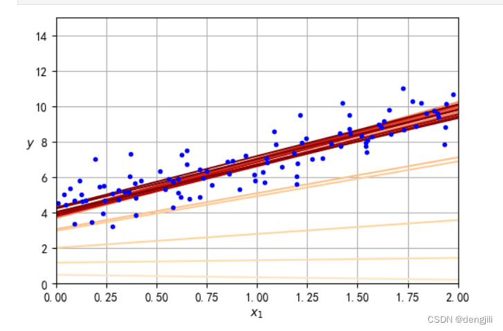
如图所示,收敛速度可以做到快慢的很好结合
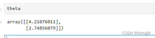
输出y=ax+b中的a,b
当然我们也可以使用sklearn提供的方法SGDRegressor简化得出y=ax+b中的a,b
from sklearn.linear_model import SGDRegressor

sgd_reg = SGDRegressor(max_iter=1000, tol=1e-5, penalty=None, eta0=0.01,
                       n_iter_no_change=100, random_state=42)
sgd_reg.fit(X, y.ravel())  # y.ravel() because fit() expects 1D targets

sgd_reg.intercept_, sgd_reg.coef_
输出

画一个a、b参数的学习过程
多加入一个min-SGD计算,加深理解
# extra code – this cell generates and saves Figure 4–11

from math import ceil

n_epochs = 50
minibatch_size = 20
n_batches_per_epoch = ceil(m / minibatch_size)

np.random.seed(42)
theta = np.random.randn(2, 1)  # random initialization

t0, t1 = 200, 1000  # learning schedule hyperparameters

def learning_schedule(t):
    return t0 / (t + t1)

theta_path_mgd = []
for epoch in range(n_epochs):
    shuffled_indices = np.random.permutation(m)
    X_b_shuffled = X_b[shuffled_indices]
    y_shuffled = y[shuffled_indices]
    for iteration in range(0, n_batches_per_epoch):
        idx = iteration * minibatch_size
        xi = X_b_shuffled[idx : idx + minibatch_size]
        yi = y_shuffled[idx : idx + minibatch_size]
        gradients = 2 / minibatch_size * xi.T @ (xi @ theta - yi)
        eta = learning_schedule(iteration)
        theta = theta - eta * gradients
        theta_path_mgd.append(theta)

theta_path_bgd = np.array(theta_path_bgd)
theta_path_sgd = np.array(theta_path_sgd)
theta_path_mgd = np.array(theta_path_mgd)

plt.figure(figsize=(7, 4))
plt.plot(theta_path_sgd[:, 0], theta_path_sgd[:, 1], "r-s", linewidth=1,
         label="SGD")
plt.plot(theta_path_mgd[:, 0], theta_path_mgd[:, 1], "g-+", linewidth=2,
         label="Mini-SGD")
plt.plot(theta_path_bgd[:, 0], theta_path_bgd[:, 1], "b-o", linewidth=3,
         label="Batch")
plt.legend(loc="upper left")
plt.xlabel(r"a")
plt.ylabel(r"b", rotation=0)
plt.axis([2.6, 4.6, 2.3, 3.4])
plt.grid()
plt.show()
输出
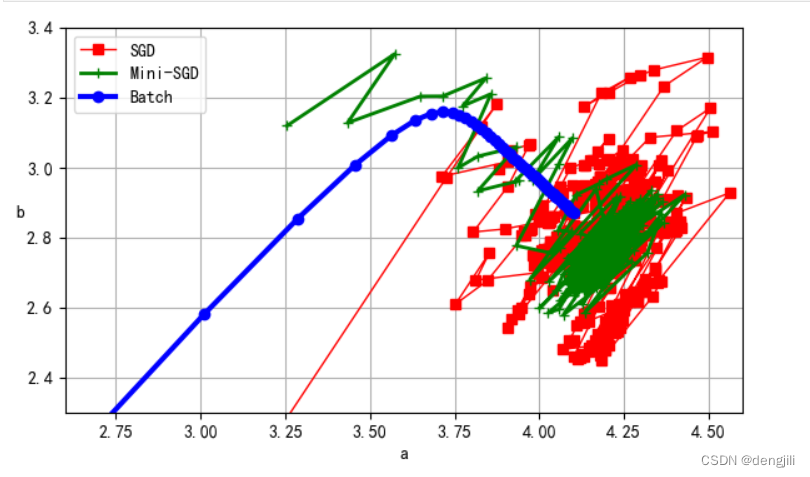
我们可以看出,SGD学习过程(计算a、b)是比较优秀的,其中 Min-SGD > SGD > batch


 834
834


 被折叠的 条评论
为什么被折叠?
被折叠的 条评论
为什么被折叠?
 到【灌水乐园】发言


