


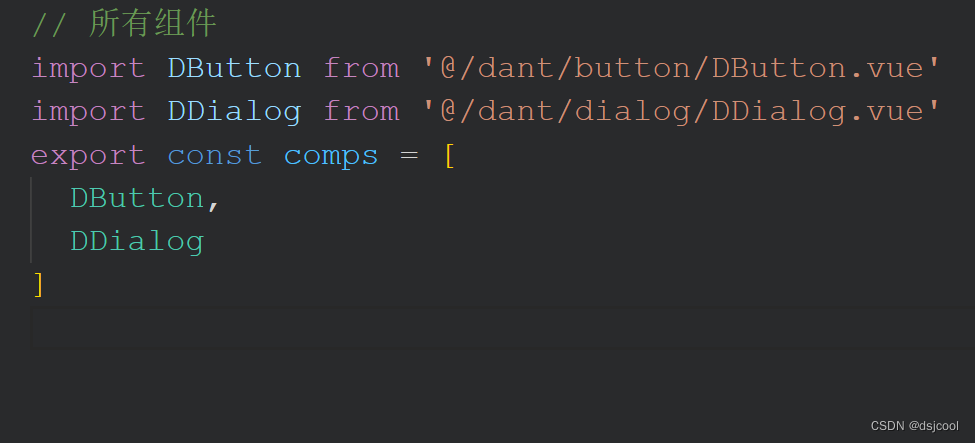
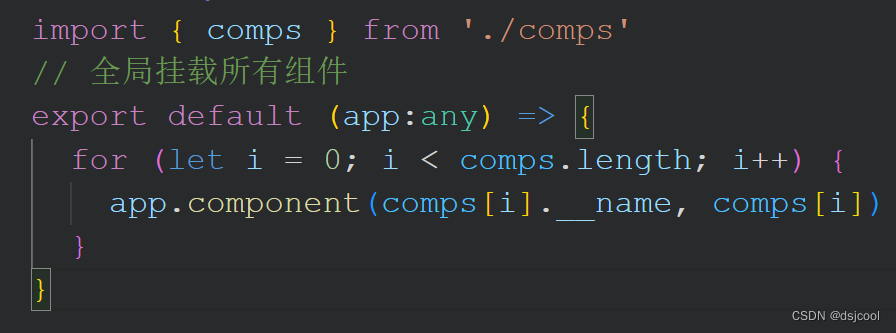
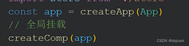
1.首先要将组件挂载到全局
(1)comps.ts
(2) index.ts
(3) main.ts
2.button 内置了几个默认样式 通过添加iconImg属性设置头部icon 原生的disabled属性 自定义disabled时的鼠标样式
1.DDutton.vue
<template>
  <button
    :disabled="disabled"
    :class="[disabled?'disabled':'']"
    class="d-button"

    :style="[style[type]]"
    @mouseleave="mouseOut($event)"
    @mouseenter="mouseIn($event)">
    <span v-if="iconImg" class="pre">
      <img :src="iconImg" alt="">
    </span>
    <span>  <slot /></span>
  </button>
</template>

<script setup lang="ts">
import { defineProps } from 'vue'
import { mouseEnter, mouseLeave, style } from './index'
const props = defineProps({
  type: {
    type: String,
    default: 'default'
  },
  iconImg: {
    type: String,
    default: ''
  },
  disabled: {
    type: Boolean,
    default: false
  }
})

const mouseIn = (e:any) => {
  mouseEnter(e, props.type)
}
const mouseOut = (e:any) => {
  mouseLeave(e, props.type)
}
</script>

<style scoped lang="scss">
.d-button {
  border: 1px solid rgb(193, 193, 193);
  border-radius: 10px;
  margin: 0 5px ;
  padding: 5px 10px;
  color: #000;
  cursor: pointer;
  letter-spacing: 2px;
  display:  inline-flex;
  align-items: center;

  .pre {
    width: 20px;
    height: 20px;
    overflow: hidden;
     margin-right: 5px;
    img {
      height: 100%;
      border-radius: 50%;
      width: 100%;

    }
  }

}
.disabled {
  // 此处建议用icon且大小小于等于32*32
  cursor: url('../../../public/favicon.ico'),default !important;
  background-color: rgba(0,0,0,.1) !important;
  color: rgb(181, 181, 181) !important;
}
</style>
2.index.ts
const style:any = {
  default: {
    hoverBgc: 'blue',
    hoverColor: '#fff',
    backgroundColor: 'rgb(239, 238, 238)',
    color: '#000'
  },
  success: {
    hoverBgc: '#ccc',
    hoverColor: '#fff',
    backgroundColor: 'blue',
    color: '#ffff'
  },
  danger: {
    hoverBgc: 'blue',
    hoverColor: '#fff',
    backgroundColor: 'red',
    color: '#ffff'
  },
  warn: {
    hoverBgc: 'blue',
    hoverColor: '#fff',
    backgroundColor: 'orange',
    color: '#ffff'
  }
}

const mouseEnter = (e:any, type:string) => {
  e.target.style.background = style[type].hoverBgc
  e.target.style.color = style[type].hoverColor
}
const mouseLeave = (e:any, type:string) => {
  e.target.style.background = style[type].backgroundColor
  e.target.style.color = style[type].color
}
export {
  style,
  mouseEnter,
  mouseLeave
}
2.message 属性:message、icon、type、closable、animation
1.message.vue
<template>
  <div class="d-message" :class="animations[animation]" :style="style[type]">
    <div class="content">
      <img v-if="type!=='default'&&!icon" :src="style[type].icon">
      <img v-else-if="icon" :src="icon">
      <a>{{ message }}</a>
      <i v-show="closable" @click="close">x</i>
    </div>
  </div>
</template>

<script setup lang="ts">
import { defineProps } from 'vue'
import { close } from './index'
import { animations } from '@/utils/animations'
defineProps({
  type: {
    type: String,
    default: 'default'
  },
  message: {
    type: String,
    default: 'default'
  },
  icon: {
    type: String,
    default: ''
  },
  closable: {
    type: Boolean,
    default: false
  },
  animation: {
    type: String,
    default: ''
  }
})
const style:any = {
  default: {
    icon: require('@/assets/icons/default.png')
  },
  succuss: {
    icon: require('@/assets/icons/success.png'),
    backgroundColor: 'yellow',
    color: '#ccc'
  },
  warn: {
    icon: require('@/assets/icons/warn.png'),
    backgroundColor: 'orange',
    color: '#fff'
  },
  danger: {
    icon: require('@/assets/icons/danger.png'),
    backgroundColor: 'red',
    color: '#fff'
  }
}
</script>

<style scoped lang="scss">
@import url('@/assets/css/animation.css');
.d-message {
  position: absolute;
  z-index: 9999;
  left: 50%;
  top: 50px;
  width: 200px;
  margin-left: -100px;
  padding: 7px 25px;
  display: flex;
  justify-content: center;
  border-radius: 15px;
  color: rgb(111, 111, 111);
  border: 1px solid #ccc;
  box-shadow: 2px 2px 3px rgba(0,0,0,.3);
  background-color: rgb(207, 205, 205);

  .content {
    display: flex;
    align-items: center;
    img {
      height: 20px;
      width: 20px;
      border-radius: 50%;
      margin-right: 5px;
    }
    i {
      position: absolute;
      right: 10px;

      cursor: pointer;
    }
    i:hover {
      color: #000;
    }
  }

}
</style>
2.index.ts 通过vue的render和createVnode进行渲染
import { createVNode, render } from 'vue'
import Message from './message.vue'
interface DMessageConfig {
  message?:string
  type?:string
  icon?:string
  closable?:Boolean
  animation?:string
}

const div = document.createElement('div')
document.body.appendChild(div)
let timer:any = null
export default ({ message, type, icon, closable, animation }:DMessageConfig) => {
  // 调用创建虚拟节点方法
  // 第一个参数为要创建的虚拟节点即编写好的vue组件
  // 第二个参数为props的参数
  const vnode = createVNode(Message, { message, type, icon, closable, animation })
  render(vnode, div)

  timer && clearTimeout(timer)
  timer = setTimeout(() => {
    render(null, div)
  }, 2000)
}
export function close() {
  timer && clearTimeout(timer)
  render(null, div)
}
3.使用
message({ type: 'warn', message: '警告 警告!!!', closable: true, animation: 'translate' })3.dialog 属性:v-model控制显示隐藏 width设置dialog宽度支持px和百分比 animation
DDialog.vue
<template>
  <div v-show="modelValue" :class="animations[animation]" class="d-dialog">
    <div class="content" :style="{'width': width}">
      <div class="dialog-title">
        <h2>
          {{ title }}
        </h2>
        <i @click="close">x</i>
      </div>
      <div class="dialog-content">
        <slot />
      </div>
      <div class="dialog-footer">
        <slot name="footer" />
      </div>
    </div>
  </div>
</template>

<script setup lang="ts">
import { defineProps, defineEmits } from 'vue'
import { animations } from '@/utils/animations'
defineProps({
  title: {
    type: String,
    default: ''
  },
  // modelValue接收父组件v-model的值 modelValue是默认的
  // 若父组件是v-model:title这种新式 props中的title就被双向绑定
  modelValue: {
    type: Boolean,
    default: false
  },
  width: {
    type: String,
    default: ''
  },
  animation: {
    type: String,
    default: ''
  }
})

const emits = defineEmits(['update:modelValue'])
const close = () => {
  // 通过update:modelValue进行更新 也是默认
  // 若v-model:title 使用update:title
  emits('update:modelValue', false)
}
</script>

<style scoped lang="scss">
@import url('@/assets/css/animation.css');
.d-dialog {
    width: 100%;
    height: 100%;
    position: absolute;
    background-color: rgba(0,0,0,.5);
    top: 0;
    left: 0;
    .content {
      width: 40%;
      padding: 10px;
      background-color: #fff;
      transform: translateX(-50%);
      position: absolute;
      left: 50%;
      top: 20%;
      .dialog-title{
        display: flex;
        justify-content:space-between;
        align-items: center;
        i {
          font-size: 25px;
          cursor: pointer;
        }
        i:hover {
          color: #ccc;
        }
      }
      .dialog-content {
       margin-bottom: 10px;
      }
      .dialog-footer {
        margin: 10px 0;
      }

  }
}

</style>
4.全局动画
animation.css 可自定义添加
.Scale {
  animation: dScaleShow 0.28s ease-in;
 }
@keyframes dScaleShow {
  0% {
   transform: scale(0);
   opacity: 0 !important;
  }

  50% {
   transform: scale(0.5);
   opacity: 0.5 !important;
  }

  100% {
   transform: scale(1);
   opacity: 1 !important;
  }
}
.Translate {
  animation: dTranslateShow 0.28s ease-in;
  -webkit-animation: dTranslateShow 0.28s ease-in;
}
@keyframes dTranslateShow {
  0% {
   transform: translateY(-100px);
   opacity: 0 !important;
   -webkit-transform: translateY(-100px);
   -moz-transform: translateY(-100px);
   -ms-transform: translateY(-100px);
   -o-transform: translateY(-100px);
}

  50% {
   transform: translateY(-50px);
   opacity: 0.5 !important;
   -webkit-transform: translateY(-50px);
   -moz-transform: translateY(-50px);
   -ms-transform: translateY(-50px);
   -o-transform: translateY(-50px);
}

  100% {
   transform: translateY(0);
   opacity: 1 !important;
   -webkit-transform: translateY(0);
   -moz-transform: translateY(0);
   -ms-transform: translateY(0);
   -o-transform: translateY(0);
}
}
.Rotate {
  animation: dRotateShow 0.28s ease-in;
  -webkit-animation: dRotateShow 0.58s ease-in;
}
@keyframes dRotateShow {
  0% {
   transform: Rotate(120deg);
   opacity: 0 !important;
   -webkit-transform: Rotate(120deg);
   -moz-transform: Rotate(120deg);
   -ms-transform: Rotate(120deg);
   -o-transform: Rotate(120deg);
}

  50% {
   transform: Rotate(240deg);
   opacity: 0.5 !important;
   -webkit-transform: Rotate(240deg);
   -moz-transform: Rotate(240deg);
   -ms-transform: Rotate(240deg);
   -o-transform: Rotate(240deg);
}

  100% {
   transform: Rotate(360deg);
   opacity: 1 !important;
   -webkit-transform: Rotate(360deg);
   -moz-transform: Rotate(360deg);
   -ms-transform: Rotate(360deg);
   -o-transform: Rotate(360deg);
}
}
animations.ts
interface IAnimation {
  scale:string
  // 这样声明使用 transform[key] 形式时不会报错
  [translate: string]: string
  rotate:string
}
export const animations:IAnimation = {
  scale: 'Scale',
  translate: 'Translate',
  rotate: 'Rotate'
}
使用 直接进行绑定 传递的animation需要是在animations中定义的类型 否者无动画效果

5.input
DInput.vue 推荐使用ref代替docment.getxxxxxxx
<template>
  <div class="d-input">
    <div class="label">
      {{ label }}
    </div>
    <div class="content">
      <span v-if="icon" :class="{}">
        <img src="@/assets/icons/default.png" alt="">
      </span>
      <input ref="inputDom" :style="[style.size[size],{'minWidth': modelValue.length*7.5+'px'},{'paddingLeft': icon===''? '10px':'30px'}]" :type="type" :placeholder="placeholder" @blur="inputBlur" @focus="inputFocus" @keyup="inputChange">
    </div>
  </div>
</template>

<script setup lang="ts">
import { defineProps, defineEmits, onMounted, ref } from 'vue'
import { style } from './index'
const props = defineProps({
  modelValue: {
    type: String,
    default: ''
  },
  placeholder: {
    type: String,
    default: '请输入'
  },
  size: {
    type: String,
    default: 'large'
  },
  type: {
    type: String,
    default: ''
  },
  label: {
    type: String,
    default: ''
  },
  icon: {
    type: String,
    default: ''
  }
})
const emits = defineEmits(['update:modelValue'])
const inputDom = ref()
onMounted(() => {
  inputDom.value.value = props.modelValue
})
const inputChange = () => {
  emits('update:modelValue', inputDom.value.value)
}
const inputFocus = () => {
  inputDom.value.style.border = '1.5px solid rgb(27, 113, 241)'
}
const inputBlur = () => {
  inputDom.value.style.border = '1.5px solid rgb(152, 152, 152)'
}
</script>

<style scoped lang="scss">
.d-input {
  display: flex;
  margin: 10px 0;
  align-items: center;

  .content {
    display: flex;
    align-items: center;
    position: relative;
    img {
      width: 20px;
      height: 20px;
      position: absolute;
      left: 10px;
      top: 50%;
      transform: translateY(-50%);
    }
     input {
      border-radius: 10px;
       padding: 5px;
       margin-left: 5px;
      outline: none;
      border: 1.5px solid rgb(152, 152, 152);

  }
  }
}
</style>
index.ts
const style:any = {
size: {
small: {
padding: '2px'
},
large: {
padding: '10px'
},
normal: {
padding: '5px'
}
}
}
export {
style
}


 331
331


 被折叠的 条评论
为什么被折叠?
被折叠的 条评论
为什么被折叠?
 到【灌水乐园】发言


