


一、shape 绘制各种形状
如绘制一个描边的圆角矩形
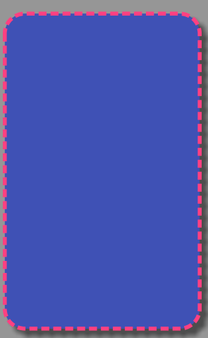
<shape xmlns:android="http://schemas.android.com/apk/res/android"
    android:shape="rectangle"
    android:useLevel="false">
    <!--填充颜色-->
    <solid android:color="@color/colorPrimary" />
    <!--描边-->
    <stroke
        android:width="10dp"
        android:color="@color/colorAccent"
        android:dashGap="10dp"
        android:dashWidth="20dp" />
    <!--尺寸-->
    <size
        android:width="500dp"
        android:height="800dp" />
    <!--圆角-->
    <corners android:radius="50dp" />

</shape>
1、android:shape : 形状
默认为矩形,有四个属性[“rectangle” | “oval” | “line” | “ring”]
rectangle:矩形
oval:椭圆形
line:线性形状
ring : 环形
2、solid 填充
就一个属性[color],表示填充什么样的颜色
color : 填充颜色
3、stroke 描边
四个属性[“width”|”color”|”dashWidth”|”dashGap”]
width : 描边的宽度
color : 描边的颜色
dashWidth : 虚线的宽度
dashGap : 虚线的间隔
如果想设置一个虚线 , [“width”|”dashWidth”|”dashGap”]这三个属性要同时使用。
4、size 尺寸
[“width”|”height”]
width : 整个形状的宽
height: 整个形状的高
5、corners 圆角
[“radius”|”bottomLeftRadius”|”bottomRightRadius”|”topLeftRadius”|”topRightRadius”]
radius : 同时设置四个角的圆角
以下对应四个角的圆角
bottomLeftRadius :
bottomRightRadius :
topLeftRadius :
6、gradient 渐变
startColor 起始颜色
centerColor 渐变中间颜色,即开始颜色与结束颜色之间的颜色
endColor 结束颜色
angle 渐变角度(PS:当angle=0时,渐变色是从左向右。 然后逆 时针方向转,当angle=90时为从下往上。angle必须为45的整数倍)
type 渐变类型[“linear” | “radial” | “sweep”]
linear 线性渐变,这是默认设置
radial 放射性渐变,以开始色为中心。
sweep 扫描线式的渐变。
单独使用 android:type=”radial”会报错。要和gradientRadius 结合使用
useLevel [“true” | “false”] (如果要使用LevelListDrawable对象,就要设置为true。设置为true无渐变。false有渐变色)这是百度的解释,没搞明白。
gradientRadius 渐变色半径.当 android:type=”radial” 时才使用。
centerX 渐变中心X点坐标的相对位置
centerY 渐变中心Y点坐标的相对位置
<shape xmlns:android="http://schemas.android.com/apk/res/android"
    android:shape="oval"
    android:useLevel="false">
    <size android:height="500dp" android:width="500dp"/>

    <gradient
        android:angle="45"
        android:centerColor="@android:color/white"
        android:endColor="@color/colorPrimary"
        android:startColor="@color/colorAccent"
        android:useLevel="false"
        android:type="radial"
        android:gradientRadius="100dp"/>

</shape>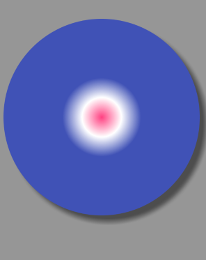
7、padding 内边距
left 左内边距
top 上内边距
right 右内边距
bottom 下内边距
二 、selector 选择器
根据组件不同的状态进行相应的变化
只有一个item标签,item标签下常用的几个状态
android:state_pressed=[“true” | “false”] //是否触摸
android:state_focused=[“true” | “false”] //是否获取到焦点
android:state_hovered=[“true” | “false”] //光标是否经过
android:state_selected=[“true” | “false”] //是否选中
android:state_checkable=[“true” | “false”] //是否可勾选
android:state_checked=[“true” | “false”] //是否勾选
android:state_enabled=[“true” | “false”] //是否可用
android:state_activated=[“true” | “false”] //是否激活
android:state_window_focused=[“true” | “false”] //所在窗口是否获取焦点
三、layer-list 将多个图片或 shape 或 selector 按照顺序层叠起来
只有一个item标签
item标签有四个属性,代表的是在四个方向上收缩多少距离
android:bottom
android:left
android:right
android:top
四、制作一个单选按钮的圆点图片,将这三种标签结合起来
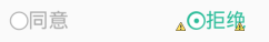
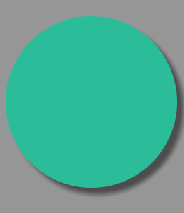
1、绘制同意前面灰色的圆圈
<?xml version="1.0" encoding="utf-8"?>
<shape xmlns:android="http://schemas.android.com/apk/res/android"
    android:shape="oval">
    <solid android:color="@android:color/white" />

    <stroke android:width="1dp" android:color="@android:color/darker_gray" />

    <size android:width="20dp" android:height="20dp" />
</shape>
2、绘制拒绝前面蓝色的圆圈
<shape xmlns:android="http://schemas.android.com/apk/res/android"
    android:shape="oval">
    <solid android:color="@color/colorPrimary"/>
    <stroke android:color="@android:color/white" android:width="5dp"/>
    <size android:width="15dp" android:height="15dp"/>
</shape>
这里shape绘制出里面蓝色的圆点,然后给周围的描上白色的边
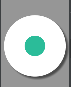
再绘制一个纯色的圆圈,用于放在小蓝点的下面,充当上图的蓝边
<shape xmlns:android="http://schemas.android.com/apk/res/android"
    android:shape="oval">
    <solid android:color="@color/colorPrimary"/>
    <size android:width="20dp" android:height="20dp"/>
</shape>
最后,使用layer-list将两张图叠起来
<layer-list xmlns:android="http://schemas.android.com/apk/res/android">

    <item android:drawable="@drawable/shape_blue_point" />
    <item
        android:bottom="2dp"
        android:drawable="@drawable/shape_stroke_blue_point"
        android:left="2dp"
        android:right="2dp"
        android:top="2dp" />
</layer-list>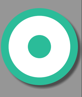
把选中状态和未选中状态的两种形状制作完成,最后使用selector来根据单选按钮选中和未选中的状态,显示不同的图片。
<?xml version="1.0" encoding="utf-8"?>
<selector xmlns:android="http://schemas.android.com/apk/res/android">

    <item android:state_checked="true">
        <layer-list>
            <item android:drawable="@drawable/shape_blue_point"/>
            <item android:bottom="2dp" android:drawable="@drawable/shape_stroke_blue_point" android:left="2dp" android:right="2dp" android:top="2dp" />
        </layer-list>
    </item>
    <item android:state_checked="false">
        <shape android:shape="oval">
            <solid android:color="@android:color/white" />

            <stroke android:width="1dp" android:color="@android:color/darker_gray" />

            <size android:width="20dp" android:height="20dp" />
        </shape>
    </item>

</selector>


 扫一扫
扫一扫
 871
871

 被折叠的 条评论
为什么被折叠?
被折叠的 条评论
为什么被折叠?
 到【灌水乐园】发言


