


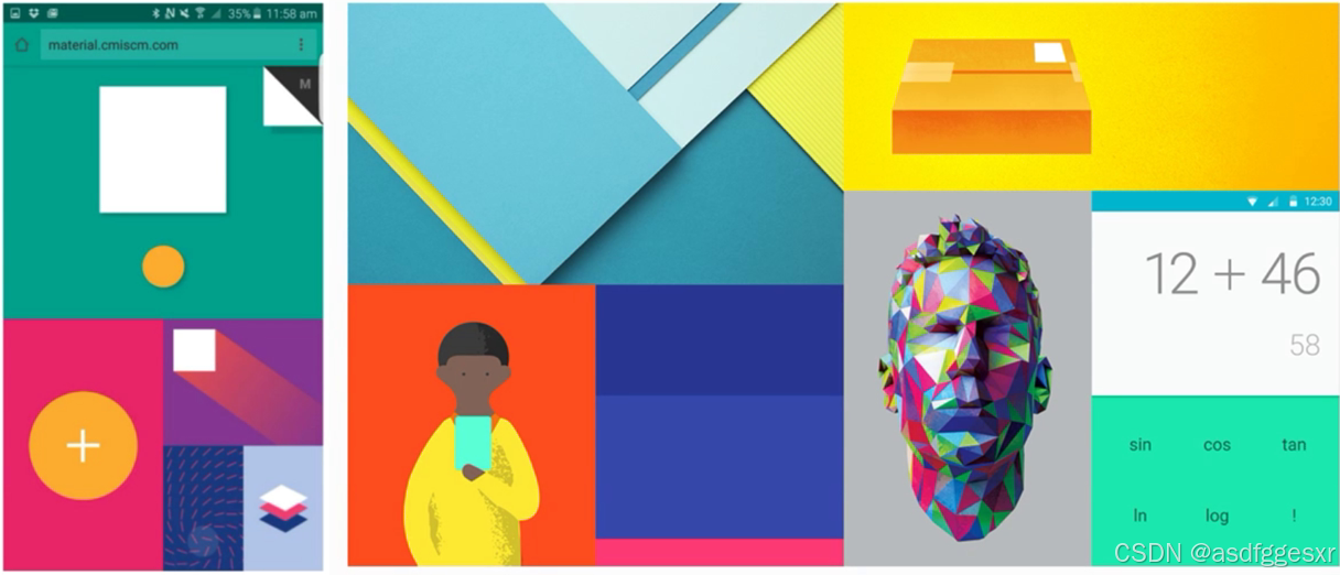
Material Design介绍
Material Design是由Google推出的一种设计语言,旨在为不同平台提供更一致、更广泛的外观和感觉。它首次在2014年的Google I/O开发者大会上发布,并成为Android应用程序设计的核心原则
特点:
材质特性:将界面元素视为具有深度和阴影的物理材质,模拟现实世界的材质特性。如通过阴影和高光效果来区分不同层级的元素,赋予界面深度和层次感。
统一性:提供了一套统一的设计语言和视觉风格,确保不同界面和产品之间的一致性。
自然交互:强调自然流畅的动效设计,让用户的操作体验更加直观和顺畅。动画应当自然流畅,帮助用户理解界面元素的变化和操作反馈。
响应式设计:支持跨设备的响应式设计,确保界面在不同尺寸屏幕上都能保持良好的展现效果。界面能够自动适应不同设备、屏幕尺寸和方向,无论是在手机、平板还是不同尺寸的屏幕上,应用都能保持良好的布局和可用性。

组件
Material Design的组件非常丰富,涵盖了从基础元素到复杂交互的各个方面。以下我将介绍一个组件并加以实现。
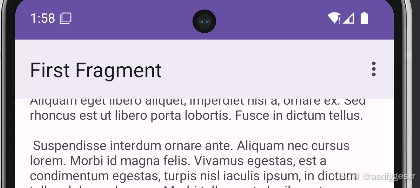
Toolbar
是Android 5.0(Lollipop)引入的一个Material Design风格的导航控件,旨在提供比传统的ActionBar更灵活和强大的功能。
添加依赖
dependencies {
    val activity_version = "1.9.2"

    // Java language implementation
    implementation("androidx.activity:activity:$activity_version")
    // Kotlin
    implementation("androidx.activity:activity-ktx:$activity_version")
}
添加到 Layout.xml文件中
<com.google.android.material.appbar.MaterialToolbar
    android:id="@+id/toolbar"
    android:layout_width="match_parent"
    android:layout_height="?attr/actionBarSize" />
实现效果如下:
按钮:
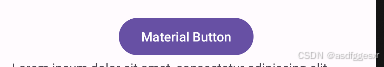
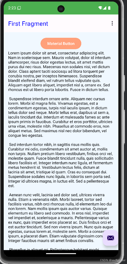
MaterialButton:
是一个功能强大且易于使用的UI组件,它提供了多样化的样式和大小、丰富的自定义选项、交互状态的支持、一致的用户体验以及高度的可定制性等特点,可以满足开发者在应用程序开发中对于按钮的各种需求。
添加到 Layout.xml文件中
<com.google.android.material.button.MaterialButton
    android:id="@+id/button_first"
    android:layout_width="wrap_content"
    android:layout_height="wrap_content"
    android:text="@string/Material_Button" />
实现效果如下:
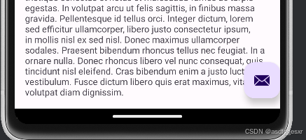
悬浮响应按钮(Floating Action Button, FAB):
圆形的漂浮按钮,有一系列特殊动作,通常用于促进用户操作。
添加到 Layout.xml文件中
<com.google.android.material.floatingactionbutton.FloatingActionButton
    android:id="@+id/fab"
    android:layout_width="wrap_content"
    android:layout_height="wrap_content"
    android:layout_gravity="bottom|end"
    android:layout_marginBottom="16dp"
    app:srcCompat="@android:drawable/ic_dialog_email" />
实现效果如下:
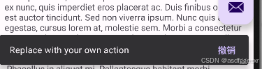
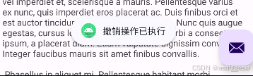
Snackbar:
Android开发中一个用于显示简短消息反馈给用户的UI组件。一般可与触发按钮后同时触发。
在MainActivity添加
binding.fab.setOnClickListener(new View.OnClickListener() {
    @Override
    public void onClick(View view) {
        Snackbar snackbar = Snackbar.make(view, "Replace with your own action", Snackbar.LENGTH_LONG)
                .setAction("撤销", new View.OnClickListener() {
                    @Override
                    public void onClick(View v) {

                        Toast.makeText(getApplicationContext(), "撤销操作已执行", Toast.LENGTH_SHORT).show();
                    }
                });
        // 显示Snackbar
        snackbar.show();
    }
});
效果如下:
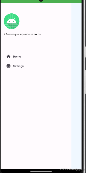
NavigationView:
是Android开发中的一个重要UI组件,它主要用于创建侧边导航菜单。
先创建一个drawer_view.xml作为侧栏的下部分
<menu xmlns:android="http://schemas.android.com/apk/res/android">
    <group android:checkableBehavior="single">
        <item
            android:id="@+id/nav_home"
            android:icon="@drawable/ic_home"
            android:title="Home" />
        <item
            android:id="@+id/nav_settings"
            android:icon="@drawable/ic_settings"
            android:title="Settings" />
        <!-- 添加更多菜单项 -->
    </group>
</menu>
创建一个nav_header.xml作为侧栏的上部分
<?xml version="1.0" encoding="utf-8"?>
<LinearLayout xmlns:android="http://schemas.android.com/apk/res/android"
    android:layout_width="match_parent"
    android:layout_height="240dp"
    android:orientation="vertical"
    android:padding="16dp">

<ImageView
android:layout_width="80dp"
android:layout_height="80dp"
android:layout_marginBottom="16dp"
android:layout_marginTop="36dp"
android:src="@mipmap/ic_launcher" />

<TextView
android:layout_width="wrap_content"
android:layout_height="wrap_content"
android:text="XBewweqwewqewqewqzxcas" />

    </LinearLayout>
最后在Layout文件中添加:
<com.google.android.material.navigation.NavigationView
    android:id="@+id/nav_view"
    android:layout_width="wrap_content"
    android:layout_height="match_parent"
    android:layout_gravity="start"
    app:headerLayout="@layout/nav_header"
    app:menu="@menu/drawer_view" />
实现效果如下:
布局:
CoordinatorLayout
这是一个功能强大且灵活的布局容器,特别适用于需要多个视图之间复杂交互的场景。
上述的布局便是写在CoordinatorLayout中的,其代码为:
<androidx.coordinatorlayout.widget.CoordinatorLayout xmlns:android="http://schemas.android.com/apk/res/android">
<!-->中间添加组件<-->
</androidx.coordinatorlayout.widget.CoordinatorLayout>
DrawerLayout:
Android开发中一种常用的布局控件,它实现了侧滑菜单的效果,使得用户可以通过从屏幕边缘滑动来打开或关闭一个侧边菜单。
通常和组件NavigationView搭配使用
代码如下:
<androidx.drawerlayout.widget.DrawerLayout
    xmlns:android="http://schemas.android.com/apk/res/android"
    xmlns:app="http://schemas.android.com/apk/res-auto"
    android:id="@+id/drawer_layout"
    android:layout_width="match_parent"
    android:layout_height="match_parent"
    >
    <!-- 主界面内容 -->
    <RelativeLayout
        android:layout_width="match_parent"
        android:layout_height="match_parent">
        <TextView
            android:id="@+id/tv_content"
            android:layout_width="wrap_content"
            android:layout_height="wrap_content"
            android:layout_centerInParent="true"
            android:text="Hello World"
            android:textSize="30sp" />
    </RelativeLayout>
    <!-- 左侧滑动菜单 -->
    <com.google.android.material.navigation.NavigationView
        android:id="@+id/nav_view"
        android:layout_width="wrap_content"
        android:layout_height="match_parent"
        android:layout_gravity="start"
        app:headerLayout="@layout/nav_header"
        app:menu="@menu/drawer_view" />


</androidx.drawerlayout.widget.DrawerLayout>
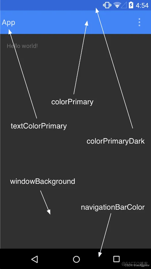
色彩主题:
色彩主题是Material Design 3设计系统中的一个重要组成部分,它提供了一套丰富的色彩工具,帮助开发者创建出既美观又符合品牌调性的用户界面。
比如可以自定义下图中标出的区域的颜色:
在res中添加
colors.xml
<resources>
    <!-- 背景颜色 -->
    <color name="background_color">#F0F8FF</color> <!-- AliceBlue -->

    <!-- Toolbar颜色 -->
    <color name="toolbar_background_color">#FFA07A</color> <!-- LightSalmon -->

    <!-- Toolbar标题颜色 -->
    <color name="toolbar_title_color">#0000FF</color> <!-- Blue -->

    <!-- 其他可能的颜色 -->
    <color name="primary_color">#4CAF50</color> <!-- Green -->
    <color name="secondary_color">#FF5733</color> <!-- Tomato -->
    <color name="text_color">#000000</color> <!-- Black -->

</resources>
themes.xml
<resources xmlns:android="http://schemas.android.com/apk/res/android">
    <!-- 定义应用的主题 -->
    <style name="AppTheme" parent="Theme.Material3.Light.NoActionBar">
        <!-- 设置窗口背景颜色 -->
        <item name="android:windowBackground">@color/background_color</item>

        <!-- 设置Toolbar的背景颜色 -->
        <item name="colorPrimary">@color/toolbar_background_color</item>
        <item name="android:textColorPrimary">@color/toolbar_title_color</item>

        <!-- 其他可能的主题属性 -->
        <item name="colorPrimaryDark">@color/primary_color</item>
        <item name="colorAccent">@color/secondary_color</item>
        <item name="android:textColor">@color/text_color</item>
    </style>

</resources>
最后在AndroidManifest.xml添加theme
<?xml version="1.0" encoding="utf-8"?>
<manifest xmlns:android="http://schemas.android.com/apk/res/android"
    xmlns:tools="http://schemas.android.com/tools">

    <application
        android:allowBackup="true"
        android:dataExtractionRules="@xml/data_extraction_rules"
        android:fullBackupContent="@xml/backup_rules"
        android:icon="@mipmap/ic_launcher"
        android:label="@string/app_name"
        android:roundIcon="@mipmap/ic_launcher_round"
        android:supportsRtl="true"
        android:theme="@style/AppTheme">  <!-- >左侧即为添加的theme  <-->
        <activity
            android:name=".MainActivity"
            android:exported="true">
            <intent-filter>
                <action android:name="android.intent.action.MAIN" />

                <category android:name="android.intent.category.LAUNCHER" />
            </intent-filter>
        </activity>
    </application>

</manifest>
实现效果:
原文链接:https://blog.csdn.net/asdfggesxr/article/details/144569767?spm=1001.2014.3001.5502
作者:陈晓彬


 扫一扫
扫一扫


 1687
1687

 被折叠的 条评论
为什么被折叠?
被折叠的 条评论
为什么被折叠?
 到【灌水乐园】发言


