


echarts官网:https://www.echartsjs.com/index.html
pyecharts官网:https://pyecharts.org/#/zh-cn/intro
一,下载pyecharts
- 打开 Anaconda Prompt

- 使用清华镜像源下载pyecharts,代码如下:
pip install -i https://pypi.tuna.tsinghua.edu.cn/simple pyecharts
二,数据导入
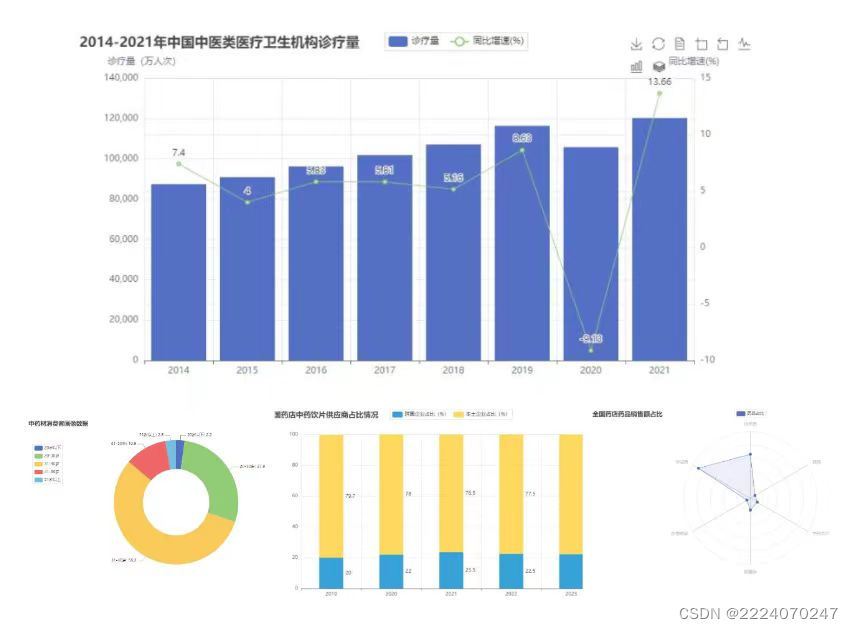
表1. 2014-2021年中国中医类医疗卫生机构诊疗量
| 年份(年) | 诊疗量(万人次) | 同比增速(%) |
| 2014 | 87430 | 7.40 |
| 2015 | 90912 | 4.00 |
| 2016 | 96225 | 5.83 |
| 2017 | 101885 | 5.81 |
| 2018 | 107147 | 5.16 |
| 2019 | 116390 | 8.63 |
| 2020 | 105764 | -9.13 |
| 2021 | 120215 | 13.66 |
表2. 中药材消费者画像数据
| 年龄 | 占比(%) |
| 20岁以下 | 2.2 |
| 20-30岁 | 27.9 |
| 31-40岁 | 56.2 |
| 41-50岁 | 10.9 |
| 51岁以上 | 2.8 |
表3. 全国药店中药饮片供应商占比情况
| 年份(年) | 跨国企业占比(%) | 本土企业占比(%) |
| 2019 | 20.3 | 79.7 |
| 2020 | 22.0 | 78.0 |
| 2021 | 23.5 | 76.5 |
| 2022 | 22.5 | 77.5 |
| 2023 | 22.3 | 77.7 |
表4. 全国药店药品销售额占比
| 药品类型 | 占比(%) |
| 化学药 | 33 |
| 中成药 | 45 |
| 生物制品 | 3 |
| 医疗器械 | 9 |
| 中药饮片 | 6 |
| 保健品 | 4 |
三,绘制图表
1.导入配置模块
from  pyecharts import options as  opts
from pyecharts.charts import Bar,Line,Pie,Radar,Page,Grid,Timeline#导入柱形图,折线图,饼图,雷达图模块
from pyecharts.globals import ThemeType #导入主题模块
2.绘制组合图——Bar,Line
#1.准备数据
year_x = ["2014", "2015", "2016", "2017", "2018", "2019","2020","2021"]
y1 = [87430,90912,96225,101885,107147,116390,105764,120215]#诊疗量
y2 = [7.40,4.00,5.83,5.81,5.16,8.63,-9.13,13.66]#同比增长
#2.绘制柱形图
bar =(
    #添加x轴、y轴的数据系列名称
    Bar()
    .add_xaxis(year_x)
    .add_yaxis("诊疗量 ",y1,z=0,#因为折线图会被柱状图遮挡,所以把柱形图置底
               label_opts=opts.LabelOpts(is_show=False))
    .extend_axis(
      yaxis=opts.AxisOpts(
          name='诊疗量(万人次)',# 柱形图y轴名称
          type_='value',
          position='left',))# 柱形图y轴在左边显示
     .extend_axis(
      yaxis=opts.AxisOpts(
          name='同比增速(%)',# 折线图y轴名称
          type_='value',
          position='right',))# 折线图y轴在右边显示
#设置全局配置项
.set_global_opts(title_opts=opts.TitleOpts(title='2014-2021年中国中医类医疗卫生机构诊疗量'),
        #图例距离左边边距:45%
        legend_opts=opts.LegendOpts(pos_left='45%' ),
        #显示提示框组件
        tooltip_opts=opts.TooltipOpts(trigger='axis',axis_pointer_type='cross'),
        #显示工具栏
        toolbox_opts=opts.ToolboxOpts(is_show=True)
    )
)
#3.绘制折线图
line = (
    Line()  #创建Line类的对象
         .add_xaxis(year_x) #添加x轴的数据
         .add_yaxis(
         series_name='同比增速(%)', #图例名:同比增速(%)
         y_axis=y2,  #y轴折线图数据
         yaxis_index=2,   #表示y轴的索引
             z=2
    )
)
#4.将折线图与柱状图进行组合—Overlap层叠
overlap_1=bar.overlap(line)
#可渲染到html网页
bar.overlap(line).render("2014-2021年中国中医类医疗卫生机构诊疗量.html")3. 绘制环图
# 1. 数据准备
age_data = [("20岁以下", 2.2), ("20-30岁", 27.9), ("31-40岁", 56.2), ("41-50岁", 10.9), ("51岁以上", 2.8)]

# 2. 创建Pie实例对象,并添加数据和设置图形配置
pie = (
    Pie()
    .add(
        "",  # 图例名称为空
        age_data,  # 添加数据
        radius=["40%", "75%"],  # 环图内直径与外直径
    )
    .set_global_opts(
        title_opts=opts.TitleOpts(title="中药材消费者画像数据"),  # 设置标题
        legend_opts=opts.LegendOpts(orient="vertical", pos_top="15%", pos_left="2%"),  # 设置图例位置
    )
    .set_series_opts(label_opts=opts.LabelOpts(formatter="{b}: {c}"))  # 设置标签显示格式
)
4.绘制堆积柱形图
year_data = [2019,2020,2021,2022,2023]
list2 = [20.0,22.0,23.5,22.5,22.3]
list3 = [79.7,78.0,76.5,77.5,77.7]
bar1 = (
    Bar(init_opts=opts.InitOpts(theme=ThemeType.LIGHT))
    .add_xaxis(year_data)
    .add_yaxis("跨国企业占比(%)", list2, stack="stack1", category_gap="60%")
    .add_yaxis("本土企业占比(%)", list3, stack="stack1", category_gap="60%")
    .set_series_opts(
        label_opts=opts.LabelOpts(
            position="right")
    )
    .set_global_opts(title_opts=opts.TitleOpts(title="全国药店中药饮片供应商占比情况"))
)
5.绘制雷达图
# 定义数据
data = [[33, 45, 3, 9, 6, 4]]

# 创建雷达图对象
radar = (
    Radar()
    .add_schema(
        shape="circle",  # 设置雷达图形状
        schema=[
            opts.RadarIndicatorItem(name="化学药", max_=50),  # 雷达图的指标项,包括名称和最大值
            opts.RadarIndicatorItem(name="中成药", max_=50),
            opts.RadarIndicatorItem(name="生物制品", max_=50),
            opts.RadarIndicatorItem(name="保健品", max_=50),
            opts.RadarIndicatorItem(name="中药饮片", max_=50),
            opts.RadarIndicatorItem(name="其他", max_=50),
        ]
    )
    .add(
        "药品占比",
        data,
        areastyle_opts=opts.AreaStyleOpts(opacity=0.1),  # 设置数据区域的透明度为0.1
        linestyle_opts=opts.LineStyleOpts(width=1)  # 设置线条的宽度为1
    )
    .set_series_opts(label_opts=opts.LabelOpts(is_show=False))  # 设置标签选项,不显示标签
    .set_global_opts(
        legend_opts=opts.LegendOpts(selected_mode="single"),  # 设置图例选项,单选模式
        title_opts=opts.TitleOpts(title="全国药店药品销售额占比"),  # 设置标题选项
    )

)
#将图表渲染到HTML:在创建图表对象中输入代码
.render("name.html")四,绘制组合图
1.Page:按顺序显示图表
pyecharts.charts 的 Page 类表示顺序显示的组合图表,它可以在同一网页中按顺序渲染多个图表。 Page 类的构造方法的语法格式如下所示:
Page (page_title ="title",js_host = "",interval = l ,layout = PageLayoutOpts())该方法的参数含义如下。
- page _ title :表示 HTML 网页的标题。
- js_host :表示远程的主机地址,默认为"https://assets.pyecharts.org/assets/"。
- interval :表示图例的间隔,默认为1。
- layout :表示布局配置项。
page = Page(layout=Page.SimplePageLayout)
page.add(overlap_1,pie,bar1,radar)#输入所创建的各图表名称
page.render_notebook()#渲染到notebook
2.Grid:以上下布局方式展示图表
pyecharts.charts 的 Grid 类表示并行排列的组合图表,它可以采用左右布局或上下布局的方式显示多个图表。 Grid 类中包含一个 add ()方法,使用 add()方法可以为组合图表添加配置项。 add()方法的语法格式如下:
add (self,chart,grid_opts,grid_index =0, is_control_axis_index=False)该方法的参数含义如下。
- chart :表示图表。
- grid_opts :表示直角坐标系配置项。
- grid_index :表示直角坐标系网格索引,默认为0。
- is_control_axis_index :表示是否由自己控制坐标轴索引,默认为 False 。
grid = (
    Grid(init_opts=opts.InitOpts(width="1200px", height="800px"))
    .add(overlap_1, grid_opts=opts.GridOpts(pos_top="50%"), is_control_axis_index=True)
    .add(bar1, grid_opts=opts.GridOpts(pos_left="5%", pos_right="5%",pos_bottom="50%"), is_control_axis_index=True)
    .add(pie, grid_opts=opts.GridOpts(pos_left="30%",pos_bottom="50%"), is_control_axis_index=True)
    .add(radar, grid_opts=opts.GridOpts(pos_right="30%",pos_bottom="50%"), is_control_axis_index=True)
    .render("组合图.html")
)
3.Timeline:按时间线轮播的组合图表
pyecharts.charts 的 Timeline 类表示按时间线轮播的组合图表,它可以通过平山时间线的不同时间来切换显示多个图表。 Timeline 类中提供了两种重要的方法: add_schema ()和add()。
- add_schema()方法用于为图表添加指定样式的时间线,该方法常用参数的含义如下。
- axis _ type :表示坐标轴的类型,可以取值为 value (数值轴)、category (类目轴)、time(时间轴)、 log(对数轴)。
- orient :表示时间线的类型,可以取值为 horizontal (水平)和 vertical (垂直)。
- play _ interval :表示播放的速度(跳动的间隔),单位为 ms 。
- is_auto_play :表示是否自动播放,默认为 False 。
- is_loop_play :表示是否循环播放,默认为 True 。
- is_rewind_play :表示是否反向播放,默认为 False 。
- is_timeline_show :表示是否显示时间线组件。
- width :表示时间线区域的宽度。
- height :表示时间线区域的高度。


 589
589


 被折叠的 条评论
为什么被折叠?
被折叠的 条评论
为什么被折叠?
 到【灌水乐园】发言


