


目录
pyecharts常用模块总结
文档链接:https://pyecharts.org/#/zh-cn/global_options
- Bar(柱状图)
- Pie(饼图)
- Line(线图)
- Page(页面组件)
- Tab(分页组件)
- Grid(组合组件)
下面给出我常用的类型图演示。
Bar(柱状图)
1. 旋转x轴标签
from pyecharts import options as opts
from pyecharts.charts import Bar

c = (
    Bar()
    .add_xaxis(
        [
            "名字很长的X轴标签1",
            "名字很长的X轴标签2",
            "名字很长的X轴标签3",
            "名字很长的X轴标签4",
            "名字很长的X轴标签5",
            "名字很长的X轴标签6",
        ]
    )
    .add_yaxis("商家A", [10, 20, 30, 40, 50, 40])
    .add_yaxis("商家B", [20, 10, 40, 30, 40, 50])
    .set_global_opts(
        xaxis_opts=opts.AxisOpts(axislabel_opts=opts.LabelOpts(rotate=-15)),
        title_opts=opts.TitleOpts(title="Bar-旋转X轴标签", subtitle="解决标签名字过长的问题"),
    )
    .render("bar_rotate_xaxis_label.html")
)

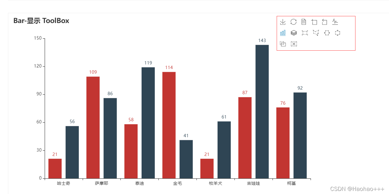
2. 添加工具箱
from pyecharts import options as opts
from pyecharts.charts import Bar
from pyecharts.faker import Faker

c = (
    Bar()
    .add_xaxis(Faker.choose())
    .add_yaxis("商家A", Faker.values())
    .add_yaxis("商家B", Faker.values())
    .set_global_opts(
        title_opts=opts.TitleOpts(title="Bar-显示 ToolBox"),
        toolbox_opts=opts.ToolboxOpts(),
        legend_opts=opts.LegendOpts(is_show=False),
    )
    .render("bar_toolbox.html")
)
可以选择右上角的工具箱
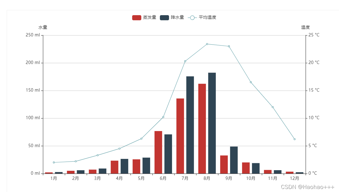
3. 柱状图与折线图混合
import pyecharts.options as opts
from pyecharts.charts import Bar, Line

"""
Gallery 使用 pyecharts 1.1.0
参考地址: https://www.echartsjs.com/examples/editor.html?c=mix-line-bar

目前无法实现的功能:

1、暂无
"""

x_data = ["1月", "2月", "3月", "4月", "5月", "6月", "7月", "8月", "9月", "10月", "11月", "12月"]

bar = (
    Bar(init_opts=opts.InitOpts(width="1600px", height="800px"))
    .add_xaxis(xaxis_data=x_data)
    .add_yaxis(
        series_name="蒸发量",
        yaxis_data=[
            2.0,
            4.9,
            7.0,
            23.2,
            25.6,
            76.7,
            135.6,
            162.2,
            32.6,
            20.0,
            6.4,
            3.3,
        ],
        label_opts=opts.LabelOpts(is_show=False),
    )
    .add_yaxis(
        series_name="降水量",
        yaxis_data=[
            2.6,
            5.9,
            9.0,
            26.4,
            28.7,
            70.7,
            175.6,
            182.2,
            48.7,
            18.8,
            6.0,
            2.3,
        ],
        label_opts=opts.LabelOpts(is_show=False),
    )
    .extend_axis(
        yaxis=opts.AxisOpts(
            name="温度",
            type_="value",
            min_=0,
            max_=25,
            interval=5,
            axislabel_opts=opts.LabelOpts(formatter="{value} °C"),
        )
    )
    .set_global_opts(
        tooltip_opts=opts.TooltipOpts(
            is_show=True, trigger="axis", axis_pointer_type="cross"
        ),
        xaxis_opts=opts.AxisOpts(
            type_="category",
            axispointer_opts=opts.AxisPointerOpts(is_show=True, type_="shadow"),
        ),
        yaxis_opts=opts.AxisOpts(
            name="水量",
            type_="value",
            min_=0,
            max_=250,
            interval=50,
            axislabel_opts=opts.LabelOpts(formatter="{value} ml"),
            axistick_opts=opts.AxisTickOpts(is_show=True),
            splitline_opts=opts.SplitLineOpts(is_show=True),
        ),
    )
)

line = (
    Line()
    .add_xaxis(xaxis_data=x_data)
    .add_yaxis(
        series_name="平均温度",
        yaxis_index=1,
        y_axis=[2.0, 2.2, 3.3, 4.5, 6.3, 10.2, 20.3, 23.4, 23.0, 16.5, 12.0, 6.2],
        label_opts=opts.LabelOpts(is_show=False),
    )
)

bar.overlap(line).render("mixed_bar_and_line.html")
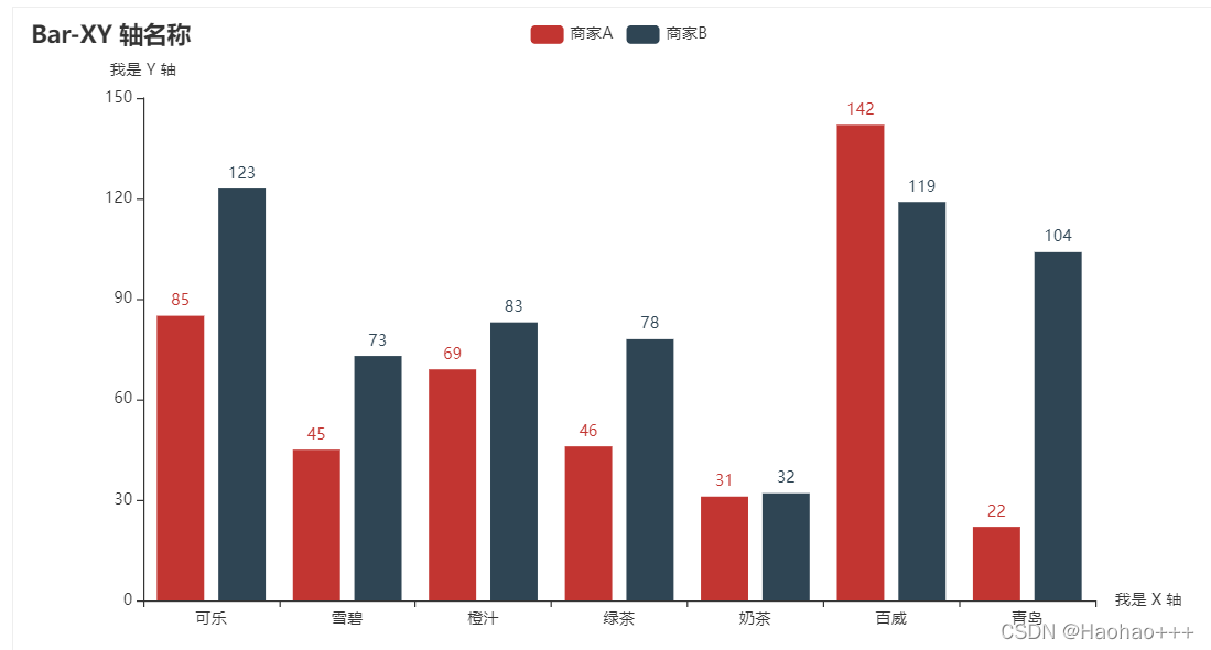
4. 标注x轴名称
在全局设置中可以设置
from pyecharts import options as opts
from pyecharts.charts import Bar
from pyecharts.faker import Faker


c = (
    Bar()
    .add_xaxis(Faker.choose())
    .add_yaxis("商家A", Faker.values())
    .add_yaxis("商家B", Faker.values())
    .set_global_opts(
        title_opts=opts.TitleOpts(title="Bar-XY 轴名称"),
        yaxis_opts=opts.AxisOpts(name="我是 Y 轴"),
        xaxis_opts=opts.AxisOpts(name="我是 X 轴"),
    )
    .render("bar_xyaxis_name.html")
)
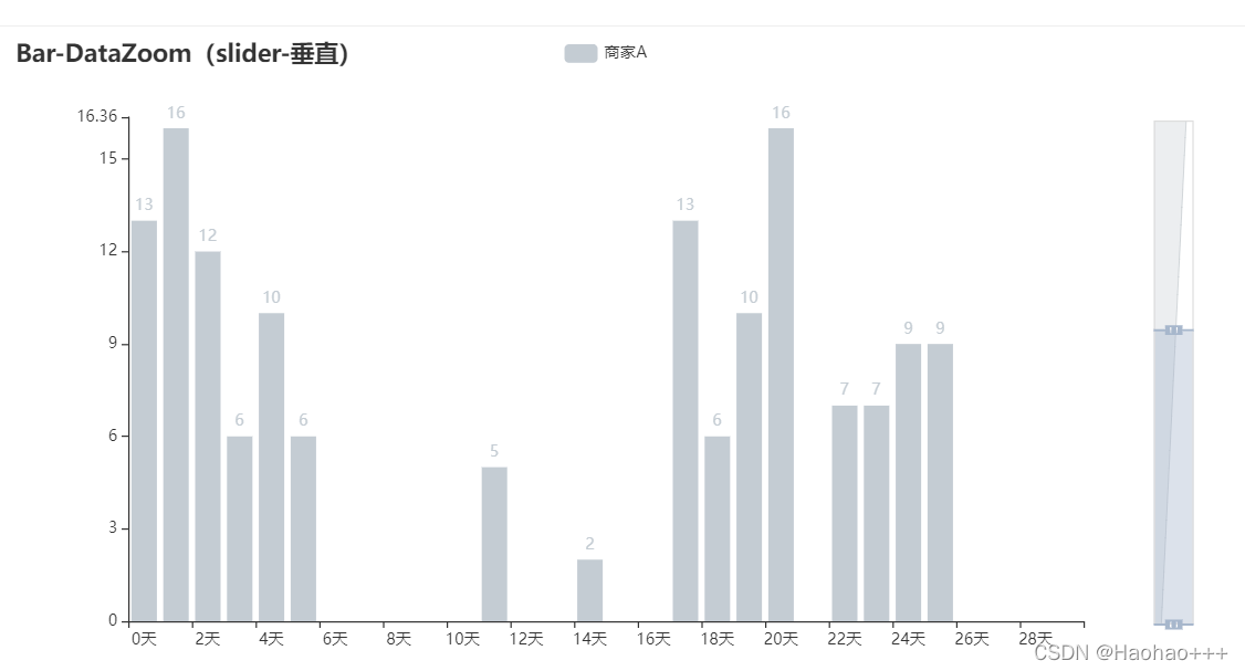
5. 设置垂直的一天时间线
from pyecharts import options as opts
from pyecharts.charts import Bar
from pyecharts.faker import Faker

c = (
    Bar()
    .add_xaxis(Faker.days_attrs)
    .add_yaxis("商家A", Faker.days_values, color=Faker.rand_color())
    .set_global_opts(
        title_opts=opts.TitleOpts(title="Bar-DataZoom(slider-垂直)"),
        datazoom_opts=opts.DataZoomOpts(orient="vertical"),
    )
    .render("bar_datazoom_slider_vertical.html")
)
6. 旋转x和y轴
from pyecharts import options as opts
from pyecharts.charts import Bar
from pyecharts.faker import Faker
c = (
Bar()
.add_xaxis(Faker.choose())
.add_yaxis("商家A", Faker.values())
.add_yaxis("商家B", Faker.values())
.reversal_axis()
.set_series_opts(label_opts=opts.LabelOpts(position="right"))
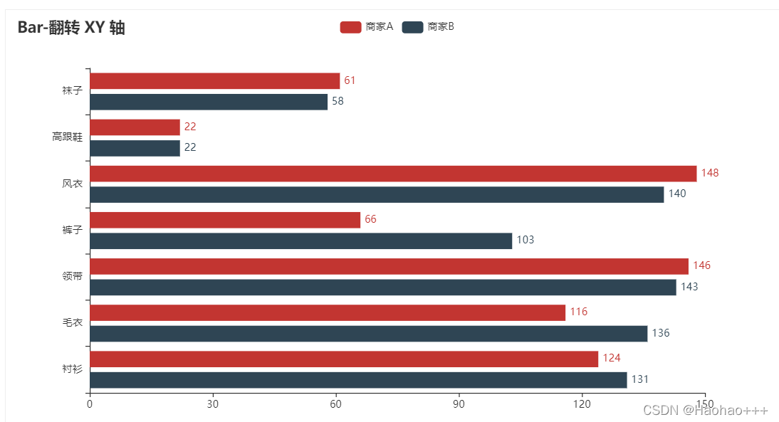
.set_global_opts(title_opts=opts.TitleOpts(title="Bar-翻转 XY 轴"))
.render("bar_reversal_axis.html")
)
Pie(饼图)
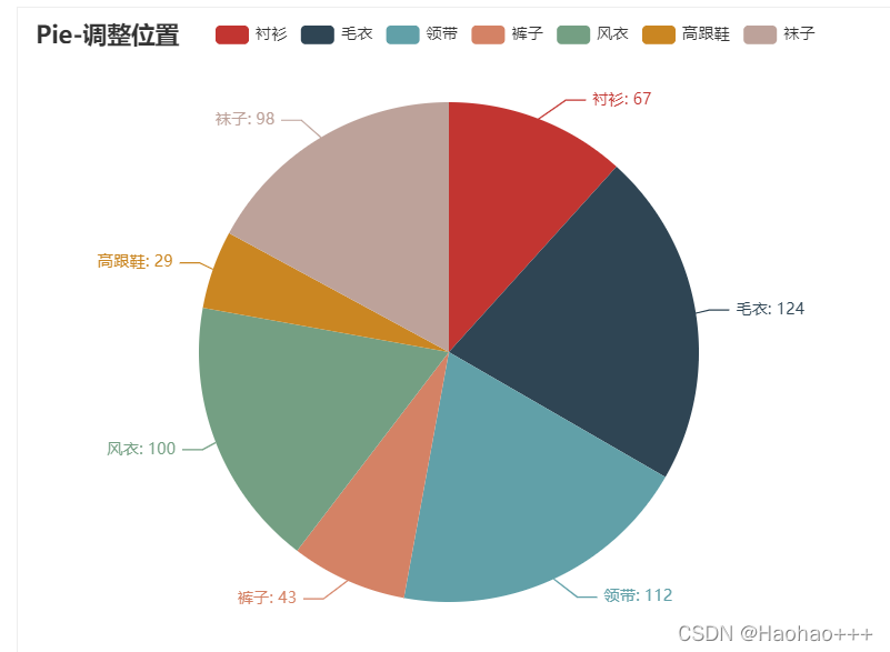
1. 设置位置和半径大小
from pyecharts import options as opts
from pyecharts.charts import Pie
from pyecharts.faker import Faker

c = (
    Pie()
    .add(
        "",
        [list(z) for z in zip(Faker.choose(), Faker.values())],
        center=["35%", "50%"], # 设置位置,按百分比设置
        radius=["30%", '20%'], # 设置内外半径大小
    )
    .set_global_opts(
        title_opts=opts.TitleOpts(title="Pie-调整位置"),
        legend_opts=opts.LegendOpts(pos_left="15%"),
    )
    .set_series_opts(label_opts=opts.LabelOpts(formatter="{b}: {c}"))
    .render("pie_position.html")
)
Line(线图)
1. 设置平滑标签
import pyecharts.options as opts
from pyecharts.charts import Line
from pyecharts.faker import Faker

c = (
    Line()
    .add_xaxis(Faker.choose())
    .add_yaxis("商家A", Faker.values(), is_smooth=True)
    .add_yaxis("商家B", Faker.values(), is_smooth=True)
    .set_global_opts(title_opts=opts.TitleOpts(title="Line-smooth"))
    .render("line_smooth.html")
)

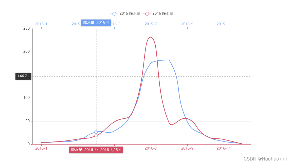
2. 设置多个x轴
import pyecharts.options as opts
from pyecharts.charts import Line

# 将在 v1.1.0 中更改
from pyecharts.commons.utils import JsCode

"""
Gallery 使用 pyecharts 1.0.0
参考地址: https://echarts.apache.org/examples/editor.html?c=multiple-x-axis

目前无法实现的功能:

1、暂无
"""

js_formatter = """function (params) {
        console.log(params);
        return '降水量  ' + params.value + (params.seriesData.length ? ':' + params.seriesData[0].data : '');
    }"""

(
    Line(init_opts=opts.InitOpts(width="1600px", height="800px"))
    .add_xaxis(
        xaxis_data=[
            "2016-1",
            "2016-2",
            "2016-3",
            "2016-4",
            "2016-5",
            "2016-6",
            "2016-7",
            "2016-8",
            "2016-9",
            "2016-10",
            "2016-11",
            "2016-12",
        ]
    )
    .extend_axis(
        xaxis_data=[
            "2015-1",
            "2015-2",
            "2015-3",
            "2015-4",
            "2015-5",
            "2015-6",
            "2015-7",
            "2015-8",
            "2015-9",
            "2015-10",
            "2015-11",
            "2015-12",
        ],
        xaxis=opts.AxisOpts(
            type_="category",
            axistick_opts=opts.AxisTickOpts(is_align_with_label=True),
            axisline_opts=opts.AxisLineOpts(
                is_on_zero=False, linestyle_opts=opts.LineStyleOpts(color="#6e9ef1")
            ),
            axispointer_opts=opts.AxisPointerOpts(
                is_show=True, label=opts.LabelOpts(formatter=JsCode(js_formatter))
            ),
        ),
    )
    .add_yaxis(
        series_name="2015 降水量",
        is_smooth=True,
        symbol="emptyCircle",
        is_symbol_show=False,
        # xaxis_index=1,
        color="#d14a61",
        y_axis=[2.6, 5.9, 9.0, 26.4, 28.7, 70.7, 175.6, 182.2, 48.7, 18.8, 6.0, 2.3],
        label_opts=opts.LabelOpts(is_show=False),
        linestyle_opts=opts.LineStyleOpts(width=2),
    )
    .add_yaxis(
        series_name="2016 降水量",
        is_smooth=True,
        symbol="emptyCircle",
        is_symbol_show=False,
        color="#6e9ef1",
        y_axis=[3.9, 5.9, 11.1, 18.7, 48.3, 69.2, 231.6, 46.6, 55.4, 18.4, 10.3, 0.7],
        label_opts=opts.LabelOpts(is_show=False),
        linestyle_opts=opts.LineStyleOpts(width=2),
    )
    .set_global_opts(
        legend_opts=opts.LegendOpts(),
        tooltip_opts=opts.TooltipOpts(trigger="none", axis_pointer_type="cross"),
        xaxis_opts=opts.AxisOpts(
            type_="category",
            axistick_opts=opts.AxisTickOpts(is_align_with_label=True),
            axisline_opts=opts.AxisLineOpts(
                is_on_zero=False, linestyle_opts=opts.LineStyleOpts(color="#d14a61")
            ),
            axispointer_opts=opts.AxisPointerOpts(
                is_show=True, label=opts.LabelOpts(formatter=JsCode(js_formatter))
            ),
        ),
        yaxis_opts=opts.AxisOpts(
            type_="value",
            splitline_opts=opts.SplitLineOpts(
                is_show=True, linestyle_opts=opts.LineStyleOpts(opacity=1)
            ),
        ),
    )
    .render("multiple_x_axes.html")
)
Page(页面组件)
from pyecharts import options as opts
from pyecharts.charts import Bar, Grid, Line, Liquid, Page, Pie
from pyecharts.commons.utils import JsCode
from pyecharts.components import Table
from pyecharts.faker import Faker
def bar_datazoom_slider() -> Bar:
c = (
Bar()
.add_xaxis(Faker.days_attrs)
.add_yaxis("商家A", Faker.days_values)
.set_global_opts(
title_opts=opts.TitleOpts(title="Bar-DataZoom(slider-水平)"),
datazoom_opts=[opts.DataZoomOpts()],
)
)
return c
def line_markpoint() -> Line:
c = (
Line()
.add_xaxis(Faker.choose())
.add_yaxis(
"商家A",
Faker.values(),
markpoint_opts=opts.MarkPointOpts(data=[opts.MarkPointItem(type_="min")]),
)
.add_yaxis(
"商家B",
Faker.values(),
markpoint_opts=opts.MarkPointOpts(data=[opts.MarkPointItem(type_="max")]),
)
.set_global_opts(title_opts=opts.TitleOpts(title="Line-MarkPoint"))
)
return c
def pie_rosetype() -> Pie:
v = Faker.choose()
c = (
Pie()
.add(
"",
[list(z) for z in zip(v, Faker.values())],
radius=["30%", "75%"],
center=["25%", "50%"],
rosetype="radius",
label_opts=opts.LabelOpts(is_show=False),
)
.add(
"",
[list(z) for z in zip(v, Faker.values())],
radius=["30%", "75%"],
center=["75%", "50%"],
rosetype="area",
)
.set_global_opts(title_opts=opts.TitleOpts(title="Pie-玫瑰图示例"))
)
return c
def grid_mutil_yaxis() -> Grid:
x_data = ["{}月".format(i) for i in range(1, 13)]
bar = (
Bar()
.add_xaxis(x_data)
.add_yaxis(
"蒸发量",
[2.0, 4.9, 7.0, 23.2, 25.6, 76.7, 135.6, 162.2, 32.6, 20.0, 6.4, 3.3],
yaxis_index=0,
color="#d14a61",
)
.add_yaxis(
"降水量",
[2.6, 5.9, 9.0, 26.4, 28.7, 70.7, 175.6, 182.2, 48.7, 18.8, 6.0, 2.3],
yaxis_index=1,
color="#5793f3",
)
.extend_axis(
yaxis=opts.AxisOpts(
name="蒸发量",
type_="value",
min_=0,
max_=250,
position="right",
axisline_opts=opts.AxisLineOpts(
linestyle_opts=opts.LineStyleOpts(color="#d14a61")
),
axislabel_opts=opts.LabelOpts(formatter="{value} ml"),
)
)
.extend_axis(
yaxis=opts.AxisOpts(
type_="value",
name="温度",
min_=0,
max_=25,
position="left",
axisline_opts=opts.AxisLineOpts(
linestyle_opts=opts.LineStyleOpts(color="#675bba")
),
axislabel_opts=opts.LabelOpts(formatter="{value} °C"),
splitline_opts=opts.SplitLineOpts(
is_show=True, linestyle_opts=opts.LineStyleOpts(opacity=1)
),
)
)
.set_global_opts(
yaxis_opts=opts.AxisOpts(
name="降水量",
min_=0,
max_=250,
position="right",
offset=80,
axisline_opts=opts.AxisLineOpts(
linestyle_opts=opts.LineStyleOpts(color="#5793f3")
),
axislabel_opts=opts.LabelOpts(formatter="{value} ml"),
),
title_opts=opts.TitleOpts(title="Grid-多 Y 轴示例"),
tooltip_opts=opts.TooltipOpts(trigger="axis", axis_pointer_type="cross"),
)
)
line = (
Line()
.add_xaxis(x_data)
.add_yaxis(
"平均温度",
[2.0, 2.2, 3.3, 4.5, 6.3, 10.2, 20.3, 23.4, 23.0, 16.5, 12.0, 6.2],
yaxis_index=2,
color="#675bba",
label_opts=opts.LabelOpts(is_show=False),
)
)
bar.overlap(line)
return Grid().add(
bar, opts.GridOpts(pos_left="5%", pos_right="20%"), is_control_axis_index=True
)
def liquid_data_precision() -> Liquid:
c = (
Liquid()
.add(
"lq",
[0.3254],
label_opts=opts.LabelOpts(
font_size=50,
formatter=JsCode(
"""function (param) {
return (Math.floor(param.value * 10000) / 100) + '%';
}"""
),
position="inside",
),
)
.set_global_opts(title_opts=opts.TitleOpts(title="Liquid-数据精度"))
)
return c
def table_base() -> Table:
table = Table()
headers = ["City name", "Area", "Population", "Annual Rainfall"]
rows = [
["Brisbane", 5905, 1857594, 1146.4],
["Adelaide", 1295, 1158259, 600.5],
["Darwin", 112, 120900, 1714.7],
["Hobart", 1357, 205556, 619.5],
["Sydney", 2058, 4336374, 1214.8],
["Melbourne", 1566, 3806092, 646.9],
["Perth", 5386, 1554769, 869.4],
]
table.add(headers, rows).set_global_opts(
title_opts=opts.ComponentTitleOpts(title="Table")
)
return table
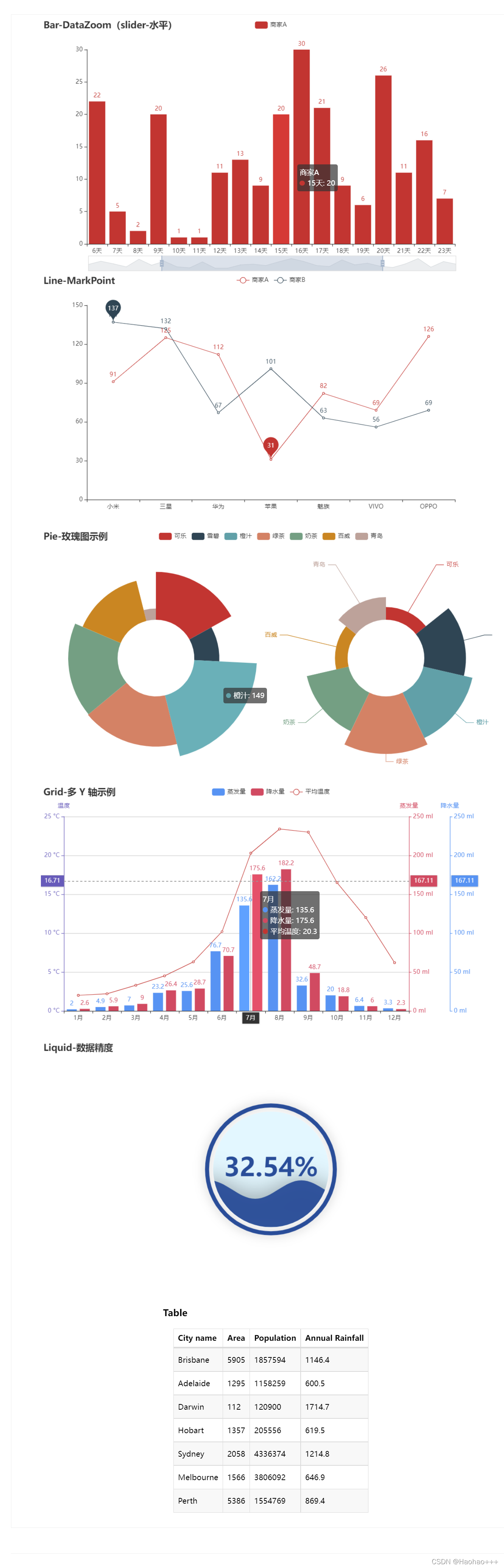
def page_simple_layout():
page = Page(layout=Page.SimplePageLayout)
page.add(
bar_datazoom_slider(),
line_markpoint(),
pie_rosetype(),
grid_mutil_yaxis(),
liquid_data_precision(),
table_base(),
)
page.render("page_simple_layout.html")
if __name__ == "__main__":
page_simple_layout()
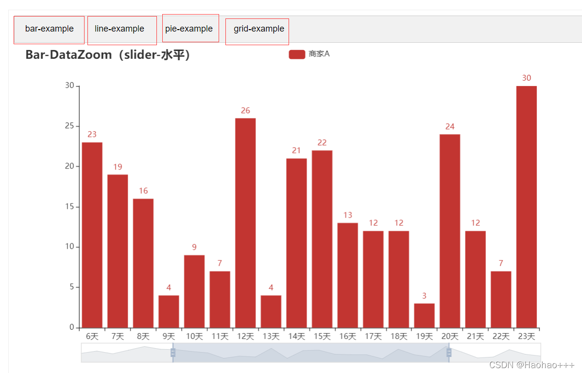
Tab(分页组件)
from pyecharts import options as opts
from pyecharts.charts import Bar, Grid, Line, Pie, Tab
from pyecharts.faker import Faker


def bar_datazoom_slider() -> Bar:
    c = (
        Bar()
        .add_xaxis(Faker.days_attrs)
        .add_yaxis("商家A", Faker.days_values)
        .set_global_opts(
            title_opts=opts.TitleOpts(title="Bar-DataZoom(slider-水平)"),
            datazoom_opts=[opts.DataZoomOpts()],
        )
    )
    return c


def line_markpoint() -> Line:
    c = (
        Line()
        .add_xaxis(Faker.choose())
        .add_yaxis(
            "商家A",
            Faker.values(),
            markpoint_opts=opts.MarkPointOpts(data=[opts.MarkPointItem(type_="min")]),
        )
        .add_yaxis(
            "商家B",
            Faker.values(),
            markpoint_opts=opts.MarkPointOpts(data=[opts.MarkPointItem(type_="max")]),
        )
        .set_global_opts(title_opts=opts.TitleOpts(title="Line-MarkPoint"))
    )
    return c


def pie_rosetype() -> Pie:
    v = Faker.choose()
    c = (
        Pie()
        .add(
            "",
            [list(z) for z in zip(v, Faker.values())],
            radius=["30%", "75%"],
            center=["25%", "50%"],
            rosetype="radius",
            label_opts=opts.LabelOpts(is_show=False),
        )
        .add(
            "",
            [list(z) for z in zip(v, Faker.values())],
            radius=["30%", "75%"],
            center=["75%", "50%"],
            rosetype="area",
        )
        .set_global_opts(title_opts=opts.TitleOpts(title="Pie-玫瑰图示例"))
    )
    return c


def grid_mutil_yaxis() -> Grid:
    x_data = ["{}月".format(i) for i in range(1, 13)]
    bar = (
        Bar()
        .add_xaxis(x_data)
        .add_yaxis(
            "蒸发量",
            [2.0, 4.9, 7.0, 23.2, 25.6, 76.7, 135.6, 162.2, 32.6, 20.0, 6.4, 3.3],
            yaxis_index=0,
            color="#d14a61",
        )
        .add_yaxis(
            "降水量",
            [2.6, 5.9, 9.0, 26.4, 28.7, 70.7, 175.6, 182.2, 48.7, 18.8, 6.0, 2.3],
            yaxis_index=1,
            color="#5793f3",
        )
        .extend_axis(
            yaxis=opts.AxisOpts(
                name="蒸发量",
                type_="value",
                min_=0,
                max_=250,
                position="right",
                axisline_opts=opts.AxisLineOpts(
                    linestyle_opts=opts.LineStyleOpts(color="#d14a61")
                ),
                axislabel_opts=opts.LabelOpts(formatter="{value} ml"),
            )
        )
        .extend_axis(
            yaxis=opts.AxisOpts(
                type_="value",
                name="温度",
                min_=0,
                max_=25,
                position="left",
                axisline_opts=opts.AxisLineOpts(
                    linestyle_opts=opts.LineStyleOpts(color="#675bba")
                ),
                axislabel_opts=opts.LabelOpts(formatter="{value} °C"),
                splitline_opts=opts.SplitLineOpts(
                    is_show=True, linestyle_opts=opts.LineStyleOpts(opacity=1)
                ),
            )
        )
        .set_global_opts(
            yaxis_opts=opts.AxisOpts(
                name="降水量",
                min_=0,
                max_=250,
                position="right",
                offset=80,
                axisline_opts=opts.AxisLineOpts(
                    linestyle_opts=opts.LineStyleOpts(color="#5793f3")
                ),
                axislabel_opts=opts.LabelOpts(formatter="{value} ml"),
            ),
            title_opts=opts.TitleOpts(title="Grid-多 Y 轴示例"),
            tooltip_opts=opts.TooltipOpts(trigger="axis", axis_pointer_type="cross"),
        )
    )

    line = (
        Line()
        .add_xaxis(x_data)
        .add_yaxis(
            "平均温度",
            [2.0, 2.2, 3.3, 4.5, 6.3, 10.2, 20.3, 23.4, 23.0, 16.5, 12.0, 6.2],
            yaxis_index=2,
            color="#675bba",
            label_opts=opts.LabelOpts(is_show=False),
        )
    )

    bar.overlap(line)
    return Grid().add(
        bar, opts.GridOpts(pos_left="5%", pos_right="20%"), is_control_axis_index=True
    )


tab = Tab()
tab.add(bar_datazoom_slider(), "bar-example")
tab.add(line_markpoint(), "line-example")
tab.add(pie_rosetype(), "pie-example")
tab.add(grid_mutil_yaxis(), "grid-example")
tab.render("tab_base.html")
可以进行图表的选择
Grid(组合组件)
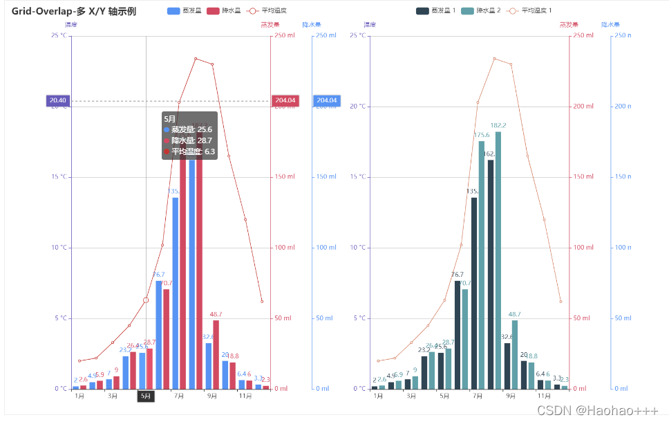
1. 多xy轴组合
from pyecharts import options as opts
from pyecharts.charts import Bar, Grid, Line

bar = (
    Bar()
    .add_xaxis(["{}月".format(i) for i in range(1, 13)])
    .add_yaxis(
        "蒸发量",
        [2.0, 4.9, 7.0, 23.2, 25.6, 76.7, 135.6, 162.2, 32.6, 20.0, 6.4, 3.3],
        yaxis_index=0,
        color="#d14a61",
    )
    .add_yaxis(
        "降水量",
        [2.6, 5.9, 9.0, 26.4, 28.7, 70.7, 175.6, 182.2, 48.7, 18.8, 6.0, 2.3],
        yaxis_index=1,
        color="#5793f3",
    )
    .extend_axis(
        yaxis=opts.AxisOpts(
            name="蒸发量",
            type_="value",
            min_=0,
            max_=250,
            position="right",
            axisline_opts=opts.AxisLineOpts(
                linestyle_opts=opts.LineStyleOpts(color="#d14a61")
            ),
            axislabel_opts=opts.LabelOpts(formatter="{value} ml"),
        )
    )
    .extend_axis(
        yaxis=opts.AxisOpts(
            type_="value",
            name="温度",
            min_=0,
            max_=25,
            position="left",
            axisline_opts=opts.AxisLineOpts(
                linestyle_opts=opts.LineStyleOpts(color="#675bba")
            ),
            axislabel_opts=opts.LabelOpts(formatter="{value} °C"),
            splitline_opts=opts.SplitLineOpts(
                is_show=True, linestyle_opts=opts.LineStyleOpts(opacity=1)
            ),
        )
    )
    .set_global_opts(
        yaxis_opts=opts.AxisOpts(
            name="降水量",
            min_=0,
            max_=250,
            position="right",
            offset=80,
            axisline_opts=opts.AxisLineOpts(
                linestyle_opts=opts.LineStyleOpts(color="#5793f3")
            ),
            axislabel_opts=opts.LabelOpts(formatter="{value} ml"),
        ),
        title_opts=opts.TitleOpts(title="Grid-Overlap-多 X/Y 轴示例"),
        tooltip_opts=opts.TooltipOpts(trigger="axis", axis_pointer_type="cross"),
        legend_opts=opts.LegendOpts(pos_left="25%"),
    )
)

line = (
    Line()
    .add_xaxis(["{}月".format(i) for i in range(1, 13)])
    .add_yaxis(
        "平均温度",
        [2.0, 2.2, 3.3, 4.5, 6.3, 10.2, 20.3, 23.4, 23.0, 16.5, 12.0, 6.2],
        yaxis_index=2,
        color="#675bba",
        label_opts=opts.LabelOpts(is_show=False),
    )
)

bar1 = (
    Bar()
    .add_xaxis(["{}月".format(i) for i in range(1, 13)])
    .add_yaxis(
        "蒸发量 1",
        [2.0, 4.9, 7.0, 23.2, 25.6, 76.7, 135.6, 162.2, 32.6, 20.0, 6.4, 3.3],
        color="#d14a61",
        xaxis_index=1,
        yaxis_index=3,
    )
    .add_yaxis(
        "降水量 2",
        [2.6, 5.9, 9.0, 26.4, 28.7, 70.7, 175.6, 182.2, 48.7, 18.8, 6.0, 2.3],
        color="#5793f3",
        xaxis_index=1,
        yaxis_index=3,
    )
    .extend_axis(
        yaxis=opts.AxisOpts(
            name="蒸发量",
            type_="value",
            min_=0,
            max_=250,
            position="right",
            axisline_opts=opts.AxisLineOpts(
                linestyle_opts=opts.LineStyleOpts(color="#d14a61")
            ),
            axislabel_opts=opts.LabelOpts(formatter="{value} ml"),
        )
    )
    .extend_axis(
        yaxis=opts.AxisOpts(
            type_="value",
            name="温度",
            min_=0,
            max_=25,
            position="left",
            axisline_opts=opts.AxisLineOpts(
                linestyle_opts=opts.LineStyleOpts(color="#675bba")
            ),
            axislabel_opts=opts.LabelOpts(formatter="{value} °C"),
            splitline_opts=opts.SplitLineOpts(
                is_show=True, linestyle_opts=opts.LineStyleOpts(opacity=1)
            ),
        )
    )
    .set_global_opts(
        xaxis_opts=opts.AxisOpts(grid_index=1),
        yaxis_opts=opts.AxisOpts(
            name="降水量",
            min_=0,
            max_=250,
            position="right",
            offset=80,
            grid_index=1,
            axisline_opts=opts.AxisLineOpts(
                linestyle_opts=opts.LineStyleOpts(color="#5793f3")
            ),
            axislabel_opts=opts.LabelOpts(formatter="{value} ml"),
        ),
        tooltip_opts=opts.TooltipOpts(trigger="axis", axis_pointer_type="cross"),
        legend_opts=opts.LegendOpts(pos_left="65%"),
    )
)

line1 = (
    Line()
    .add_xaxis(["{}月".format(i) for i in range(1, 13)])
    .add_yaxis(
        "平均温度 1",
        [2.0, 2.2, 3.3, 4.5, 6.3, 10.2, 20.3, 23.4, 23.0, 16.5, 12.0, 6.2],
        color="#675bba",
        label_opts=opts.LabelOpts(is_show=False),
        xaxis_index=1,
        yaxis_index=5,
    )
)

overlap_1 = bar.overlap(line)
overlap_2 = bar1.overlap(line1)

grid = (
    Grid(init_opts=opts.InitOpts(width="1200px", height="800px"))
    .add(
        overlap_1, grid_opts=opts.GridOpts(pos_right="58%"), is_control_axis_index=True
    )
    .add(overlap_2, grid_opts=opts.GridOpts(pos_left="58%"), is_control_axis_index=True)
    .render("grid_overlap_multi_xy_axis.html")
)
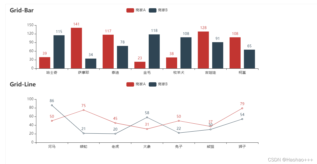
2. 多图结合
from pyecharts import options as opts
from pyecharts.charts import Bar, Grid, Line
from pyecharts.faker import Faker

bar = (
    Bar()
    .add_xaxis(Faker.choose())
    .add_yaxis("商家A", Faker.values())
    .add_yaxis("商家B", Faker.values())
    .set_global_opts(title_opts=opts.TitleOpts(title="Grid-Bar"))
)
line = (
    Line()
    .add_xaxis(Faker.choose())
    .add_yaxis("商家A", Faker.values())
    .add_yaxis("商家B", Faker.values())
    .set_global_opts(
        title_opts=opts.TitleOpts(title="Grid-Line", pos_top="48%"),
        legend_opts=opts.LegendOpts(pos_top="48%"),
    )
)

grid = (
    Grid()
    .add(bar, grid_opts=opts.GridOpts(pos_bottom="60%"))
    .add(line, grid_opts=opts.GridOpts(pos_top="60%"))
    .render("grid_vertical.html")
)


 564
564

 被折叠的 条评论
为什么被折叠?
被折叠的 条评论
为什么被折叠?
 到【灌水乐园】发言


