


Android Drawable 相信大家都不陌生,本篇我们就来全面深入了解它,Drawable是一种可以在Canvas上进行绘制的抽象的图像,它的子类也相当多,所以在开发中很容易导致我们对不同Drawable的理解产生混乱,因此我们很有必要来全面了解一下Drawable的子类及其使用方式滴,哈~。 Drawable的简述本文摘抄至 : 泽坚
摘要 : 介绍了Drawable的实现子类对应xml的标签和其属性的意思与用法。
Drawable实现子类 对应的xml标签 BitmapDrawable <bitmap> NinePatchDrawable <nine-patch> ShapeDrawable <shape> LayerDrawable <layer-list> StateListDrawable <selector > LevelListDrawable <level-list> TransitionDrawable <transition> InsetDrawable <inset> ScaleDrawable <scale> ClipDrawable <clip> ColorDrawable <color > GradientDrawable <gradient >
- 相关视屏链接慕课网:Anroid Drawable讲解
- 分拆成单个标签的讲解Android样式的开发:shape篇
Drawable在我们开发中常被用来作为 View的背景图片,一般情况下我们都是通过XML来定义Drawable。当然我们也 可以通过代码来创建Drawable,值不够会比较复杂而已。Drawable最大的好处就是可以方便我们做出一些特殊的UI效果,这点比我们自定义View实现的效果来得更容易些。因此深入理解Drawable的用法还是很有必要的,接下来我们来看看Drawable的一些特性:
- Drawable本身表示的只是一种图像的概念,因此Drawable不仅仅是图片,也可以是颜色构造出来的图像效果。
- Drawable本身是一个抽象类,因此具体的实现都是由子类完成的。
- Drawable额内部宽高可以分别通过getIntrinsicWidth()和getIntrinsicHeight()获取,但并不是所有的Drawable都有内部宽高的属性。
- 比如一个颜色形成的 drawable并没有宽高的概念。
- 在大多数情况下,Drawable并没有大小的概念,因为当Drawable作为View的背景图时,Drawable会被拉伸至View的同等大小。
BitmapDrawable
BitmapDrawable 是对Bitmap的一种包装(对应 xml中的 bitmpa标签), 可以设置他包装的 Bitmap在BitmapDrawable区域内的绘制方式。如平铺填充、拉伸填充或者保持图片原始大小,也可以在BitmapDrawable区域内部使用gravity指定的对齐方式。其语法如下:
<?xml version="1.0" encoding="utf-8"?>
<bitmap
xmlns:android="http://schemas.android.com/apk/res/android"
android:src="@[package:]drawable/drawable_resource"
android:antialias=["true" | "false"]
android:dither=["true" | "false"]
android:filter=["true" | "false"]
android:gravity=["top" | "bottom" | "left" | "right" | "center_vertical" |
"fill_vertical" | "center_horizontal" | "fill_horizontal" |
"center" | "fill" | "clip_vertical" | "clip_horizontal"]
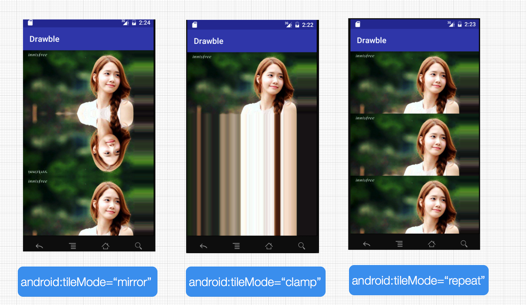
android:tileMode=["disabled" | "clamp" | "repeat" | "mirror"]
/>android:src
类型 :Drawable resource。必须,引用一个 Drawable resource。
android:antialias
类型 : Boolean。是否开启抗锯齿。开启后图片会变得更平滑些。因此一般建议开启,设置为 true即可。
android:dither
类型:Boolean。 是否允许抖动。如果位图与屏幕的像素配置不同时,开启这个选项可以让高质量的图片在低质量的屏幕上保持较好的显示效果(例如 : 一个位图的像素设置是 ARGB_8888,但屏幕的设置是 RGB_565,开启这个选项可以使图片不过与失真)一般建议开启,为 true即可。
android:filter
类型 Boolean。是否允许对应位图进行滤波。当图片呗压缩或拉伸时,使用滤波可以获得平滑的外观效果。一般建议开启,为 true即可。
android:gravity
当图片小于容器尺寸时,设置此选项可以对图片进行定位。这个属性比较多,不同的选项可以使用“ | ”来组合使用。
| 可选项 | 含义 |
|---|---|
| top | 将图片放在容器的顶部,不改变图片大小 |
| bottom | 将图片放在容器底部,不改变图片大小 |
| left | 将图片放在容器左侧,不改变图片大小 |
| right | 将图片放在容器右侧,不改变图片大小 |
| center_vertical | 图片竖直居中,不改变图片大小 |
| fill_vertical | 图片竖直方向填充容器 |
| center_horizontal | 图片水平居中,不改变图片大小 |
| fill_horizontal | 图片水平方向填充容器 |
| center | 使图片在水平方向和竖直方向同时居中,不改变图片大小 |
| fill | 图片填充容器,默认值 |
| clip_vertical | 竖直方向剪切,很少使用 |
| clip_horizontal | 水平方向剪切,很少使用 |
android:mipMap
纹理映射处理技术,不太懂,不过一般也不用,默认为false
android:tileMode
平铺模式。共有以下几个值
- disabled :默认值,表示不使用平铺
- clamp :复制边缘色彩
- repeat :X、Y 轴进行重复图片显示,也就是我们说要说的平铺
- mirror :在水平和垂直方向上使用交替镜像的方式重复图片的绘制
BitmapDrawable的xml使用方式比较简单,我们这里就不贴案例了哈。接下来我们来看看在代码中如何使用BitmapDrawable。
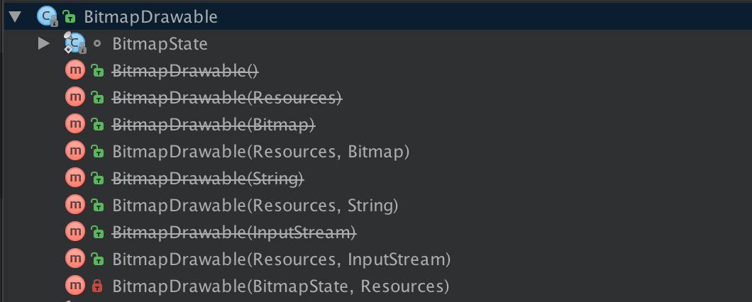
实际上我们从BitmapDrawable的源码可以看出,目前Google建议我们创建BitmapDrawable的构造方法有3种
public BitmapDrawable(Resources res, Bitmap bitmap)

public BitmapDrawable(Resources res, String filepath)

public BitmapDrawable(Resources res, java.io.InputStream is)Bitmap mBitmap = BitmapFactory.decodeResource(getResources(), R.drawable.image1);
BitmapDrawable mBitmapDrawable = new BitmapDrawable(getResources(),mBitmap);
mBitmapDrawable.setTileModeXY(TileMode.MIRROR, TileMode.MIRROR);//平铺方式
mBitmapDrawable.setAntiAlias(true);//抗锯齿
mBitmapDrawable.setDither(true);//防抖动
//设置到imageView上即可
imageView.setImageDrawable(mBitmapDrawable);NinePatchDrawable
NinePatchDrawable表示的是我们熟悉的.9格式的图片,.9图片可以在保证图片不失真的情况下任意进行缩放,在实际的使用中我们也是通过Xml来实现即可:
<nine-patch xmlns:android="http://schemas.android.com/apk/res/android"
    android:src="drawable/resource"
android:dither="[true|false]"/> ShapeDrawable
ShapeDrawable对应xml的 shape标签,在实际开发中我们经常将2其作为背景图片使用。因为ShapeDrawable可以帮助我们通过颜色来构造图片,也可以构造渐变的图片。总之,ShapeDrawable足矣满足我们大部分特殊需求。下面我们说说其使用方法 :
<?xml version="1.0" encoding="utf-8"?>
<shape
    xmlns:android="http://schemas.android.com/apk/res/android"
    android:shape=["rectangle" | "oval" | "line" | "ring"] >
    <corners
        android:radius="integer"
        android:topLeftRadius="integer"
        android:topRightRadius="integer"
        android:bottomLeftRadius="integer"
        android:bottomRightRadius="integer" />
    <gradient
        android:angle="integer"
        android:centerX="integer"
        android:centerY="integer"
        android:centerColor="integer"
        android:endColor="color"
        android:gradientRadius="integer"
        android:startColor="color"
        android:type=["linear" | "radial" | "sweep"]
        android:usesLevel=["true" | "false"] />
    <padding
        android:left="integer"
        android:top="integer"
        android:right="integer"
        android:bottom="integer" />
    <size
        android:width="integer"
        android:height="integer" />
    <solid
        android:color="color" />
    <stroke
        android:width="integer"
        android:color="color"
        android:dashWidth="integer"
        android:dashGap="integer" />
</shape>| 属性 | 含义 |
|---|---|
| android:innerRadius | 圆环的半径与android:innerRadiusRatio同时存在时,以android:innerRadius 为准 |
| android:innerRadiusRatio | 内半径占整个Drawable宽度的比例,默认值为9.如果为n,那么半径=宽度/n |
| android:thickness | 圆环的厚度,即外半径减去内半径的大小与android:thicknessRatio同时存在时以android:thickness为准 |
| android:thicknessRatio | 厚度占整个Drawable宽度比例,默认值为3,如果为n,那么厚度=宽度/n |
| android:useLevel | 一般都应该使用false,否则可能无法达到预期显示效果,除非它被当做LevelListDrawable来使用。 |
<corners>
指定边角的半径,数值越大角越圆,数值越小越趋近于直角,参数为:
<corners
android:radius="integer"
android:topLeftRadius="integer"
android:topRightRadius="integer"
android:bottomLeftRadius="integer"
android:bottomRightRadius="integer" /><gradient>
设置颜色渐变与 <solid>为互斥标签。 因为 <solid>表示纯色填充,而 <gradient>表示渐变填充。
| 属性 | 含义 |
|---|---|
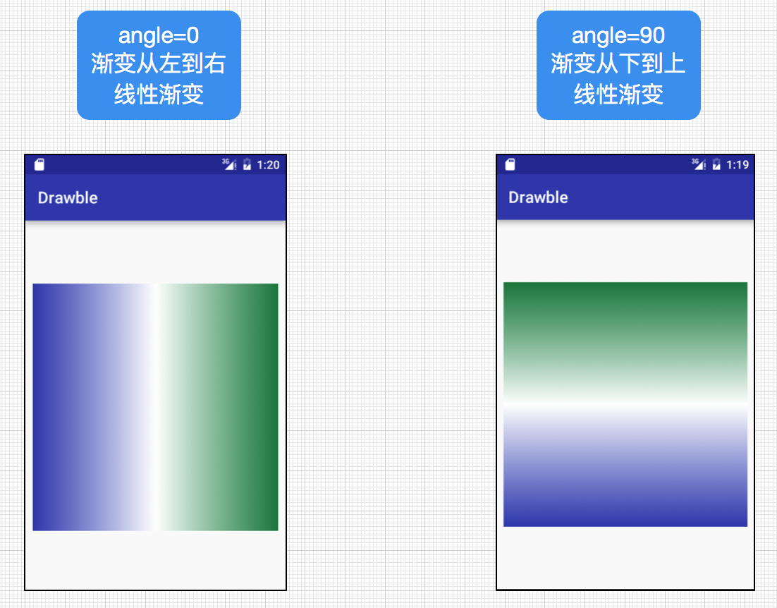
| android:angle | 渐变的角度,默认为0,其值务必为45°的倍数,0表示从左到右,90表示从下到上。 |
| android:centerX | 渐变中心点的横坐标 |
| android:centerY | 渐变的中心点的纵坐标,渐变中心点会影响渐变的具体效果。 |
| android:startColor | 渐变的开始颜色 |
| android:centerColor | 渐变的中间颜色 |
| android:endColor | 渐变的结束颜色 |
| android:gradientRadius | 渐变的半径,当android:type=”radial”有效 |
| android:useLevel | 一般为false |
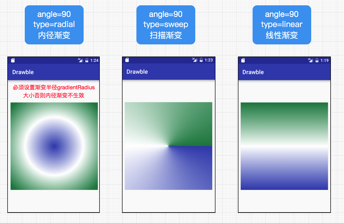
| android:type | 渐变类别,linear(线性)为默认值,radial(径内渐变),sweep(扫描渐变) |
angle=0和angle=90的区别(都为线性渐变):
linear(线性)为默认值,radial(径内渐变),sweep(扫描渐变)区别如下:
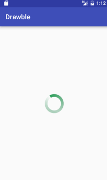
到这里我们利用前面的介绍的知识点来实现一个环形进度圈的案例,我们将shape属性设置为ring(圆环),然后再设置其内半径以及环的厚度,并设置渐变色调,shape_drawable.xml代码如下:
<?xml version="1.0" encoding="utf-8"?>
<shape xmlns:android="http://schemas.android.com/apk/res/android"
    android:innerRadius="20dp"
    android:shape="ring"
    android:thickness="8dp"
    android:useLevel="false" >

    <gradient android:angle="0"
        android:startColor="@color/normal"
        android:centerColor="#5027844F"
        android:endColor="#fff"
        android:useLevel="false"
        android:type="sweep"
        />
</shape>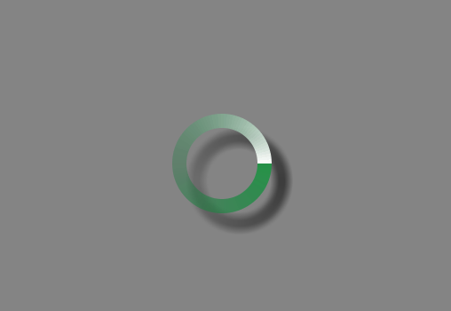
接着,我们将该自定义环形圈设置给一个旋转动画,并利用该旋转动画自定义成一个环形进度圈的style,最后将该自定义的style赋值给Progress组件。代码如下:
自定义旋转动画progress_rotate.xml:
<?xml version="1.0" encoding="utf-8"?>
<rotate xmlns:android="http://schemas.android.com/apk/res/android"
    android:drawable="@drawable/shape_drawable"
    android:pivotX="50%"
    android:pivotY="50%"
    android:fromDegrees="0"
    android:toDegrees="360"
    >
</rotate><style name="CustomProgressStyle" >
<item name="android:indeterminateDrawable">@drawable/progress_rotate</item>
<item name="android:minWidth">72dp</item>
<item name="android:maxWidth">72dp</item>
<item name="android:minHeight">72dp</item>
<item name="android:maxHeight">72dp</item>
</style><ProgressBar
android:layout_width="100dp"
android:layout_height="100dp"
android:layout_centerInParent="true"
style="@style/CustomProgressStyle"
android:indeterminateDuration="700"
/>
<solid>
表示纯色填充,通过android:color设置颜色即可。
<stroke>
描述边框,属性如下:
| 属性 | 含义 |
|---|---|
| android:width | 描述边框的宽度,数值越大,越边框越厚 |
| android:color | 边框的颜色 |
| android:dashWidth | 成虚线的线段宽度 |
| android:dashGap | 组成虚线的线段之间的间隔,间隔越大,虚线看起的间隙就越大 |
有点要明白的是android:dashWidth和android:dashGap有任意一个为0,则虚线无法预期显示。
<padding>
表示内容或子标签边距,4个属性top、bottom、left、right,需要注意的是这个标签的作用是为内容设置与当前应用此shape的View的边距,而不是设置当前View与父元素的边距。
<size>
设置背景大小,width和height俩属性。一般来说这个值不是shape的最终显示大小,因为shape作为背景时会根据View的大小而填充其背景,因此Shape的大小很多时候是View的大小决定的。
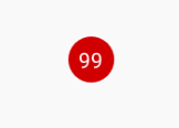
这里,shapeDrawable的基本属性我们都介绍完了,下面我们来实现一个比较常见的效果,我们在微信朋友圈点赞或者发布评论时总会出现一个红色带数字的小圆圈提示,嗯,我们就来模仿一下这个效果的实现,首先我们必须把shape属性设置为oval,并设置其纯填充颜色为红色,给一个临时大小宽高大小相同(之所以称为临时大小,是因为其最终大小由使用的View决定的),这样一个圆形背景图就出现啦。代码如下:
<?xml version="1.0" encoding="utf-8"?>
<shape xmlns:android="http://schemas.android.com/apk/res/android"
    android:shape="oval"
    >
    <solid android:color="#D90E0E" />
    <size android:height="10dp" android:width="10dp" />
</shape><TextView
android:layout_width="30dp"
android:layout_height="30dp"
android:layout_centerInParent="true"
android:gravity="center"
android:textColor="#fff"
android:text="99"
android:background="@drawable/shape_circle_number"
/>
实际上在开发中我们经常会利用shapeDrawable来自定义出所需要的各种背景图像或者显示图片,同时也有益于减少对美工图片的依赖,另外一个好处通过自定义shapeDrawable图片会比美工图片的size小很多,这样我们就能减少不必要的size,以减轻apk的size,可谓两全其美,因此能用shapeDrawable定义图像时,应该尽量使用它。
LayerDrawable
一个LayerDrawable是一个可以管理一组drawable对象的drawable。在LayerDrawable的drawable资源按照列表的顺序绘制,列表的最后一个drawable绘制在最上层。LayerDrawable对于xml的 <layer-list>标签其语法如下:
<?xml version="1.0" encoding="utf-8"?>
<layer-list
xmlns:android="http://schemas.android.com/apk/res/android" >
<item
    android:drawable="@[package:]drawable/drawable_resource"
    android:id="@[+][package:]id/resource_name"
    android:top="dimension"
    android:right="dimension"
    android:bottom="dimension"
    android:left="dimension" />
</layer-list>android:id
资源ID,一个为这个item定义的唯一的资源ID。 使用:”@+id/name”.这样的方式。可以检索或修改这个drawable通过下面的方式:View.findViewById() or Activity.findViewById().
android:top
Integer,Drawable相对于View的顶部的偏移量,单位像素
android:right
Integer,Drawable相对于View的右边的偏移量,单位像素
android:bottom
Integer,Drawable相对于View的底部的偏移量,单位像素
android:left
Integer,Drawable相对于View的左边的偏移量,单位像素
android:drawable
Drawable资源,可以引用已有的drawable资源,也可在item中自定义Drawable。默认情况下,layer-list中的Drawable都会被缩放至View的大小,因此在必要的情况下,我们可以使用android:gravity属性来控制图片的展示效果,防止图片变形或者被过度拉伸。
下面我们来利用layer-list的叠层效果实现一个文本输入框的底部横线背景。
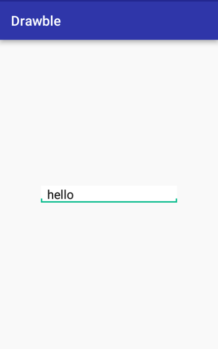
xml 代码如下:
<?xml version="1.0" encoding="utf-8"?>
<layer-list xmlns:android="http://schemas.android.com/apk/res/android">
    <item>
      <shape android:shape="rectangle">
          <solid android:color="@color/colorAccent" />
      </shape>
    </item>

    <item android:bottom="6dp">
        <shape android:shape="rectangle">
            <solid android:color="#ffffff"/>
        </shape>
    </item>

    <item android:bottom="2dp"
          android:left="2dp"
          android:right="2dp">
        <shape android:shape="rectangle">
            <solid android:color="#ffffff" />
        </shape>
    </item>
</layer-list><EditText
android:layout_width="200dp"
android:layout_height="wrap_content"
android:layout_centerInParent="true"
android:background="@drawable/layer_drawable"
/> <?xml version="1.0" encoding="utf-8"?>
<layer-list xmlns:android="http://schemas.android.com/apk/res/android">
<!-- 灰色阴影 内容距离左边2dp,距离顶部4dp-->
<item
android:left="2dp"
android:top="4dp">
<shape>
<solid android:color="@android:color/darker_gray" />
<corners android:radius="10dp" />
</shape>
</item>
<!-- 白色前景 内容距离底部4dp 右边2dp-->
<item
android:bottom="4dp"
android:right="2dp">
<shape>
<solid android:color="#FFFFFF" />
<corners android:radius="10dp" />
</shape>
</item>
</layer-list>
当然我们也可以在代码中实现这里仅给出示例,不深究,还是建议采用xml的方式定义
Bitmap bitmap=BitmapFactory.decodeResource(getResources(), R.drawable.image1);
Drawable[] drawables=new Drawable[3];
drawables[0]=new BitmapDrawable(bitmap);
drawables[1]=new BitmapDrawable(bitmap);
drawables[2]=new BitmapDrawable(bitmap);
LayerDrawable layer=new LayerDrawable(drawables);
//设置图层边界距离
layer.setLayerInset(0, 20, 20, 0, 0);
layer.setLayerInset(1, 40, 40, 0, 0);
layer.setLayerInset(2, 60, 60, 0, 0);
ImageView imageView=(ImageView)findViewById(R.id.imgView);
imageView.setImageDrawable(layer);StateListDrawable
StateListDrawable对于xml的 <selector>标签,这个标签可以说是我们最常用的标签了,在开发中,有时候我们需要一个View在点击前显示某种状态,而在点击后又切换到另外一种状态,这时我们就需要利用标签来实现啦。如下案例,我们在点击输入邮件地址前文本框底线是灰色,而在点击后文本框底线就变成蓝色了,这也是标签的应用之一。
StateListDrawable本身也是表示Drawable的集合,每个Drawable就对于View的一种状态,如上面的灰色底线和蓝色底线对应着View的两种V不同时期的状态,因此我们经常使用StateListDrawable来设置View的背景,以便在不同状态下显示不同的效果,从而获得更优的用户体验。其主要语法如下:
<?xml version="1.0" encoding="utf-8"?>
<selector xmlns:android="http://schemas.android.com/apk/res/android"
    android:constantSize=["true" | "false"]
    android:dither=["true" | "false"]
    android:variablePadding=["true" | "false"] >
    <item
        android:drawable="@[package:]drawable/drawable_resource"
        android:state_pressed=["true" | "false"]
        android:state_focused=["true" | "false"]
        android:state_hovered=["true" | "false"]
        android:state_selected=["true" | "false"]
        android:state_checkable=["true" | "false"]
        android:state_checked=["true" | "false"]
        android:state_enabled=["true" | "false"]
        android:state_activated=["true" | "false"]
        android:state_window_focused=["true" | "false"] />
</selector>| 属性 | 含义 |
|---|---|
| android:drawable | 该状态下要显示的图像,可以是Drawable也可以是图片 |
| android:state_pressed | 表示是否处于被按下状态 |
| android:state_focused | 表示是否已得到焦点状态 |
| android:state_hovered | 表示光标是否停留在View的自身大小范围内的状态 |
| android:state_selected | 表示是否处于被选中状态 |
| android:state_checkable | 表示是否处于可勾选状态 |
| android:state_checked | 表示是否处于已勾选状态,一般用于CheckBox |
| android:state_enabled | 表示是否处于可用状态 |
| android:state_active | 表示是否处于激活状态 |
| android:state_window_focused | 表示是否窗口已得到焦点状态 |
selector标签的属性含义如下:
android:constantSize
StateListDrawable的固有大小是否随着其状态改变而改变,因为在状态改变后,StateListDrawable会切换到别的Drawable,而不同的Drawable其大小可能不一样。true表示大小不变,这时其固有大小是内容所有Drawable的固有大小的最大值。false则会随着状态改变而改变,默认值为false
android:variablePadding
表示 StateListDrawable的padding是否随状态的改变而改变,默认值为false,一般建议设置为false就行。
android:dither
是否开启抖动效果,开启后可使高质量的图片在低质量的屏幕上仍然有较好的显示效果,一般建议开启,设置为true。
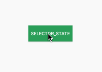
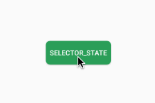
接下来我们来看一个例子,按钮点击前后状态改变。代码如下:
<?xml version="1.0" encoding="utf-8"?>
<selector xmlns:android="http://schemas.android.com/apk/res/android">
    <!--获取焦点状态-->
    <item
    android:state_focused="true"
    android:drawable="@color/color_state"
    />

    <!--按下状态-->
    <item android:state_pressed="true"
    android:drawable="@color/color_state" />

    <!--默认状态下-->
    <item android:drawable="@color/normal" />
</selector><Button
android:padding="8dp"
android:layout_width="wrap_content"
android:layout_height="wrap_content"
android:layout_centerInParent="true"
android:text="Selector_State"
android:textColor="#fff"
android:background="@drawable/selector_drawable"
/>效果如下:
上面是通过颜色定义不同状态下的显示 效果,当然我们也可以利用shapeDrawable定义各种背景图像然后应用到StateListDrawable中,下面我们定义两个不同状态下的圆角矩形,并应用到button上
shape_drawable_for_btn_normal.xml代码如下:
<?xml version="1.0" encoding="utf-8"?>
<shape xmlns:android="http://schemas.android.com/apk/res/android"
    android:shape="rectangle"
    >
    <solid android:color="@color/normal"></solid>
    <corners android:radius="8dp" />
</shape><?xml version="1.0" encoding="utf-8"?>
<shape xmlns:android="http://schemas.android.com/apk/res/android"
android:shape="rectangle"
>
<solid android:color="@color/color_state"></solid>
<corners android:radius="8dp" />
</shape><?xml version="1.0" encoding="utf-8"?>
<selector xmlns:android="http://schemas.android.com/apk/res/android">
<!--获取焦点状态-->
<item
android:state_focused="true"
android:drawable="@drawable/shape_drawable_for_btn_press"
/>
<!--按下状态-->
<item android:state_pressed="true"
android:drawable="@drawable/shape_drawable_for_btn_press" />
<!--默认状态下-->
<item android:drawable="@drawable/shape_drawable_for_btn_normal" />
</selector><Button
android:padding="8dp"
android:layout_width="wrap_content"
android:layout_height="wrap_content"
android:layout_centerInParent="true"
android:text="Selector_State"
android:textColor="#fff"
android:background="@drawable/selector_for_btn"
/>
最后给出一个通过代码实现的案例给大家参考(建议尽量使用xml定义,代码定义比较复杂):
/** 设置Selector。 */
    public static StateListDrawable newSelector(Context context, int idNormal, int idPressed, int idFocused,
                                                int idUnable) {
        //相当于<selector>标签
        StateListDrawable bg = new StateListDrawable();
        Drawable normal = context.getResources().getDrawable(R.drawable.shape_drawable_for_btn_normal);
        Drawable pressed = context.getResources().getDrawable(R.drawable.shape_drawable_for_btn_press);
        Drawable focused =context.getResources().getDrawable(R.drawable.shape_drawable_for_btn_press);
        Drawable unable = context.getResources().getDrawable(R.drawable.shape_drawable_for_btn_unable);
        //设置每种状态下的Drawable显示
        // View.PRESSED_ENABLED_STATE_SET
        bg.addState(new int[] { android.R.attr.state_pressed, android.R.attr.state_enabled }, pressed);
        // View.ENABLED_FOCUSED_STATE_SET
        bg.addState(new int[] { android.R.attr.state_enabled, android.R.attr.state_focused }, focused);
        // View.ENABLED_STATE_SET
        bg.addState(new int[] { android.R.attr.state_enabled }, normal);
        // View.FOCUSED_STATE_SET
        bg.addState(new int[] { android.R.attr.state_focused }, focused);
        // View.WINDOW_FOCUSED_STATE_SET
        bg.addState(new int[] { android.R.attr.state_window_focused }, unable);
        // View.EMPTY_STATE_SET
        bg.addState(new int[] {}, normal);
        return bg;
    }
LevelListDrawable
LevelListDrawable对 xml的 <level-list>标签,也表示一个Drawable的集合,但集合中的每个Drawable都一个等级。根据不同等级,LevelListDrawable会切换到相应的Drawable。语法如下:
<?xml version="1.0" encoding="utf-8"?>
<level-list
    xmlns:android="http://schemas.android.com/apk/res/android" >
    <item
        android:drawable="@drawable/drawable_resource"
        android:maxLevel="integer"
        android:minLevel="integer" />
</level-list>| 属性 | 含义 |
|---|---|
| android:drawable | 该等级下需要展示的图片 |
| android:maxLevel | 该项所允许的最大level |
| android:minLevel | 该项所允许的最小level |
<?xml version="1.0" encoding="utf-8"?>
<level-list xmlns:android="http://schemas.android.com/apk/res/android">
    <item android:drawable="@drawable/image4"
        android:maxLevel="0"
        />

    <item android:drawable="@drawable/image1"
          android:maxLevel="1"
        />

    <item android:drawable="@drawable/image2"
        android:maxLevel="2"
        />

    <item android:drawable="@drawable/image3"
        android:maxLevel="3"
        />
</level-list>public class MainActivity extends AppCompatActivity {
private static ImageView imageView;
static Handler handler = new Handler(){
@Override
public void handleMessage(Message msg) {
if(msg.what==1){
imageView.getDrawable().setLevel(1);
}else if(msg.what==2){
imageView.getDrawable().setLevel(2);
}else if(msg.what==3){
imageView.getDrawable().setLevel(3);
}
}
};
@Override
protected void onCreate(Bundle savedInstanceState) {
super.onCreate(savedInstanceState);
setContentView(R.layout.activity_main);
imageView=(ImageView)findViewById(R.id.image);
imageView.setImageResource(R.drawable.level_list_drawable);
imageView.setImageLevel(0);
for (int i=1;i<4;i++){
handler.sendEmptyMessageDelayed(i,i*2000);
}
}
}
实际上我们还可以设置等级范围,当等级在某个范围内时去显示对应范围内的图片,这也是可以的。这个比较简单,这里就不演示了哈。
TransitionDrawable
很多时候我们在实现渐变的动画效果时,都会使用到animation,但实际上我们有既简单又完美的解决方法,没错,它就是TransitionDrawable啦,TransitionDrawable用于实现两个Drawable之间的淡入淡出的效果,它对应的是 <transition>标签; 其语法如下:
<?xml version="1.0" encoding="utf-8"?>
<transition
xmlns:android="http://schemas.android.com/apk/res/android" >
    <item
        android:drawable="@[package:]drawable/drawable_resource"
        android:id="@[+][package:]id/resource_name"
        android:top="dimension"
        android:right="dimension"
        android:bottom="dimension"
        android:left="dimension" />
</transition>android:id
资源ID,drawable资源的唯一标识。使用”@+id/name”方式来给这个item定义一个新的资源ID。可以使用View.findViewById()或者 Activity.findViewById()等方式检索和修改这个item。
同样,我们来看一个实例:
<?xml version="1.0" encoding="utf-8"?>
<transition xmlns:android="http://schemas.android.com/apk/res/android">
    <item android:drawable="@drawable/image1"/>
    <item android:drawable="@drawable/image2" />
</transition><ImageView
android:id="@+id/image"
android:layout_width="wrap_content"
android:layout_height="wrap_content"
android:layout_centerInParent="true"
android:background="@drawable/transition_drawable"
/> TransitionDrawable drawable= (TransitionDrawable) imageView.getBackground();
drawable.startTransition(4000); <ImageView
android:id="@+id/image"
android:layout_width="wrap_content"
android:layout_height="wrap_content"
android:layout_centerInParent="true"
android:src="@drawable/transition_drawable"
/> TransitionDrawable drawable= (TransitionDrawable) imageView.getDrawable();
drawable.startTransition(4000); 
最后我们给出代码实现的方式,比较简单,这里不过多分析:
ImageView imageView= (ImageView) findViewById(R.id.tranImage);

Bitmap bitmap1= BitmapFactory.decodeResource(getResources(), R.drawable.image1);
Bitmap bitmap2= BitmapFactory.decodeResource(getResources(), R.drawable.image2);
final TransitionDrawable td = new TransitionDrawable(new Drawable[] {  new BitmapDrawable(getResources(), bitmap1),
        new BitmapDrawable(getResources(), bitmap2) });
imageView.setImageDrawable(td);
td.startTransition(4000);
InsetDrawable
有时候我们可能需要为一个全屏的LinearLayout布局指定背景图,但我们不想让背景图充满屏幕,这时我们就需要使用到InsetDrawable了,InsetDrawable对应 <inset>标签,它可以将其他Drawable内嵌到自己当中,并可以在四周预留出一定的间距。当我们希望View的背景比实际区域小时,就可以采用InsetDrawable来实现,个人认为这个效果并没有什么特殊之处,因为layerDrawable也是可以达到相同的预期效果的。其语法如下:
<?xml version="1.0" encoding="utf-8"?>
<inset
    xmlns:android="http://schemas.android.com/apk/res/android"
    android:drawable="@drawable/drawable_resource"
    android:insetTop="dimension"
    android:insetRight="dimension"
    android:insetBottom="dimension"
android:insetLeft="dimension" />| 属性 | 含义 |
|---|---|
| android:insetTop | 图像距离上边的距离 |
| android:insetRight | 图像距离右边的距离 |
| android:insetBottom | 图像距离底边的距离 |
| android:insetLeft | 图像距离左边的距离 |
<?xml version="1.0" encoding="utf-8"?>
<inset xmlns:android="http://schemas.android.com/apk/res/android"
    android:insetBottom="10dp"
    android:drawable="@drawable/transition_bg_1"
    android:insetTop="10dp"
    android:insetLeft="10dp"
    android:insetRight="10dp"
    >
</inset> <?xml version="1.0" encoding="utf-8"?>
<RelativeLayout xmlns:android="http://schemas.android.com/apk/res/android"
xmlns:tools="http://schemas.android.com/tools"
android:layout_width="match_parent"
android:layout_height="match_parent"
android:background="@drawable/inset_drawable"
tools:context="com.zejian.drawble.MainActivity">
</RelativeLayout>
ScaleDrawable
caleDrawable对应 <scale>标签,主要基于当前的level,对指定的Drawable进行缩放操作。有点需要特别注意的是我们如果定义好了ScaleDrawable,要将其显示出来的话,必须给ScaleDrawable设置一个大于0小于10000的等级(级别越大Drawable显示得越大,等级为10000时就没有缩放效果了),否则将无法正常显示。我们可以看看其draw函数的源码:
  @Override
  public void draw(Canvas canvas) {
      final Drawable d = getDrawable();
      if (d != null && d.getLevel() != 0) {
          d.draw(canvas);
      }
}<?xml version="1.0" encoding="utf-8"?>
<scale
xmlns:android="http://schemas.android.com/apk/res/android"
android:drawable="@drawable/drawable_resource"
android:scaleGravity=["top" | "bottom" | "left" | "right" | "center_vertical" |
"fill_vertical" | "center_horizontal" | "fill_horizontal" |
"center" | "fill" | "clip_vertical" | "clip_horizontal"]
android:scaleHeight="percentage"
android:scaleWidth="percentage" />当图片小于容器尺寸时,设置此选项可以对图片经典定位,这个属性比较多,不同选项可以使用‘|’来组合使用。
| 可选项 | 含义 |
|---|---|
| top | 将图片放在容器的顶部,不改变图片大小 |
| bottom | 将图片放在容器底部,不改变图片大小 |
| left | 将图片放在容器左侧,不改变图片大小 |
| right | 将图片放在容器右侧,不改变图片大小 |
| center_vertical | 图片竖直居中,不改变图片大小 |
| fill_vertical | 图片竖直方向填充容器 |
| center_horizontal | 图片水平居中,不改变图片大小 |
| fill_horizontal | 图片水平方向填充容器 |
| center | 使图片在水平方向和竖直方向同时居中,不改变图片大小 |
| fill | 图片填充容器,默认值 |
| clip_vertical | 竖直方向剪切,很少使用 |
| clip_horizontal | 水平方向剪切,很少使用 |
android:scaleHeight
表示Drawable的高的缩放比例,值越大,内部Drawable的高度显示得越小,例如android:scaleHeight=”70%”,那么显示时Drawable的高度只有原来的30%。
android:scaleWidth
表示Drawable的宽的缩放比例,值越大,内部Drawable的宽显示得越小,例如android:scaleWidth=”70%”,那么显示时Drawable的宽度只有原来的30%。
直接来看个例子呗,我们设置两组宽高分别缩放70%和30%,然后来对比一下情况
<?xml version="1.0" encoding="utf-8"?>
<scale xmlns:android="http://schemas.android.com/apk/res/android"
    android:drawable="@drawable/image1"
    android:scaleHeight="70%"
    android:scaleWidth="70%"
    android:scaleGravity="center"
    >
</scale>
<?xml version="1.0" encoding="utf-8"?>
<scale xmlns:android="http://schemas.android.com/apk/res/android"
android:drawable="@drawable/image1"
android:scaleHeight="30%"
android:scaleWidth="30%"
android:scaleGravity="center"
>
</scale>ImageView scaleImage= (ImageView) findViewById(R.id.scaleImage);
ScaleDrawable scale= (ScaleDrawable) scaleImage.getBackground();
scale.setLevel(1);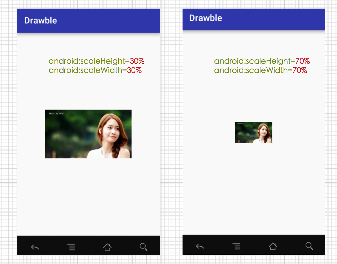
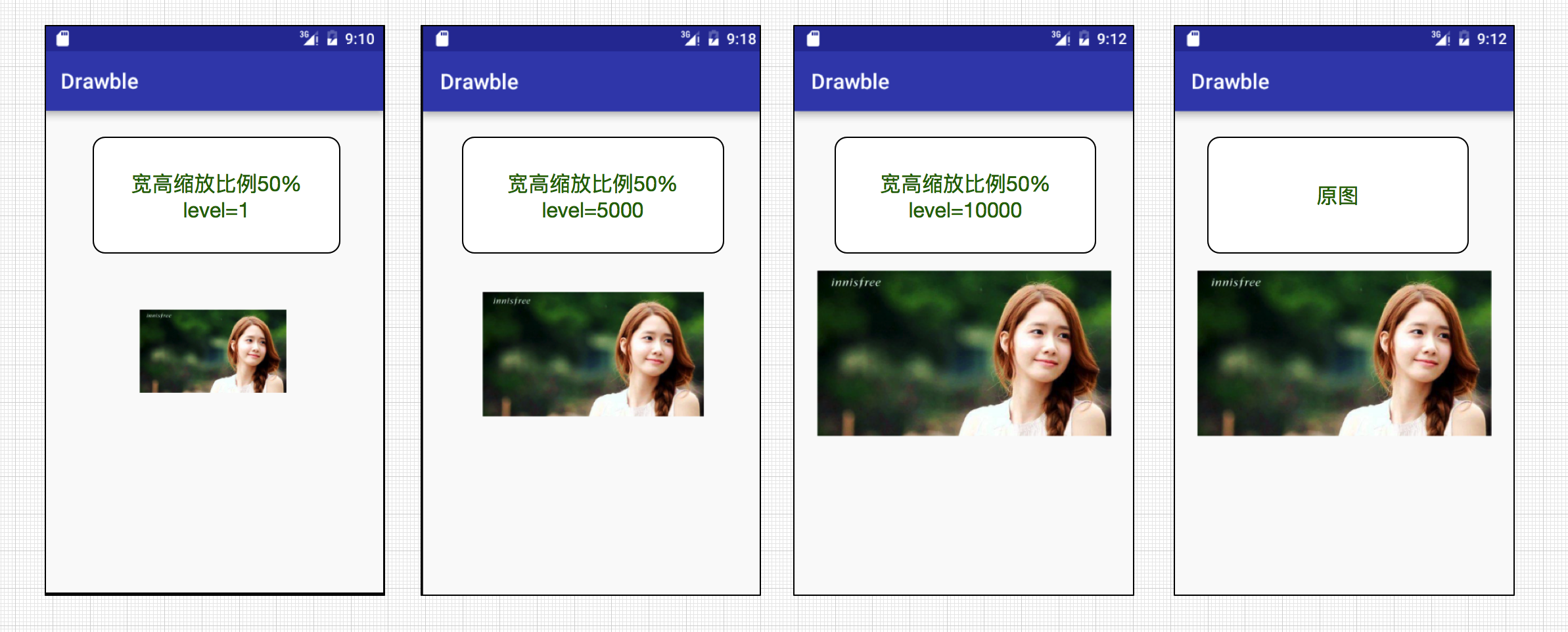
我们再来对比一下宽高同等缩放比例(50%)下,level对Drawable的影响效果,分别设置level等级为1,5000,10000.
ClipDrawable
ClipDrawable是通过设置一个Drawable的当前显示比例来裁剪出另一张Drawable,我们可以通过调节这个比例来控制裁剪的宽高,以及裁剪内容占整个View的权重,通过ClipDrawable的setLevel()方法控制显示比例,ClipDrawable的level值范围在[0,10000],level的值越大裁剪的内容越少,当level为10000时则完全显示,而0表示完全裁剪,不可见。需要注意的是在给clip元素中android:drawable属性设置背景图片时,图片不能是 .9图,因为这涉及到裁剪这张图片,如果设置为点九图,裁剪的实际情况会与想要的效果不一样。ClipDrawable对应xml的 <clip>标签,其语法如下:
 <?xml version="1.0" encoding="utf-8"?>
 <clip
 xmlns:android="http://schemas.android.com/apk/res/android"
 android:drawable="@drawable/drawable_resource"
 android:clipOrientation=["horizontal" | "vertical"]
 android:gravity=["top" | "bottom" | "left" | "right" | "center_vertical" |
                  "fill_vertical" | "center_horizontal" | "fill_horizontal" |
"center" | "fill" | "clip_vertical" | "clip_horizontal"] />| 属性值 | 含义 |
|---|---|
| top | 将这个对象放在容器的顶部,不改变其大小。当clipOrientation 是”vertical”,裁剪从底部开始 |
| bottom | 将这个对象放在容器的底部,不改变其大小。当clipOrientation 是 “vertical”,裁剪从顶部(top)开始 |
| left | 将这个对象放在容器的左部,不改变其大小。当clipOrientation 是 “horizontal”,裁剪从drawable的右边(right)开始,默认值 |
| right | 将这个对象放在容器的右部,不改变其大小。当clipOrientation 是 “horizontal”,裁剪从drawable的左边(left)开始 |
| center_vertical | 将对象放在垂直中间,不改变其大小,如果clipOrientation 是 “vertical”,那么从上下同时开始裁剪 |
| fill_vertical | 垂直方向上不发生裁剪。(除非drawable的level是 0,才会不可见,表示全部裁剪完) |
| center_horizontal | 将对象放在水平中间,不改变其大小,clipOrientation 是 “horizontal”,那么从左右两边开始裁剪 |
| fill_horizontal | 水平方向上不发生裁剪。(除非drawable的level是 0,才会不可见,表示全部裁剪完) |
| center | 将这个对象放在水平垂直坐标的中间,不改变其大小。当clipOrientation 是 “horizontal”裁剪发生在左右。当clipOrientation是”vertical”,裁剪发生在上下。 |
| fill | 填充整个容器,不会发生裁剪。(除非drawable的level是 0,才会不可见,表示全部裁剪完)。 |
| clip_vertical | 附加选项,表示竖直方向的裁剪,很少使用 |
| clip_horizontal | 附加选项,表示水平方向的裁剪,很少使用 |
<?xml version="1.0" encoding="utf-8"?>
<clip xmlns:android="http://schemas.android.com/apk/res/android"
    android:drawable="@drawable/image1"
    android:clipOrientation="horizontal"
    android:gravity="right"
    >
</clip><ImageView
android:id="@+id/clipImage"
android:layout_width="wrap_content"
android:layout_height="wrap_content"
android:layout_centerInParent="true"
android:background="@drawable/clip_drawable"
/> ImageView clipImage= (ImageView) findViewById(R.id.clipImage);
ClipDrawable clip= (ClipDrawable) clipImage.getBackground();
clip.setLevel(6000);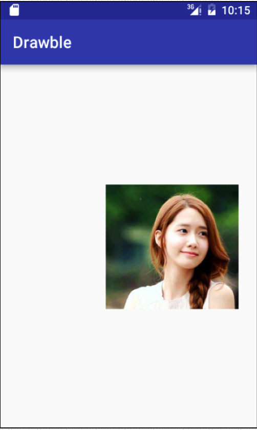
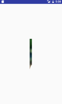
最后我们来实现一个案例,在实际开发中经常会使用到动画来实现一些特殊效果,比如我们可能需要实现一个徐徐展开的图片,这时我们的ClipDrawable就派上用场了,接着我们就是利用ClipDrawable来实现一个拥有徐徐展开效果的图片
思路:
因为ClipDrawable的setLevel(int level)可以控制截取图片的部分,因此我们可以设置一个定时器,让程序每隔一段时间就调用ClipDrawable的setLevel(int level)方法即可实现图片徐徐展开效果。
我们首先来实现一个clip_drawable_image.xml,并设置clipOrientation=”horizontal”,即水平剪切,以及设置gravity=”center”,即左右同时裁剪,代码如下:
<?xml version="1.0" encoding="utf-8"?>
<clip xmlns:android="http://schemas.android.com/apk/res/android"
    android:drawable="@drawable/image1"
    android:clipOrientation="horizontal"
    android:gravity="center">
</clip><RelativeLayout xmlns:android="http://schemas.android.com/apk/res/android"
xmlns:tools="http://schemas.android.com/tools"
android:layout_width="match_parent"
android:layout_height="match_parent"
tools:context=".MainActivity" >
<ImageView
android:id="@+id/image"
android:layout_width="wrap_content"
android:layout_height="wrap_content"
android:layout_centerInParent="true"
android:scaleType="fitStart"
android:src="@drawable/clip_drawable_image"
/>
</RelativeLayout>public class Clip_Activity extends Activity {
private final static int IS_CONTUNUE=0x22;
private ClipDrawable drawable;
private ImageView imageView;
Timer timer = new Timer();
final Handler handler = new Handler() {
@Override
public void handleMessage(Message msg) {
if (msg.what == IS_CONTUNUE) {
/**setlevel()设置图片截取的大小
* 修改ClipDrawable的level值,level值为0--10000;
* 10000:截取图片大小为空白,0:截取图片为整张图片;
*/
drawable.setLevel(drawable.getLevel() + 200);
}
}
};
@Override
protected void onCreate(Bundle savedInstanceState) {
super.onCreate(savedInstanceState);
setContentView(R.layout.activity_clip);
imageView = (ImageView) findViewById(R.id.image);
//获取图片所显示的ClipDrawable对象
drawable = (ClipDrawable) imageView.getDrawable();
//定时器
timer.schedule(new TimerTask() {
@Override
public void run() {
Message msg = new Message();
msg.what = IS_CONTUNUE;
handler.sendMessage(msg);
if (drawable.getLevel() >= 10000) {
timer.cancel();
}
}
}, 0, 200);
}
}
ColorDrawable
ColorDrawable 是最简单的Drawable,它实际上是代表了单色可绘制区域,它包装了一种固定的颜色,当ColorDrawable被绘制到画布的时候会使用颜色填充Paint,在画布上绘制一块单色的区域。 在xml文件中对应 <color>标签,它只有一个android:color属性,通过它来决定ColorDrawable的颜色。
xml实现如下:
<?xmlversion="1.0" encoding="utf-8"?>
<color xmlns:android="http://schemas.android.com/apk/res/android"
  android:color="@color/normal"
/>
也可以使用代码实现,注意传入的颜色值为16进制的数字:
ColorDrawable cd = new ColorDrawable(0xff000000);
ImageView iv = (ImageView)findViewById(...);
iv.setImageDrawable(cd);
GradientDrawable
GradientDrawable 表示一个渐变区域,可以实现线性渐变、发散渐变和平铺渐变效果,实际上这个我们在上一篇的shapeDrawable中就已经分析过了,忘了可以回头复习一下哈~,其对应的标签为一般都是配置shapeDrawable来使用,为其实现渐变颜色。这里给出简单案例如下:
<?xml version="1.0" encoding="utf-8"?>
<shape xmlns:android="http://schemas.android.com/apk/res/android"
    android:shape="rectangle"
    >

    <gradient android:angle="90"
        android:startColor="@color/colorPrimary"
        android:centerColor="#fff"
        android:endColor="@color/color_state"
        android:type="linear"
        />
</shape>
当然GradientDrawable也可以作为View的背景图,案例代码实现如下:
//分别为开始颜色,中间夜色,结束颜色
int colors[] = { 0xff255779 , 0xff3e7492, 0xffa6c0cd };
GradientDrawable gd = new GradientDrawable(GradientDrawable.Orientation.TOP_BOTTOM, colors);
最后设置给View的背景图即可。
setBackgroundDrawable(gd);


 1532
1532

 被折叠的 条评论
为什么被折叠?
被折叠的 条评论
为什么被折叠?
 到【灌水乐园】发言


