背景:
项目中需要移动端和pc端,通过媒体查询写一套太麻烦了,于是搞了PC一套,移动端一套,那么
问题来了,怎么在移动端显示移动端的页面,PC端显示PC端的页面?蹬蹬瞪~于是乎,就有了这
篇文章!!
解决方案有以下两种:
方案一:在页面入口文件index.html文件中判断访问设备类型,决定进入哪个文件。【适用于非qiankun项目】
说明:qiankun项目,如果用以上方案,会存在一个问题。由于我们手动在访问路径中拼了个/pc(例如:https://xxx:8000/pc/sub/xx),这会导致此路由,无法匹配页面,所以页面是空白的。
具体的实现过程:
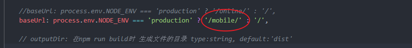
1、分别将PC端、移动端的打包文件夹名称改成pc、mobile;
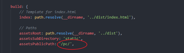
2、分别修改PC、移动端项目打包配置项,具体如下:
移动端(vue-cli 3.x vue.config.js文件)
PC端(vue cli 2.x:config-->index.js)
3、在外层路径加一个index.html文件,判断根据不同设备,显示不同界面:
index.html代码:
<!DOCTYPE html>
<html lang="en">
<head>
<meta charset="UTF-8">
<meta name="viewport" content="width=device-width, initial-scale=1.0">
<meta http-equiv="X-UA-Compatible" content="ie=edge">
<title>xxxxxxxx</title>
</head>
<body>
<script>
var userAgent = navigator.userAgent.toLowerCase();
var platform;
if(userAgent == null || userAgent == ''){
platform = 'WEB' ;
}else{
if(userAgent.indexOf("android") != -1 ){
platform = 'ANDROID';
location.href = "./mobile/";
}else if(userAgent.indexOf("ios") != -1 || userAgent.indexOf("iphone") != -1 || userAgent.indexOf("ipad") != -1){
platform = 'IOS';
location.href = "./mobile/";
}else if(userAgent.indexOf("windows phone") != -1 ){
platform = 'WP';
location.href = "./pc/";
}else{
platform = 'WEB' ;
location.href = "./pc/";
}
}
</script>
</body>
</html>
最终整个文件目录就是这样子的了:
方案二:通过修改nginx配置,实现不同端的文件路径指向。【推荐使用此方式,适配性高】
具体的实现方案:
# 自定义变量 $device_root
# mobile/anroid/iphone/ipad 指向文件路径: /home/software/internet/web/mobile【存放mobile打包web文件】
#其他 指向文件路径:/home/software/internet/web【存放pc打包文件】
map $http_user_agent $device_root {
"~*mobile" /home/software/internet/web/mobile;
"~*android" /home/software/internet/web/mobile;
"~*iphone" /home/software/internet/web/mobile;
"~*ipad" /home/software/internet/web/mobile;
default /home/software/internet/web;
}
location / {
root $device_root;
try_files $uri $uri/ /index.html; #映射到index.html上
}
完结~