


定位
- 定位的基本介绍
网页的三种常见布局方式:标准流 浮动 定位
标准流:块级元素独占一行,垂直布局。行内元素/行内块元素一行显示多个,水平布局
浮动:可以让原本垂直布局的块级元素变成水平布局
定位:可以让元素自由的摆放在网页的任意位置,一般用于盒子之间的层叠情况。定位之后的元素层级最高,可以层叠在其他盒子上面,也可以让盒子始终固定在屏幕中的某个位置

- 定位的基本使用
设置定位方式并且设置偏移值
设置定位方式属性名position
偏移值设置分为两个方向,水平和垂直方向各选一个使用即可,选取的原则一般是就近原则,离哪边近就用哪个


- 静态定位
默认值,就是之前的标准流
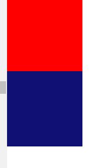
position:static 不能通过方位属性进行移动。如果加了方位,盒子就会消失
笼统来说定位不包括静态定位
<!DOCTYPE html>
<html lang="en">

<head>
    <meta charset="UTF-8">
    <meta name="viewport" content="width=device-width, initial-scale=1.0">
    <title>Document</title>
    <style>
        * {
            margin: 0;
            padding: 0;
        }

        div {
            width: 300px;
            height: 300px;
        }

        .red {
            background-color: red;
        }

        .green {
            /* 1、定位方式-相对定位 */
            position: relative;
            /* 2、偏移值 */
            top: 100px;
            left: 100px;
            background-color: green;
             /* 3、盒子消失了 */
        }

        .blue {
            background-color: blue;
        }
    </style>
</head>

<body>
    <div class="red"></div>
    <div class="green"></div>
    <div class="blue"></div>
</body>

</html>
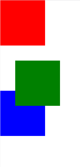
- 相对定位
自恋型定位,相对于自己之前的位置进行移动
position:relative
需要配合方位属性进行移动,相对于自己原来位置移动,在页面中占位置(没有脱标)
配合绝对定位使用,并且应用于小范围的移动
<!DOCTYPE html>
<html lang="en">

<head>
    <meta charset="UTF-8">
    <meta name="viewport" content="width=device-width, initial-scale=1.0">
    <title>Document</title>
    <style>
        * {
            margin: 0;
            padding: 0;
        }

        div {
            width: 300px;
            height: 300px;
        }

        .red {
            background-color: red;
        }

        .green {
            /* 1、定位方式-相对定位 */
            position: relative;
            /* 2、偏移值 */
            top: 100px;
            left: 100px;
            background-color: green;
              /* 3、绿色盒子相对自己左上角发生了偏移 */
        }

        .blue {
            background-color: blue;
        }
    </style>
</head>

<body>
    <div class="red"></div>
    <div class="green"></div>
    <div class="blue"></div>
</body>

</html>
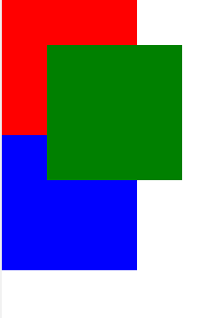
- 绝对定位
拼爹型定位,相对于非静态定位的父元素进行定位移动
position:absolute
需要配合方位属性实现移动
默认相对于浏览器可视区域进行移动
在页面中不占位置(已经脱标)
祖先元素中没有定位,则默认相对于浏览器进行移动
祖先元素中有定位,相对于最近的有定位的祖先元素进行移动
<!DOCTYPE html>
<html lang="en">
<head>
  <meta charset="UTF-8">
  <meta name="viewport" content="width=device-width, initial-scale=1.0">
  <title>Document</title>
  <style>
    * {
      margin: 0;
      padding: 0;
    }

    div {
      width: 300px;
      height: 300px;
    }

    .red {
      background-color: red;
    }

    .green {
      /* 1、定位方式-绝对定位 */
      position: absolute;

      /* 2、偏移值 */
      top: 100px;
      left: 100px;
      /* 3、相对于浏览器左上角进行移动 */
      /* 4、祖先元素中没有定位 */
      background-color: green;
    }

    .blue {
      background-color: blue;
    }

  </style>
</head>
<body>
  <div class="red"></div>
  <div class="green"></div>
  <div class="blue"></div>
</body>
</html>
<!DOCTYPE html>
<html lang="en">
<head>
  <meta charset="UTF-8">
  <meta name="viewport" content="width=device-width, initial-scale=1.0">
  <title>Document</title>
  <style>
    .father {
      /* 设置定位 */
      position: relative;

      width: 600px;
      height: 600px;
      background-color: pink;
    }

    .son {
      /* 设置定位 */
      position: relative;

      width: 400px;
      height: 400px;
      background-color: skyblue;
    }

    .sun {
      /* 绝对定位 */
      position: absolute;
      right: 0;
      bottom: 0;

      width: 200px;
      height: 200px;
      background-color: blue;
    }
    /* 相对于最近的设置了相对定位的父级元素来说,因此是相对于son这个盒子来进行定位 */

  </style>
</head>
<body>
  <div class="father">
    <div class="son">
      <div class="sun"></div>
    </div>
  </div>
</body>
</html>

- 子绝父相
让子元素相对于父元素进行自由移动。子元素绝对定位,父元素相对定位,上面的代码亦是如此,
为什么要如此做呢?因为父元素是相对定位,相对定位没有脱标,对网页布局影响最小
<!DOCTYPE html>
<html lang="en">

<head>
    <meta charset="UTF-8">
    <meta name="viewport" content="width=device-width, initial-scale=1.0">
    <title>Document</title>
    <style>
        .father {
            /* 父相 */
            position: relative;
            /* 父绝 */
            /* position: absolute; */
            width: 600px;
            height: 600px;
            background-color: pink;
        }

        .son {
            /* 子绝 */
            position: absolute;
            right: 0;
            bottom: 0;
            width: 400px;
            height: 400px;
            background-color: blue;
        }
    </style>
</head>

<body>
    <div class="father">
        <div class="son"></div>
    </div>
</body>

</html>

来讲一种特殊情景,在使用子绝父相的时候,发现父元素已经有绝对定位了,此时直接子绝即可。
因为父元素已经有定位,说明满足它的要求,如果盲目修改父元素定位方式,可能会影响之前写好的布局
<!DOCTYPE html>
<html lang="en">
<head>
  <meta charset="UTF-8">
  <meta name="viewport" content="width=device-width, initial-scale=1.0">
  <title>Document</title>
  <style>
    .father {
      /* 父相 */
      position: relative;

      width: 600px;
      height: 600px;
      background-color: pink;
    }

    .son {
      /* 子绝 */
      position: absolute;
      right: 0;
      bottom: 0;

      width: 400px;
      height: 400px;
      background-color: blue;
    }

  .sun {
    /* 子绝 */
    position: absolute;
    right: 0;
    top: 0;

    width: 200px;
    height: 200px;
    background-color: yellow;
  }

  </style>
</head>
<body>
  <div class="father">
    <div class="son">
      <div class="sun"></div>
    </div>
  </div>
</body>
</html>

- 子绝父相经典案例
使用子绝父相,让子盒子在父盒子中水平垂直都居中。关键是要求父子元素在任意宽高下都能实现

这个题由于规定宽高是随意的,所以我们不能仅仅把思维局限于left top设置固定的宽高值。
一般思路在于:先让子盒子往右移动父盒子宽度的一半距离,再让子盒子往左移动自己宽度的一半距离,即可实现水平居中效果。当然对于垂直居中,同理。先让子盒子往下移动父盒子高度的一半距离,再让子盒子往上移动自己高度的一半距离。那么这部分的具体代码该如何实现呢?
子盒子由于是相对定位,设置left:50% 原先的话子盒子是紧贴于父盒子左上角,因此这个代码表示子盒子距离左边的距离为50%(这个50%是针对于父盒子而言)
再让子盒子往左移动自己的一半,一般来说我们可以设置margin-left 并且设置为负值,表示向左靠近。但是这个代码在子盒子的宽度发生变化后需要重新修改代码,不符合我们的预设条件。因此我们采用transform:translateX(-50%)表示沿着X轴负方向(向左)始终移动自己宽度的一半,此时子盒子宽度变化不需要修改代码。
我以上说的是针对水平居中,垂直居中同理,代码如下
<!DOCTYPE html>
<html lang="en">
<head>
  <meta charset="UTF-8">
  <meta name="viewport" content="width=device-width, initial-scale=1.0">
  <title>Document</title>
  <style>
    .father {
      position: relative;
      width: 600px;
      height: 400px;
      background-color: pink;
    }

    .son {
      /* 1、子绝父相 */
      position: absolute;

      /* 2、让子盒子往右走大盒子一半 */
      left: 50%;

      /* 3、让子盒子往下走大盒子一半 */
      top: 50%;

      /* 4、让子盒子往左+往上走自己的一半 */
      /* transform: translateX(-50%); */
      /* transform: translateY(-50%); */
      /* 合写: */
      transform: translate(-50%,-50%);

      width: 200px;
      height: 100px;
      background-color: blue;
    }
  </style>
</head>
<body>
  <div class="father">
    <div class="son"></div>
  </div>
</body>
</html>
- 固定定位
死心眼型定位,相对于浏览器进行定位移动
position:fixed
需要配合方位属性进行移动,相对于浏览器可视区域进行移动。在页面中不占位置(已经脱标)
应用场景:让盒子固定在屏幕中的某个位置(比如京东的头部区域)

<!DOCTYPE html>
<html lang="en">

<head>
    <meta charset="UTF-8">
    <meta name="viewport" content="width=device-width, initial-scale=1.0">
    <title>Document</title>
    <style>
        img {
            /* 固定定位 */
            position: fixed;
            top: 100px;
            right: 100px;
        }

        div {
            background-color: white;
            width: 100%;
            height: 3000px;
        }
    </style>
</head>

<body>
    <img src="./images/floor1.jpg" alt="">
    <div></div>
</body>

</html>
可以把这张图片放到上述代码中,修改自己图片路径,查看最终结果。
- 元素的层级关系
不同布局方式元素的层级关系 标准流<浮动<定位
不同定位之间的层级关系 相对 绝对 固定默认层级相同 此时HTML中写在下面的元素层级更高,会覆盖上面的元素
我们可以使用z-index来改变定位元素的层级,数字越大,层级越高
<!DOCTYPE html>
<html lang="en">
<head>
  <meta charset="UTF-8">
  <meta name="viewport" content="width=device-width, initial-scale=1.0">
  <title>Document</title>
  <style>
    * {
      margin: 0;
      padding: 0;
    }

    div {
      width: 300px;
      height: 300px;
    }

    .red {
      /* 相对定位 */
      position: relative;
      top: 0;
      left: 0;
      /* z-index: 9999; */
      background-color: red;
    }

    .green {
      /* 绝对定位 */
      position: absolute;
      top: 100px;
      left: 100px;
      /* z-index: 2; */
      /* float: left; */
      background-color: green;

    }

    .blue {
      /* 固定定位 */
      position: fixed;
      top: 200px;
      left: 200px;
      /* z-index: 999; */
      /* width: 310px;
      height: 310px; */
      background-color: blue;
    }
  </style>
</head>
<body>
  <div class="red"></div>
  <div class="green"></div>
  <div class="blue"></div>
</body>
</html>

自行实验更改z-index的值,观察最终结果。需要注意z-index不要乱给,建议范围是1-999即可。(实际范围请参考其他文章)
装饰
- 垂直对齐方式
一个常见现象:浏览器文字类型元素排版中存在用于对齐的基线(baseline)

于是就引申出文字对齐的问题,当图片和文字在一行中显示时,其实底部不是对齐的。因此我要解决行内/行内块元素垂直对齐问题。

于是我们引入了vertical-align属性来实现垂直对齐方式,如下表所示。我是给img设置vertical-align属性!

项目中vertical-align可以解决的问题
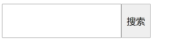
1文本框和表单按钮无法对齐的问题
<!DOCTYPE html>
<html lang="en">

<head>
    <meta charset="UTF-8">
    <meta name="viewport" content="width=device-width, initial-scale=1.0">
    <title>Document</title>
    <style>
        input {
            height: 50px;
            /* 自动内减 */
            box-sizing: border-box;
            /* 方法一:设置垂直对齐方式 */
            /* vertical-align: bottom; */
            /* 方法二:设置浮动 */
            /* float: left; */
        }
    </style>
</head>

<body>
    <input type="text"><input type="button" value="搜索">
</body>

</html>
2input和img无法对齐问题
<!DOCTYPE html>
<html lang="en">
<head>
  <meta charset="UTF-8">
  <meta name="viewport" content="width=device-width, initial-scale=1.0">
  <title>Document</title>
  <style>
    img {
      vertical-align: bottom;
    }
  </style>
</head>
<body>
  <img src="./images/1.jpg" alt=""><input type="text">
</body>
</html>
图片自取

最终展示效果(缩小图,这两张图片大小是一样的)

3div中的文本框,文本框无法贴顶问题
<!DOCTYPE html>
<html lang="en">
<head>
  <meta charset="UTF-8">
  <meta name="viewport" content="width=device-width, initial-scale=1.0">
  <title>Document</title>
  <style>
    .father {
      width: 400px;
      height: 400px;
      background-color: pink;
    }

    input {
      vertical-align: top;
    }

  </style>
</head>
<body>
  <div class="father">
    <input type="text">
  </div>
</body>
</html>

4div不设高度由img标签撑开,此时img标签下面会存在额外间隙问题
<!DOCTYPE html>
<html lang="en">
<head>
  <meta charset="UTF-8">
  <meta name="viewport" content="width=device-width, initial-scale=1.0">
  <title>Document</title>
  <style>
    .father {
      width: 400px;
      background-color: pink;
    }

    img {
      /* 解决方法一:改变img标签的垂直对齐方式不为baseline即可 */
      /* vertical-align: bottom; */

      /* 解决方法二:设置img转换成块级元素 */
      display: block;
    }

  </style>
</head>
<body>
  <div class="father">
    <img src="./images/1.jpg" alt="">
  </div>
</body>
</html>

5使用line-height让img标签垂直居中问题
<!DOCTYPE html>
<html lang="en">
<head>
  <meta charset="UTF-8">
  <meta http-equiv="X-UA-Compatible" content="IE=edge">
  <meta name="viewport" content="width=device-width, initial-scale=1.0">
  <title>Document</title>
  <style>
    .father {
      width: 600px;
      height: 600px;
      background-color: pink;
      line-height: 600px;
    }

    img {
      vertical-align: middle;
    }
  </style>
</head>
<body>
  <div class="father">
    <img src="./images/1.jpg" alt="">
  </div>
</body>
</html>

- 光标类型
设置鼠标光标在元素上时显示的样式cursor

- 边框圆角
让盒子四个角变得圆润,增加页面细节,提升用户体验。border-radius
从左上角开始赋值,然后顺时针赋值,没有赋值的看对角

边框圆角的两个常见应用:画一个正圆和胶囊按钮
画一个正圆,盒子必须是正方形,设置边框圆角为盒子宽高的一半
胶囊按钮盒子要求是长方形,设置为盒子高度的一半
<!DOCTYPE html>
<html lang="en">

<head>
    <meta charset="UTF-8">
    <meta name="viewport" content="width=device-width, initial-scale=1.0">
    <title>Document</title>
    <style>
        /* 画一个正圆 */

        .one {
            /* 1、盒子必须是正方形 */
            width: 300px;
            height: 300px;
            /* 2、设置边框圆角为盒子宽高的一半 */
            /* border-radius: 150px; */
            border-radius: 50%;
            background-color: orange;
            margin-bottom: 20px;
        }
        /* 画一个胶囊按钮 */

        .two {
            /* 1、盒子要求是长方形 */
            width: 300px;
            height: 100px;
            /* 2、设置边框圆角为盒子高度的一半 */
            border-radius: 50px;
            background-color: purple;
            margin-bottom: 20px;
            text-align: center;
            line-height: 100px;
            color: #fff;
            font-size: 20px;
        }

        .three {
            /* 1、盒子要求是长方形 */
            width: 300px;
            height: 100px;
            /* 2、设置边框圆角为盒子高度的一半 */
            border-radius: 50px;
            border: 1px solid orange;
            text-align: center;
            line-height: 100px;
            font-size: 20px;
            color: orange;
        }
    </style>
</head>

<body>

    <div class="one"></div>

    <div class="two">1</div>

    <div class="three">2</div>
</body>

</html>

- overflow溢出部分显示效果
溢出部分指的是盒子内容部分所超出盒子范围的区域
控制内容溢出部分的显示效果,比如显示,隐藏,滚动条 overflow

<!DOCTYPE html>
<html lang="en">
<head>
  <meta charset="UTF-8">
  <meta name="viewport" content="width=device-width, initial-scale=1.0">
  <title>Document</title>
  <style>
    div {
      width: 300px;
      height: 300px;
      background-color: pink;

      /* 溢出部分显示效果 */
      overflow: auto;
    }
  </style>
</head>
<body>
  <div>我是内容我是内容我是内容我是内容我是内容我是内容我是内容我是内容我是内容我是内容我是内容我是内容我是内容我是内容我是内容我是内容我是内容我是内容我是内容我是内容我是内容我是内容我是内容我是内容我是内容我是内容我是内容我是内容我是内容我是内容我是内容我是内容我是内容我是内容我是内容我是内容我是内容我是内容我是内容我是内容我是内容我是内容我是内容我是内容我是内容我是内容我是内容我是内容我是内容我是内容我是内容我是内容我是内容我是内容我是内容我是内容我是内容我是内容我是内容我是内容我是内容我是内容我是内容我是内容我是内容我是内容我是内容我是内容我是内容我是内容我是内容我是内容我是内容我是内容我是内容我是内容我是内容我是内容我是内容我是内容我是内容我是内容我是内容我是内容我是内容我是内容我是内容我是内容我是内容我是内容我是内容我是内容我是内容我是内容我是内容我是内容我是内容我是内容我是内容我是内容我是内容我是内容我是内容我是内容我是内容我是内容我是内容我是内容我是内容我是内容我是内容我是内容我是内容我是内容我是内容我是内容我是内容我是内容我是内容我是内容我是内容我是内容我是内容我是内容我是内容我是内容我是内容我是内容我是内容我是内容我是内容我是内容我是内容我是内容我是内容我是内容我是内容我是内容我是内容我是内容</div>
</body>
</html>
- 元素本身隐藏
让某元素本身在屏幕中不可见。常用的两种
visibility:hidden和display:none
前者隐藏元素本身,并且在网页中占位置。后者在网页中不占位置。
因此我们经常使用display属性完成元素的显示隐藏切换
<!DOCTYPE html>
<html lang="en">
<head>
  <meta charset="UTF-8">
  <meta name="viewport" content="width=device-width, initial-scale=1.0">
  <title>Document</title>
  <style>
    .father {
      width: 400px;
      height: 400px;
      background-color: pink;
    }

    .son {
      width: 100px;
      height: 100px;
      background-color: blue;
      /* 默认隐藏 */
      display: none;
    }

    .father:hover .son {
      /* hove到father后让son元素显示 */
      display: block;
    }
  </style>
</head>
<body>
  <div class="father">
    <div class="son"></div>
  </div>
</body>
</html>
- 元素透明度的概念
让某元素整体一起变透明 设置opacity属性
0表示完全不透明 1表示完全透明
<!DOCTYPE html>
<html lang="en">
<head>
  <meta charset="UTF-8">
  <meta name="viewport" content="width=device-width, initial-scale=1.0">
  <title>Document</title>
  <style>
    div {
      width: 400px;
      height: 400px;
      background-color: red ;
      /* 元素整体透明度 */
      /* opacity: 1; */
      /* opacity: 0; */
      opacity: .5;
    }

  </style>
</head>
<body>
  <div>
    <img src="./images/1.jpg" alt="">
    我是内容
  </div>
</body>
</html>
(图片在上面的部分。自取,也可以用自己的)

- table边框合并
让相邻表格边框进行合并,得到细线边框的效果
border-collapse:collapse
详见(标签进阶知识)
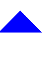
- 用CSS画三角形
在网页中出现的小三角形,利用盒子边框完成。
设置一个盒子,设置四周不同颜色的边框,将盒子宽高设置为0,仅保留边框,得到四个三角形,选择其中一个后,其他三角形(边框)设置颜色为透明
<!DOCTYPE html>
<html lang="en">
<head>
  <meta charset="UTF-8">
  <meta name="viewport" content="width=device-width, initial-scale=1.0">
  <title>Document</title>
  <style>
    div {
      width: 0px;
      height: 0px;
      /* background-color: pink; */

      /* 方法一: */
      /* border-top: 100px solid skyblue;
      border-right: 100px solid yellow;
      border-bottom: 100px solid purple;
      border-left: 100px solid blue; */

      /* 方法二: */
      border: 100px solid transparent;
      border-bottom-color: blue;
    }
  </style>
</head>
<body>
  <div></div>
</body>
</html>
设置三角形的代码很有意思,我们可以多多去尝试,不同的情况,看看三角形最后都可以变成什么样子的。(一定要理解原理,单单在需要用的时候复制代码,不利于自己能力的提升。)
选择器扩展
- 链接伪类选择器
常用于选中超链接的不同状态。如果需要同时实现以下四种伪类状态结构,需要按照LVHA顺序书写

<!DOCTYPE html>
<html lang="en">
<head>
  <meta charset="UTF-8">
  <meta name="viewport" content="width=device-width, initial-scale=1.0">
  <title>Document</title>
  <style>
    /* 选中a标签未访问过的状态 */
    a:link {
      color: red;
    }

    /* 选中a标签访问过之后的状态 */
    a:visited {
      color: yellow;
    }

    /* 选中鼠标悬停的状态 */
    a:hover {
      color: orange;
    }

    /* 选中鼠标按下的状态 */
    a:active {
      color: skyblue;
    }
  </style>
</head>
<body>
  <a href="#">我是a标签</a>
</body>
</html>
- 焦点伪类选择器
用于选中元素获取焦点时状态,常用于表单控件。
<!DOCTYPE html>
<html lang="en">
<head>
  <meta charset="UTF-8">
  <meta name="viewport" content="width=device-width, initial-scale=1.0">
  <title>Document</title>
  <style>
    /* 选中input获取焦点的状态 */
    input:focus {
      background-color: #ccc;
    }
  </style>
</head>
<body>
  <input type="text">
</body>
</html>
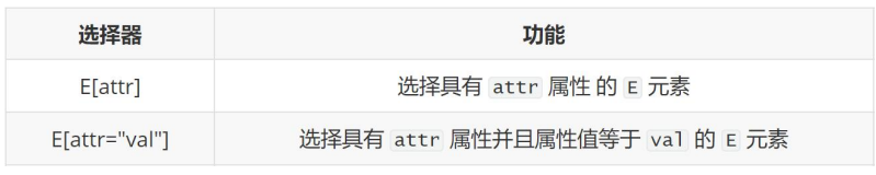
- 属性选择器
通过元素上的HTML属性来选择元素,常用于选择input标签
<!DOCTYPE html>
<html lang="en">
<head>
  <meta charset="UTF-8">
  <meta name="viewport" content="width=device-width, initial-scale=1.0">
  <title>Document</title>
  <style>
    /* 找到页面中的input,并且需要有type属性 */
    input[type] {
      /* background-color: pink; */
    }

    /* 找到页面中的input,并且需要type属性值为text */
    input[type="text"] {
      background-color: red;
    }

    input[type="password"] {
      background-color: green;
    }

  </style>
</head>
<body>
  <input type="text">
  <input type="password">
</body>
</html>


 2253
2253


 被折叠的 条评论
为什么被折叠?
被折叠的 条评论
为什么被折叠?
 到【灌水乐园】发言


