


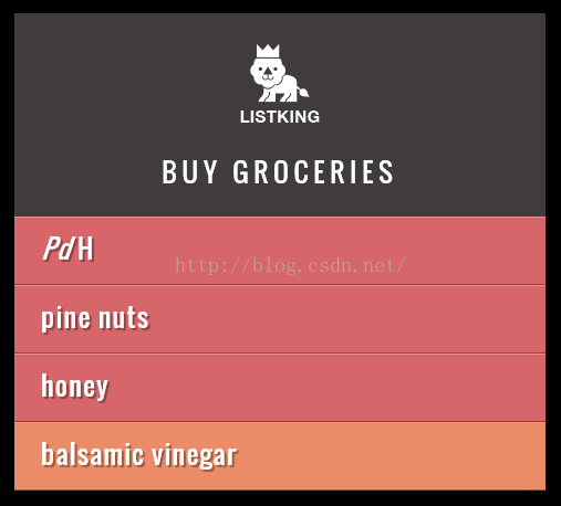
示例效果:
JS代码:
// Store the first list item in a variable
var firstItem = document.getElementById('one');

// Get the content of the first list item
var itemContent = firstItem.innerHTML;

// Update the content of the first list item so it is a link
firstItem.innerHTML = '<a href=\"http://weibo.com/u/1905511377?refer_flag=1001030101_&is_all=1\">' + itemContent + '</a>';
HTML代码:
<!DOCTYPE html>
  <html>
  <head>
    <title>JavaScript & jQuery - Chapter 5: Document Object Model - Inner HTML</title>
    <meta name="viewport" content="width=device-width, initial-scale=1.0">
    <link rel="stylesheet" href="css/c05.css">
  </head>
  <body>
    <div id="page">
      <h1 id="header">List</h1>
      <h2>Buy groceries</h2>
      <ul>
        <li id="one" class="hot"><em>Pd</em> H</li>
        <li id="two" class="hot">pine nuts</li>
        <li id="three" class="hot">honey</li>
        <li id="four">balsamic vinegar</li>
      </ul>
    </div>
    <script src="js/inner-html.js"></script>
  </body>
</html>
CSS代码:
@import url(http://fonts.googleapis.com/css?family=Oswald);

body {
	background-color: #000;
	font-family: 'Oswald', 'Futura', sans-serif;
	margin: 0;
	padding: 0;}

#page {
	background-color: #403c3b;
	margin: 0 auto 0 auto;}
	/* Responsive page rules at bottom of style sheet */

h1 {
	background-image: url(../images/kinglogo.png);
	background-repeat: no-repeat;
	background-position: center center;
	text-align: center;
	text-indent: -1000%;
	height: 75px;
	line-height: 75px;
	width: 117px;
	margin: 0 auto 0 auto;
	padding: 30px 10px 20px 10px;}

h2 {
	color: #fff;
	font-size: 24px;
	font-weight: normal;
	text-align: center;
	text-transform: uppercase;
	letter-spacing: .2em;
	margin: 0 0 23px 0;}

h2 span {
	border-radius: 50%;
	background-color: #000;
	font-size: 10px;
  text-align: center;
  display: inline-block;
  position: relative;
  top: -5px;
  height: 18px;
  width: 20px;
  margin-left: 5px;
  padding: 4px 0 0 4px;}

ul {
	background-color: #584f4d;
	border:none;
	padding: 0;
	margin: 0;}

li {
	background-color: #ec8b68;
	color: #fff;
	border-top: 1px solid #fe9772;
	border-bottom: 1px solid #9f593f;
	font-size: 24px;
	letter-spacing: .05em;
	list-style-type: none;
	text-shadow: 2px 2px 1px #9f593f;
	height: 50px;
	padding-left: 1em;
	padding-top: 10px;}

.hot {
	background-color: #d7666b;
	color: #fff;
	text-shadow: 2px 2px 1px #914141;
	border-top: 1px solid #e99295;
	border-bottom: 1px solid #914141;}

.cool {
	background-color: #6cc0ac;
	color: #fff;
	text-shadow: 2px 2px 1px #3b6a5e;
	border-top: 1px solid #7ee0c9;
	border-bottom: 1px solid #3b6a5e;}

.complete {
  background-color: #999;
	color: #fff;
	background-image: url("../images/icon-trash.png");
	background-position: center, right;
	background-repeat: no-repeat;
	border-top: 1px solid #666;
	text-shadow: 2px 2px 1px #333;}

li a {
	color: #fff;
	text-decoration: none;
	background-image: url("../images/icon-link.png");
	background-position: center, right;
	background-repeat: no-repeat;
    padding-right: 200px;}

p {
	color: #403c3b;
	background-color: #fff;
	border-radius: 5px;
	text-align: center;
	padding: 10px;
	margin: 20px auto 20px auto;
	min-width: 20%;
	max-width: 80%; }

#scriptResults {
	padding-bottom: 10px;}

/* Small screen - acts like the app would */
@media only screen and (max-width: 500px) {
    body {
        background-color: #584f4d;
    }
    #page {
        max-width: 480px;
    }
}
@media only screen and (min-width: 501px) and (max-width: 767px) {
    #page {
        max-width: 480px;
        margin: 20px auto 20px auto;
    }
}
@media only screen and (min-width: 768px) and (max-width: 959px) {
    #page {
        max-width: 480px;
        margin: 20px auto 20px auto;
    }
}
/* Larger screens act like a demo for the app */
@media only screen and (min-width: 960px) {
    #page {
        max-width: 480px;
        margin: 20px auto 20px auto;
   	}
}
@media (-webkit-min-device-pixel-ratio: 2), (min-resolution: 192dpi) {
    h1{
        background-image: url(../images/2xkinglogo.png);
        background-size: 72px 72px;
    }
}


 626
626


 被折叠的 条评论
为什么被折叠?
被折叠的 条评论
为什么被折叠?
 到【灌水乐园】发言


