


Autoregression / AR,就是用前期数据来预测后期数据的回归模型,所以叫做自回归模型。
它的逻辑简单,但对时间序列问题能够做出相当准确的预测。<原文链接这里>
文章目录
1)自回归函数
y
^
t
=
b
0
+
b
1
y
t
−
1
+
.
.
.
+
b
n
y
t
−
n
,
其
中
n
<
t
y\hat{}_t = b_0 + b_1y_{t-1} + ... + b_ny_{t-n} , 其中n<t
y^t=b0+b1yt−1+...+bnyt−n,其中n<t
只有在数据平稳/弱平稳的基础上,才能进行实现序列分析
正式的说,如果一个时间序列 x t x_t xt 的一阶矩和二阶矩(即均值和方差)具有时间不变性,则称它为弱平稳的。弱平稳性是很重要的,因为它为预测提供了基础框架。
——《金融数据分析导论:基于R语言》2.1 平稳性
2)上例子
1. 首先取数&画图
import pandas as pd
import matplotlib.pyplot as plt

df = pd.read_csv('https://raw.githubusercontent.com/jbrownlee/Datasets/master/daily-min-temperatures.csv',
				 index_col=0, parse_dates=True)
print(df.head())
df.plot()
plt.show()

# 结果如下
            Temp
Date
1981-01-01  20.7
1981-01-02  17.9
1981-01-03  18.8
1981-01-04  14.6
1981-01-05  15.8
 从上图可知温度序列是弱平稳的(weakly stationary);但是肉眼看不精确是不是平稳的,此时ADF Test/ Augmented Dickey-Fuller Test就排上用场了,其原假设H0:存在单位根/UNIT ROOT(即数据不平稳)
from statsmodels.tsa.stattools import adfuller
a = df.Temp
print(adfuller(a,    # 下述参数均为默认值
				maxlag=None,
				regression='c',
				autolag='AIC',   # 自动在[0, 1,...,maxlag]中间选择最优lag数的方法;
				store=False,
				regresults=False)
				)

# 结果如下
(-4.444804924611687,   #  AIC标准下得到的统计值,用于和下边 1%,5%,和10%临界值比较。但更方便的是直接用下边的p值
 0.00024708263003611164,   #  AIC标准下的p值,即原假设成立的概率
 20,     # usedlag: AIC标准下adfuller用的lags
 3629,   # nobs: 本次检测用到的【观测值】个数;
{'1%': -3.4321532327220154,   # 1%标准下的临界值
'5%': -2.862336767636517,
'10%': -2.56719413172842},
16642.822304301197) # icbest: The maximized information criterion if autolag is not None.
由p值可以看出,原假设成立的概率极低,我们应该拒绝原假设。即数据平稳。
adfuller函数官方文档备注:
Augmented Dickey-Fuller的原假设是存在单位根,备择假设是不存在单位根。如果p-value大于临界值,那么我们就不能拒绝有一个单位根存在。
p-value是通过MacKinnon 1994年的回归曲面近似得到的,但使用的是更新的2010年表。
2. 快速查看数据是否适合AR模型
from pandas.plotting import lag_plot
lag_plot(df)   # 默认lag=1
plt.show()
# 结果如图所示:
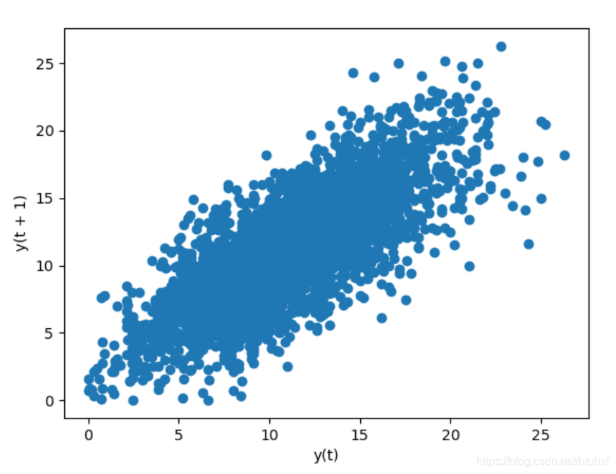 如上图所示,
y
t
+
1
y_{t+1}
yt+1和
y
t
y_t
yt明显相关。当然我们能通过计算,得到相关系数是0.77和显著性水平0。
如上图所示,
y
t
+
1
y_{t+1}
yt+1和
y
t
y_t
yt明显相关。当然我们能通过计算,得到相关系数是0.77和显著性水平0。
from scipy.stats import pearsonr

a = df.Temp
b = df.Temp.shift(1)

print(pearsonr(a[1:], b[1:]))

# 结果如下
(0.7748702165384458, 0.0)
3. 上边是很好的检测方法。但是如果我们想同时查看 Y t Y_t Yt和 Y t − 1 Y_{t-1} Yt−1,…, Y t − n Y_{t-n} Yt−n的相关性,重复n次就太繁琐了。
下面介绍一个一次性画出n多Lag的自回归系数方法:statsmodels.graphics.tsaplots.plot_acf()
from statsmodels.graphics.tsaplots import plot_acf, plot_pacf
fig, axes = plt.subplots(2,1)

fig, axes = plt.subplots(2, 1)
plot_acf(df['Temp'], ax=axes[0])
plot_pacf(df['Temp'], ax=axes[1])

plt.tight_layout()
plt.show()
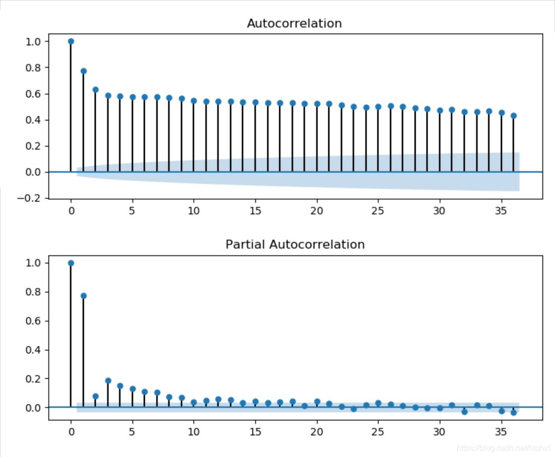
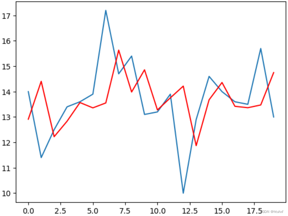
4. 最后,到此为止我们就知道如何查看时间序列数据的自相关性了。接下来看如何用对它建立模型。
import pandas as pd
import numpy as np
from statsmodels.tsa.ar_model import AutoReg
import matplotlib.pyplot as plt
from sklearn.metrics import mean_squared_error as MSE

df = pd.read_csv('e:/daily-min-temperatures.csv',
                 index_col=0, parse_dates=True)
"""把模型数据分为train和test,分别用来训练模型和对比模型预测结果"""
x = df.Temp.values
train, test = x[:-20], x[-20:]  # test的个数设定为7

"""训练模型得到所需参数:AR的滞后项个数p,和自回归函数的各个系数"""
p = 29  # 调参可以参看下文的链接
# 即时间序列模型中常见的p,即AR(p), ARMA(p,q), ARIMA(p,d,q)中的p。
# p的实际含义,此处得到p=29,意味着当天的温度由最近29天的温度来预测。
model_fit = AutoReg(train, lags=p).fit()
params = model_fit.params

history = train[-p:]
history = np.hstack(history).tolist()  # 唯一的目的就是接下来通过append(test[i])实时更新history
# 也可以用history = [history[i] for i in range(len(history))] ,
# (append函数不适用于np.narray类型的history)

predictions = []
for t in range(len(test)):
	yhat = params[0]
	for i in range(p):
		yhat += params[i+1] * history[-1-i]  # history滚动提供lags
	predictions.append(yhat)
	history.append(test[t])
print(np.mean((np.array(test) - np.array(predictions))**2))  # 得到mean_squared_error, MSE
plt.plot(test)
plt.plot(predictions, color='r')
plt.show()
附注:
- 2个随机变量X和Y的pearson线性相关系数定义为:
ρ
x
,
y
=
C
o
v
(
X
,
Y
)
V
a
r
(
X
)
V
a
r
(
Y
)
=
E
[
(
X
−
μ
x
)
(
Y
−
μ
y
)
]
E
(
X
−
μ
x
)
2
E
(
Y
−
μ
y
)
2
ρ_{x,y} = \frac{Cov(X, Y)}{\sqrt{Var(X)Var(Y)}} = \frac{E[(X-μ_x)(Y-μ_y)]}{\sqrt{E(X-μ_x)^2E(Y-μ_y)^2}}
ρx,y=Var(X)Var(Y)Cov(X,Y)=E(X−μx)2E(Y−μy)2E[(X−μx)(Y−μy)]
– 具体到样本:
ρ
^
x
,
y
=
∑
t
=
1
T
[
(
x
t
−
x
ˉ
)
(
y
t
−
y
ˉ
)
]
∑
t
=
1
T
(
x
t
−
x
ˉ
)
2
∑
t
=
1
T
(
y
t
−
y
ˉ
)
2
\hat{ρ}_{x,y} = \frac{\sum_{t=1}^{T} [(x_t -\bar{x})(y_t-\bar{y})]}{\sqrt{\sum_{t=1}^{T} (x_t -\bar{x})^2\sum_{t=1}^{T}(y_t-\bar{y})^2}}
ρ^x,y=∑t=1T(xt−xˉ)2∑t=1T(yt−yˉ)2∑t=1T[(xt−xˉ)(yt−yˉ)]


 307
307

 被折叠的 条评论
为什么被折叠?
被折叠的 条评论
为什么被折叠?
 到【灌水乐园】发言


