


未经允许,不得转载!!
说的不全不周之处,欢迎指正、交流!!
padding内边距,属性有:auto、%、数值px以及inherit(inherit在任何IE下不兼容);
padding包括padding-top、padding-right、padding-bottom、padding-left缩写{上下,左右}或{上,右,下,左}
浏览器渲染占位:
如效果图:
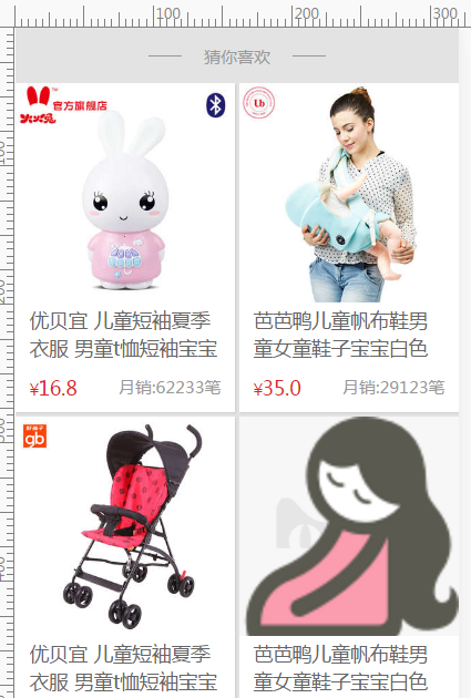
上图是一种常见的商品展示效果图,结构是一个图片+宝贝标题+价格+销量!
我们在PC端的处理方式:一般是图片高宽定死即可,这是OK的!
但是在移动端,固定高宽,no、no不宜采取;不定宽高度在移动端又会出现一种难看的“闪屏”的bug,很丑,很难看!这时候padding就上场了。
我们知道padding的百分比的参照物是其父元素的宽度。
demo:
<!DOCTYPE html>
<html lang="en">
    <head>
        <meta charset="utf-8">
        <meta name="apple-mobile-web-app-title" content="TMALL">
        <meta name="apple-mobile-web-app-capable" content="yes">
        <meta name="apple-mobile-web-app-status-bar-style" content="black-translucent">
        <meta name="viewport" content="width=device-width,initial-scale=1,maximum-scale=1,user-scalable=no">
        <meta name="format-detection" content="telephone=no, address=no">
        <title>http://blog.csdn.net/ime33  padding百分比填充</title>
        <style type="text/css">
            *{
                padding:0;
                margin: 0;
                font-family: "微软雅黑";
            }
            ul,li{
                list-style: none;
            }
            body{
                background: #e3e3e3;
            }
            .box .likebox{
                display: block;
                overflow: hidden;
                width:100%;
                background: #e3e3e3;
            }
            .box .likebox .header{
                position: relative;
                text-align: center;
                height: 40px;
                line-height: 42px;
            }
            .box .likebox .header:before{
                position: absolute;
                display: block;
                content: " ";
                height: 0;
                overflow: hidden;
                border-bottom: 1px solid #999;
                width: 24px;
                left: 30%;
                top: 50%;
            }
            .box .likebox .header:after{
                position: absolute;
                display: block;
                content: " ";
                height: 0;
                overflow: hidden;
                border-bottom: 1px solid #999;
                width: 24px;
                right: 30%;
                top: 50%;
            }
            .box .likebox .header h3{
                display: inline;
                font-weight: 400;
                color: #999;
                font-size: 12px;
                vertical-align: top;
            }
            .content .cell{
                float: left;
                width: 49.5%;
                position: relative;
                overflow: hidden;
                margin-bottom: 1%;
                background: #FFF;
                box-shadow: 1px 1px 1px rgba(0,0,0,.1);
            }
            .content .cell:nth-child(2n-1){
                margin-right: 1%;
            }
            .content .cell:before{
                display: block;
                content: " ";
                padding-top: 150%;
                height: 0;
            }
            .content .cell>*{
                position: absolute;
                top: 0;
                left: 0;
                right: 0;
                bottom: 0;
            }
            .content .cell .item{
                display: block;
            }
            .content .item .image {
                position: relative;
                padding-top: 100%;//重点
                height: 0;
                overflow: hidden;

            }
            .img-wrapper {
                background: #f7f7f7 url(./images/load.png) no-repeat center center;//可放loading
                background-size: contain;
            }
            .content .item .image img {//图片定位上去
                position: absolute;
                width: 100%;
                top: 0;
                left: 0;
            }
             .content .item .title {
                position: absolute;
                bottom: 15%;
                left: 0;
                width: 100%;
                box-sizing: border-box;
                height: 40px;
                line-height: 20px;
                padding: 0 10px;
                overflow: hidden;
                font-size: 14px;
                color: #666;
            }
            .content .item .detail {
                position: absolute;
                bottom: 4%;
                left: 0;
                padding: 0 10px;
                width: 100%;
                box-sizing: border-box;
                height: 18px;
                overflow: hidden;
            }
            .content .item .detail .price {
                float: left;
                height: 18px;
                line-height: 18px;
                text-align: center;
            }
            .content .item .detail .price .actPrice {
                color: #DD2727;
            }
            .content .item .detail .price>div {
                display: inline-block;
                margin-right: 2px;
            }
            .content .item .detail .price .actPrice .sym {
                font-size: 12px;
            }
            .content .item .detail .price .sym {
                font-family: Arial,sans-serif;
            }
             .content .item .detail .price .actPrice .num {
                font-size: 14px;
            }
            .content .item .detail .sale {
                float: right;
                font-size: 12px;
                color: #999;
                height: 18px;
                line-height: 18px;
            }
            .content .item .detail:after {
                display: block;
                content: ".";
                height: 0;
                visibility: hidden;
                clear: both;
                overflow: hidden;
            }
            .blank{
                display: inline-block;
                width: 100%;
                height: 100px;
                background: #e3e3e3;
            }
        </style>
    </head>
    <body>
        <div class="box">
            <div class="likebox">
                <div class="header">
                    <h3>猜你喜欢</h3>
                </div>
                <div class="content">
                    <div class="cell">
                        <a class="item" href="#">
                            <div class="image img-wrapper">
                                <img src="./images/0.jpg" class="img-ks-lazyload">
                            </div>
                            <div class="title">优贝宜 儿童短袖夏季衣服 男童t恤短袖宝宝夏装纯棉童装女童上衣</div>
                            <div class="detail">
                                <div class="price"><div class="actPrice"><span class="sym">¥</span><span class="num">16.8</span></div></div>
                                <div class="sale">月销:62233笔</div>
                            </div>
                        </a>
                    </div>
                    <div class="cell">
                        <a class="item" href="#">
                            <div class="image img-wrapper">
                                <img src="./images/1.jpg" class="img-ks-lazyload">
                            </div>
                            <div class="title">芭芭鸭儿童帆布鞋男童女童鞋子宝宝白色球鞋潮小白布鞋2016夏新款</div>
                            <div class="detail">
                                <div class="price"><div class="actPrice"><span class="sym">¥</span><span class="num">35.0</span></div></div>
                                <div class="sale">月销:29123笔</div>
                            </div>
                        </a>
                    </div>
                </div>
            </div>
        </div>


    </body>
</html>
在这里我在图片容器上进行针对父元素宽度100%添加padding-top:100%,再让图片定位上去,当然也可以在容器的伪元素上进行padding操作,做法一致!
这样即使图片未加载出来,但是css已经渲染padding了一个位置,为图片展示做好了准备;
加料:在图片容器中添加loading被背景图,再配合一个淡入动画效果就更完美了;
.img-ks-lazyload {
                -webkit-animation: ks-fadeIn 350ms linear 0ms 1 normal both;
                animation: ks-fadeIn 350ms linear 0ms 1 normal both;
                opacity: 1;
            }
            @-webkit-keyframes ks-fadeIn{0%{opacity:0}100%{opacity:1}}
            @keyframes ks-fadeIn{0%{opacity:0}100%{opacity:1}}
            .img-ks-lazyload{-webkit-animation:ks-fadeIn 350ms linear 0ms 1 normal both;animation:ks-fadeIn 350ms linear 0ms 1 normal both;opacity:1}
            .img-ks-beforeload{opacity:0}
当然,可能你的图片不是1:1的,根据你的图片高宽比修改padding百分比值就好了!
总结
自适应的精髓在于宽度,margin/padding设置百分比弥补了元素高度无法自适应地与元素宽度保持一致的缺陷。
水平有限,欢迎指正、交流!!


 359
359


 被折叠的 条评论
为什么被折叠?
被折叠的 条评论
为什么被折叠?
 到【灌水乐园】发言


