


未经允许,不得转载!
水平有限,说的不周之处欢迎大牛指正、交流!!
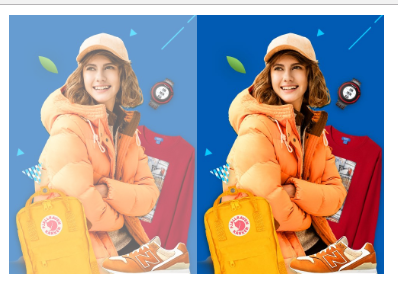
一、透明度opacity{value|inherit}
demo:
<!DOCTYPE html>
<html lang="en">
    <head>
        <meta charset="utf-8">
        <title>http://blog.csdn.net/ime33 css滤镜</title>
        <style type="text/css">
            .imgbox{
                width: 150px;
                height: auto;
                float: left;
            }
            img {
                display: block;
                width: 100%;
                height: auto;
            }
            .filter img {
                opacity: .6;
                filter: alpha(opacity=60); /* 针对 IE8 以及更早的版本 */
                width: 100%;
                height: auto;
            }
        </style>
    </head>
    <body>
        <div class="imgbox filter">
            <img src="https://img.alicdn.com/tps/i4/TB1mVCGPXXXXXbqXFXXSutbFXXX.jpg">
        </div>
        <div class="imgbox">
            <img src="https://img.alicdn.com/tps/i4/TB1mVCGPXXXXXbqXFXXSutbFXXX.jpg">
        </div>
    </body>
</html>
二、filter{none | blur() | brightness() | contrast() | drop-shadow() | grayscale() | hue-rotate() | invert() | opacity() | saturate() | sepia() | url();}
Alpha:设置透明层次
blur:创建高速度移动效果,即模糊效果
Chroma:制作专用颜色透明
DropShadow:创建对象的固定影子
FlipH:创建水平镜像图片
FlipV:创建垂直镜像图片
glow:加光辉在附近对象的边外
gray:把图片灰度化
invert:反色
light:创建光源在对象上
mask:创建透明掩膜在对象上
shadow:创建偏移固定影子
wave:波纹效果
Xray:使对象变得像被x光照射一样
blur>demo:
<style type="text/css">
            .imgbox{
                width: 150px;
                height: auto;
                float: left;
            }
            img {
                display: block;
                width: 100%;
                height: auto;
            }
            .filter img {
                filter: url(blur.svg#blur); /* FireFox, Chrome, Opera */

                -webkit-filter: blur(2px); /* Chrome, Opera */
                   -moz-filter: blur(2px);
                    -ms-filter: blur(2px);
                        filter: blur(2px);

                filter: progid:DXImageTransform.Microsoft.Blur(PixelRadius=2, MakeShadow=false); /* IE6~IE9 */
                width: 100%;
                height: auto;
            }
        </style>
三、filter>grayscale
demo:
<style type="text/css">
            .imgbox{
                width: 150px;
                height: auto;
                float: left;
            }
            img {
                display: block;
                width: 100%;
                height: auto;
            }
            .filter img {
                -webkit-filter: grayscale(100%); /* Chrome, Safari, Opera */
                filter: grayscale(100%);
                width: 100%;
                height: auto;
            }
        </style>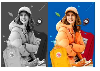
四、综合点的例子
demo:
<!DOCTYPE html>
<html lang="en">
    <head>
        <meta charset="utf-8">
        <title>css滤镜</title>
        <style type="text/css">
            * {
                margin: 0px;
                padding: 0px;
                font-size: 16px;
                font-family: 微软雅黑;
            }
            .mainbox {
                width: 498px;
                height: 680px;
                position: relative;
                background: url(https://img.alicdn.com/tps/i4/TB1mVCGPXXXXXbqXFXXSutbFXXX.jpg) center top;
                background-size: cover;
            }
            .content {
                width: 400px;
                height: 200px;
                position: absolute;
                top: 50%;
                left: 50%;
                overflow: hidden;
                margin-top: -100px;
                margin-left: -200px;
                border-radius: 10px;
                box-shadow: 0 10px 20px rgba(0, 0, 0, 0.5);
                z-index: 100;
                padding: 20px;
                box-sizing: border-box;
            }
            .content::before {
                content: "";
                position: absolute;
                top: 0px;
                left: 0px;
                right: 0px;
                bottom: 0px;
                z-index: -1;
                -webkit-filter: blur(20px);
                filter: blur(20px);
                margin: -30px;  /*消除边缘透明*/
                background: url(https://img.alicdn.com/tps/i4/TB1mVCGPXXXXXbqXFXXSutbFXXX.jpg) center top;
                background-size: cover;
                background-attachment: fixed;
            }
            .content h3 {
                text-align: center;
                margin-bottom: 20px;
                font-size: 22px;
            }
        </style>
    </head>
    <body>
        <div class="mainbox">
            <div class="content">
                <h3>这里是标题</h3>
                <p>这里是内容这里是内容这里是内容这里是内容这里是内容这里是内容这里是内容这里是内容这里是内容这里是内容里是内容这里是内容这里</p>
            </div>
        </div>
    </body>
</html>
感谢阅读!!


 198
198

 被折叠的 条评论
为什么被折叠?
被折叠的 条评论
为什么被折叠?
 到【灌水乐园】发言


