


五. 结点连接图(node link plot)
(源代码:NodeLinks.m)有时,我们需要绘制出不同结点之间的连通关系,即结点连接图。以下以绘制美国128座城市之间的连通关系为例,介绍两种结点连接图的画法。
1) 定义每座城市与距它最近的城市连通,与其余视为不连通,然后根据连通性,利用gplot命令,直观的绘出结点连接图。(图9)
%% #1
%% 定义数据
[XYCoord] = xlsread('inter_city_distances.xlsx','Sheet3');
[intercitydist citynames] = xlsread('inter_city_distances.xlsx','Distances');

% 避免将自身判定为最近的城市
howManyCities = 128;
for i =1:howManyCities;intercitydist(i,i)=Inf;end

%% 定义临接矩阵
% n阶方阵,1表示相连,0表示不相连; 这是我们规定城市只与它最近的城市相连
adjacency = zeros(howManyCities,howManyCities);
for i = 1:howManyCities
    alls = find(intercitydist(i,:)==min(intercitydist(i,:)));
    for j = 1:length(alls)
        adjacency(i,alls(j)) = 1;
        adjacency(alls(j),i) = 1;
    end
    clear alls
end
figure('units','normalized','position',[ 0.2813    0.2676    0.3536    0.3889]);
plot(XYCoord(1:howManyCities,1),XYCoord(1:howManyCities,2),'ro');hold on;
title('距离最近的城市彼此相连');
gplot(adjacency,XYCoord);
xlabel('南北');
ylabel('东西');
set(gcf,'Color',[1 1 1],'paperpositionmode','auto');
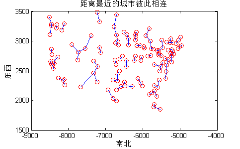
图 9
2) 定义距离小于100英里的城市为相连,以更紧致的方式绘出连接情况。(图10)
%% 定义临接关系(距离小于100英里的城市之间认为是相邻的)
% 重新排列数据,以使距离短的城市大致靠近
for i = 1:howManyCities;  intercitydist(i,i) = 0; end
[balh I] = sort(intercitydist(1,:));
citynames = citynames(I);
XYCoord = XYCoord(I,:);
%% 重新计算距离矩阵
for i = 1:howManyCities;
    for j = 1:howManyCities
        if i==j
            intercitydist(i,i) = Inf;
        else
            intercitydist(i,j) = sqrt((XYCoord(i,1)-XYCoord(j,1))^2 + (XYCoord(i,2)-XYCoord(j,2))^2);
        end
    end
end
%% 计算临接矩阵
adjacency = zeros(howManyCities,howManyCities);
for i = 1:howManyCities
    alls = find(intercitydist(i,:)<100);
    for j = 1:length(alls)
        adjacency(i,alls(j)) = 1;
        adjacency(alls(j),i) = 1;
    end
    clear alls
end

%% 图像大小和位置
figure('units','normalized','position',[0.0844    0.2259    0.8839    0.4324]);
axes('Position',[0.0371    0.2893    0.9501    0.6296]);
xlim([1 howManyCities]);
ylim([0 100]);
hold on;
%% 在X轴上标注城市名称
set(gca,'xtick',1:howManyCities,'xticklabel',citynames,...
                                   'ticklength',[0.001 0]);
box on;
rotateXLabels(gca,90);
%% 为不同弧线分配不同的颜色(距离越近,颜色越深)
m = colormap(pink(howManyCities+1));
cmin = min(min(intercitydist));
cmax = 150;
%% 绘制弧线
for i = 1:howManyCities
    for j = 1:howManyCities
        if adjacency(i,j)==1
            x=[i (i+j)/2 j];
            y=[0 intercitydist(i,j) 0];
            pol_camp=polyval(polyfit(x,y,2),linspace(i,j,25));
            plot(linspace(i,j,25),pol_camp,'Color',m(fix((intercitydist(i,j)-cmin)/(cmax-cmin)*howManyCities)+1,:),'linewidth',100/intercitydist(i,j));
        end
    end
end
%% 标注
title('公路距离小于100英里的城市','fontsize',14);
ylabel('城市间距离');
set(gca,'Position',[0.0371    0.2893    0.9501    0.6296]);
%% 绘制水平网格以增加可读性
line(repmat(get(gca,'xlim'),9,1)',[linspace(10,90,9); linspace(10,90,9)],'Color',[.8 .8 .8]);
set(gcf,'Color',[1 1 1],'paperpositionmode','auto');
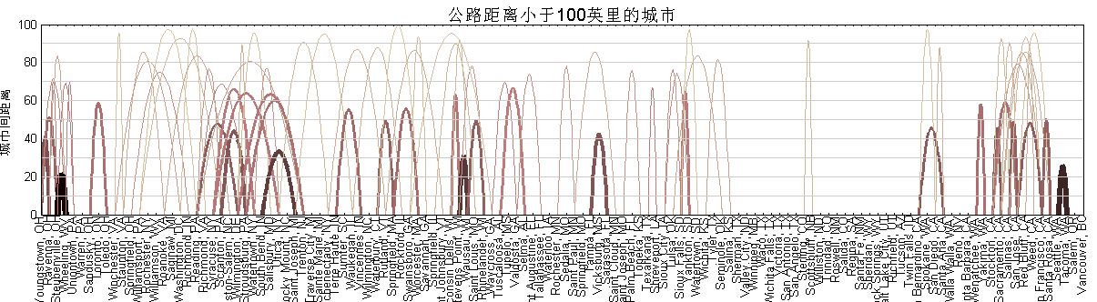
图 10
六. 日历热图(Heat Map)
(源代码:CalendarHeatMap.m)
数据大小可以用颜色的深浅直观的表示,这可以通过imagesc或pcolor命令获得(二者参考点的位置不同)。以下即是用Imagesc命令,绘制Google公司10到11年的股价数据。(图11)
%% Add path to utilities
addpath('.\utilities');


%% 数据预处理
[GOOG dateGOOG] = xlsread('GOOG_090784_012412.csv');
dateGOOG = datenum({dateGOOG{2:end,1}});
dateGOOG = dateGOOG(end:-1:1);
GOOG = GOOG(end:-1:1,:);
% 选择最后两年的数据
newData = [];
newDateData=[];
for i =1:numel(dateGOOG)-1
    if abs(dateGOOG(i+1)-dateGOOG(i))==1
        newData     =   [newData;   GOOG(i)];
        newDateData =   [newDateData dateGOOG(i)];
    else
        delta = abs(dateGOOG(i+1)-dateGOOG(i));
        for j = 1:delta
            newData     =   [newData;   NaN];
            newDateData =   [newDateData dateGOOG(i)+j-1];
        end
    end
end
newData     =   [newData;   GOOG(end)];
newDateData =   [newDateData dateGOOG(end)];
idx = find(newDateData<=datenum('12/31/2011')&newDateData>=datenum('1/1/2010'));
newData=newData(idx);
newDateData = newDateData(idx);


%% 日历布局
% 1行6个月,两年共4行
figure('units','normalized','Position',[ 0.3380    0.0889    0.6406    0.8157]);
colormap('summer');
xs = [0.03 .03+.005*1+1*.1525 0.03+.005*2+2*.1525 0.03+.005*3+3*.1525 0.03...
    +.005*4+4*.1525 0.03+.005*5+5*.1525];
ys = [0.14 .14+0.04*1+1*.165   .14+0.04*2+2*.165   .14+0.04*3+3*.165];


% 估计每月的天数
isthereALeapyear = find(~(mod(unique(str2num(datestr(newDateData,'yyyy'))),4)| ...
    mod(unique(str2num(datestr(newDateData,'yyyy'))),400)));
if isempty(isthereALeapyear)
    D = [31 28 31 30 31 30; 31 31 30 31 30 31;31 28 31 30 31 30; 31 31 30 31 30 31];
else
    if isthereALeapyear==1
        D = [31 29 31 30 31 30; 31 31 30 31 30 31;31 28 31 30 31 30; 31 31 30 31 30 31];
    else
        D = [31 28 31 30 31 30; 31 31 30 31 30 31;31 29 31 30 31 30; 31 31 30 31 30 31];
    end
end

%% 开始绘图
Dcnt=0;
for i = 1:4
    for j = 1:6
        % 绘制月视图
        axes('Position',[xs(j) ys(i) .1525    0.165]);
        % 计算所在的月份
        idx = find(newDateData>=datenum([datestr(newDateData(1)+Dcnt,'mm') ...
            '/01/'  datestr(newDateData(1)+Dcnt,'yyyy')]) & ...
             newDateData<=datenum([datestr(newDateData(1)+Dcnt,'mm') '/31/' ...
             datestr(newDateData(1)+Dcnt,'yyyy')]));
        % 得到当月信息
        A = calendar(newDateData(1)+Dcnt);
        % 填入股价数据
        data = NaN(size(A));
        for k = 1:max(max(A))
            [xx yy] = find(A==k);
            data(xx,yy) = newData(idx(k));
        end
        % 上色
        imagesc(data); alpha(.4);hold on;set(gca,'fontweight','bold');
        xlim([.5 7.5]); ylim([0 6.5]);
        for m = 1:6
            for n= 1:7
                if A(m,n)~=0
                    text(n,m,num2str(A(m,n)));
                end
            end
        end
        % 添加日历头
        text(.75,.25,'S','fontweight','bold'); text(1.75,.25,'M','fontweight','bold');
        text(2.75,.25,'T','fontweight','bold');
        text(3.75,.25,'W','fontweight','bold');text(4.75,.25,'R','fontweight','bold');
        text(5.75,.25,'F','fontweight','bold');text(6.75,.25,'S','fontweight','bold');

        title([datestr(newDateData(1)+Dcnt,'mmm')  datestr(newDateData(1)+Dcnt,'yy')]);
        set(gca,'xticklabel',[],'yticklabel',[],'ticklength',[0 0]);
        line([-.5:7.5; -.5:7.5], [zeros(1,9); 6.5*ones(1,9)],'Color',[.8 .8 .8]);
        line([zeros(1,9); 7.5*ones(1,9)],[-.5:7.5; -.5:7.5], 'Color',[.8 .8 .8]);
        box on;
        Dcnt=Dcnt+D(i,j);
    end
end


%%增加图标和标题
colorbar('Location','SouthOutside','Position',[ 0.1227    0.0613    0.7750    0.0263]);
alpha(.4);
annotation('textbox',[0.30 0.9354 0.8366 0.0571],...
    'String','2010年1月到2011年12月Google股价日记录',...
    'LineStyle','none','Fontsize',14);


 set(gcf,'Color',[1 1 1],'paperpositionmode','auto');
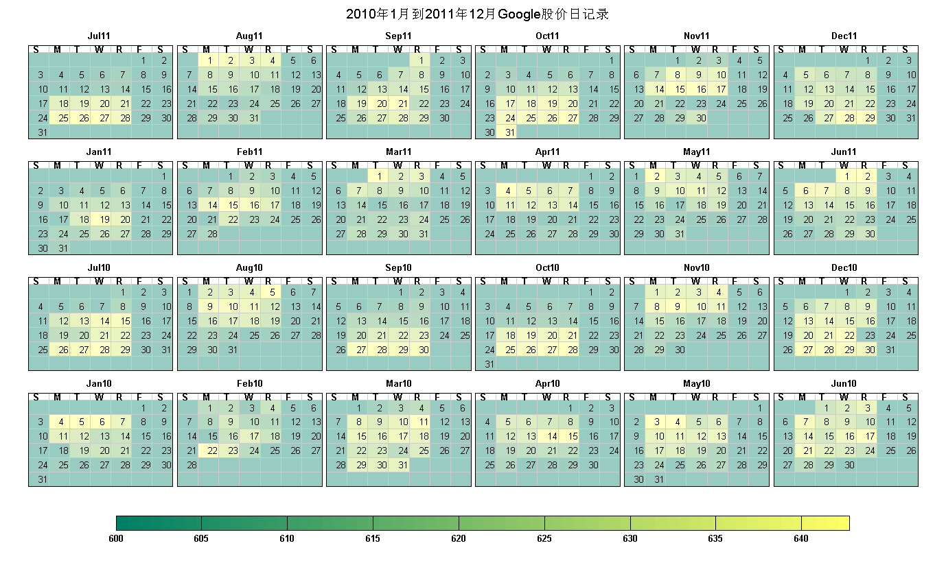
图 11
七. 数据分布的可视化分析
(源代码:DistributionAnalysis.m)
1) 首先利用散点图和直方图对数据进行初步观察。(图 12)
%% 加载数据
load distriAnalysisData;

%% 观测数据分布
% 绘制直方图
figure('units','normalized','position',[0.2099    0.6269    0.4354    0.2778]);
subplot(1,2,1);plot(sort(B),'.');xlabel('序号');ylabel('观察值');title('一维散点图');
subplot(1,2,2);hist(B);xlabel('间隔');ylabel('观测频率');title('直方图');
set(gcf,'Color',[1 1 1],'paperpositionmode','auto');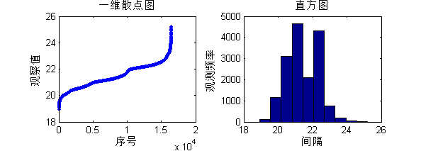
图 12
2) 进一步优化直方图,对数据进行更细致考查。(图13)
%% 优化直方图
figure('units','normalized','position',[0.2099    0.6269    0.4354    0.2778]);
[N c] = hist(B,round(sqrt(length(B))));
bar(c,N);
title('间隔大小 = sqrt(n)');
xlabel('间隔');ylabel('观测频率');title('优化直方图间隔以发现隐藏的结构');
set(gcf,'Color',[1 1 1],'paperpositionmode','auto');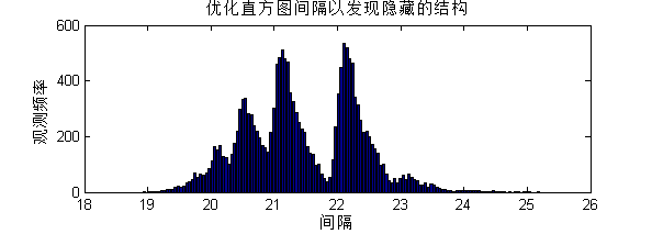
图 13
3) 利用样条插值,为直方图添加包络线。(图14)
%% 利用样条插值绘制直方图的包络
[N c] = hist(B,200);
% 用样条计算包络
env = interp1(c,N,c,'spline');
% 绘制归一化的包络
figure('units','normalized','position',[ 0.2099    0.6269    0.4354    0.2778]);
bar(c,N./max(N));hold;
plot(c,env./max(env),'r','Linewidth',3);
xlabel('间隔'); ylabel({'归一化后的包络','间隔数为200'});
title('直方图包络是数据经验分布建模的有力工具');
set(gcf,'Color',[1 1 1],'paperpositionmode','auto');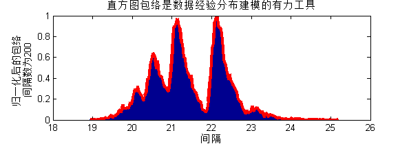
图 14
4) 绘制QQ图,观察数据分布的正态性。(图15)
%% MATLAB qqplot 命令
figure;qqplot(B);box on
title({get(get(gca,'title'),'String'),'数据点越接近曲线,数据分布的正态性越好'});
set(gcf,'Color',[1 1 1],'paperpositionmode','auto');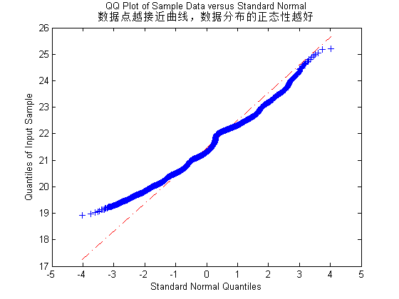
图 15
5) 残差分析,评估模型对数据真实分布的近似程度。(图16)
%% 分析残差
figure;
sigma_ampl = [79.267229 8.121365 5 6.254915 5.062882 11.117357 577.45966 ...
    531.38438 962.45674 1800 800 357.92132];
mu=[29 38 51 70 103 133];
% 高斯混合模型
f_sum=0;x=1:200;
for i=1:6
    f_sum=f_sum+sigma_ampl(i+6)./(sigma_ampl(i)).*exp(-(x-mu(i)).^2./(2*sigma_ampl(i).^2));
end
subplot(2,1,1);
clear h;
h(1)=plot(c,env,'Linewidth',1.5);hold on;
h(2)=plot(c,f_sum,'r','Linewidth',1.5); axis tight
legendflex(h,{'直方图轮廓','高斯混合模型'},'ref',gcf,'anchor',{'ne','ne'},'xscale',.5,'buffer',[-50 -50]);
title({'对数据分布建模后,通过残差分析评估','模型对数据描述的符合程度'});
subplot(2,1,2);
plot(c,env-f_sum,'.');axis tight;
title(['残差 = 观测值 - 拟合值, 均方误差 = ' num2str(sqrt(sum(abs(env-f_sum).^2)))]);
set(gcf,'Color',[1 1 1],'paperpositionmode','auto');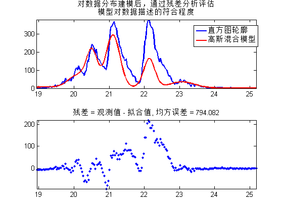
图 16
八. 时间序列分析
(源代码:TimeSeriesAnalysis.m)
1) 绘制散点图。(图17)
load timeseriesAnalysis;

%% 数据散点图
figure;
subplot(2,1,1);plot(x,ydata1);title('样本1实时心率(采样间隔0.5秒)');xlabel('时间(秒)');ylabel('心率(心跳次数/分钟)');
subplot(2,1,2);plot(x,ydata2);title('样本2实时心率(采样间隔0.5秒)');xlabel('时间(秒)');ylabel('心率(心跳次数/分钟)');
set(gcf,'color',[1 1 1],'paperpositionmode','auto');
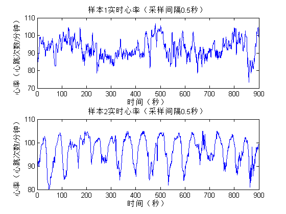
图 17
2) 过滤信号中的线性成分(detrend)。(图18)
%% 过滤数据的线性趋势(detrend)
figure;
y_detrended1 = detrend(ydata1);
y_detrended2 = detrend(ydata2);
subplot(2,1,1);plot(x, ydata1,'-',x, ydata1-y_detrended1,'r');title('去除线性成分后的信号1');
legend({'信号','线性成分'});
xlabel('时间 (秒)');ylabel('心率(心跳次数/分钟)');
subplot(2,1,2);plot(x, ydata2,'-',x, ydata2-y_detrended2,'r');title('去除线性成分后的信号2');
legend({'信号','线性成分'});
xlabel('时间(秒)');ylabel('心率(心跳次数/分钟)');
set(gcf,'color',[1 1 1],'paperpositionmode','auto');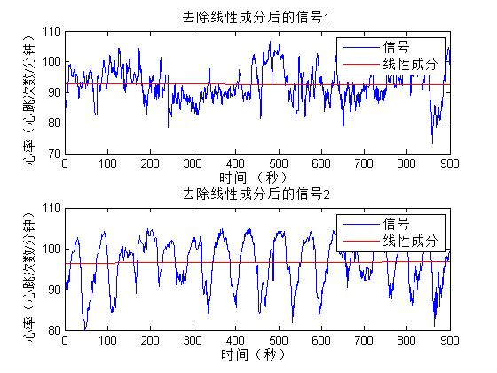
图 18
3) 计算自相关函数,绘制自相关图(correlogram)。(图19)
%% 自相关函数
figure;
y_autoCorr1 = acf(subplot(2,1,1),ydata1,100);
set(get(gca,'title'),'String','心率数据自相关函数(样本1)');
set(get(gca,'xlabel'),'String','间期(秒)');
tt = get(gca,'xtick');
for i = 1:length(tt); ttc{i} = sprintf('%.2f ',0.5*tt(i)); end
set(gca,'xticklabel',ttc);
y_autoCorr2 = acf(subplot(2,1,2),ydata2, 100);
set(gca,'xticklabel',ttc);
set(get(gca,'title'),'String','心率数据自相关函数(样本2)');
set(get(gca,'xlabel'),'String','间期(秒)');
set(gcf,'color',[1 1 1],'paperpositionmode','auto');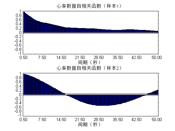
图 19
%% 利用傅里叶变换寻找周期成分
figure;

nfft = 2^(nextpow2(length(x)));
% 快速傅里叶变换(信号长度小于nfft时补零)
ySpectrum1 = fft(y_detrended1,nfft);
ySpectrum2 = fft(y_detrended2,nfft);

NumUniquePts = ceil((nfft+1)/2);
% FFT is symmetric, throw away second half and use the magnitude of the coeeicients only
powerSpectrum1 = abs(ySpectrum1(1:NumUniquePts));
powerSpectrum2 = abs(ySpectrum2(1:NumUniquePts));
% Scale the fft so that it is not a function of the length of x
powerSpectrum1 = powerSpectrum1./max(powerSpectrum1);
powerSpectrum2 = powerSpectrum2./max(powerSpectrum2);
powerSpectrum1 = powerSpectrum1.^2;
powerSpectrum2 = powerSpectrum2.^2;
% Since we dropped half the FFT, we multiply the coeffixients we have by 2 to keep the same energy.
% The DC component and Nyquist component, if it exists, are unique and should not be multiplied by 2.
if rem(nfft, 2) % odd nfft excludes Nyquist point
     powerSpectrum1(2:end) = powerSpectrum1(2:end)*2;
     powerSpectrum2(2:end) = powerSpectrum2(2:end)*2;
else
     powerSpectrum1(2:end -1) = powerSpectrum1(2:end -1)*2;
     powerSpectrum2(2:end -1) = powerSpectrum2(2:end -1)*2;
end
% This is an evenly spaced frequency vector with NumUniquePts points.
% Sampling frequency
Fs = 1/(x(2)-x(1));
f = (0:NumUniquePts-1)*Fs/nfft;
plot(f,powerSpectrum1,'-',f,powerSpectrum2,'r');
title('心率信号能量谱');
xlabel('频率(赫兹)'); ylabel('能量');
xlim([0 .25]);
annotation_pinned('textarrow',[.15,.085],[.25,.03],'String',{'0.1Hz处的尖峰很可能','是该样本呼吸的频率'});
annotation_pinned('textarrow',[.1,.02],[.75,.87],'String',{'0.02 Hz处的尖峰很可能','是该样本呼吸的频率'});
set(gcf,'color',[1 1 1],'paperpositionmode','auto');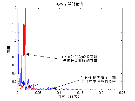
图 20
5) 对信号平滑处理,去掉频谱上系数较小的成分。(图21)
%% 去除能量较小的频率成分
figure;
% 不使用0垫位
ySpectrum1 = fft(ydata1);
ySpectrum2 = fft(ydata2);
% 去掉很小的系数
freqInd1=find(abs(ySpectrum1)<400);
freqInd2=find(abs(ySpectrum2)<400);
ySpectrum1(freqInd1)=0;
ySpectrum2(freqInd2)=0;
% 重建信号
y_cyclic1=ifft(ySpectrum1);
y_cyclic2=ifft(ySpectrum2);
subplot(2,1,1);
h(1)= plot(x,ydata1,'b');hold on;h(2)=plot(x,y_cyclic1,'r','linewidth',1.5);
title('心率信号1');axis tight;
legendflex(h,...                %handle to plot lines
    {'原始信号','平滑后信号'},... %corresponding legend entries
    'ref', gcf, ...             %which figure
    'anchor', {'e','e'}, ...  %location of legend box
    'buffer',[-10 0], ...         % an offset wrt the location
    'fontsize',8,...            %font size
    'xscale',.5);               %a scale factor for actual symbols
xlabel('时间(秒)');ylabel('心率(心跳次数/分钟)');
subplot(2,1,2);
h(1) = plot(x,ydata2,'b');hold on;h(2)=plot(x,y_cyclic2,'r','linewidth',1.5);
title('心率信号2');axis tight;
xlabel('时间(秒)');ylabel('心率(心跳次数/分钟)');
set(gcf,'color',[1 1 1],'paperpositionmode','auto');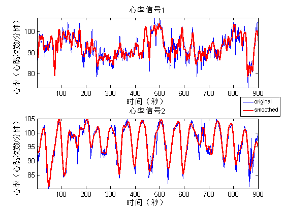
图 21


 1万+
1万+

 被折叠的 条评论
为什么被折叠?
被折叠的 条评论
为什么被折叠?
 到【灌水乐园】发言


