


QML <3> 文件方式自定义组件 定制Button
前言
基于QML 实现自定义组件 Button,Button样式来源于视频教程:
英文字幕】Qt quick(QML)技术解读 入门到熟练(完结)
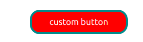
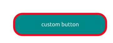
按钮实现 文字显示、鼠标进入退出效果、点击信号,运行效果如图所示:
鼠标进入:
一、组件(Compontents)
一个组件是一个可以重复使用的元素,在单独文件中定义组件Component时, 指定的QML文件名 则为组件名,即在其他QML文件中使用的组件名称,在定义文件名称时 首字母必须为大写
二、按钮属性定义
自定义按钮 基类为Item , 定义属性如下:
Item {
 id:button
 property string  backColor
 property string bordColor
 property int borderWidth
 property int radius
 property string buttonText
 property int  fontSize
 property string  textColor
 property alias text: buttontext.text
...
}
定义属性方式有两种,以按钮文字为例:
1、直接变量声明,如 property string buttonText ,在将buttonText 赋值给显示文字控件Text 的 text 属性
2、使用别名 alias
将显示文字控件Text 的 text 属性 定义别名 如:property alias text: buttontext.text
三.信号定义
1 信号定义
信号使用 signal关键字定义 ,格式为
signal [([ [, …]])]

2 槽定义
on+信号名,on后第一个字母大写,信号定义的时候可以小写开头
四.文字显示
自定义按钮文字显示使用 Text,代码如下:
Text
 {
     id:buttontext
     anchors.centerIn: recMouseArea
     text:buttonText
     color: textColor
     font.pixelSize: fontSize
     wrapMode: Text.WordWrap

 }
五.按钮框
按钮框为Rectangle,显示按钮背景,按钮边框,宽度、高度等属性,代码如下:
Rectangle
 {
     id:blueRec
     radius: button.radius
     color:backColor
     border.color: button.bordColor
     border.width: button.borderWidth
     width:parent.width
     height: parent.height
 }
六.鼠标响应
MouseArea 捕捉鼠标动作,并将响应区域设置为整个按钮框Rectangle区域,代码如下:
MouseArea
 {
     id:recMouseArea
     anchors.fill: parent
     hoverEnabled: true
     onEntered:
     {
         blueRec.scale =1.5
         blueRec.color =bordColor
         blueRec.border.color =backColor
     }
     onExited:
     {
         blueRec.scale =1
         blueRec.color =backColor
         blueRec.border.color =bordColor
     }
     onClicked:
     {
         buttClicked()
     }
 }
七.自定义组件使用
引用组件对应qml文件后,使用组件示例代码如下:
Window
    {
        id:propertyview
        PropertyView
        {
            id:protertyId
            anchors.centerIn:  parent
            backColor: "red"
            bordColor: "dark cyan"
            borderWidth:4
            radius:20
            width:200
            height: 50
            buttonText: "custom button"
            fontSize: 18
            textColor: "white"
            onButtClicked:
            {
                console.log("button Clicekd")
            }
        }
        width: 640
        height: 480
    }
总结
完整代码:
import QtQuick 2.0

Item {
 id:button
 property string  backColor
 property string bordColor
 property int borderWidth
 property int radius
 property string buttonText
 property int  fontSize
 property string  textColor
 property alias text: buttontext.text
 signal buttClicked
 Rectangle
 {
     id:blueRec
     radius: button.radius
     color:backColor
     border.color: button.bordColor
     border.width: button.borderWidth
     width:parent.width
     height: parent.height
 }
 Text
 {
     id:buttontext
     anchors.centerIn: recMouseArea
     text:buttonText
     color: textColor
     font.pixelSize: fontSize
     wrapMode: Text.WordWrap

 }

 MouseArea
 {
     id:recMouseArea
     anchors.fill: parent
     hoverEnabled: true
     onEntered:
     {
         blueRec.scale =1.5
         blueRec.color =bordColor
         blueRec.border.color =backColor
     }
     onExited:
     {
         blueRec.scale =1
         blueRec.color =backColor
         blueRec.border.color =bordColor
     }
     onClicked:
     {
         buttClicked()
     }
 }
}


 1029
1029


 被折叠的 条评论
为什么被折叠?
被折叠的 条评论
为什么被折叠?
 到【灌水乐园】发言


