


一、引言
在qml开发中,本文总结自己在开发中比较喜欢的实现自定义按钮的两种方式:
(1)Button+states
(2)Image + MouseArea
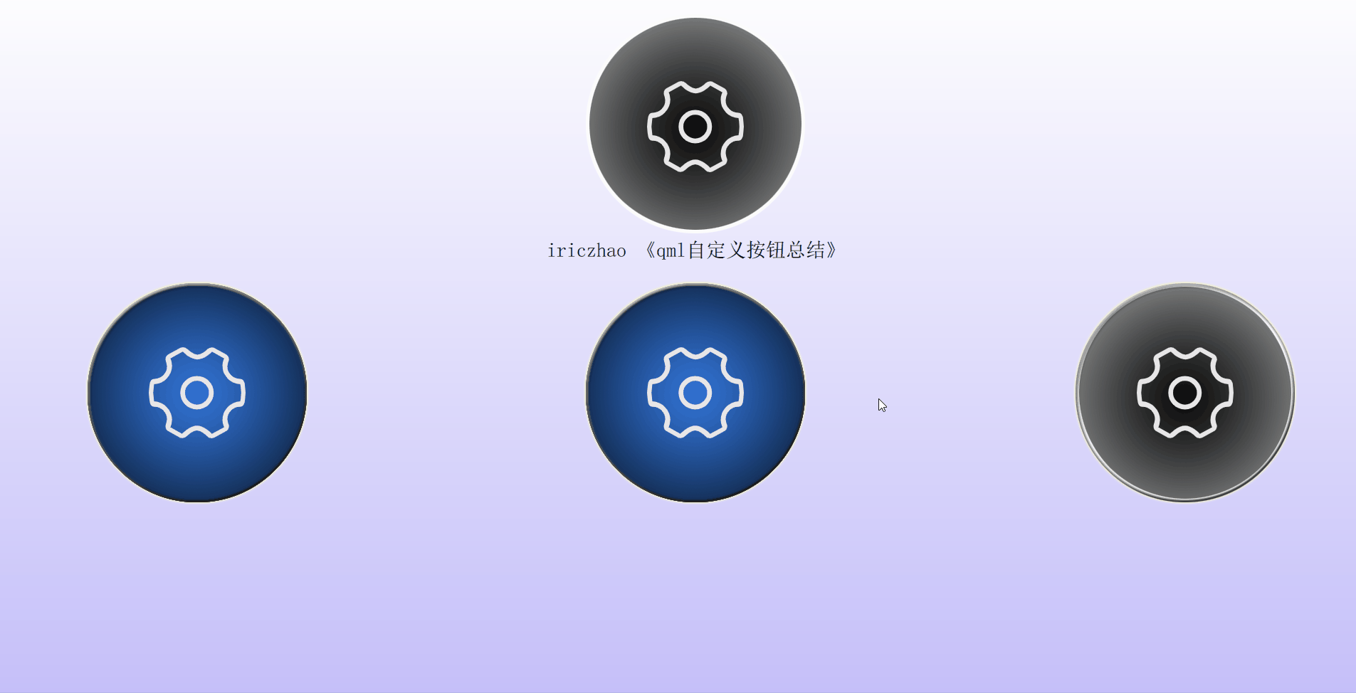
【效果如下】
—
二、自定义按钮
2-1、以贴图方式实现自定义按钮
(直接上码啦)
//【Button + states 实现】
import QtQuick 2.10
import QtQuick.Templates 2.1 as T

T.Button {
    id: control
    implicitWidth: Math.max(background ? background.implicitWidth : 0,
                            iconOn.implicitWidth + leftPadding + rightPadding)
    implicitHeight: Math.max(background ? background.implicitHeight : 0,
                             iconOn.implicitHeight + topPadding + bottomPadding)
    leftPadding: 4
    rightPadding: 4

    text: control.state
    property alias iconOffSource: iconOff.source
    property alias iconOnSource: iconOn.source
    autoExclusive: false
    checkable: true


    Image {
        id: iconOn
        x: 0
        y: 0
        source: "qrc:/asserts/images/setting_normal.png"
    }

    Image {
        id: iconOff
        x: 0
        y: 0
        source: "qrc:/asserts/images/setting_checked.png"
    }

    //创建按钮的“已选择”和“正常”两种状态
    states: [
        //已选择状态
        State {
            name: "checked"
            when: control.checked

            PropertyChanges {
                target: iconOff
                visible: false
            }
        },

        //正常状态
        State {
            name: "normal"
            when: !control.pressed && !control.checked &&!control.hovered

            PropertyChanges {
                target: iconOn
                visible: false
            }
        }
    ]
}
//【Image + MouseArea实现】
import QtQuick 2.4
import QtQuick.Controls 2.0
import QtQuick.Layouts 1.3


Image {
    id: root
    source: "qrc:/asserts/images/settingsIcon.png"
    signal clicked

    property int duration: 500
    property alias text: label.text

    MouseArea {
        anchors.fill: parent
        anchors.bottomMargin: -29
        onClicked: root.clicked()
        onPressed: {
            glow.visible = true
            animation1.start()
            animation2.start()
        }
    }

    Rectangle {
        id: glow
        x: 34
        y: 39
        visible: false
        width: 250
        height: 250
        color: "#00000000"
        radius: 125
        scale: 1.05
        border.color: "yellow"
    }

    Label {
        id: label
        x: 292
        y: 328
        text: qsTr("Label")
        anchors.horizontalCenter: parent.horizontalCenter
        color: "white"
        font.family: Constants.fontFamily
        font.pixelSize: 28
        anchors.horizontalCenterOffset: 0
    }

    PropertyAnimation {
        target: glow
        id: animation1
        duration: root.duration
        loops: 1
        from: 1.05
        to: 1.1
        property: "scale"
    }

    ParallelAnimation {
        id: animation2
        SequentialAnimation {
            PropertyAnimation {
                target: glow
                duration: root.duration
                loops: 1
                from: 0.2
                to: 1.0
                property: "opacity"
            }
            PropertyAnimation {
                target: glow
                duration: root.duration
                loops: 1
                from: 1.0
                to: 0.0
                property: "opacity"
            }

            PropertyAction {
                target: glow
                property: "visible"
                value: false
            }
        }

        SequentialAnimation {
            PropertyAction {
                target: glow
                property: "border.width"
                value: 50
            }

            PauseAnimation {
                duration: 20
            }

            PropertyAnimation {
                target: glow
                duration: root.duration
                loops: 2
                from: 50
                to: 10
                property: "border.width"
            }
        }
    }
}


 846
846


 被折叠的 条评论
为什么被折叠?
被折叠的 条评论
为什么被折叠?
 到【灌水乐园】发言


