


文章目录
默认设置散点图
https://ggplot2-book.org/polishing.html
rm(list=ls())
library(ggplot2)

attach(mtcars)

ggplot(data = mtcars,aes(x=wt,y=mpg))+
  geom_point()+
  labs(title = "Test",subtitle = "test",x = "Weight",y = "Miles per gallon" )
– ggplot函数主要是指定数据集,参数data传入,ggplot函数没有视觉输出,需要几何函数geom来完成视觉输出
– aes()函数主要是指定数据中的变量承担什么角色,通过x,y传入坐标轴,以及group,fill,color,shape传入分组变量,size传入尺寸等
– geom_point()函数向“画布”上做了散点图,呈现出视觉效果
– labs()可添加注释:主标题,子标题,xlab,ylab

拓展散点图 – 散点的大小
我们知道几何函数geom_point()有个size参数可以改变散点的大小,但是是整体改变点的大小。
我想让数据框中的某个变量的大小决定散点的大小。
ggplot(mtcars, aes(x=wt, y=mpg, size=disp)) +
  geom_point(shape=21, color="black", fill="cornsilk") +
  labs(x="Weight", y="Miles Per Gallon",title="Bubble Chart", size="Engine\nDisplacement")

# 此时在aes函数内部设置size参数,将变量disp的value 传递给size决定每个散点的大小
# 其中的labs中设置的 size仅仅是更改图例的title
# geom_point设置的color以及fill控制了散点的呈现方式;aes设置的color以及fill控制了变量的映射关系,通过变量影响散点的呈现方式。

拓展散点图 – 散点的颜色
上述说集合函数geom_point可以设置shape,size,color控制散点的颜色,这些都是整体上的控制
当我们想要变量映射到散点的属性上时,就需要在aes函数里设置了,但是aes里设置的颜色不好看怎么改变呢?
mtcars$cyl <- factor(mtcars$cyl)
ggplot(mtcars, aes(x=wt, y=mpg, color=cyl)) +
  geom_point() +
  scale_color_manual(values=c("orange", "olivedrab", "navy"))+
  labs(x="Weight", y="Miles Per Gallon",title="Bubble Chart")

# scale_color_manual进行手动设置
#或者 使用 scale_color_brewer() or scale_fill_brewer()函数进行指定比较流行的色彩集进行设置
# scale_color_brewer(palette="Set1") "  还有 Set2"  "Set3"  "Pastel1"  "Pastel2"  "Paired"  "Dark2"或"Accent"

拓展散点图 – 形状
根据变量来进行形状设置
mtcars$cyl <- factor(mtcars$cyl)

ggplot(data=mtcars, aes(x=hp, y=mpg,shape=cyl, color=cyl)) +
  geom_point(size=3) +
  labs(title="Automobile Data by Engine Type", x="Horsepower", y="Miles Per Gallon")
– 其中使用因子化的变量cyl 控制散点的形状和颜色

拓展散点图 – 修改图例
在aes()函数传递的分组变量,默认会在图片输出的右侧出现图列。我们可以修改图例的位置和title等
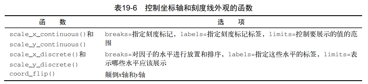
ggplot(data = mtcars,aes(x=wt,y=mpg,color=am))+
  geom_point()+
  labs(title = "Test",x = "Weight",y = "Miles per gallon",color="Type")+
  theme(legend.position = c(0.1,0.8))

# 图例的title修改:aes传入的分组变量是神什么,在labs里对应的使用分组变量的名称进行修改
# 图例的位置修改,theme函数是我们对最终图像的呈现的一个整体把握,可以使用legend.position修改图例的位置
# 可以传递:top,bottom,left,right,也可以传递一个二元素向量表示在x,y轴上的相对位置。

引申一下theme函数
如前文所说,theme函数可以让我们对图像的整体呈现进行一个把控。
theme函数可以让我们修改背景,调整字体,颜色,网格线等。
但是theme的参数太多了,想让人放弃!!!
mytheme <- theme(plot.title=element_text(face="bold.italic",size="14", color="brown"),
				axis.title=element_text(face="bold.italic",size=10, color="brown"),
				axis.text=element_text(face="bold", size=9,color="darkblue"),
				panel.background=element_rect(fill="white",color="darkblue"),
				panel.grid.major.y=element_line(color="grey",linetype=1),
				panel.grid.minor.y=element_line(color="grey",linetype=2),
				panel.grid.minor.x=element_blank(),
				legend.position="top")

ggplot(data = mtcars,aes(x=wt,y=mpg,color=am))+
  geom_point()+
  labs(title = "Test",x = "Weight",y = "Miles per gallon",color="Type")+
  mytheme

# theme可以保存成自定义函数,然后重复调用
#

拓展散点图 – 修改坐标轴 – 刻度
需要注意的是坐标轴不仅需要区分x,y还需要区分是连续型变量还是离散型因子。
ggplot(data = mtcars,aes(x=wt,y=mpg,color=am))+
  geom_point()+
  scale_y_continuous(breaks = c(15,30),labels = c("15%","30%"))+
  labs(title = "Test",x = "Weight",y = "Miles per gallon",color="Type")

拓展散点图 – 修改坐标轴 – 刻度标签
ggplot(data = mtcars,aes(x=wt,y=mpg,color=am))+
  geom_point()+
  scale_y_continuous(breaks = c(15,30),labels = c("15%","30%"))+
  labs(title = "Test",x = "Weight",y = "Miles per gallon",color="Type")

# 上述代码只能实现刻度标记位置和标签内容,无法实现标签的移动和旋转
ggplot(data = mtcars,aes(x=wt,y=mpg,color=am))+
  geom_point()+
  labs(title = "Test",x = "Weight",y = "Miles per gallon",color="Type")+
  theme(axis.text.x = element_text(angle = -45)
  )

拓展散点图 – 刻画/小画面
mtcars$am <- factor(mtcars$am, levels=c(0,1),labels=c("Automatic", "Manual"))
mtcars$vs <- factor(mtcars$vs, levels=c(0,1),labels=c("V-Engine", "Straight Engine"))

ggplot(data=mtcars, aes(x=hp, y=mpg)) +
  geom_point(size=3) +
  facet_grid(am~vs) +
  labs(title="Automobile Data by Engine Type", x="Horsepower", y="Miles Per Gallon")
– facet_grid函数将“画布”根据因子am~vs的组合分成多个小画面
– facet_wrap()函数facet_grid()函数可以创建网格图形,也就是刻面图形

分组+刻画
mtcars$am <- factor(mtcars$am, levels=c(0,1),labels=c("Automatic", "Manual"))
mtcars$vs <- factor(mtcars$vs, levels=c(0,1),labels=c("V-Engine", "Straight Engine"))
mtcars$cyl <- factor(mtcars$cyl)
ggplot(data=mtcars, aes(x=hp, y=mpg,shape=cyl,color=cyl)) +
  geom_point(size=3) +
  facet_grid(am~vs) +
  labs(title="Automobile Data by Engine Type",x="Horsepower", y="Miles Per Gallon")
常见的刻画函数
其中 var ,rowvar,colvar都是因子型变量
拓展散点图 – 添加辅助线
添加斜线
ggplot(data = mtcars,aes(x=wt,y=mpg,color=am))+
  geom_point()+
  geom_abline(slope = 1,intercept = 10,linetype = "dashed")+
  labs(title = "Test",x = "Weight",y = "Miles per gallon",color="Type")+
  theme(axis.text.x = element_text(angle = -45))
添加水平/垂直线
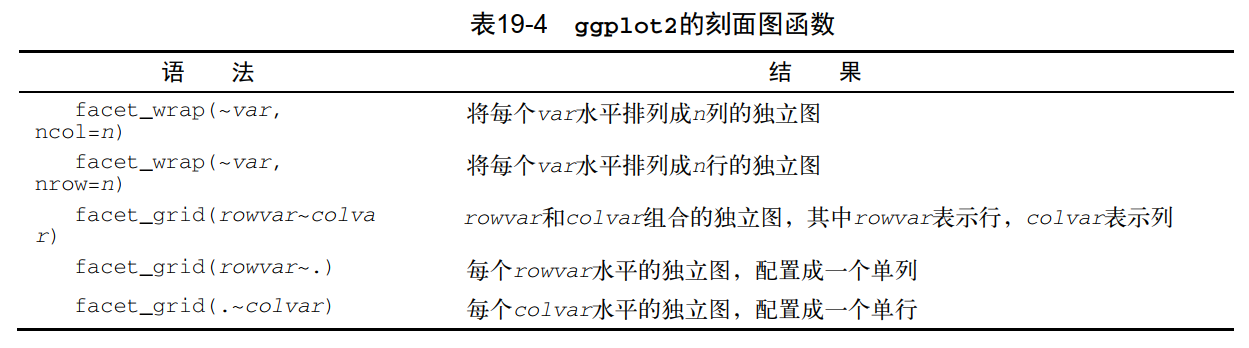
ggplot(data = mtcars,aes(x=wt,y=mpg,color=am))+
  geom_point()+
  geom_hline(yintercept = 20,colour="red",linetype="dashed")+
  geom_vline(xintercept = 3,colour="red",linetype="dashed")+
  labs(title = "Test",x = "Weight",y = "Miles per gallon",color="Type")+
  theme(axis.text.x = element_text(angle = -45))
拓展散点图 – 添加线性回归线以及置信区间
ggplot(data=mtcars, aes(x=wt, y=mpg)) +
  geom_point(pch=17, color="blue", size=2) +
  geom_smooth(method="lm",formula = y~x ,color="red", linetype=2) +
  labs(title="Automobile Data", x="Weight", y="Miles Per Gallon")
– geom_point的可选参数很多,其中pch 设置点的形状,color设置颜色,size设置大小
– geom_smooth也有很多可选参数

geom_smoth函数依赖于stat_smooth函数来计算画出一个拟合曲线和置信区间
很多时候关于几何函数geom_smooth的帮助信息很少但是关于统计函数stat_smooth的帮助信息肯定会很多。
使用相应的几何函数时,如何工作的以及参数有哪些,一定要检查这个函数及其相关的统计函数
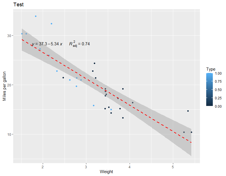
拓展散点图 – 添加回归曲线的方程式以及决定系数
# install.packages("ggpmisc")# install.packages("ggpmisc")
library(ggpmisc)

ggplot(data = mtcars,aes(x=wt,y=mpg,color=am))+
  geom_point()+
  geom_smooth(method="lm",formula = y~x ,color="red", linetype=2) +
  labs(title = "Test",x = "Weight",y = "Miles per gallon",color="Type")+
  stat_poly_eq(
    aes(label = paste(..eq.label.., ..adj.rr.label.., sep = '~~~~~~')),
    formula = y ~ x,  parse = TRUE,size = 4,label.x = 0.1,label.y = 0.8)
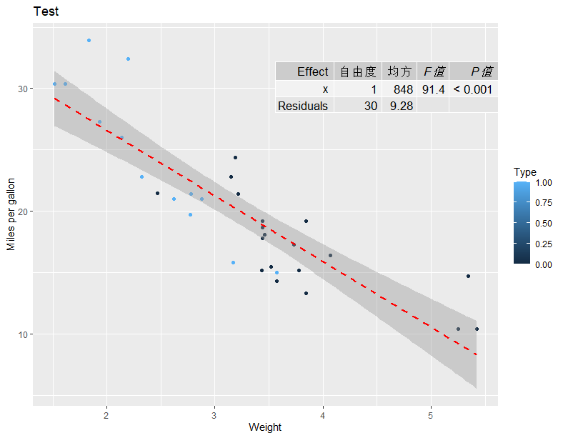
拓展散点图 – 添加方差分析表
ggplot(data = mtcars,aes(x=wt,y=mpg,color=am))+
  geom_point()+
  geom_smooth(method="lm",formula = y~x ,color="red", linetype=2) +
  labs(title = "Test",x = "Weight",y = "Miles per gallon",color="Type")+
  stat_fit_tb(method = "lm",
              method.args = list(formula = y ~ x),
              tb.type = "fit.anova",
              tb.vars = c(Effect = "term",
                          "自由度" = "df",
                          "均方" = "meansq",
                          "italic(F值)" = "statistic",
                          "italic(P值)" = "p.value"),
              label.y = 0.9, label.x = 1,#调整相对位置的
              size = 4.5,
              parse = TRUE
  )
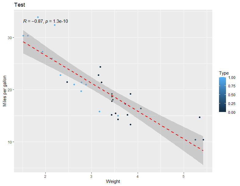
拓展散点图 – 添加相关性系数以及显著性
ggplot(data = mtcars,aes(x=wt,y=mpg,color=am))+
  geom_point()+
  geom_smooth(method="lm",formula = y~x ,color="red", linetype=2) +
  labs(title = "Test",x = "Weight",y = "Miles per gallon",color="Type")+
  ggpubr::stat_cor(method = "pearson",aes(x= wt,y=mpg))
拓展散点图 – 添加附图 – 箱线图
借助ggExtra包实现
p1 <- ggplot(mtcars, aes(x=wt, y=mpg)) +
  geom_point() +
  scale_color_manual(values=c("orange", "olivedrab", "navy"))+
  labs(x="Weight", y="Miles Per Gallon",title="Bubble Chart")

ggExtra::ggMarginal(p = p1,type = "density",xparams = list(fill = "orange"),yparams = list(fill = "blue"))
ggExtra::ggMarginal(p = p1,type = "boxplot")
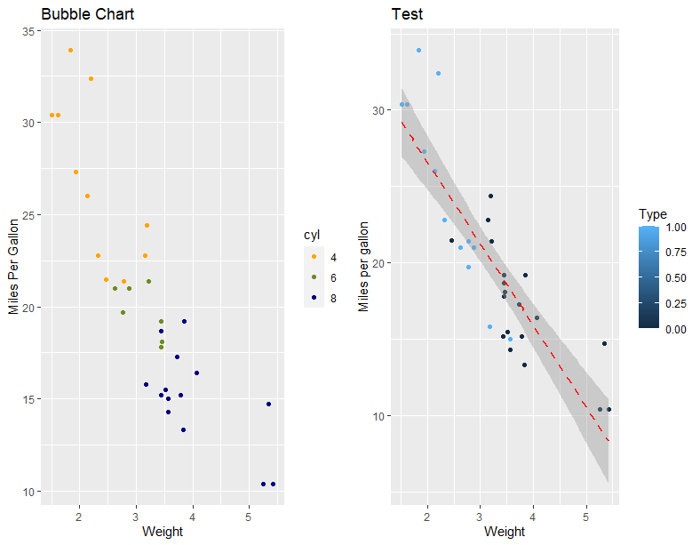
拓展散点图 – 多图组合
借助最简单的gridExtra包实现
p1 <- ggplot(mtcars, aes(x=wt, y=mpg, color=cyl)) +
  geom_point() +
  scale_color_manual(values=c("orange", "olivedrab", "navy"))+
  labs(x="Weight", y="Miles Per Gallon",title="Bubble Chart")

p2 <- ggplot(data = mtcars,aes(x=wt,y=mpg,color=am))+
  geom_point()+
  geom_smooth(method="lm",formula = y~x ,color="red", linetype=2) +
  labs(title = "Test",x = "Weight",y = "Miles per gallon",color="Type")

gridExtra::grid.arrange(p1,p2,ncol=2)
保存效果图
pdf("output.pdf", width = 6, height = 6)
ggplot(mpg, aes(displ, cty)) + geom_point()
dev.off()
# ggsave 不指定file 参数则默认保存最近的一个视图效果
ggplot(mpg, aes(displ, cty)) + geom_point()
ggsave("output.pdf")

# 手动指定要报存哪个结果
p1 <- ggplot(mpg, aes(displ, cty)) + geom_point()
ggsave(plot = p1,filename = "output.pdf",width = ,height = ) # 文件后缀指定保存类型


 2199
2199


 被折叠的 条评论
为什么被折叠?
被折叠的 条评论
为什么被折叠?
 到【灌水乐园】发言


