


Let's create a minimal and slick login form using basic HTML5 then enhancing it with some CSS3 techniques. Time to transform some simple elements into something beautiful..
Introduction
Web forms are an integral part of a website’s design. Whatever the purpose, forms are intended to be a simple way for users to input values and submit data. Having HTML5 and CSS3 at our disposal, allows us to create forms that are both intuitive to use and visually appealing.
The Design
I believe that web design should be clean and efficient. The form design that we are going to be coding follows those principals, including just three elements: a username input, a password input, and a submit input. Because the markup is so simple, it allows for more flexibility when we code it into HTML and CSS.
Here are some elements in the design that we will need to keep in mind for coding:
- Gradients
- Inner Shadows
- Borders with Opacity
- Text Shadows
- Placeholder Text
Most elements are CSS styling, but we will check out the placeholder attribute as well, since that will suggest to our users what kind of data they should enter.
Step 1: Base HTML and CSS Structure
Let’s start off by creating a clean HTML5 template with a form and three inputs:
|
01
02
03
04
05
06
07
08
09
10
11
12
13
14
15
16
17
18
19
|
<!
DOCTYPE
html>
<
html
lang
=
"en"
>
<
head
>
<
meta
charset
=
"utf-8"
>
<
title
>slick Login</
title
>
<
meta
name
=
"description"
content
=
"slick Login"
>
<
meta
name
=
"author"
content
=
"Webdesigntuts+"
>
</
head
>
<
body
>
<
form
>
<
input
type
=
"text"
name
=
"username"
>
<
input
type
=
"password"
name
=
"password"
>
<
input
type
=
"submit"
value
=
"Log In"
>
</
form
>
</
body
>
</
html
>
|
Right now, we don’t have anything too special, just a form, three inputs and a blank document. Let’s create a CSS file called style.css and link it back to our HTML page:
|
1
|
<
link
rel
=
"stylesheet"
type
=
"text/css"
href
=
"style.css"
/>
|
Remember, the CSS file is currently located in our main directory; make sure you use the correct path if you choose to put your CSS file in another folder, such as the folder‘css’.
Before we add any of our own styling to the CSS file, it is always good practice to start off from a clean slate. We'll start off our styles with Eric Meyer's CSS Reset which removes default styling and allows us to build our rules from the same point in whichever browser.
Let’s start off with defining a font and background gradient for our login page. Insert this code after the CSS reset:
|
01
02
03
04
05
06
07
08
09
10
|
body {
font-family
:
sans-serif
;
background-color
:
#323B55
;
background-image
: -webkit-linear-gradient(
bottom
,
#323B55
0%
,
#424F71
100%
);
background-image
: -moz-linear-gradient(
bottom
,
#323B55
0%
,
#424F71
100%
);
background-image
: -o-linear-gradient(
bottom
,
#323B55
0%
,
#424F71
100%
);
background-image
: -ms-linear-gradient(
bottom
,
#323B55
0%
,
#424F71
100%
);
background-image
: linear-gradient(
bottom
,
#323B55
0%
,
#424F71
100%
);
}
|
Now that we've added in that piece of code, our page should now have a cool linear gradient background. The gradient starts at the bottom of the page (0%) where the color is #323B55 and ends at the top of the page (100%) where the color is #424F71. Just incase the page is viewed from a browser which doesn't support gradients, it is important to declare a background-color, which I set to the same color as the gradient at 0%. The great thing about CSS3 gradients is that you can add many 'stops', for example another color change at 25%. The last thing to add in the body tag is the font-family, I decided to use the Sans Serif type.
Now that we have our foundation, it is time to start adding some more styling!
Step 2: Styling the Login Form
Before we start the CSS styling for the login form, we need to add some stuff to our HTML document. First, start off with adding an id to the form, we will call it 'slick-login'. Next, add a placeholder attribute in each of the input tags. Here is how the HTML page should look so far:
|
01
02
03
04
05
06
07
08
09
10
11
12
13
14
15
16
17
18
19
20
|
<!
DOCTYPE
html>
<
html
lang
=
"en"
>
<
head
>
<
meta
charset
=
"utf-8"
>
<
title
>slick Login</
title
>
<
meta
name
=
"description"
content
=
"slick Login"
>
<
meta
name
=
"author"
content
=
"Webdesigntuts+"
>
<
link
rel
=
"stylesheet"
type
=
"text/css"
href
=
"style.css"
/>
</
head
>
<
body
>
<
form
id
=
"slick-login"
>
<
input
type
=
"text"
name
=
"username"
placeholder
=
"me@tutsplus.com"
>
<
input
type
=
"password"
name
=
"password"
placeholder
=
"password"
>
<
input
type
=
"submit"
value
=
"Log In"
>
</
form
>
</
body
>
</
html
>
|
The HTML5 input placeholder attribute is a great addition to input tags. Instead of having an input value that the user has to replace, the placeholder attribute allows us to display help text and have it disappear once the user starts to type in the field. It's not yet widely supported, and should therefore be used with caution. Say, for example, theplaceholder attribute does not work in a browser, the user will not know what values to enter. Later on we'll be covering a fallback technique, but it's also worth nothing that placeholder text should be a suggestion, rather than labeling the input.
Now that we have our updated HTML page, we can start adding some styling to the login forms. Here is the CSS for our form id which we declared before.
|
1
2
3
4
5
6
7
8
9
|
#slick-login {
width
:
220px
;
height
:
155px
;
position
:
absolute
;
left
:
50%
;
top
:
50%
;
margin-left
:
-110px
;
margin-top
:
-75px
;
}
|
For this login form, I decided to align it perfectly (horizontally and vertically) in the center of the page. It is quite straight-forward to position elements like this. As you can see from the code above, position the element 50% from the top and left, and then using the margin values, push back the element half of the width and height. This is a great method to align elements in the center of the page, but it isn't that great in terms of flexibility. For example, if you would like to duplicate elements, you would have to change the width, height and margin values in order to keep the element aligned. Even though I aligned the form in the center of the page, feel free to change the code to whatever you like!
Now that we have our form aligned, it's time to move on to styling the inputs!
Step 3: Styling the Inputs
Now, we are really getting to the fun stuff. Lets start off by adding the CSS for the text and password inputs:
|
01
02
03
04
05
06
07
08
09
10
11
12
13
14
15
16
17
18
19
20
21
22
23
24
25
26
27
28
29
30
31
32
33
34
35
36
37
|
#slick-login input[type=
"text"
],#slick-login input[type=
"password"
] {
width
:
100%
;
height
:
40px
;
positon:
relative
;
margin-top
:
7px
;
font-size
:
14px
;
color
:
#444
;
outline
:
none
;
border
:
1px
solid
rgba(
0
,
0
,
0
, .
49
);
padding-left
:
20px
;
-webkit-background-
clip
: padding-box;
-moz-background-
clip
: padding-box;
background-
clip
: padding-box;
border-radius:
6px
;
background-color
:
#fff
;
background-image
: -webkit-linear-gradient(
bottom
,
#FFFFFF
0%
,
#F2F2F2
100%
);
background-image
: -moz-linear-gradient(
bottom
,
#FFFFFF
0%
,
#F2F2F2
100%
);
background-image
: -o-linear-gradient(
bottom
,
#FFFFFF
0%
,
#F2F2F2
100%
);
background-image
: -ms-linear-gradient(
bottom
,
#FFFFFF
0%
,
#F2F2F2
100%
);
background-image
: linear-gradient(
bottom
,
#FFFFFF
0%
,
#F2F2F2
100%
);
-webkit-box-shadow:
inset
0px
2px
0px
#d9d9d9
;
box-shadow:
inset
0px
2px
0px
#d9d9d9
;
}
#slick-login input[type=
"text"
]:focus,#slick-login input[type=
"password"
]:focus {
-webkit-box-shadow:
inset
0px
2px
0px
#a7a7a7
;
box-shadow:
inset
0px
2px
0px
#a7a7a7
;
}
#slick-login input:first-child {
margin-top
:
0px
;
}
|
Remember, our goal is to make the form flexible. Instead of declaring a fixed input width, I decided to make the width relative to the form's width. This way, if we decided to change the width of the form, all the inputs will change accordingly.
Because we declared a margin-top value for all the inputs, we need to add a first-childselector and make sure the margin-top of the first input is set to zero. This way, the first input value will always be positioned at the top of the form.
Another thing to keep in mind is setting the outline property to none, so that the browser doesn't add any unwanted outlines to our inputs.
Transparent Borders
To make the form more flexible, we are going to add a transparent border, so that whatever background the website has, the form will change to suit it. Because theopacity attribute changes the opacity of the whole element, I decided to search for a method to just change the border opacity.
If you declare the border color in rgba, it is possible to add an alpha value. As you can see above, our border is a solid 1px black border, but its opacity is 47%.
The Padding Problem
In our design, the text in the field is shifted to the right. To achieve this effect in CSS, we can simply use the padding-left property and set it to 20px. When we render the code, a problem arises. The padding value adds 20 pixels to the input width, which is not what we would like.
In order to fix this, we can add a background-clip property and set the value to padding-box. This snippet of CSS makes sure that the padding does not affect the width of the input. You can learn more about the background-clip property at Mozilla.
Adding the Inner Shadow
Another very cool CSS3 property is box-shadow. Using the inset parameter allows us to create an inner shadow on the input element. Using the focus selector, we can easily change the values and colors around when the user clicks on the field.
Step 4: Styling the Submit Button
The submit button is a very important part of a form, so let's make it stand out! Here is the CSS we are going to be using for the submit input:
|
01
02
03
04
05
06
07
08
09
10
11
12
13
14
15
16
17
18
19
20
21
22
23
24
25
26
27
28
29
30
31
32
33
34
35
36
37
38
39
40
41
42
43
44
45
46
47
48
49
50
51
52
53
54
55
|
#slick-login input[type=
"submit"
] {
width
:
100%
;
height
:
50px
;
margin-top
:
7px
;
color
:
#fff
;
font-size
:
18px
;
font-weight
:
bold
;
text-shadow
:
0px
-1px
0px
#5b6ddc
;
outline
:
none
;
border
:
1px
solid
rgba(
0
,
0
,
0
, .
49
);
-webkit-background-
clip
: padding-box;
-moz-background-
clip
: padding-box;
background-
clip
: padding-box;
border-radius:
6px
;
background-color
:
#5466da
;
background-image
: -webkit-linear-gradient(
bottom
,
#5466da
0%
,
#768ee4
100%
);
background-image
: -moz-linear-gradient(
bottom
,
#5466da
0%
,
#768ee4
100%
);
background-image
: -o-linear-gradient(
bottom
,
#5466da
0%
,
#768ee4
100%
);
background-image
: -ms-linear-gradient(
bottom
,
#5466da
0%
,
#768ee4
100%
);
background-image
: linear-gradient(
bottom
,
#5466da
0%
,
#768ee4
100%
);
cursor
:
pointer
;
-webkit-box-shadow:
inset
0px
1px
0px
#9ab1ec
;
box-shadow:
inset
0px
1px
0px
#9ab1ec
;
}
#slick-login input[type=
"submit"
]:hover {
background-color
:
#5f73e9
;
background-image
: -webkit-linear-gradient(
bottom
,
#5f73e9
0%
,
#859bef
100%
);
background-image
: -moz-linear-gradient(
bottom
,
#5f73e9
0%
,
#859bef
100%
);
background-image
: -o-linear-gradient(
bottom
,
#5f73e9
0%
,
#859bef
100%
);
background-image
: -ms-linear-gradient(
bottom
,
#5f73e9
0%
,
#859bef
100%
);
background-image
: linear-gradient(
bottom
,
#5f73e9
0%
,
#859bef
100%
);
-webkit-box-shadow:
inset
0px
1px
0px
#aab9f4
;
box-shadow:
inset
0px
1px
0px
#aab9f4
;
margin-top
:
10px
;
}
#slick-login input[type=
"submit"
]:active {
background-color
:
#7588e1
;
background-image
: -webkit-linear-gradient(
bottom
,
#7588e1
0%
,
#7184df
100%
);
background-image
: -moz-linear-gradient(
bottom
,
#7588e1
0%
,
#7184df
100%
);
background-image
: -o-linear-gradient(
bottom
,
#7588e1
0%
,
#7184df
100%
);
background-image
: -ms-linear-gradient(
bottom
,
#7588e1
0%
,
#7184df
100%
);
background-image
: linear-gradient(
bottom
,
#7588e1
0%
,
#7184df
100%
);
-webkit-box-shadow:
inset
0px
1px
0px
#93a9e9
;
box-shadow:
inset
0px
1px
0px
#93a9e9
;
}
|
The CSS for our submit button is quite straight forward; we're using borders, gradients and inner shadows to make the button stand out. Another CSS3 property we are going to look at is text-shadow.
To make the button text stand out a bit more, we will add a 1px solid shadow on top of the text. Using a darker color (#5b6ddc), we can make the white text more prominent against the light blue background. Even the most subtle effect like adding a text shadow can add a lot to your design, helping text stand out.
I went ahead and added the code for the hover and active selectors. All that is changed is the color of the gradient and the inner shadow. Notice how the color change is rather subtle, but it adds a lot to the design. I also changed the value of margin-top to three pixels lower on the hover state. The change feels natural and adds to the elegance of the form.
So far, everything looks great, but if you hover over and click on some elements, it seems a little choppy. Time to add some animation!
Step 5: Adding Transitions to Elements
To make things flow a lot better, let's add this bit of CSS code to our inputs:
|
1
2
3
4
5
|
-webkit-transition:
all
.
1
s ease-in-out;
-moz-transition:
all
.
1
s ease-in-out;
-o-transition:
all
.
1
s ease-in-out;
-ms-transition:
all
.
1
s ease-in-out;
transition:
all
.
1
s ease-in-out;
|
Using a quick and simple transition, all our elements look and feel a lot better. Notice the transition of inner shadow color on the text inputs and the submit button animation on hover; the transitions make the form look complete.
Although everything looks good, let's add some more goodies before we call it a day.
Step 6: Adding Labels
To make sure our form is properly accessible, add this bit of markup next to your inputtags:
|
1
2
|
<
label
for
=
"username"
>username</
label
>
<
label
for
=
"password"
>password</
label
>
|
Because we want to make our form as simple as possible, we decided to use theplaceholder attribute. Another way that also could have worked would be adding in alabel tag. Because we don't need the tag in our design, rather for accessibility and SEO purposes, we will add this CSS code in:
|
1
2
3
|
#slick-login label {
display
:
none
;
}
|
Setting the display property to none achieves the look we want, which in this case, is no look at all!
Step 7: Cross-Browser Compatibility
Now, let's go back to that potential problem we would have with the placeholder attribute. Say someone is viewing this website from a browser that does not support placeholder: our blank inputs would be pretty unhelpful. To fix this, we will use jQuery and Modernizrto detect support and rectify situations where ther is none. To get started, let's link the scripts to our HTML page.
Drop the script tags in the <head> of your HTML. For best performance, you should have them follow after your stylesheet references. The reason we recommend placing Modernizr in the head is two-fold: the HTML5 Shiv (that enables HTML5 elements in IE) must execute before the <body> - Modernizr
|
1
2
|
|
Now, create a new javascript file called placeholder.js. Unique Method has a great way of using Modernizr to create a fallback for the placeholder attribute. Add this code into the javascript file:
|
01
02
03
04
05
06
07
08
09
10
11
12
13
14
15
16
17
18
19
20
21
22
23
24
25
26
27
28
29
30
31
32
33
34
35
36
37
38
39
40
41
42
|
$(
function
()
{
// check placeholder browser support
if
(!Modernizr.input.placeholder)
{
// set placeholder values
$(
this
).find(
'[placeholder]'
).each(
function
()
{
if
($(
this
).val() ==
''
)
// if field is empty
{
$(
this
).val( $(
this
).attr(
'placeholder'
) );
}
});
// focus and blur of placeholders
$(
'[placeholder]'
).focus(
function
()
{
if
($(
this
).val() == $(
this
).attr(
'placeholder'
))
{
$(
this
).val(
''
);
$(
this
).removeClass(
'placeholder'
);
}
}).blur(
function
()
{
if
($(
this
).val() ==
''
|| $(
this
).val() == $(
this
).attr(
'placeholder'
))
{
$(
this
).val($(
this
).attr(
'placeholder'
));
$(
this
).addClass(
'placeholder'
);
}
});
// remove placeholders on submit
$(
'[placeholder]'
).closest(
'form'
).submit(
function
()
{
$(
this
).find(
'[placeholder]'
).each(
function
()
{
if
($(
this
).val() == $(
this
).attr(
'placeholder'
))
{
$(
this
).val(
''
);
}
})
});
}
});
|
We will also link the javascript file to our HTML page:
|
1
|
<
script
type
=
"text/javascript"
src
=
"placeholder.js"
></
script
>
|
In order to make this work, we need to add a placeholder class to the field inputs:
|
1
2
|
<
input
type
=
"text"
name
=
"username"
class
=
"placeholder"
placeholder
=
"me@tutsplus.com"
>
<
input
type
=
"password"
name
=
"password"
class
=
"placeholder"
placeholder
=
"password"
>
|
Now, let's add the styling for the placeholder class in our CSS file:
|
1
2
3
|
.placeholder {
color
:
#444
;
}
|
While we're at it, let's also add a helpful snippet of CSS that will make sure the widths of the inputs stay the same, regardless of the padding and borders:
|
1
|
* { -moz-box-sizing: border-box; -webkit-box-sizing: border-box; box-sizing: border-box; }
|
For more information as to why box-sizing is so great, Paul Irish has a great explanation.
Step 8: Adding a Simple Animation
To make our form even more fancy, we will add a simple rising animation to the form when the page loads. Let's start off with declaring the animation and adding keyframes:
|
01
02
03
04
05
06
07
08
09
10
11
12
13
14
15
16
17
18
19
20
21
22
23
24
25
26
27
28
29
30
31
32
33
34
35
36
37
38
39
40
41
42
43
44
45
46
47
48
49
50
51
52
53
54
55
56
57
58
59
60
61
62
63
64
65
66
67
68
69
70
71
72
73
|
@keyframes
"login"
{
0%
{
-ms-filter:
"progid:DXImageTransform.Microsoft.Alpha(Opacity=0)"
;
filter: alpha(opacity=
0
);
opacity:
0
;
margin-top
:
-50px
;
}
100%
{
-ms-filter:
"progid:DXImageTransform.Microsoft.Alpha(Opacity=100)"
;
filter: alpha(opacity=
100
);
opacity:
1
;
margin-top
:
-75px
;
}
}
@-moz-keyframes login {
0%
{
filter: alpha(opacity=
0
);
opacity:
0
;
margin-top
:
-50px
;
}
100%
{
filter: alpha(opacity=
100
);
opacity:
1
;
margin-top
:
-75px
;
}
}
@-webkit-keyframes
"login"
{
0%
{
filter: alpha(opacity=
0
);
opacity:
0
;
margin-top
:
-50px
;
}
100%
{
filter: alpha(opacity=
100
);
opacity:
1
;
margin-top
:
-75px
;
}
}
@-ms-keyframes
"login"
{
0%
{
-ms-filter:
"progid:DXImageTransform.Microsoft.Alpha(Opacity=0)"
;
filter: alpha(opacity=
0
);
opacity:
0
;
margin-top
:
-50px
;
}
100%
{
-ms-filter:
"progid:DXImageTransform.Microsoft.Alpha(Opacity=100)"
;
filter: alpha(opacity=
100
);
opacity:
1
;
margin-top
:
-75px
;
}
}
@-o-keyframes
"login"
{
0%
{
filter: alpha(opacity=
0
);
opacity:
0
;
margin-top
:
-50px
;
}
100%
{
filter: alpha(opacity=
100
);
opacity:
1
;
margin-top
:
-75px
;
}
}
|
The CSS above declares a new animation called login and alters the margin-top andopacity values so that the form fades in and rises into position. Now, let's add in the CSS for the slick-login id:
|
1
2
3
4
5
|
-webkit-animation: login
1
s ease-in-out;
-moz-animation: login
1
s ease-in-out;
-ms-animation: login
1
s ease-in-out;
-o-animation: login
1
s ease-in-out;
animation: login
1
s ease-in-out;
|
Now, every time the page loads, the one second animation will execute. Now that we have styled, fixed and animated, we are done!
Final HTML and CSS
Here's a look at the final HTML for this slick login form:
And the CSS:
Conclusion
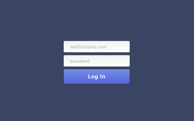
Here's a glimpse at the final result:
The great thing about this form is that it's very easy to change. It's also very easy to extend, add more inputs, validation, functionality etc. Thanks for reading along and I hope you learned something. I'll be interested to hear what you use this for!


 2148
2148

 被折叠的 条评论
为什么被折叠?
被折叠的 条评论
为什么被折叠?
 到【灌水乐园】发言


