


母亲节是表达爱意的好机会!小朋友可以亲手制作一个会"动"的电子贺卡,让妈妈看到你的编程小魔法!不需要复杂工具,只要按照步骤操作,就能做出一个充满爱心的网页:飘落的花瓣、闪烁的星星、会变祝福语的魔法卡片,点击屏幕还会有惊喜特效哦!这份特别的礼物,妈妈一定会感动又骄傲~
📝 制作步骤图解
第一步:新建文件
桌面右键 → 新建 → 文本文档
重命名为 mom-day.html (先创建.txt文件,稍后改扩展名)
第二步:输入魔法代码
右键用记事本打开文件
复制粘贴下方任一素材的代码 ⬇️
第三步:保存为网页格式
点击记事本菜单:文件 → 另存为
保存类型选择 “所有文件”
确保文件名是 mom-day.html(重要!)
💡 扩展名显示方法(Windows):
- 文件资源管理器 → 顶部【查看】→ 勾选 ✔"文件扩展名"
第四步:打开魔法贺卡
保存的 mom-day.html 文件
双击文件,等待浏览器打开
点击屏幕任意位置触发特效 ✨
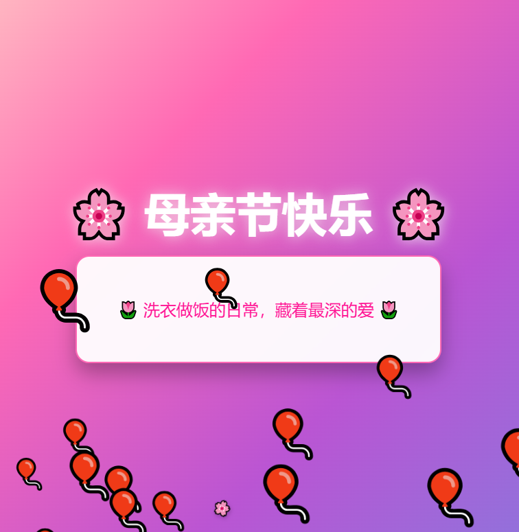
1. 素材一:
<!DOCTYPE html>
<html lang="zh-CN">
<head>
<meta charset="UTF-8">
<title>母亲节快乐!</title>
<style>
body {
margin: 0;
height: 100vh;
overflow: hidden;
background: linear-gradient(45deg, #ff9a9e, #fad0c4, #fad0c4, #a18cd1);
font-family: 'Microsoft YaHei', sans-serif;
}
.container {
position: relative;
height: 100%;
display: flex;
flex-direction: column;
justify-content: center;
align-items: center;
}
.title {
color: #fff;
font-size: 3em;
text-shadow: 2px 2px 4px rgba(0,0,0,0.3);
margin-bottom: 30px;
animation: float 3s ease-in-out infinite;
}
.message-box {
background: rgba(255, 255, 255, 0.9);
padding: 30px 50px;
border-radius: 15px;
box-shadow: 0 10px 20px rgba(0,0,0,0.2);
max-width: 600px;
text-align: center;
transition: transform 0.3s;
}
.message {
font-size: 1.2em;
color: #e91e63;
line-height: 1.6;
}
.heart {
position: absolute;
color: #ff4081;
animation: fall linear forwards;
}
@keyframes float {
0%, 100% { transform: translateY(0); }
50% { transform: translateY(-20px); }
}
@keyframes fall {
to {
transform: translateY(100vh) rotate(360deg);
opacity: 0;
}
}
</style>
</head>
<body>
<div class="container">
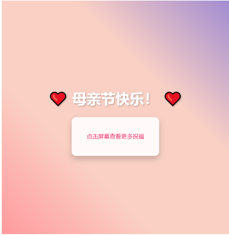
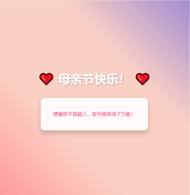
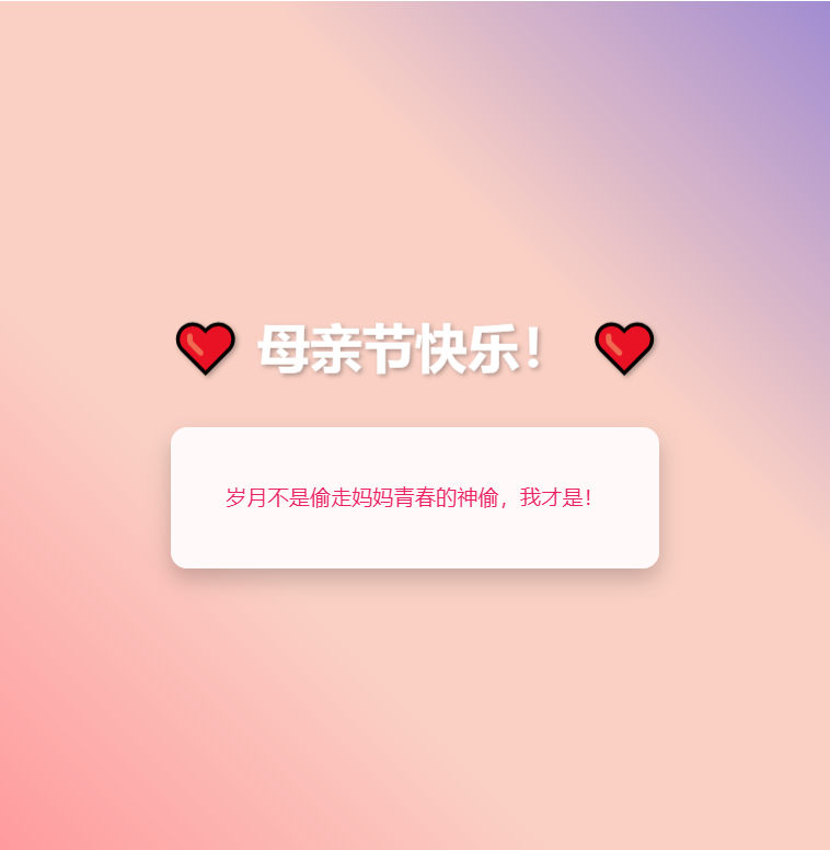
<h1 class="title">❤️ 母亲节快乐! ❤️</h1>
<div class="message-box">
<p class="message" id="message">点击屏幕查看更多祝福</p>
</div>
</div>
<script>
// 祝福语数组
const messages = [
"感谢您不是超人,却为我变成了万能!",
"岁月不是偷走妈妈青春的神偷,我才是!",
"您陪我长大,我陪您慢慢变老~",
"世界上最美的称呼是——妈妈!",
"母爱是柴米油盐间的琐碎细腻❤️",
"妈妈的爱,藏在每一句唠叨里~",
"缓慢又笨拙的路上,谢谢您陪我长大!"
];
// 动态创建爱心
function createHeart() {
const heart = document.createElement('div');
heart.classList.add('heart');
heart.innerHTML = '❤';
heart.style.left = Math.random() * 100 + 'vw';
heart.style.animationDuration = Math.random() * 3 + 2 + 's';
heart.style.fontSize = Math.random() * 20 + 10 + 'px';
document.body.appendChild(heart);
// 动画结束后移除元素
setTimeout(() => {
heart.remove();
}, 5000);
}
// 点击事件处理
let index = 0;
document.addEventListener('click', () => {
// 更新祝福语
document.getElementById('message').textContent = messages[index];
index = (index + 1) % messages.length;
// 创建多个爱心
for(let i = 0; i < 5; i++) {
createHeart();
}
// 添加点击动画
document.querySelector('.message-box').style.transform = 'scale(1.05)';
setTimeout(() => {
document.querySelector('.message-box').style.transform = 'scale(1)';
}, 200);
});
// 自动创建爱心
setInterval(createHeart, 500);
</script>
</body>
</html>
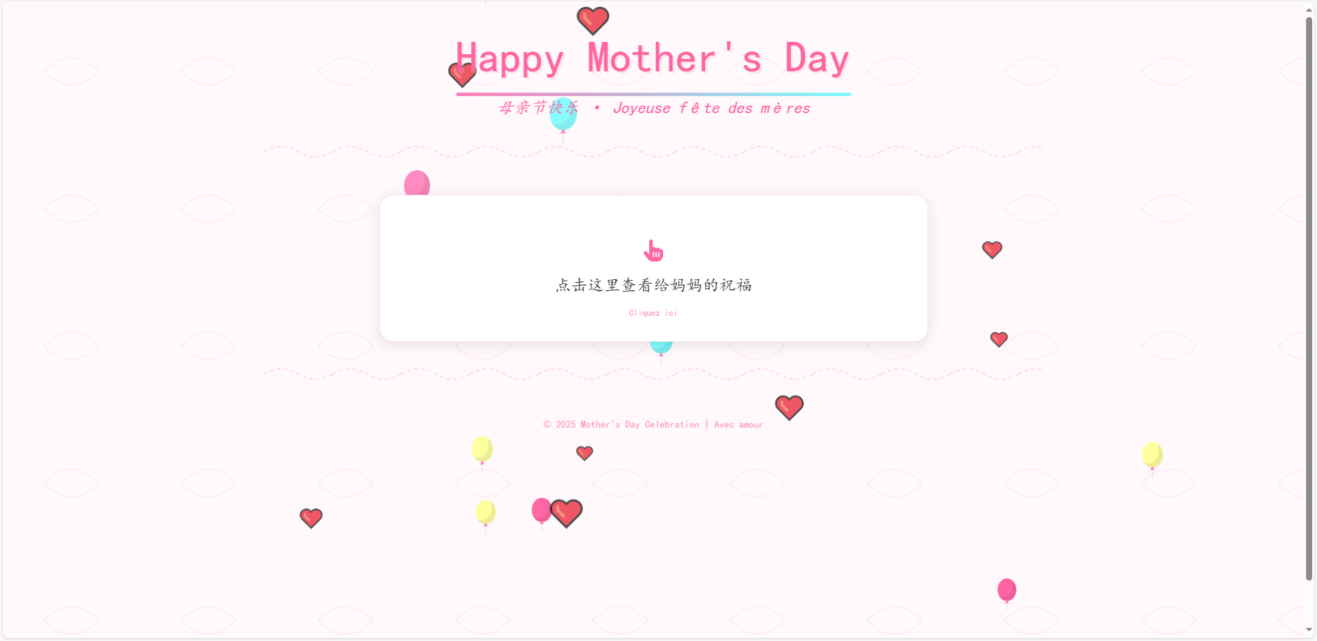
2.素材二
素材三
<!DOCTYPE html>
<html lang="zh-CN">
<head>
<meta charset="UTF-8">
<meta name="viewport" content="width=device-width, initial-scale=1.0">
<title>Mère's Day | 母亲节快乐</title>
<link href="https://lf6-cdn-tos.bytecdntp.com/cdn/expire-100-M/font-awesome/6.0.0/css/all.min.css" rel="stylesheet">
<link href="https://s2.ssl.qhres2.com/static/56662140ef7d5d03.css" rel="stylesheet">
<style>
:root {
--primary: #ff7eb9;
--secondary: #ff65a3;
--accent: #7afcff;
--text: #333;
--bg: #fff9fb;
--shadow: 0 4px 20px rgba(0, 0, 0, 0.1);
}
@font-face {
font-family: 'Handwriting';
src: url('https://fonts.googleapis.com/css2?family=Caveat:wght@400;700&display=swap');
font-display: swap;
}
body {
font-family: 'Caveat', cursive, 'Handwriting', sans-serif;
background-color: var(--bg);
color: var(--text);
margin: 0;
padding: 0;
min-height: 100vh;
overflow-x: hidden;
background-image: url('data:image/svg+xml;utf8,<svg width="100" height="100" viewBox="0 0 100 100" xmlns="http://www.w3.org/2000/svg"><path d="M30,50 Q50,30 70,50 Q50,70 30,50" fill="none" stroke="%23ff7eb9" stroke-width="0.5" opacity="0.2"/></svg>');
background-size: 200px;
animation: float 6s ease-in-out infinite;
}
@keyframes float {
0%, 100% { background-position: 0 0; }
50% { background-position: 0 20px; }
}
.container {
max-width: 1200px;
margin: 0 auto;
padding: 2rem;
position: relative;
z-index: 1;
}
header {
text-align: center;
margin-bottom: 3rem;
position: relative;
}
h1 {
font-size: 4rem;
color: var(--secondary);
margin: 0;
text-shadow: 3px 3px 0 rgba(255, 190, 185, 0.3);
position: relative;
display: inline-block;
}
h1::after {
content: '';
position: absolute;
bottom: -10px;
left: 0;
width: 100%;
height: 5px;
background: linear-gradient(90deg, var(--primary), var(--accent));
border-radius: 5px;
}
.subtitle {
font-size: 1.5rem;
color: var(--secondary);
margin-top: 0.5rem;
font-style: italic;
}
.card {
background: white;
border-radius: 20px;
padding: 2rem;
box-shadow: var(--shadow);
margin: 2rem auto;
max-width: 800px;
position: relative;
overflow: hidden;
transition: transform 0.3s ease;
border: 1px solid rgba(255, 126, 185, 0.2);
}
.card:hover {
transform: translateY(-5px);
}
.card::before {
content: '';
position: absolute;
top: -10px;
left: -10px;
right: -10px;
bottom: -10px;
border: 2px dashed var(--primary);
border-radius: 25px;
opacity: 0.3;
pointer-events: none;
}
.message-box {
text-align: center;
padding: 2rem;
cursor: pointer;
transition: all 0.3s ease;
position: relative;
}
.message-box:hover {
background: rgba(255, 126, 185, 0.05);
}
.message-box::before {
content: 'Cliquez ici';
position: absolute;
bottom: 0;
left: 50%;
transform: translateX(-50%);
font-size: 0.8rem;
color: var(--secondary);
opacity: 0.7;
}
.hidden-message {
display: none;
font-size: 1.8rem;
line-height: 1.6;
color: var(--secondary);
margin-top: 1rem;
padding: 1.5rem;
background: rgba(255, 190, 185, 0.1);
border-radius: 15px;
border-left: 5px solid var(--primary);
animation: fadeIn 0.5s ease-out;
}
@keyframes fadeIn {
from { opacity: 0; transform: translateY(10px); }
to { opacity: 1; transform: translateY(0); }
}
.balloon {
position: absolute;
width: 50px;
height: 60px;
background: var(--primary);
border-radius: 50%;
box-shadow: inset -10px -10px 0 rgba(0, 0, 0, 0.07);
animation: float-up 8s ease-in infinite;
z-index: -1;
}
.balloon::before {
content: '▲';
font-size: 12px;
color: var(--primary);
position: absolute;
bottom: -11px;
left: 50%;
transform: translateX(-50%);
}
.balloon::after {
content: '';
position: absolute;
bottom: -24px;
left: 50%;
transform: translateX(-50%);
height: 15px;
width: 1px;
background: rgba(0, 0, 0, 0.2);
}
@keyframes float-up {
0% { transform: translateY(100vh) scale(0.5); opacity: 0; }
10% { opacity: 1; }
50% { transform: translateY(-50vh) scale(1); }
100% { transform: translateY(-100vh) scale(0.5); opacity: 0; }
}
.heart {
position: absolute;
font-size: 1.5rem;
color: var(--secondary);
animation: pulse 1.5s ease infinite;
opacity: 0.7;
}
@keyframes pulse {
0%, 100% { transform: scale(1); }
50% { transform: scale(1.3); }
}
footer {
text-align: center;
margin-top: 3rem;
color: var(--secondary);
font-size: 0.9rem;
opacity: 0.7;
}
.floral-border {
height: 30px;
background-image: url('data:image/svg+xml;utf8,<svg width="100" height="30" viewBox="0 0 100 30" xmlns="http://www.w3.org/2000/svg"><path d="M0,15 Q25,0 50,15 T100,15" fill="none" stroke="%23ff7eb9" stroke-width="1" stroke-dasharray="5,5"/></svg>');
background-repeat: repeat-x;
margin: 2rem 0;
opacity: 0.5;
}
</style>
</head>
<body>
<div class="container">
<!-- Balloons -->
<div id="balloons-container"></div>
<!-- Hearts -->
<div id="hearts-container"></div>
<header>
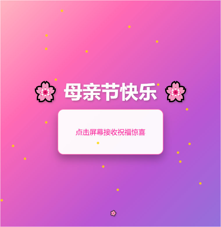
<h1>Happy Mother's Day</h1>
<div class="subtitle">母亲节快乐 · Joyeuse fête des mères</div>
<div class="floral-border"></div>
</header>
<div class="card">
<div class="message-box" id="messageTrigger">
<i class="fas fa-hand-pointer" style="font-size: 2rem; color: var(--secondary); margin-bottom: 1rem;"></i>
<p style="font-size: 1.5rem;">点击这里查看给妈妈的祝福</p>
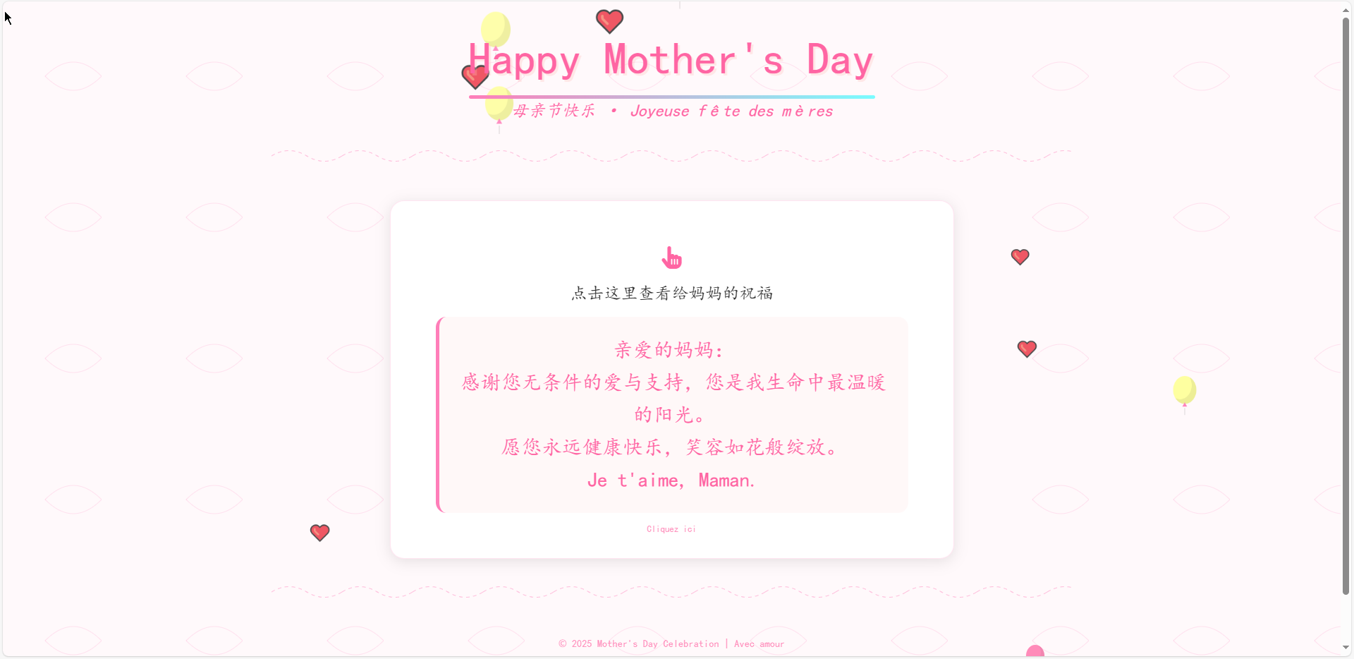
<div class="hidden-message" id="hiddenMessage">
<p>亲爱的妈妈:</p>
<p>感谢您无条件的爱与支持,您是我生命中最温暖的阳光。</p>
<p>愿您永远健康快乐,笑容如花般绽放。</p>
<p>Je t'aime, Maman.</p>
</div>
</div>
</div>
<div class="floral-border"></div>
<footer>
<p>© 2025 Mother's Day Celebration | Avec amour</p>
</footer>
</div>
<script>
document.addEventListener('DOMContentLoaded', function() {
// Create balloons
const balloonsContainer = document.getElementById('balloons-container');
const colors = ['#ff7eb9', '#ff65a3', '#7afcff', '#feff9c', '#fff740'];
for (let i = 0; i < 15; i++) {
const balloon = document.createElement('div');
balloon.className = 'balloon';
balloon.style.left = Math.random() * 100 + 'vw';
balloon.style.background = colors[Math.floor(Math.random() * colors.length)];
balloon.style.animationDuration = (6 + Math.random() * 7) + 's';
balloon.style.animationDelay = Math.random() * 5 + 's';
balloonsContainer.appendChild(balloon);
}
// Create floating hearts
const heartsContainer = document.getElementById('hearts-container');
for (let i = 0; i < 10; i++) {
const heart = document.createElement('div');
heart.className = 'heart';
heart.innerHTML = '❤️';
heart.style.left = Math.random() * 100 + 'vw';
heart.style.top = Math.random() * 100 + 'vh';
heart.style.animationDelay = Math.random() * 2 + 's';
heart.style.fontSize = (1 + Math.random() * 1.5) + 'rem';
heartsContainer.appendChild(heart);
}
// Message reveal
const messageTrigger = document.getElementById('messageTrigger');
const hiddenMessage = document.getElementById('hiddenMessage');
messageTrigger.addEventListener('click', function() {
if (hiddenMessage.style.display === 'block') {
hiddenMessage.style.display = 'none';
} else {
hiddenMessage.style.display = 'block';
// Create burst effect
for (let i = 0; i < 10; i++) {
const burstHeart = document.createElement('div');
burstHeart.className = 'heart';
burstHeart.innerHTML = '❤️';
burstHeart.style.position = 'absolute';
burstHeart.style.left = '50%';
burstHeart.style.top = '50%';
burstHeart.style.transform = 'translate(-50%, -50%)';
burstHeart.style.fontSize = (1 + Math.random() * 2) + 'rem';
burstHeart.style.animation = `fly-away ${1 + Math.random()}s ease-out forwards`;
const angle = Math.random() * Math.PI * 2;
const distance = 50 + Math.random() * 100;
burstHeart.style.setProperty('--end-x', Math.cos(angle) * distance + 'px');
burstHeart.style.setProperty('--end-y', Math.sin(angle) * distance + 'px');
document.body.appendChild(burstHeart);
setTimeout(() => {
burstHeart.remove();
}, 1000);
}
}
});
// Add burst animation
const style = document.createElement('style');
style.textContent = `
@keyframes fly-away {
to {
transform: translate(calc(-50% + var(--end-x)), calc(-50% + var(--end-y)));
opacity: 0;
}
}
`;
document.head.appendChild(style);
});
</script>
</body>
</html>
···


 扫一扫
扫一扫


 154
154

 被折叠的 条评论
为什么被折叠?
被折叠的 条评论
为什么被折叠?
 到【灌水乐园】发言


