


drawable文件夹下定义的xml有哪些作用?
首先,看看有哪些标签可以使用,一共有10类,我使用
Eclipse:Version: Luna Service Release 1a (4.4.1)。在xml中Ctrl+/可以看到以下内容。
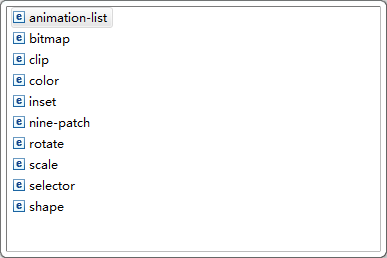
还有一类layer-list,上图没有显示出来,暂时还不知道为什么,这个标签用于图形叠加。
从最常用和最熟悉的说起:
1、shape标签
- 通常用于自定义控件背景,圆角、渐变、填充等静态背景效果。可以这种方法定义的图形,尽量选用这种方式,可以减小apk包大小。
摘抄:http://blog.csdn.net/ekeuy/article/details/12349853
2、使用示例
- shape文件中stroke使用效果,定义了一个红色边框
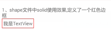
<?xml version="1.0" encoding="utf-8"?>
<shape xmlns:android="http://schemas.android.com/apk/res/android" >
    <!-- stroke就是定义的边框,这里指定边框宽度为1dip, -->
    <!-- 另外我们可以指定每个, -->
    <stroke
        android:width="1dip"
        android:color="@color/red" />
</shape>- 给TextView定义一个灰色背景,如果是纯色可以直接color,这里还是一试。另外试下shape文件中padding的用法。
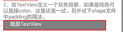
<?xml version="1.0" encoding="utf-8"?>
<shape xmlns:android="http://schemas.android.com/apk/res/android" >
    <!-- solid就一个颜色属性, -->
    <solid android:color="@color/gray" />
    <stroke
        android:width="2dp"
        android:color="@color/red" />
    <!--
         padding的作用时图形边框距内容的距离,padding值不包含边框宽度;这个属性应该用得比较少,因为控件本身就有类似控制属性。
        android:left    整型 左内边框距内容的距离
        android:top     整型 上内边框距内容的距离
        android:right   整型 右内边距
        android:bottom  整型 下内边距
    -->
    <padding android:left="20dp" />
</shape>- 3、给TextView定义一个白色背景,灰色圆角边框。
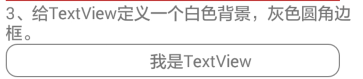
<?xml version="1.0" encoding="utf-8"?>
<shape xmlns:android="http://schemas.android.com/apk/res/android" >
    <!-- 这里灰色边框 -->
    <stroke
        android:width="1dp"
        android:color="@color/grey" />
    <!-- 每个角半径,数字越大,角就越圆 -->
    <corners android:radius="10dp" />
    <!-- 设置了左边距 -->
    <padding android:left="50dp"/>
</shape>- 4、给按钮定义一个从上到下渐变的背景色。
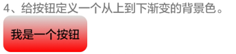
<?xml version="1.0" encoding="utf-8"?>
<shape xmlns:android="http://schemas.android.com/apk/res/android" >
    <corners android:radius="10dp" />
    <padding
        android:left="10dp"
        android:right="10dp" />
    <gradient
        android:angle="90"
        android:endColor="@color/backColor"
        android:startColor="@color/red" />
</shape>- 5、给按钮定义一个从上到下渐变的背景色并且点击时可以变化,。需要再定义一个点击时显示的背景色,还要用到selector
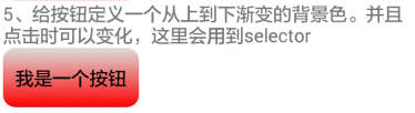
<?xml version="1.0" encoding="utf-8"?>
<selector xmlns:android="http://schemas.android.com/apk/res/android">
    <!--默认时显示背景-->
    <item android:drawable="@drawable/shape_file_use_demo_4"/>
    <!--点击时显示背景-->
    <item android:drawable="@drawable/shape_file_use_demo_5" android:state_pressed="true"/>
</selector>- shape_file_use_demo_5.xml
正常显示以第4示例中的背景来显示,点击时的背景人是调换了开始和结束的位置。
<?xml version="1.0" encoding="utf-8"?>
<shape xmlns:android="http://schemas.android.com/apk/res/android" >
    <corners android:radius="10dp" />
    <padding
        android:left="10dp"
        android:right="10dp" />
    <gradient
        android:angle="90"
        android:endColor="@color/red"
        android:startColor="@color/backColor" />
</shape>


 1452
1452


 被折叠的 条评论
为什么被折叠?
被折叠的 条评论
为什么被折叠?
 到【灌水乐园】发言


