


Drawable简介
Drawable都表示一种图像的概念,但又不全是图片,通过颜色也可以构造出各式各样的图像效果。在实际开发Drawable常被用来作为View的背景使用。Drawable一般通过XML来定义,我们也可以通过代码来创建具体的Drawable对象。在Android设计中,Drawable是一个抽象类,它是所有Drawable的基类。Drawable的内部宽高这个参数很重要,可以通过getIntrinsicWidth和getIntrinsicHeight获取。但不是所有Drawable都有内部宽高,比如一个颜色形成的Drawable就没有宽高的概念。要注意它的内部宽高不等同于它的大小,一般来说Drawable是没有大小概念的,当用作View的背景时,Drawable会被拉伸至View的同等大小。
Drawable的优点
Drawable是一个抽象的概念,它可以被canvas绘制,常见的有颜色和图片都可以是一个drawable。因为drawable可以做出一些特殊的ui效果,所以对比图片来说,它的优点如下:
1、首先,它的使用比较简单,在xml里已经定义了大量的属性方法,我们只要熟悉各个属性的ui效果和特点就可以自己组合各种的界面效果。
2、其次,它的实现成本比自定义View低,一些比较简单的、定制性、重复性的UI效果使用drawable将会缩小开发成本。但是一些比较复杂的ui场景,drawable却表现不出自定义view的那种效果。
3、相比较于图片而言,drawable占用空间更小,这样有利于缩小apk的体积。
Drawable与Bitmap对比
定义对比:
Bitmap:称作位图,一般的位图的文件格式扩展名为.bmp,当然编码器也有很多,RGB565,RGB8888,作为一种追个像素的显示对象,执行效率高,但是存储效率低,可以理解成一种存储对象
Drawable:Android下的通用的图片形象,它可以装载常用格式的图像,比如GIF,PNG,JPG,BMP,提供一些高级的可视化方法。
属性对比:
| 属性名 | Bitmap | Drawable |
| 显示清晰度 | 相同 | 相同 |
| 占用内存 | 大 | 小 |
| 支持缩放 | 是 | 是 |
| 支持色相色差的调整 | 是 | 否 |
| 支持旋转 | 是 | 是 |
| 支持透明色 | 是 | 是 |
| 绘制速度 | 慢 | 快 |
| 支持像素操作 | 是 | 否 |
绘图的便利性比较:
Drawable有很多的派生类,可以实现渐变,层叠的效果
Bitmap一般用来做空白画布来进行绘图
简易性比较:
Drawable是自带画笔的,更改画笔的属性是可以直接更新到ShapeDrawable上的,但是Drawable子类使用Canvas并不方便,只能用来完成一些固有的功能,如果要使用Drawable来绘图,可以自定义Drawable
Bitmap上可以按照之前绘制那样设置画笔,然后进行绘制
使用方式对比:
Bitmap主要靠在View中通过Canvas.drawBitmap()函数画出来
Drawable可以在View中通过Drawable.draw(Canvas canvas)函数画出来,也可以通过setImageBackground()、setBackgroundDrawable()来设置Drawable资源
总结:
Bitmap在占用内存和绘制速度上不如Drawable的优势
Bitmap绘图方便,Drawable调用paint方便调用canvas不方便
Drawable有一些子类,可以方便完成一些绘图功能
在View中需要自己生成图像时,才会使用Bitmap绘图,绘图后的结果保存在这个Bitmap中,比如根据Bitmap生成它的倒影,在使用Xfermode来融合倒转的图片原图与渐变的图片的时候,就需要根据图片的大小来生成一张同样大小的渐变图片,必须使用Bitmap
当使用Drawable的子类能完成一些固有的功能的时候,优先选择Drawable
当需要使用Drawable的setImageBackground(), setBackgroundDrawable()的设置drawable资源函数的时候,只能选择Draawable
当在自定义View中在指定位置显示图像功能的时候,既可以使用Drawable,也可以使用Bitmap
除drawable和bitmap以外的地方,都可以使用自定义View来实现
Drawable的分类介绍
Android中Drawable是一个抽象类,每个具体的Drawable都是其子类,Drawable的子类如下:
| Drawable分类 | 描述 |
|---|---|
| AnimationDrawable | 动画可绘制对象(AnimationDrawable),用于创建逐帧动画的可绘制对象。帧动画是一种比较传统的动画,它是由一系列不同的图像创建的,按照顺序播放,就像播放电影一样。 |
| BitmapDrawable | 位图可绘制对象(BimapDrawable)是 Android 的一种通用位图格式,我们可以简单粗暴地理解成 Bitmap 的另外一种表现形式。但是和 Bitmap 相比 BimapDrawable 占用资源更少、性能更高。 |
| ClipDrawable | 裁剪可绘制对象(ClipDrawable)根据level等级对可绘制对象进行裁剪,可以根据level与gravity来控制子可绘制对象的宽度与高度。 |
| ColorDrawable | 单色可绘制对象(ColorDrawable) 是最简单的Drawable,它包装了一种固定的颜色,当ColorDrawable被绘制到画布的时候会使用颜色填充Paint,在画布上绘制一块单色的区域。 |
| GradientDrawable | 渐变可绘制对象(GradientDrawable) 表示一个渐变区域,可以实现线性渐变、发散渐变和平铺渐变效果。 |
| InsertDrawable | 插入可绘制对象(InsetDrawable)以指定距离插入其他可绘制对象,当视图需要小于视图实际边界的背景时,此类可绘制对象很有用。 |
| LayerDrawable | 图层列表可绘制对象(LayerDrawable)是可绘制对象列表组成的可绘制对象。列表中的每个可绘制对象均按照列表顺序绘制,列表中的最后一个可绘制对象绘于顶部。 |
| LevelListDrawable | 级别列表可绘制对象(LevelListDrawable)管理可绘制对象列表,每个可绘制对象都有设置Level等级限制,当使用setLevel()时,会加载级别列表中 android:maxLevel 值大于或等于传递至方法的值的可绘制对象资源。 |
| TransitionDrawable | 转换可绘制对象(TransitionDrawable)可在两种可绘制对象资源之间交错淡出。 |
| StateListDrawable | 状态列表可绘制对象(StateListDrawable)会根据对象状态,使用多个不同的图像来表示同一个图形。 |
| ScaleDrawable | 缩放可绘制对象(ScaleDrawable)根据level等级来更改其可绘制对象大小。 |
| ShapeDrawable | 形状可绘制对象(ShapeDrawable)通过XML来定义各种形状的可绘制对象 |
AnimationDrawable(动画可绘制对象)
这个在介绍动画的时候介绍过了,这里就不再介绍了。
BitmapDrawable(位图可绘制对象)
BitmapDrawable叫做可绘制的位图文件,可以通过Java代码或者xml文件创建。
通过xml文件使用BitmapDrawable资源:
在Android Studio的“res/drawable”文件夹的右键菜单中,选择“New->Drawable resource file”,添加一个新的可绘制资源文件。
之后,在弹出的对话框中,设置资源文件的文件名,我设置的是bitmap_drawable,并且将资源文件的类型设置为“bitmap”。
键入如下代码:
<?xml version="1.0" encoding="utf-8"?>
<bitmap xmlns:android="http://schemas.android.com/apk/res/android"
    android:src="@drawable/minion1"
    android:antialias="true"
    android:dither="true"
    android:filter="true"
    android:gravity="center"
    android:tileMode="disabled"/>
【1】android:src
类型:Drawable resource。必需。 引用一个drawable resource.
【2】android:antialias
类型:Boolean。是否开启抗锯齿。开启后图片会变得更平滑些,因此一般建议开启,设置为true即可。
【3】android:dither
类型:Boolean。是否允许抖动,如果位图与屏幕的像素配置不同时,开启这个选项可以让高质量的图片在低质量的屏幕上保持较好的显示效果
(例如:一个位图的像素设置是 ARGB 8888,但屏幕的设置是RGB 565,开启这个选项可以是图片不过于失真)一般建议开启,为true即可。
【4】android:filter
类型:Boolean。是否允许对位图进行滤波。当图片被压缩或者拉伸时,使用滤波可以获得平滑的外观效果。一般建议开启,为true即可
【5】android:gravity
当图片小于容器尺寸时,设置此选项可以对图片经典定位,这个属性比较多,不同选项可以使用‘|’来组合使用。
【6】android:tileMode
定义平铺模式。当平铺模式启用时,位图会重复,且注意:一旦平铺模式启用, android:gravity 属性就将会被忽略,
disabled:默认值,表示不使用平铺
clamp:复制边缘色彩
repeat:X、Y 轴进行重复图片显示,也就是我们说要说的平铺
mirror:在水平和垂直方向上使用交替镜像的方式重复图片的绘制
android:src="@drawable/bitmap_drawable"通过Java代码使用BitmapDrawable:
首先,将要使用图片导入到Android Studio的“res/drawable”中。
然后在MainActivity中键入如下代码。
    void bitmapDrawable(){
        BitmapDrawable bitmapDrawable = (BitmapDrawable) ResourcesCompat.getDrawable(
                getResources(),R.drawable.minion2,null);
        ImageView imageView = findViewById(R.id.imageView1);
        imageView.setImageDrawable(bitmapDrawable);
    }
getResources()方法的作用是获取资源,并将其保存到Resources类的变量res中;ResourcesCompat类保存了指定ID的可绘制资源,getDrawable是该类的方法,返回可绘制资源,第一个参数指定了该项目的资源,第二个参数是要获取的可绘制资源的ID,第三个参数是可绘制资源的主题(theme),null表示不指定主题。通过以上代码,就可以获取导入的BitmapDrawable资源。
iv1是与图像视图控件关联的ImageView类的对象,通过setImageDrawable()方法设置该控件显示的位图,其中setImageDrawable()方法的参数drawable,就是之前获取到的BitmapDrawable资源。
最后在MainActivity的onCreate中调用bitmapDrawable就可以了。
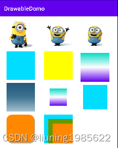
运行效果如下:
ClipDrawable(裁剪可绘制对象)
ClipDrawable是通过设置一个Drawable的当前显示比例来裁剪出另一张Drawable,我们可以通过调节这个比例来控制裁剪的宽高,以及裁剪内容占整个View的权重,通过ClipDrawable的setLevel()方法控制显示比例,ClipDrawable的level值范围在[0,10000],level的值越大裁剪的内容越少,当level为10000时则完全显示,而0表示完全裁剪,不可见。
在Android Studio的“res/drawable”文件夹的右键菜单中,选择“New->Drawable resource file”,添加一个新的可绘制资源文件。
之后,在弹出的对话框中,设置资源文件的文件名,我设置的是clip_drawable,并且将资源文件的类型设置为“clip”。
键入如下代码:
<?xml version="1.0" encoding="utf-8"?>
<clip xmlns:android="http://schemas.android.com/apk/res/android"
    android:drawable="@drawable/bitmap_drawable"
    android:clipOrientation="horizontal"
    android:gravity="center" />
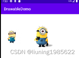
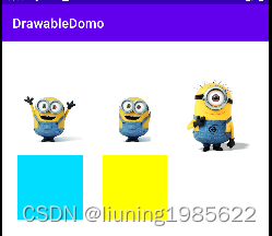
然后在MainActivity中键入如下代码:
  void clipDrawable(){
        ClipDrawable clipDrawable =  (ClipDrawable) ResourcesCompat.getDrawable(
                getResources(),R.drawable.clip_drawable,null);
        clipDrawable.setLevel(5000);


        ImageView imageView = findViewById(R.id.imageView2);
        imageView.setImageDrawable(clipDrawable);
    }
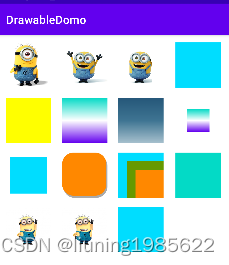
运行效果如下:

ColorDrawable(单色可绘制对象)
ColorDrawable 是最简单的Drawable,它实际上是代表了单色可绘制区域,它包装了一种固定的颜色,当ColorDrawable被绘制到画布的时候会使用颜色填充Paint,在画布上绘制一块单色的区域。 在xml文件中对应<color>标签,它只有一个android:color属性,通过它来决定ColorDrawable的颜色。
xml实现如下:
<?xml version="1.0" encoding="utf-8"?>
<color xmlns:android="http://schemas.android.com/apk/res/android"
    android:color="@android:color/holo_blue_bright"/>
也可以使用代码实现,注意传入的颜色值为16进制的数字:
    void colorDrawable(){
        ColorDrawable colorDrawable = new ColorDrawable(Color.YELLOW);


        ImageView imageView = findViewById(R.id.imageView5);
        imageView.setImageDrawable(colorDrawable);
    }
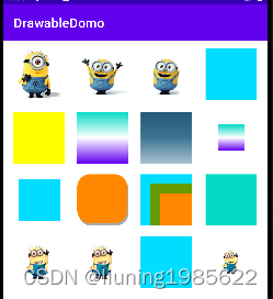
运行效果如下:
GradientDrawable(渐变可绘制对象)
GradientDrawable 表示一个渐变区域,可以实现线性渐变、发散渐变和平铺渐变效果,其对应的标签为<gtadient>一般都是配置shapeDrawable来使用,为其实现渐变颜色,代码实现GradientDrawable还可以设置边框,圆角,边框宽度等等,
xml实现如下:
<?xml version="1.0" encoding="utf-8"?>
<shape xmlns:android="http://schemas.android.com/apk/res/android"
    android:shape="rectangle">


    <gradient android:angle="90"
        android:startColor="@color/design_default_color_primary"
        android:centerColor="#fff"
        android:endColor="@color/design_default_color_secondary"
        android:type="linear"/>


</shape>
也可以使用代码实现:
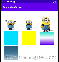
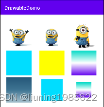
    void gradientDrawable(){
        int colors[] = {0xff255779, 0xff3e7492, 0xffa6c0cd};
        GradientDrawable gradientDrawable = new GradientDrawable(GradientDrawable.Orientation.TOP_BOTTOM,colors);


        ImageView imageView = findViewById(R.id.imageView7);
        imageView.setImageDrawable(gradientDrawable);
    }
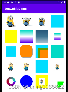
运行效果如下:
InsetDrawable(插入可绘制对象)
有时候我们可能需要为一个全屏的LinearLayout布局指定背景图,但我们不想让背景图充满屏幕,这时我们就需要使用到InsetDrawable了,InsetDrawable对应<inset>标签,它可以将其他Drawable内嵌到自己当中,并可以在四周预留出一定的间距。
当我们希望View的背景比实际区域小时,就可以采用InsetDrawable来实现。
xml实现如下:
<?xml version="1.0" encoding="utf-8"?>
<inset xmlns:android="http://schemas.android.com/apk/res/android"
    android:drawable="@drawable/gradient_drawable"
    android:insetBottom="20dp"
    android:insetLeft="20dp"
    android:insetRight="20dp"
    android:insetTop="20dp" />
也可以使用代码实现:
    void insetDrawable(){
        ColorDrawable colorDrawable = (ColorDrawable)ResourcesCompat.getDrawable(
                getResources(),R.drawable.color_drawable,null);
        InsetDrawable insetDrawable = new InsetDrawable(
                colorDrawable,20);


        ImageView imageView = findViewById(R.id.imageView9);
        imageView.setImageDrawable(insetDrawable);
    }
运行效果如下:
LayerDrawable(图层列表可绘制对象)
一个LayerDrawable是一个可以管理一组drawable对象的drawable。在LayerDrawable的drawable资源按照列表的顺序绘制,列表的最后一个drawable绘制在最上层。一个layer-list可以包含多个item,而每个item则表示一个Drawable。
我们可以利用LayerDrawable实现带阴影的圆角矩形。
xml实现如下:
<?xml version="1.0" encoding="utf-8"?>
<layer-list xmlns:android="http://schemas.android.com/apk/res/android">
    <item
        android:left="2dp"
        android:top="4dp">
        <shape>
            <solid android:color="@android:color/darker_gray"/>
            <corners android:radius="20dp"/>
        </shape>
    </item>


    <item
        android:bottom="4dp"
        android:right="2dp">
        <shape>
            <solid android:color="@android:color/holo_orange_dark"/>
            <corners android:radius="20dp"/>
        </shape>
    </item>
</layer-list>
也可以使用代码实现:
    void LayerDrawable(){
        ColorDrawable colorDrawable1 = (ColorDrawable)ResourcesCompat.getDrawable(
                getResources(),R.drawable.color_drawable1,null);
        ColorDrawable colorDrawable2 = (ColorDrawable)ResourcesCompat.getDrawable(
                getResources(),R.drawable.color_drawable2,null);
        ColorDrawable colorDrawable3 = (ColorDrawable)ResourcesCompat.getDrawable(
                getResources(),R.drawable.color_drawable3,null);
        Drawable[] drawables = new Drawable[3];
        drawables[0] = colorDrawable1;
        drawables[1] = colorDrawable2;
        drawables[2] = colorDrawable3;


        LayerDrawable layerDrawable = new LayerDrawable(drawables);
        layerDrawable.setLayerInset(0,0,0,0,0);
        layerDrawable.setLayerInset(1,40,40,0,0);
        layerDrawable.setLayerInset(2,80,80,0,0);


        ImageView imageView = findViewById(R.id.imageView11);
        imageView.setImageDrawable(layerDrawable);
    }
运行效果如下:
LevelListDrawable(级别列表可绘制对象)
LevelListDrawable对应于<level-list>标签,也表示一个Drawable的集合,但集合中的每个Drawable都一个等级。根据不同等级,LevelListDrawable会切换到相应的Drawable,实际上我们也很容易知道<level-list>标签中的每个Item各表示一个Drawable,并有与之对应的等级,而等级则是由android:maxLevel和android:minLevel所决定的,其等级范围是0-10000,最小为0,默认值,最大则为10000,还是一样的做法。
如下Domo在xml代码中利用LevelListDrawable创建2个item,在java代码设置ImageView的Resource为这个Drawable,然后创建子线程,每隔1秒切换一次item。
xml代码如下:
<?xml version="1.0" encoding="utf-8"?>
<level-list xmlns:android="http://schemas.android.com/apk/res/android">
    <item
        android:drawable="@color/design_default_color_primary"
        android:maxLevel="0" />
    <item
        android:drawable="@color/design_default_color_secondary"
        android:maxLevel="11" />


</level-list>
Java代码如下:
    void LevelListDrawable(){
        ImageView imageView = findViewById(R.id.imageView12);
        imageView.setImageResource(R.drawable.level_list_drawable);


        new Thread(new Runnable() {
            int imageLevel = 0;


            @Override
            public void run() {
                while (true) {
                    if (imageLevel == 0) {
                        imageLevel = 1;
                    } else {
                        imageLevel = 0;
                    }
                    imageView.setImageLevel(imageLevel);
                    try {
                        Thread.sleep(1000);
                    } catch (InterruptedException e) {
                        e.printStackTrace();
                    }
                }
            }
        }).start();
    }
运行后会看到ImageView颜色一秒钟切换一次。
TransitionDrawable(转换可绘制对象)
很多时候我们在实现渐变的动画效果时,都会使用到animation,但实际上我们有既简单又完美的解决方法,没错,它就是TransitionDrawable啦,TransitionDrawable用于实现两个Drawable之间的淡入淡出的效果。
如下Domo在xml代码中创建TransitionDrawable,添加2个item对应2个图片,然后在java代码中实现2个图片的渐变效果。
xml代码如下:
<?xml version="1.0" encoding="utf-8"?>
<transition xmlns:android="http://schemas.android.com/apk/res/android">
    <item android:drawable="@drawable/minion3" />
    <item android:drawable="@drawable/minion1" />
</transition>
Java代码如下:
    void TransitionDrawable(){
        TransitionDrawable transitionDrawable = (TransitionDrawable) ResourcesCompat.getDrawable(
                getResources(),R.drawable.transition_drawable,null);


        ImageView imageView = findViewById(R.id.imageView13);
        imageView.setImageDrawable(transitionDrawable);
        transitionDrawable.startTransition(4000);
    }
运行后会看到ImageView图片会渐变切换一次。
StateListDrawable(状态列表可绘制对象)
StateListDrawable对于xml的<selector>标签,这个标签可以说是我们最常用的标签了,在开发中,有时候我们需要一个View在点击前显示某种状态,而在点击后又切换到另外一种状态,这时我们就需要利用<selector>标签来实现啦。StateListDrawable本身也是表示Drawable的集合,每个Drawable就对于View的一种状态。
item的属性介绍如下:
| 属性 | 含义 |
|---|---|
| android:drawable | 该状态下要显示的图像,可以是Drawable也可以是图片 |
| android:state_pressed | 表示是否处于被按下状态 |
| android:state_focused | 表示是否已得到焦点状态 |
| android:state_hovered | 表示光标是否停留在View的自身大小范围内的状态 |
| android:state_selected | 表示是否处于被选中状态 |
| android:state_checkable | 表示是否处于可勾选状态 |
| android:state_checked | 表示是否处于已勾选状态,一般用于CheckBox |
| android:state_enabled | 表示是否处于可用状态 |
| android:state_active | 表示是否处于激活状态 |
| android:state_window_focused | 表示是否窗口已得到焦点状态 |
selector标签的属性含义如下:
| 属性 | 解析 |
|---|---|
| android:constantSize | StateListDrawable的固有大小是否随着其状态改变而改变,因为在状态改变后,StateListDrawable会切换到别的Drawable,而不同的Drawable其大小可能不一样。true表示大小不变,这时其固有大小是内容所有Drawable的固有大小的最大值。false则会随着状态改变而改变,默认值为false |
| android:variablePadding | 表示 StateListDrawable的padding是否随状态的改变而改变,默认值为false,一般建议设置为false就行。 |
| android:dither | 是否开启抖动效果,开启后可使高质量的图片在低质量的屏幕上仍然有较好的显示效果,一般建议开启,设置为true。 |
xml实现代码如下:
创建StateListDrawable的xml文件,文件内容如下:
<?xml version="1.0" encoding="utf-8"?>
<selector xmlns:android="http://schemas.android.com/apk/res/android"
    android:constantSize="true"
    android:variablePadding="false"
    android:dither="true">
    <item
        android:state_pressed="true"
        android:drawable="@drawable/minion3"/>
    <item android:drawable="@drawable/minion1"/>
</selector>
在要设置的View的xml需要追加如下语句,否则点击不好用:
android:clickable="true"Java实现代码如下:
void StateListDrawable(){
    Drawable normal = ResourcesCompat.getDrawable(
            getResources(),R.drawable.color_drawable1,null);
    Drawable pressed = ResourcesCompat.getDrawable(
            getResources(),R.drawable.color_drawable3,null);


    StateListDrawable stateListDrawable = new StateListDrawable();
    stateListDrawable.addState(new int[]{android.R.attr.state_pressed},pressed);
    stateListDrawable.addState(new int[]{},normal);


    ImageView imageView = findViewById(R.id.imageView15);
    imageView.setImageDrawable(stateListDrawable);
}
运行后当点中ImageView图片,图片会切换切换,松手后图片恢复。
ScaleDrawable(缩放可绘制对象)
ScaleDrawable对应<scale>标签,主要基于当前的level,对指定的Drawable进行缩放操作。有点需要特别注意的是我们如果定义好了ScaleDrawable,要将其显示出来的话,必须给ScaleDrawable设置一个大于0小于10000的等级(级别越大Drawable显示得越大,等级为10000时就没有缩放效果了)
android:gravity
当图片小于容器尺寸时,设置此选项可以对图片经典定位,这个属性比较多,不同选项可以使用‘|’来组合使用。
android:scaleHeight
表示Drawable的高的缩放比例,值越大,内部Drawable的高度显示得越小,例如android:scaleHeight=”70%”,那么显示时Drawable的高度只有原来的30%。
android:scaleWidth
表示Drawable的宽的缩放比例,值越大,内部Drawable的宽显示得越小,例如android:scaleWidth=”70%”,那么显示时Drawable的宽度只有原来的30%。
| 可选项 | 含义 |
|---|---|
| top | 将图片放在容器顶部,不改变图片大小 |
| bottom | 将图片放在容器底部,不改变图片大小 |
| left | 将图片放在容器左侧,不改变图片大小 |
| right | 将图片放在容器右侧,不改变图片大小 |
| center_vertical | 图片竖直居中,不改变图片大小 |
| fill_vertical | 图片竖直方向填充容器 |
| center_horizontal | 图片水平居中,不改变图片大小 |
| fill_horizontal | 图片水平方向填充容器 |
| center | 使图片在水平方向和竖直方向同时居中,不改变图片大小 |
| fill | 图片填充容器,默认值 |
| clip_vertical | 竖直方向剪切 |
| clip_horizontal | 水平方向剪切 |
xml代码如下:
<?xml version="1.0" encoding="utf-8"?>
<scale xmlns:android="http://schemas.android.com/apk/res/android"
    android:drawable="@drawable/minion1"
    android:scaleHeight="30%"
    android:scaleWidth="30%"
    android:scaleGravity="center">


</scale>
Java代码如下:
void ScaleDrawable(){
    ScaleDrawable scaleDrawable = (ScaleDrawable) ResourcesCompat.getDrawable(
            getResources(),R.drawable.scale_drawable,null);
    scaleDrawable.setLevel(1);


    ImageView imageView = findViewById(R.id.imageView16);
    imageView.setImageDrawable(scaleDrawable);
}
运行后效果如下:
ShapeDrawable(形状可绘制对象)
ShapeDrawable对于Xml的shape标签,在实际开发中我们经常将其作为背景图片使用,因为ShapeDrawable可以帮助我们通过颜色来构造图片,也可以构造渐变效果的图片。
从代码中我们可以看出Shape的子元素包括、<gradient>、<padding>、<size>、<solid>、<stroke>,我们一个个分析。
android:shape:这个属性表示图像的形状,可以是rectangle(矩形)、oval(椭圆)、line(横线)、ring(圆环)。默认为rectangle。
这里对于ring值还有几个相关的属性:
| 属性 | 含义 |
|---|---|
| android:innerRadius | 圆环的半径与android:innerRadiusRatio同时存在时,以android:innerRadius 为准 |
| android:innerRadiusRatio | 内半径占整个Drawable宽度的比例,默认值为9.如果为n,那么半径=宽度/n |
| android:thickness | 圆环的厚度,即外半径减去内半径的大小与android:thicknessRatio同时存在时以android:thickness为准 |
| android:thicknessRatio | 厚度占整个Drawable宽度比例,默认值为3,如果为n,那么厚度=宽度/n |
| android:useLevel | 一般都应该使用false,否则可能无法达到预期显示效果,除非它被当做LevelListDrawable来使用。 |
shape的实现效果
<corners>
指定边角的半径,数值越大角越圆,数值越小越趋近于直角,参数为:
<corners
android:radius="integer"
android:topLeftRadius="integer"
android:topRightRadius="integer"
android:bottomLeftRadius="integer"
android:bottomRightRadius="integer" />
Android:radius直接指定4个角的半径,另外4个属性可以单独设置4个角的角度.
<gradient>
设置颜色渐变与<solid>为互斥标签,因为solid表示纯色填充,而gradient表示渐变填充。
| 属性 | 含义 |
|---|---|
| android:angle | 渐变的角度,默认为0,其值务必为45°的倍数,0表示从左到右,90表示从下到上。 |
| android:centerX | 渐变中心点的横坐标 |
| android:centerY | 渐变的中心点的纵坐标,渐变中心点会影响渐变的具体效果。 |
| android:startColor | 渐变的开始颜色 |
| android:centerColor | 渐变的中间颜色 |
| android:endColor | 渐变的结束颜色 |
| android:gradientRadius | 渐变的半径,当android:type=”radial”有效 |
| android:useLevel | 一般为false |
| android:type | 渐变类别,linear(线性)为默认值,radial(径内渐变),sweep(扫描渐变) |
<solid>
表示纯色填充,通过android:color设置颜色即可。
<stroke>
描述边框,属性如下:
| 属性 | 含义 |
|---|---|
| android:width | 描述边框的宽度,数值越大,越边框越厚 |
| android:color | 边框的颜色 |
| android:dashWidth | 组成虚线的线段宽度 |
| android:dashGap | 组成虚线的线段之间的间隔,间隔越大,虚线看起的间隙就越大 |
<padding>
表示内容或子标签边距,4个属性top、bottom、left、right,需要注意的是这个标签的作用是为内容设置与当前应用此shape的View的边距,而不是设置当前View与父元素的边距。
<size>
设置背景大小,width和height俩属性。一般来说这个值不是shape的最终显示大小,因为shape作为背景时会根据View的大小而填充其背景,因此Shape的大小很多时候是View的大小决定的。
下面分别使用xml方式画一个圆环,使用JAVA方式画圆形、正方形、扇形。
xml实现方式代码如下:
<?xml version="1.0" encoding="utf-8"?>
<shape xmlns:android="http://schemas.android.com/apk/res/android"
    android:shape="ring"
    android:innerRadiusRatio="5"
    android:thicknessRatio="6"
    android:useLevel="false">


    <gradient
        android:startColor="@color/design_default_color_primary"
        android:centerColor="@color/design_default_color_error"
        android:endColor="@color/design_default_color_secondary"
        android:type="sweep"/>


</shape>
ShapeDrawable对象是需要与Shape对象进行关联的,所以如果使用第一个构造函数,必须使用ShapeDrawable.setShape(Shape shape)函数来设置 Shape对象,一般使用第二个构造函数。
Shape类是一个基类,draw()函数是一个虚函数,每个子类可以根据不同的需求来绘出不同的图形,所以构造ShapeDrawable并不能直接传递shape类型的队形,因为shape中没有实现draw(),而是需要传入已经实现了draw()函数的Shape类的派生类。
| 派生类 | 意义 |
|---|---|
| RectShape | 构造一个矩形Shape |
| ArcShape | 构造一个扇形Shape |
| OcalShape | 构造一个椭圆的Shape |
| RoundRectShape | 构造一个圆角矩形Shape, 可带有镂空矩形效果 |
| PathShape | 构造一个可根据路径绘制的Shape |
Java实现方式代码如下:
void OvalShapeDrawable(){
    ShapeDrawable shapeDrawable = new ShapeDrawable(new OvalShape());
    shapeDrawable.getPaint().setColor(Color.BLUE);
    Rect rect = new Rect();
    rect.top = 0;
    rect.left = 0;
    rect.bottom = 40;
    rect.right = 40;


    shapeDrawable.setBounds(rect);
    ImageView imageView = findViewById(R.id.imageView18);
    imageView.setBackground(shapeDrawable);
    imageView.setImageDrawable(shapeDrawable);
}


void RectShapeDrawable(){
    Drawable drawable = ResourcesCompat.getDrawable(
            getResources(),R.drawable.minion1,null);
    ScaleDrawable scaleDrawable = new ScaleDrawable(
            drawable,Gravity.CENTER,0.5f,0.5f);
    ShapeDrawable shapeDrawable = new ShapeDrawable(new RectShape());
    shapeDrawable.getPaint().setColor(Color.YELLOW);
    scaleDrawable.setLevel(1);


    Rect rect = new Rect();
    rect.top = 0;
    rect.left = 0;
    rect.bottom = 40;
    rect.right = 40;


    shapeDrawable.setBounds(rect);
    ImageView imageView = findViewById(R.id.imageView19);
    imageView.setBackground(shapeDrawable);
    imageView.setImageDrawable(scaleDrawable);
}


void ArcShapeDrawable(){
    ShapeDrawable shapeDrawable = new ShapeDrawable(new ArcShape(0,90));
    shapeDrawable.getPaint().setColor(Color.GREEN);
    Rect rect = new Rect();
    rect.top = 0;
    rect.left = 0;
    rect.bottom = 40;
    rect.right = 40;


    shapeDrawable.setBounds(rect);
    ImageView imageView = findViewById(R.id.imageView20);
    imageView.setBackground(shapeDrawable);
}
要注意最后都是调用 imageView.setBackground(shapeDrawable)来设置imageView的背景色,而不是imageView.setImageDrawable(shapeDrawable),用imageView.setImageDrawable(shapeDrawable)会无法显示。
但其他Drawable用imageView.setImageDrawable(Drawable)和imageView.setBackground(Drawable)都可以显示,但两者是有差别的。
setImageDrawable:代表以这个drawable的实际大小放到imageview中,不会拉伸或失真等情况,因为其是等比例缩放。 setBackgroundDrawable:代表以这个drawable的作为背景放到imageview中填充imageview的宽高,即ImageView多高多宽,drawable就相应放大至多宽多高。
实现效果如下:
Domo代码:


 1290
1290


 被折叠的 条评论
为什么被折叠?
被折叠的 条评论
为什么被折叠?
 到【灌水乐园】发言


