


正常的布局是块元素从上到下(因为占用一行)
内联元素从左到右.
但是flexbox是让子项目尽量的改变高度宽度,用最好的方式适应各种的设备。
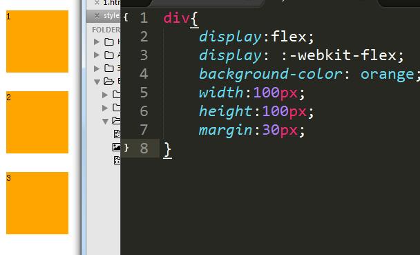
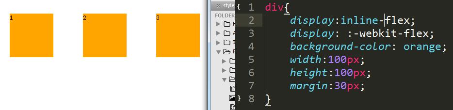
(1) Display: flex | inline-flex
flex: 按照 块 伸缩
inline-flex: 内联 伸缩
设为Flex布局以后,子元素的float、clear和vertical-align属性将失效。
【面试题】
除了display: inline block 将元素定义为块或者内联还有什么方法?
display:flex | inline-flex
(2) Display: flex-flow
flex-flow: flex-direction flex-wrap
伸缩方向 和 伸缩换行
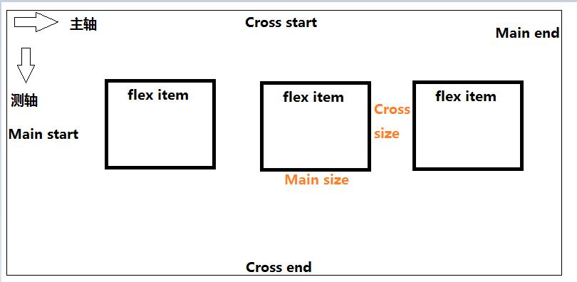
创建主轴
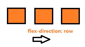
 flex-direction:
                row  从左到右
                row-reverse 从右到左
                column 从上到下
                column-reverse 从下到上
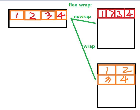
创建测轴
 flex-wrap: 单行还是多行
            nowrap 单行显示
            wrap   多行
            wrap-reverse 多行方向相反
(3) Justify-content
主轴对齐
   justify-content:
             flex-start 从起始位置
             flex-end
             center     从中间位置
             space-between
             space-around
(4) align-items align-self
测轴对齐方式: 与justify-content相对应
align-items
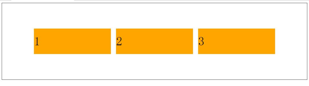
.div{
    display: flex;
    display: -webkit-flex;
    font-size:3em;

    text-align: center;/*文字水平居中*/
    line-height: 100px;/*文字垂直居中*/

    border:1px solid #333;
    min-width:1024px;
    height:300px;
    flex-flow:row nowrap;

    justify-content: center;/*水平居中*/
    align-items: center;/*垂直居中*/
}
p{
    width:300px;
    height:100px;
    margin:10px;
    background: orange;
    /*flex:1;*/
}
(5) order
伸缩文档出现的顺序
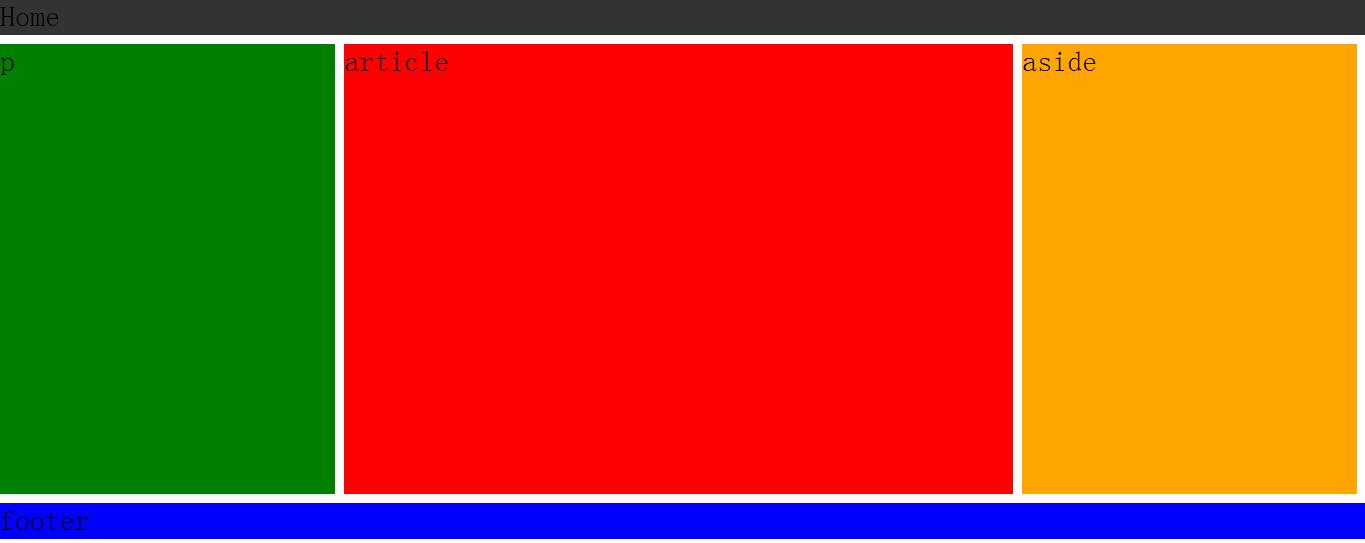
<div class="layout">
  <nav>Home</nav>

  <div class="center">
    <aside>aside</aside>
    <article>article</article>
    <div>p</div>
  </div>

  <footer>footer</footer>
</div>body,html,div,nav,footer,aside,article{
margin:0; padding:0;
}
.layout{
min-width: 1000px;
height:auto;
margin:0 auto;
font-size: 2em;
}
nav{
height:40px;
background-color: #333;
margin-bottom: 10px;
}
.center{
width:inherit;
height:500px;
display: flex;/**/
flex-flow:row no-wrap;
justify-content:flex-start;
order:1;/*顺序*/
}
/*.center*/
aside{
flex:1; /*占宽度为1/4*/
margin-right:10px;
background:orange;
order:3;/*顺序3*/
}
article{
flex:2;/*占宽度为1/2*/
margin-right:10px;
background:red;
order:2;/*顺序2*/
}
.center div:last-child{
flex:1;/*占宽度为1/4*/
margin-right:10px;
background:green;
order:1;/*顺序1*/
}
/*.center*/
footer{
height:40px;
margin-top:10px;
background-color: blue;
}
(6) 兼容性
display: box;             /* OLD - Android 4.4- */
display: -webkit-box;     /* OLD - iOS 6-, Safari 3.1-6 */
display: -moz-box;       /* OLD - Firefox 19- */
display: -ms-flexbox;     /* TWEENER - IE 10 */
display: -webkit-flex;   /* NEW - Chrome */
display: flex;           /* NEW,Opera 12.1, Firefox 20+ */


 扫一扫
扫一扫

 被折叠的 条评论
为什么被折叠?
被折叠的 条评论
为什么被折叠?
 到【灌水乐园】发言


