


一、字体图标
字体图标展示的是图标,本质是字体。处理简单的、颜色单一的小图标。
1.如何使用字体图标:
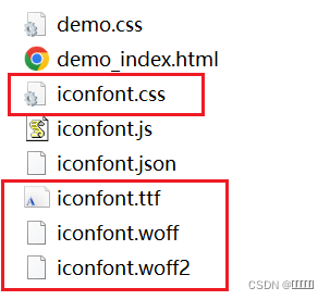
(一)将相关文件,复制至fonts文件夹中
(二)字体图标的使用
- 引入css文件
(1)本地链接引入
<!-- 引入字体图标的css文件 -->
<link rel="stylesheet" href="./fonts/iconfont.css">
(2) 线上链接引入
<!-- 注意:一如线上地址要加http: -->
<link rel="stylesheet" href="http://at.alicdn.com/t/font_3234864_h0da2uig6lr.css">- 调用字体图标的方式
(1)使用字体图标 – 类名:
 <!-- 如果是一个标签来使用字体文件,可以采取2个类名的形式。iconfont固定类名,不可更改(开发最常用) -->
<span class="iconfont icon-gouwuchekong"></span>-
第一个类名
iconfont目的是告诉这个盒子里面的文字是字体图标。 -
第二个类名
icon-daohangdizhi, 告诉盒子到底使用哪个小图标。
(2)使用unicode编码
<!-- 直接在标签内部放入一个编码 -->
<span class="iconfont"></span>(3)使用伪元素字体图
<link rel="stylesheet" href="./fonts/iconfont.css">
    <style>
        i::after{
            content: '\e600';
        }
        .two::after{
            content: '\e669';
        }
    </style>
</head>
<body>
    <i class="iconfont"></i>
    <i class="iconfont two"></i>

</body>
</html>
字体图标的综合应用(字体图标相当于字体,其颜色大小均可调整)
<!DOCTYPE html>
<html lang="en">
<head>
    <meta charset="UTF-8">
    <meta name="viewport" content="width=device-width, initial-scale=1.0">
    <meta http-equiv="X-UA-Compatible" content="ie=edge">
    <title>Document</title>
    <link rel="stylesheet" href="./fonts/iconfont.css">
    <style>
        .box{
            width: 100px;
            height: 60px;
            background-color: #ccc;
            text-align: center;
            line-height: 60px;
        }
        .one{
            color:#FF4200;
            font-size: 20px;
        }
        .two{
            color: rgb(54, 213, 224);
        }
    </style>
</head>
<body>
    <div class="box">
        <em class="iconfont icon-gouwuchekong one"></em>
        购物车
        <em class="iconfont icon-arrow-down two"></em>
    </div>
</body>
</html>
二、平面转换
改变盒子在平面内的形态(位移、旋转、缩放) 2D转换
平面转换属性 transform
(一)、位移
transform: translate(水平移动距离, 垂直移动距离);
  <style>
        .box {
            width: 400px;
            height: 400px;
            background-color: pink;
            /* 移动盒子 */
            /* margin-left: -100px; */
            /* 位移translate(X,Y); */
            /* transform: translate(-100px, 0); */
            /* 当Y轴为0时,是可以省略的 */
            /* transform: translate(-100px); */
            /* 位移translate(水平方向, 垂直方向)  记这个 */
            transform: translate(100px, 100px);
            /*位移translateX(水平方向) translateY垂直方向 */
            transform: translateX(100px) translateY(100px);
            /* 单方向写法 */
            /* transform: translateX(100px); */
        }
    </style>
</head>
<body>
    <div class="box"></div>
</body>
取值(正负均可)
- 像素(px)单位数值
- 百分比(参照物为盒子自身尺寸)
注意:X轴正向为右,Y轴正向为下
- translate()如果只给出一个值, 表示x轴方向移动距离
- 单独设置某个方向的移动距离:translateX() & translateY()
位移-绝对定位居中
方法一:
 <style>
        .father {
            position: relative;
            width: 800px;
            height: 800px;
            background-color: pink;
        }

        .father .son {
            position: absolute;
            /* 先移动父盒子宽的一半 */
            left: 50%;
            /* 在移动小盒子宽一半 */
            /* margin-left: -100px; */
            /* 位移 100%是自己大小,50%是自己大小的一半 */
            /* 先移动父盒子高的一半 */
            top: 50%;
            /* 在移动小盒子高的一半  */
            /* margin-top: -100px; */
            transform: translate(-50%, -50%);
            width: 200px;
            height: 200px;
            background-color: aqua;
        }
    </style>
</head>

<body>
    <div class="father">
        <div class="son"></div>
    </div>
</body>


方法二:
<style>
        .father {
            position: relative;
            width: 800px;
            height: 800px;
            background-color: pink;
        }

        .father .son {
            /* 1.先让盒子在原来的位置脱离标准流 */
            position: absolute;
            left: 0;
            top: 0;
            bottom: 0;
            right: 0;
            /* 2.通过margin:auto;4个方向全部auto盒子就可以居中 */
            margin: auto;
            width: 200px;
            height: 200px;
            background-color: aqua;
        }
    </style>
</head>

<body>
    <div class="father">
        <div class="son"></div>
    </div>
</body>
位移与margin的区别:
- margin的100%是浏览器的距离
- translate(100%)是自己原来位置的大小
- margin移动盒子会影响下面的元素
- transform: translate不会影响其他的元素
<!DOCTYPE html>
<html lang="en">

<head>
    <meta charset="UTF-8">
    <meta http-equiv="X-UA-Compatible" content="IE=edge">
    <meta name="viewport" content="width=device-width, initial-scale=1.0">
    <title>Document</title>
    <style>
        .box {
            width: 400px;
            height: 400px;
            background-color: pink;
            /* margin的100%是浏览器的距离 */
            margin-left: 100%;
        }

        .one {
            width: 400px;
            height: 400px;
            background-color: blue;
            /* transform: translateX(100%); */
            /* translate(100%)是自己原来位置的大小 */
            transform: translate(100%);
        }
    </style>
</head>

<body>
    <div class="box"></div>
    <div class="one"></div>
</body>

</html>
<!DOCTYPE html>
<html lang="en">

<head>
    <meta charset="UTF-8">
    <meta http-equiv="X-UA-Compatible" content="IE=edge">
    <meta name="viewport" content="width=device-width, initial-scale=1.0">
    <title>Document</title>
    <style>
        .box {
            width: 400px;
            height: 400px;
            background-color: pink;
            /* margin移动盒子会影响下面的元素 */
            /* margin-top: 50px; */
            /* transform: translateY(50px); */
            /*  transform: translate不会影响其他的元素 */
            transform: translate(0, 50px);
        }
    </style>
</head>

<body>
    <div class="box">

    </div>

    123
</body>

</html>
(二) 、旋转
语法 :transform: rotate(角度) 角度单位是deg
<!DOCTYPE html>
<html lang="en">

<head>
    <meta charset="UTF-8">
    <meta http-equiv="X-UA-Compatible" content="IE=edge">
    <meta name="viewport" content="width=device-width, initial-scale=1.0">
    <title>Document</title>
    <style>
        .box {
            width: 200px;
            height: 200px;
            border-radius: 50%;
            background-color: pink;
            /* 过渡 */
            transition: all 2s;
        }

        .box:hover {
            /* 旋转 rotate(角度)*/
            /* 360deg =1turn(一圈)*/
            transform: rotate(2turn);
        }

        .box img {
            width: 100%;
            height: 100%;
        }
    </style>
</head>

<body>
    <div class="box">
        <img src="./images/p4-tx3.png" alt="">
    </div>
</body>

</html>
取值正负均可
- 取值为正, 则顺时针旋转
- 取值为负, 则逆时针旋转
(三)、转换原点
默认圆点是盒子中心点 transform-origin: 原点水平位置 原点垂直位置;
<!DOCTYPE html>
<html lang="en">

<head>
    <meta charset="UTF-8">
    <meta http-equiv="X-UA-Compatible" content="IE=edge">
    <meta name="viewport" content="width=device-width, initial-scale=1.0">
    <title>Document</title>
    <style>
        .box {
            width: 400px;
            height: 400px;
            background-color: pink;
            margin: 200px auto;
            transition: all 1s;
            /* 改变旋转中心 transform-origin水平方向 垂直方向 */
            /* 方位名词: left左  right右 center居中 top上 bottom下 */
            /* transform-origin:right top; */
            /* px+百分比 */
            transform-origin: 400px 0px;
        }

        .box:hover {
            transform: rotate(2turn);
        }
    </style>
</head>

<body>
    <div class="box"></div>
</body>

</html>
三、渐变
渐变是多个颜色逐渐变化的视觉效果 一般用于设置盒子的背景 background-image
<!DOCTYPE html>
<html lang="en">

<head>
    <meta charset="UTF-8">
    <meta http-equiv="X-UA-Compatible" content="IE=edge">
    <meta name="viewport" content="width=device-width, initial-scale=1.0">
    <title>Document</title>
    <style>
        .box {
            width: 400px;
            height: 400px;
            /* 渐变色linear-gradient */
            /* 渐变色默认是从上到下 */
            /* background-image: linear-gradient(yellow, red, #000, green); */

            /* 渐变色从左到右 to改变他渐变方向*/
            /* to属性后面跟上方位名词 left左  right右 top上 bottom下 */

            /* background-image: linear-gradient(to top, yellow, red, blue); */

            /* 渐变色也可以通过角度来进进行设置 单位是deg */
            /* background-image: linear-gradient(45deg, yellow, red); */

            /* 用的最多的渐变色  从透明色变成半透明色使用的比较多 */

            background-image: linear-gradient(transparent, rgba(0, 0, 0, .5));
        }
    </style>
</head>

<body>
    <div class="box"></div>
</body>

</html>- 渐变色默认是从上到下 to可以改变渐变方向
- 渐变色也可以通过角度来进进行设置单位是deg
- 用的最多的渐变色是从透明色变成半透明色background-image: linear-gradient(transparent, rgba(0, 0, 0, .5));


 1666
1666


 被折叠的 条评论
为什么被折叠?
被折叠的 条评论
为什么被折叠?
 到【灌水乐园】发言


