


R语言在数理统计、数据分析以及数据可视化也是一把利器,但是,不管是使用它的人还是了解的人多不如Python多。然而,其实R语言也是一门优雅的语言,也可以很好的处理数据,并且充分进行可视化。下面,我们使用最近Kaggle上的一个数据集——奥运会120年历史,具体进行数据分析。
- 导入数据和R包
这里直接使用tidyverse包,这个包包含了几乎所有R处理数据的包,所以不用像Python一样导入很多包了。
# 设置工作目录
setwd("E:\\database\\120-years-of-olympic-history-athletes-and-results")
# 导入包
library(tidyverse)
# 查看工作目录下的文件
dir()
# 读取数据集
ath_events <- read_csv("athlete_events.csv")
noc_region <- read_csv("noc_regions.csv")
# 使用下面三个API查看一下数据集内容
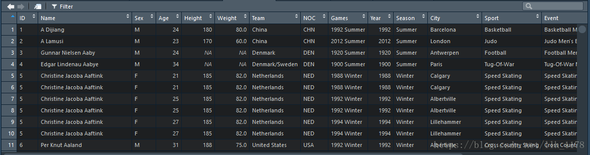
View(ath_events)
glimpse(ath_events)
View(noc_region)ath_events数据集
noc_region数据集
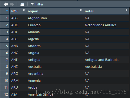
个人感觉R读取的数据集方式很不错,上面还有Filter选项和“上下三角形”可以直接进行数据集的筛选。
# 查看数据集一共有多少运动员参加,这里要注意一名运动员可能不单单参加一项比赛,所以,这里要用unique()函数。
length(unique(ath_events$ID))
接下来我们将两个数据集合并为一个数据集,Key为NOC这一列。
# 合并两个数据框
events <- ath_events %>%
  inner_join(noc_region, by = "NOC")
View(events)
head(events)
然后,对数据集进行一些预处理。
# 改变性别的表示方法
events$Sex <- str_replace(events$Sex, "F", "Female")
events$Sex <- str_replace(events$Sex, "M", "Male")
# 将Medal这列的NA值填充
events$Medal <- str_replace_na(events$Medal, "No Medal")
# 通过观察数据,发现ID不是唯一的,因为,每个人可能参加多个项目而且可能参加几届奥运会,所以,我们将ID转化为因子来处理(因子是唯一)。
ath_events$ID <- factor(ath_events$ID)
2.首先分析每届奥运会男女比例的变化
# 筛选出男性每届奥运会的人数
groupMale <- events %>%
  filter(Sex == "Male") %>%
  group_by(Year, Season) %>%
summarize(Number_Of_Men = n()) 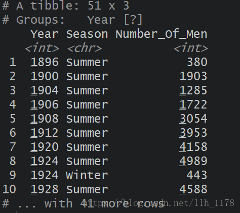
# 同样计算出女性的人数
groupFemale <- events %>%
  filter(Sex == "Female") %>%
  group_by(Year, Season) %>%
  summarise(Number_Of_Women = n())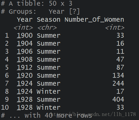
可以观察到女性最早参加奥运会是在1900年的夏季奥运会。
# 计算男女比例
(group <- groupMale %>%
  left_join(groupFemale) %>%
  mutate(Sex_Ratio = Number_Of_Men/Number_Of_Women))
# 将数据中比率这一列的NA填充。
group$Sex_Ratio[is.na(group$Sex_Ratio)] <- 175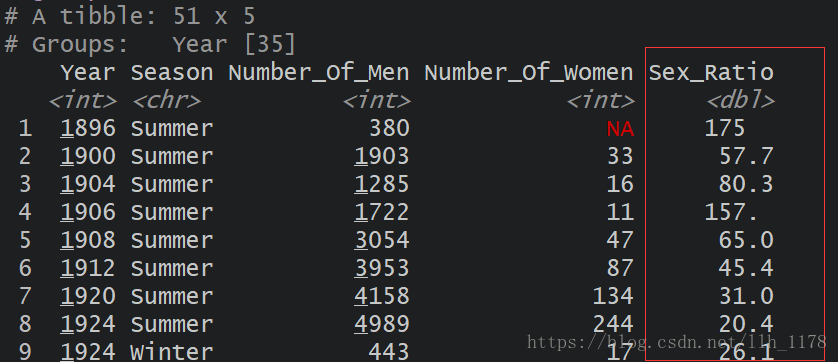
然后,我们就可以进行可视化了。
# 可视化
## 第一张整体上的趋势
p1 <- group %>%
  ggplot(aes(x = Year, y= Sex_Ratio, group = Season)) +
  geom_line(aes(color = Season)) +
  geom_point(aes(color = Season)) +
  theme_minimal() +
  labs(y = "Sex Ratio", title = "Sex Ratio in Olympics through the years") +
  xlab("") +
  theme(plot.title = element_text(hjust = 0.5))
## 第二张局部上的趋势
p2 <- group %>%
  filter(Year>1927) %>%
  ggplot(aes(x = Year, y= Sex_Ratio, group = Season)) +
  geom_line(aes(color = Season)) +
  geom_point(aes(color = Season)) +
  theme_minimal() +
  labs(x = "Year", y = "Sex Ratio", title = "Sex Ratio in Olympics through the years after 1927") +
  theme(plot.title = element_text(hjust = 0.5))


cowplot::plot_grid(p1,p2, ncol = 1,
                   align = 'h', axis = 'l')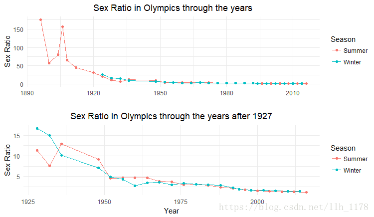
第二张图放大了1927年之后,奥运会上男女数量的变化趋势,总体上,现目前参加奥运会男女比例几乎接近于1:1,说明男尊女卑的思想越来越淡;平等、尊重是现代奥运会的主旨。
3.分析冬季或夏季奥运会与性别之间的关系
aths_sex <- ath_events %>%
          group_by(Season, Sex) %>%
          count(ID) %>%
          summarise(Count = n()) %>%
          mutate(Percentage = round(Count * 100 / sum(Count)))
aths_sex
然后,进行数据可视化。
# 可视化
aths_sex %>%
  ggplot(aes(x= Season, y= Percentage, fill = Sex)) +
  geom_bar(stat = "identity", position=position_dodge()) +
  geom_label(aes(label=Percentage), position=position_dodge(0.9))+
  ggtitle("Total number of Female Athlete and Male Athlete in 1896-2016") +
  labs(y = "Precentage(%)") +
  theme_minimal() +
  theme(plot.title = element_text(hjust = 0.5, face = "bold"))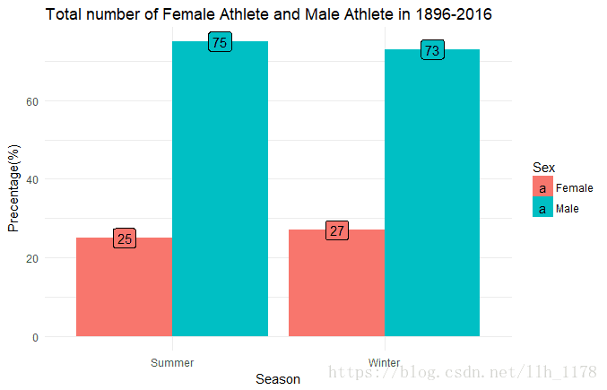
从图中的性别比例,可以看出女性参加冬季奥运会要多一点点;男性参加夏季奥运会要多一点点,总体差异不大。
4.从总体上分析每届奥运会参加的人员数量
# 每届奥运会的运动员数量变化
aths_year <- events %>%
              group_by(Year, Season) %>%
              count(ID) %>%
              summarise(Num_Participants = n())
aths_year

# 可视化
aths_year %>%
  ggplot(aes(x = Year, y = Num_Participants, group = Season)) +
  geom_line(aes(color = Season), size = 1.2) +
  geom_point(aes(color = Season), size = 2.8) +
  labs(x = "Year", y = "Number of Participants", title = "Number of participants during the olympics") +
  theme_minimal() +
  theme(plot.title = element_text(hjust = 0.5)) +
scale_x_continuous(breaks = seq(1896, 2017, 8)) 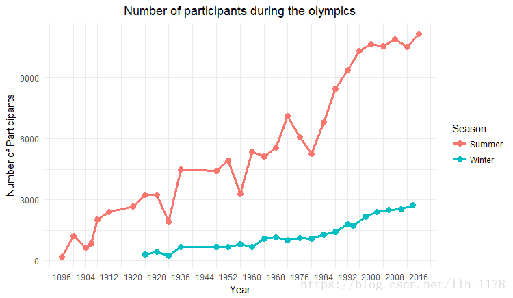
从图中可以观察到,参加夏季奥运会的人数远远多于冬季的人数,因为,可能是比赛项目少的原因。另外,我们还可以观察到,1936年到1948年之间没有举行奥运会,同样的还有1912年到1920年之间也没有举行奥运会,这是因为,二战(1939年9月1日—1945年9月2日)和一战(1914年8月—1918年11月)的原因取消了奥运会比赛。
5.奥运会的比赛项目变化
# 随时间变化,奥运会项目的变化情况。
counts <- events %>%
  group_by(Year, Season) %>%
  summarise(
    Events = length(unique(Event)),
    Nations = length(unique(NOC))
  )
counts

# 可视化
## 比赛项目变化
p1 <- counts %>%
  ggplot(aes(Year, Events, group = Season, color = Season)) +
  geom_point(size=2) +
  geom_line() +
  theme_minimal() +
  labs(y = "Events", title = "The number of events and nations have changed over time") +
  xlab("") +
  theme(plot.title = element_text(hjust = 0.5))
## 参加比赛的国家变化
p2 <- counts %>%
  ggplot(aes(Year, Nations, group = Season, color = Season)) +
  geom_point(size=2) +
  geom_line() +
  theme_minimal() +
  ylab("Nations") +
  xlab("Year") +
  theme(plot.title = element_text(hjust = 0.5)) +
  annotate("text", x = c(1976, 1980),
           y = c(105, 70),
           label = c("Montreal 1976", "Moscow 1980"),
           size = 3
           )
cowplot:: plot_grid(p1, p2, ncol = 1)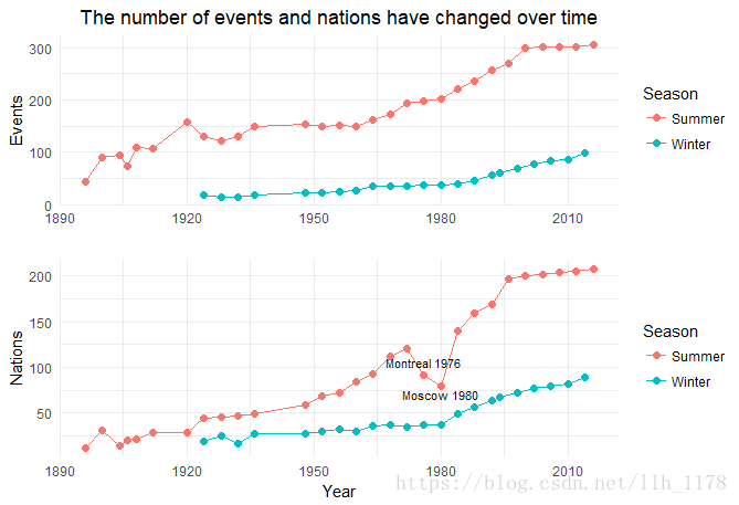
第一张图是关于奥运会比赛项目的,可以看出在1980-2000年这20年,比赛项目增长趋势最大,且以夏季奥运会尤为突出,但,最近十几年比赛项目增加趋势慢慢变为平稳的态势了;第二张图是关于参加奥运会国家数量的变化趋势的,其中有两届奥运会存在变化的。
1976年蒙特利尔奥运会:由于25个国家,其中大部分是非洲人,抵制奥运会,抵制南非的种族隔离政策。1980年的夏季奥运会上,非洲国家在夏季奥运会上的出席人数有限,因此参加了1980年的冬季奥运会。奥运会史上的种族歧视事件。
1980年莫斯科奥运会:为了应对苏联入侵阿富汗,包括美国在内的66个国家抵制参加奥运会。政治事件对奥运会的影响也是颇深的。
6.分析各个国家所得奖牌的数目
## 金牌
(gold_num <- events %>%
  group_by(Team, Medal) %>%
  filter(!is.na(Medal)) %>%
  summarise(
    aths_num = length(unique(ID))
  ) %>%
  filter(Medal == "Gold") %>%
  arrange(desc(aths_num)) %>%
  filter(aths_num >= 200))
gold_num$Team <- factor(gold_num$Team, levels=gold_num$Team)
#银牌
(silver_num <- events %>%
    group_by(Team, Medal) %>%
    filter(!is.na(Medal)) %>%
    summarise(
      aths_num = length(unique(ID))
    ) %>%
    filter(Medal == "Silver") %>%
    arrange(desc(aths_num)) %>%
    filter(aths_num >= 200))
silver_num$Team <- factor(silver_num$Team, levels=silver_num$Team)
# 铜牌
(bronze_num <- events %>%
    group_by(Team, Medal) %>%
    filter(!is.na(Medal)) %>%
    summarise(
      aths_num = length(unique(ID))
    ) %>%
    filter(Medal == "Bronze") %>%
    arrange(desc(aths_num)) %>%
    filter(aths_num >= 200))
bronze_num$Team <- factor(bronze_num$Team, levels=bronze_num$Team)

## 可视化
w1 <- gold_num %>%
  ggplot(aes(Team, aths_num)) +
  geom_bar(stat = "identity", fill = "gold1") +
  xlab("") +
  ylab("number of athletes") +
  theme_minimal() +
  ggtitle("Historical Gold counts from events of Olympic") +
  theme(axis.text.x = element_text(face = "bold", angle = 30),
        axis.title.y = element_text(face = "bold", size = 12),
        plot.title = element_text(hjust = 0.5)) +
  geom_text(aes(y = aths_num, label = aths_num), vjust = 1.5, color = "white", size = 4, fontface = "bold")


w2 <- silver_num %>%
  ggplot(aes(Team, aths_num)) +
  geom_bar(stat = "identity", fill = "gray70") +
  xlab("") +
  ylab("number of athletes") +
  theme_minimal() +
  ggtitle("Historical Silver counts from events of Olympic") +
  theme(axis.text.x = element_text(face = "bold", angle = 30),
        axis.title.y = element_text(face = "bold", size = 12),
        plot.title = element_text(hjust = 0.5)) +
  geom_text(aes(y = aths_num, label = aths_num), vjust = 1.5, color = "white", size = 4, fontface = "bold")

w3 <- bronze_num %>%
  ggplot(aes(Team, aths_num)) +
  geom_bar(stat = "identity", fill = "gold4") +
  xlab("Team") +
  ylab("number of athletes") +
  theme_minimal() +
  ggtitle("Historical Bronze counts from events of Olympic") +
  theme(axis.text.x = element_text(face = "bold", angle = 30),
        axis.title.y = element_text(face = "bold", size = 12),
        axis.title.x = element_text(face = "bold", size = 12),
        plot.title = element_text(hjust = 0.5)) +
  geom_text(aes(y = aths_num, label = aths_num), vjust = 1.5, color = "white", size = 4, fontface = "bold")

cowplot::plot_grid(w1, w2, w3, ncol = 1)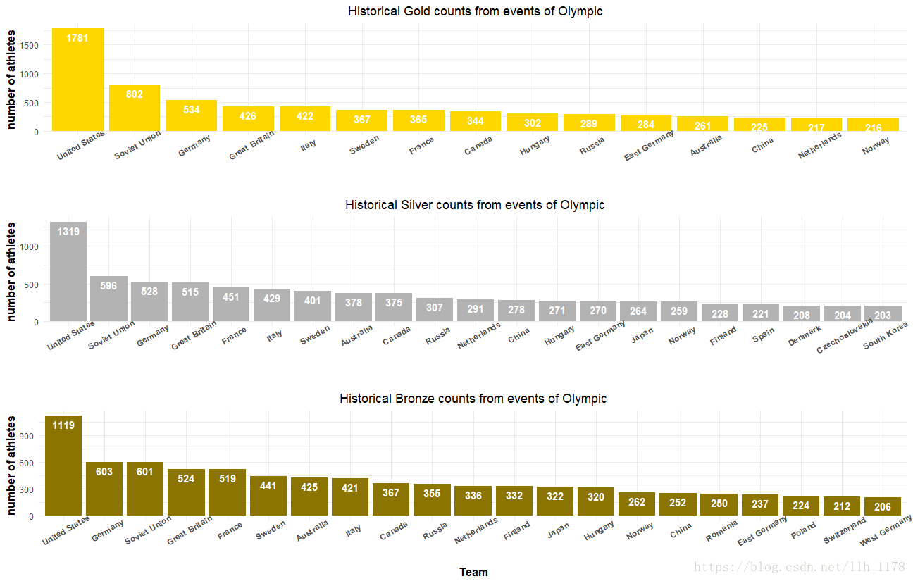
我选取了获得奖牌数目大于200的21个国家,通过比较发现美国不管是金牌、银牌还是铜牌都领先很多,而我们国家可能因为各种原因耽误了好多届奥运会,所以奖牌数量不多,但是,近些年我们国家在奥运会上获得的奖牌数量明显增多,接下来,我们就分析一下2008年北京奥运会的奖牌数量。
## 2008年奥运会的奖牌情况

counts_2008 <- events %>%
  filter(Year==2008, !is.na(Medal), Sport != "Art Competitions") %>%
  group_by(Team, Medal) %>%
  summarize(Count=length(Medal)) %>%
  filter(Count >= 20)
counts_2008

# 排序国家奖牌数
levs_2008 <- counts_2008 %>%
  group_by(Team) %>%
  summarize(Total=sum(Count)) %>%
  arrange(Total) %>%
  select(Team)
counts_2008$Medal <- factor(counts_2008$Medal, levels=c("Gold", "Silver", "Bronze"))
counts_2008$Team <- factor(counts_2008$Team, levels=levs_2008$Team)


# Plot 2008
ggplot(counts_2008, aes(x=Team, y=Count, fill=Medal)) +
  geom_bar(stat = "identity") +
  theme_minimal() +
  scale_fill_manual(values=c("gold1","gray70","gold4")) +
  ggtitle("Medal counts at the 2008 Olympics") +
  theme(plot.title = element_text(hjust = 0.5))

counts_2008
# tian jia zhu shi
ce <- arrange(counts_2008, desc(Team), desc(Medal))
ce <- data.frame(ce)
ce
new <- data.frame(ce[order(ce[,1]),], p=unlist(tapply(ce[,3],ce[,1],cumsum)))
new
ggplot(new, aes(x=Team, y=Count, fill=Medal)) +
  geom_bar(stat = "identity") +
  theme_minimal() +
  scale_fill_manual(values=c("gold1","gray70","gold4")) +
  geom_text(aes(y = p, label = Count), hjust = 1.5, color = "white", size = 4, fontface = "bold") +
  ggtitle("Medal counts at the 2008 Olympics") +
  theme(plot.title = element_text(hjust = 0.5),
        axis.text.x = element_text(face = "bold"),
        axis.title.y = element_text(face = "bold", size = 12),
        axis.title.x = element_text(face = "bold", size = 12)) +
  labs(y = "Number of Medal", x = "Country") +
  coord_flip()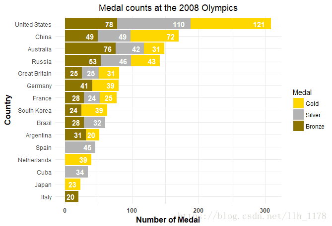
我们在08年北京奥运会上排名第二,只是跟美国的差距还是有一段的,但是,也可以看出我们国家运动员水平已经有了很大部分的提升了。
7.分析参加奥运会的选手年龄
### 最小年龄
cat("The minimum age of the athletes in the modern olympics is", min(events$Age, na.rm = TRUE))
The minimum age of the athletes in the modern olympics is 10
### 最大年龄
cat("The maximum age of the athletes in the modern olympics is", max(events$Age, na.rm = TRUE))
The maximum age of the athletes in the modern olympics is 97
### 最多年龄
# 计算众数
getmode <- function(v) {
  uniqv <- unique(v)
  uniqv[which.max(tabulate(match(v, uniqv)))]
}

ages <- select(events, Age) %>%
  filter(!is.na(Age))
ages <- unlist(ages)

cat("The mode age of the athletes in the modern olympics is", getmode(ages))
The mode age of the athletes in the modern olympics is 23
计算年龄的分布
age_density <- events %>%
  group_by(Age) %>%
  summarize(
    Age_num = n()
  )
计算奖牌与年龄的关系
medal_age_density <- events %>%
  group_by(Age, Medal) %>%
  summarize(
    Age_num = n()
  )
medal_age_density
可视化:
p1 <- events %>%
  ggplot(aes(x = Age)) +
  geom_density(color = "black", fill = "tomato") +
  labs(x = "Age", title = "Distribution of Age") +
  theme_minimal() +
  xlab("") +
  theme(plot.title = element_text(hjust = 0.5))

p2 <- events %>%
  ggplot(aes(x=Age, fill=Medal)) +
  geom_density(alpha=0.4) +
  labs(x = "Age", title = "Distribution of Age by Medal") +
  theme_minimal()+
  theme(plot.title = element_text(hjust = 0.5))

cowplot::plot_grid(p1,p2, ncol = 1,
                   align = 'h', axis = 'l')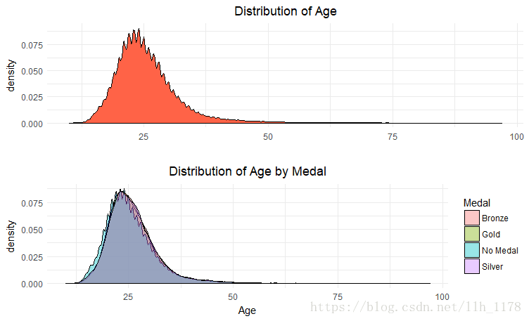
从图大致可以看出,运动员参加奥运会的年龄主要集中在13-37岁之间,而获得奖牌的的几率与年龄分布大致相同,意思就是哪区段的年龄人数多,获奖的概率也大,这跟具体是什么年龄没有本质上的关系。
8.分析运动员的身高体重
## 身高、体重随时间的变化
data <- events %>%
  filter(!is.na(Height), !is.na(Weight), Year > 1959)

p1 <- data %>%
  ggplot(aes(as.factor(Year), y = Weight, fill = Sex)) +
  geom_boxplot(alpha = .4) +
  labs(title = "Distribution of Weight") +
  xlab("") +
  theme_minimal()+
  theme(plot.title = element_text(hjust = 0.5))

p2 <- data %>%
  ggplot(aes(as.factor(Year), y = Height, fill = Sex)) +
  geom_boxplot(alpha = .8) +
  labs(x = "Year", title = "Distribution of Height") +
  theme_minimal()+
  theme(plot.title = element_text(hjust = 0.5))
cowplot::plot_grid(p1, p2, ncol = 1)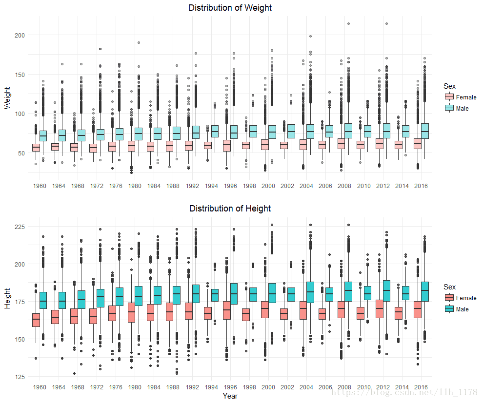
接着,我们在来看身高、体重之间的关系
data %>%
  ggplot(aes(x = Weight, y = Height, color = Sex)) +
  geom_point(alpha = .2, position = "jitter") +
  stat_smooth(method = lm, se = FALSE) +
  theme_minimal() +
  ggtitle("Distribution of Weight and Height") +
  theme(plot.title = element_text(hjust = 0.5))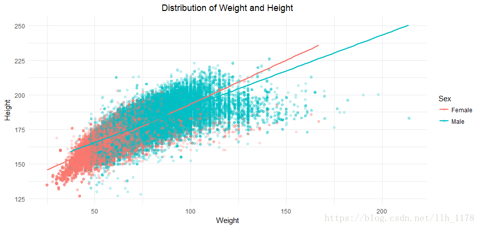
通过身体和体重的分布,预测了不同性别的身高体重趋势。
最后,随便看看身高、体重分别与奖牌之间的分布
medal_weight_density <- data %>%
  group_by(Weight, Medal) %>%
  summarize(
    Weight_num = n()
  )
medal_weight_density

medal_height_density <- data %>%
  group_by(Height, Medal) %>%
  summarize(
    height_num = n()
  )
medal_height_density

p1 <- data %>%
  ggplot(aes(x=Weight, fill=Medal)) +
  geom_density(alpha = .3) +
  labs(title = "Distribution of Weight by Medal") +
  theme_minimal()+
  xlab("") +
  theme(plot.title = element_text(hjust = 0.5)) +
  scale_x_continuous(breaks = seq(25, 220, 25))

p2 <- data %>%
  ggplot(aes(x = Height, fill = Medal)) +
  geom_density(alpha = .3) +
  labs(x = "Height", title = "Distribution of Height by Medal") +
  theme_minimal()+
  theme(plot.title = element_text(hjust = 0.5)) +
  scale_x_continuous(breaks = seq(127, 230, 15))
cowplot::plot_grid(p1, p2, ncol = 1)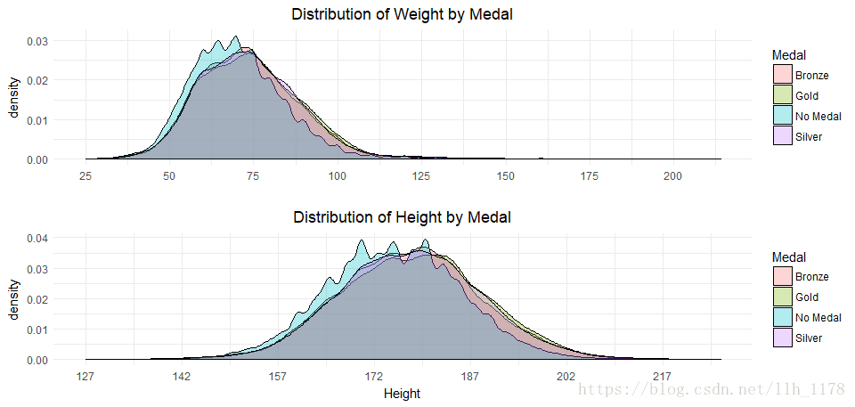
从图中大致可以看出:体重75左右,身高在180左右获得奖牌的可能性最大。
9.分析运动项目与奖牌获得数之间关系
在分析运动项目时,应该考虑每一届的奥运会项目可能不一样,所以,我们将没有的项目当做没有人参加,用0表示。最后,使用热图来展示分布的情况。
1. 参加每种项目的人数

2.每种项目获奖的人数
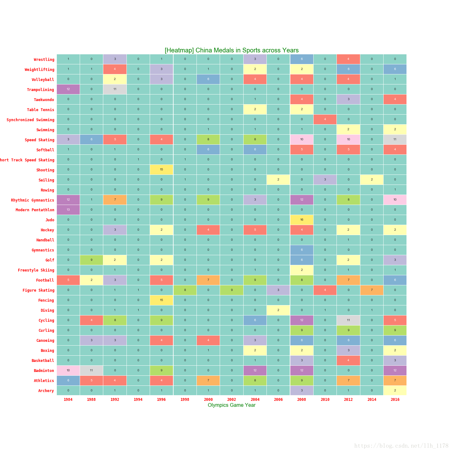
至此,对奥运会的历史数据分析告一段落,有想要自己分析数据的,可以在Kaggle上下载。谢谢阅读,请多多指教!


 4042
4042

 被折叠的 条评论
为什么被折叠?
被折叠的 条评论
为什么被折叠?
 到【灌水乐园】发言


