


节点 Node
LogicFlow 内置了一些基础节点,开发者在实际应用场景中,可以基于这些基础节点,定义符合自己业务逻辑的节点。
认识基础节点
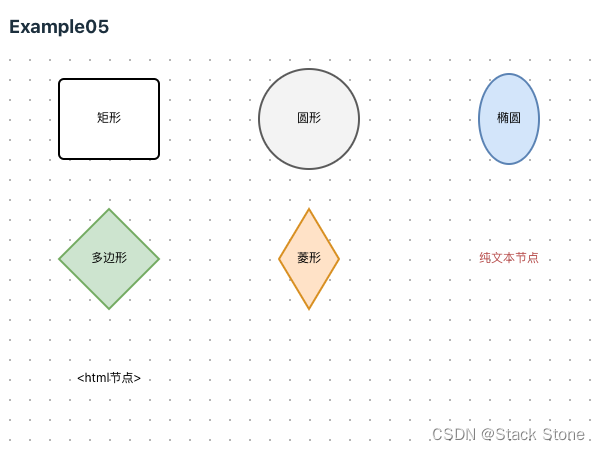
LogicFlow是基于svg做的流程图编辑框架,所以我们的节点和连线都是svg基本形状,对LogicFlow节点样式的修改,也就是对svg基本形状的修改。LogicFlow内部存在7中基础节点,分别为:
如下所示:
LogicFlow 的基础节点是比较简单的,但是在业务中对节点外观要求可能有各种情况。LogicFlow提供了非常强大的自定义节点功能,可以支持开发者自定义各种节点。下面是基于继承的自定义节点介绍。
自定义节点
LogicFlow是基于继承来实现自定义节点、边。开发者可以继承LogicFlow内置的节点,然后利用面向对象的重写机制。重写节点样式相关的方法,来达到自定义节点样式的效果。
注意:
LogicFlow推荐在实际应用场景中,所有的节点都使用自定义节点,将节点的type定义为符合项目业务意义的名称。而不是使用圆形、矩形这种仅表示外观的节点。
节点 model 和 view
在自定义一个节点的时候,我们需要定义节点的model和view。这是因为LogicFlow基于MVVM模式,需要通过重写定义model上获取样式相关的方法和重写view上的getShape来定义更复杂的节点外观。
在项目目录 src/views/Example/LogicFlow/component 下分别创建以下代码:
src/views/Example/LogicFlow/component/CustomCircle/index.ts// 从 @logicflow/core 引入相关的类 import { CircleNode, // 基础圆形节点视图 CircleNodeModel, // 基础圆形节点模型 GraphModel, // 图形模型,用于管理和操作图形 NodeConfig // 节点配置类型定义 } from '@logicflow/core' // 定义一个自定义的圆形节点模型类,继承自 CircleNodeModel class CustomCircleModel extends CircleNodeModel { // 构造函数 constructor(data: NodeConfig, graphModel: GraphModel) { // 调整节点的文本配置,确保文本与节点位置保持一致 data.text = { value: data.text as string, // 强制将文本内容视为字符串 x: data.x, // 设置文本的 x 坐标为节点的 x 坐标 y: data.y // 设置文本的 y 坐标为节点的 y 坐标 } // 调用父类的构造函数,完成节点模型的初始化 super(data, graphModel) } } // 导出自定义节点的配置,用于在 LogicFlow 中注册和使用这种节点 export default { type: 'CustomCircle', // 自定义节点类型的唯一标识 view: CircleNode, // 视图使用基础的圆形节点视图 model: CustomCircleModel // 模型使用上面定义的自定义圆形节点模型 }src/views/Example/LogicFlow/component/CustomDiamond/index.ts// 从 @logicflow/core 引入必要的类 import { DiamondNode, // 基础菱形节点的视图 DiamondNodeModel, // 基础菱形节点的模型 GraphModel, // 图形模型,用于图的管理和操作 NodeConfig // 节点配置类型定义 } from '@logicflow/core' // 创建一个自定义的菱形节点模型类,继承自 DiamondNodeModel class CustomDiamondModel extends DiamondNodeModel { // 构造函数 constructor(data: NodeConfig, graphModel: GraphModel) { // 在调用父类构造函数前,初始化文本属性 data.text = { value: data.text as string, // 强制类型转换,确保文本值为字符串 x: data.x, // 设置文本的 x 坐标与节点 x 坐标一致 y: data.y + 40 // 设置文本的 y 坐标,使其在节点下方40像素处 } // 调用父类的构造函数进行初始化 super(data, graphModel) // 设置自定义的半径属性,控制菱形的宽高 this.rx = 50 // 水平方向的半径(即半宽) this.ry = 20 // 垂直方向的半径(即半高) } } // 导出自定义节点的配置,使其可以在 LogicFlow 中使用 export default { type: 'CustomDiamond', // 自定义节点类型的唯一标识 view: DiamondNode, // 视图使用基础的菱形节点视图 model: CustomDiamondModel // 模型使用上面定义的自定义菱形节点模型 }src/views/Example/LogicFlow/component/CustomEllipse/index.ts// 从 @logicflow/core 库中导入所需的类 import { EllipseNode, // 基础椭圆形节点的视图类 EllipseNodeModel, // 基础椭圆形节点的模型类 GraphModel, // 用于管理图的整体模型 NodeConfig // 节点配置接口 } from '@logicflow/core' // 定义一个自定义的椭圆形节点模型类,继承自 EllipseNodeModel class CustomEllipseModel extends EllipseNodeModel { // 构造函数 constructor(data: NodeConfig, graphModel: GraphModel) { // 检查文本数据是否存在且为字符串,如果是,则设置文本属性 if (data.text && typeof data.text === 'string') { data.text = { value: data.text, // 设置文本值 x: data.x, // 设置文本的 x 坐标为节点的 x 坐标 y: data.y + 40 // 设置文本的 y 坐标为节点的 y 坐标向下偏移40像素 } } // 调用父类构造函数进行初始化 super(data, graphModel) // 设置自定义的椭圆大小属性 this.rx = 50 // 椭圆的水平半径 this.ry = 20 // 椭圆的垂直半径 } } // 导出自定义节点的配置 export default { type: 'CustomEllipse', // 自定义节点的类型标识 view: EllipseNode, // 使用基础椭圆形节点的视图 model: CustomEllipseModel // 使用定义的自定义椭圆形节点模型 }src/views/Example/LogicFlow/component/CustomPolygon/index.ts// 从 @logicflow/core 库导入所需的类和类型 import { PointTuple, PolygonNode, PolygonNodeModel } from '@logicflow/core' // 定义一个自定义多边形节点模型类,继承自 PolygonNodeModel class CustomPolygonModel extends PolygonNodeModel { // 设置多边形节点的属性 setAttributes() { const width = 100 // 多边形的宽度 const height = 100 // 多边形的高度 const x = 50 // 多边形中心的 x 坐标 const y = 50 // 多边形中心的 y 坐标 // 计算多边形的顶点列表,形成一个八边形 const pointList: PointTuple[] = [ [x - 0.205 * width, y - 0.5 * height], // 左上顶点 [x + 0.205 * width, y - 0.5 * height], // 右上顶点 [x + 0.5 * width, y - 0.205 * height], // 右上角拐点 [x + 0.5 * width, y + 0.205 * height], // 右下角拐点 [x + 0.205 * width, y + 0.5 * height], // 右下顶点 [x - 0.205 * width, y + 0.5 * height], // 左下顶点 [x - 0.5 * width, y + 0.205 * height], // 左下角拐点 [x - 0.5 * width, y - 0.205 * height] // 左上角拐点 ] // 将计算出的顶点赋值给 points 属性 this.points = pointList } // 重写获取文本样式的方法 getTextStyle() { const { refX = 0, refY = 0 } = this.properties // 从属性中提取参考点 const style = super.getTextStyle() // 调用父类方法获取基本文本样式 // 返回新的文本样式,通过矩阵变换调整文本位置 return { ...style, transform: `matrix(1 0 0 1 ${refX} ${refY + 70})` // 在 y 方向上向下移动 70 像素 } } } // 导出自定义多边形节点的配置 export default { type: 'CustomPolygon', // 自定义节点类型的唯一标识 view: PolygonNode, // 视图使用基础的多边形节点视图 model: CustomPolygonModel // 模型使用上面定义的自定义多边形节点模型 }src/views/Example/LogicFlow/component/CustomRect/index.ts// 从 @logicflow/core 库导入所需的类 import { RectNode, RectNodeModel } from '@logicflow/core' // 导入文本节点的主题类型定义 import { TextNodeTheme } from '@logicflow/core/types/constant/DefaultTheme' // 定义一个自定义的矩形节点视图类,继承自基础的矩形节点视图 class CustomRectNode extends RectNode {} // 定义一个自定义的矩形节点模型类,继承自基础的矩形节点模型 class CustomRectModel extends RectNodeModel { // 设置矩形节点的属性 setAttributes() { this.width = 200 // 设置矩形的宽度为 200 this.height = 80 // 设置矩形的高度为 80 this.radius = 50 // 设置矩形的边角半径为 50,使边角为圆角 } // 重写获取文本样式的方法 getTextStyle(): TextNodeTheme { const { refX = 0, refY = 0 } = this.properties as Record<string, any> // 从属性中提取参考点 const style = super.getTextStyle() // 调用父类方法获取基本文本样式 // 返回新的文本样式,通过矩阵变换调整文本位置 return { ...style, transform: `matrix(1 0 0 1 ${refX} ${refY + 60})` // 在 y 方向上向下移动 60 像素 } } // 重写获取节点样式的方法 getNodeStyle() { const style = super.getNodeStyle() // 调用父类方法获取基本节点样式 style.stroke = 'blue' // 设置节点边框颜色为蓝色 return style } } // 导出自定义矩形节点的配置 export default { type: 'CustomRect', // 自定义节点类型的唯一标识 view: CustomRectNode, // 视图使用定义的自定义矩形节点视图 model: CustomRectModel // 模型使用上面定义的自定义矩形节点模型 }
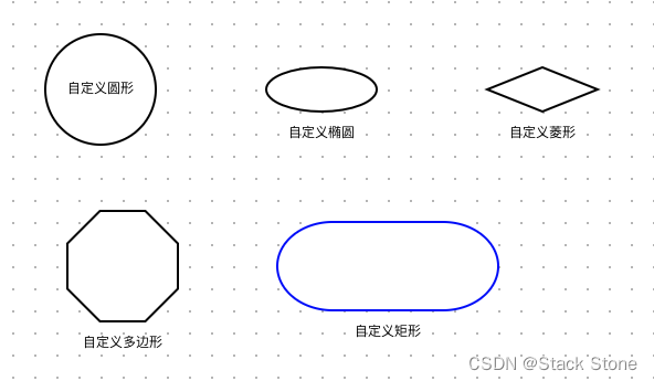
上面的 5 个代码分别定义了 5 个自定义节点,节点类型为:CustomCircle、CustomDiamond、CustomEllipse、CustomPolygon、CustomRect,之后编写 src/views/Example/LogicFlow/Example06.vue,内容如下:
<script setup lang="ts">
// 导入 LogicFlow 核心库和相关样式
import LogicFlow from '@logicflow/core'
import '@logicflow/core/dist/style/index.css'
// 导入 Vue 3 的 onMounted 生命周期钩子
import { onMounted } from 'vue'
// 导入自定义的图形节点组件
import CustomCircle from './component/CustomCircle'
import CustomEllipse from './component/CustomEllipse'
import CustomPolygon from './component/CustomPolygon'
import CustomDiamond from './component/CustomDiamond'
import CustomRect from './component/CustomRect'

// 配置 LogicFlow 的静默模式和交互行为
const SilentConfig = {
  isSilentMode: true, // 启用静默模式
  stopScrollGraph: true, // 禁止滚动图形
  stopMoveGraph: true, // 禁止移动图形
  stopZoomGraph: true, // 禁止缩放图形
  adjustNodePosition: true // 调整节点位置
}

// 定义图表数据,包含自定义节点,但没有连线
const data = {
  nodes: [
    {
      id: 'node_id_1',
      type: 'CustomCircle',
      x: 100,
      y: 60,
      text: '自定义圆形'
    },
    {
      id: 'node_id_2',
      type: 'CustomEllipse',
      x: 300,
      y: 60,
      text: '自定义椭圆'
    },
    {
      id: 'node_id_4',
      type: 'CustomDiamond',
      x: 500,
      y: 60,
      text: '自定义菱形'
    },
    {
      id: 'node_id_3',
      type: 'CustomPolygon',
      x: 110,
      y: 220,
      text: '自定义多边形'
    },
    {
      id: 'node_id_5',
      type: 'CustomRect',
      x: 350,
      y: 220,
      text: '自定义矩形'
    }
  ],
  edges: []
}

// 在 Vue 组件挂载后执行
onMounted(() => {
  // 创建 LogicFlow 实例并配置容器和网格显示
  const lf = new LogicFlow({
    container: document.getElementById('container')!, // 指定显示 LogicFlow 图表的 HTML 容器
    grid: true, // 启用网格显示
    ...SilentConfig // 应用静默模式和其他配置
  })
  // 注册自定义节点
  lf.register(CustomCircle)
  lf.register(CustomEllipse)
  lf.register(CustomPolygon)
  lf.register(CustomDiamond)
  lf.register(CustomRect)
  // 渲染图表数据并将视图居中
  lf.render(data)
  lf.translateCenter()
})
</script>

<template>
  <h3>Example06</h3>
  <div id="container"></div>
  <!-- 用于显示 LogicFlow 图表的容器 -->
</template>

<style>
#container {
  /* 设置容器的宽度为整个父容器的宽度 */
  width: 100%;
  /* 设置容器的高度为 500 像素 */
  height: 500px;
}
</style>
项目启动后,页面内容如下所示:
LogicFlow 内部存在 7 种基础节点, 自定义节点的时候可以基于需要选择任意一种来继承, 然后取一个符合自己业务意义的名字。以@logicflow/extension中提供的可缩放节点为例:LogicFlow 基础节点不支持节点缩放,于是 LogicFlow 在extension包中,基于基础节点,封装了对节点缩放的逻辑,然后发布出去。这样开发者可以直接基于extension中的可缩放节点进行自定义。
自定义节点model
LogicFlow把自定义节点外观分为了自定义节点样式属性和自定义节点形状属性两种方式。更多详细定义方法,参见:NodeModelApi
1. 样式属性
在LogicFlow中,外观属性表示控制着节点边框、颜色这类偏外观的属性。这些属性是可以直接通过主题配置来控制的。自定义节点样式可以看做在主题的基础上基于当前节点的类型进行再次定义。
例如:在主题中对所有rect节点都定义其边框颜色为红色stroke:red,那么可以在自定义节点UserTask的时候,重新定义UserTask边框为stroke:blue。更细粒度的节点样式控制方法,详情见API样式属性。
class UserTaskModel extends RectNodeModel {
  getNodeStyle() {
    const style = super.getNodeStyle();
    style.stroke = 'blue';
    return style;
  }
}
2. 形状属性
在LogicFlow中,形状属性表示节点的宽width、高height,矩形的圆角radius,圆形的半径r,多边形的顶点points等这些控制着节点最终形状的属性。因为LogicFlow在计算节点的锚点、连线的起点终点的时候,会基于形状属性进行计算。对于形状属性的自定义,需要在setAttributes方法或initNodeData方法中进行。
LogicFlow对于不同的基础节点,存在一些各基础节点自己特有的形状属性。详情见API形状属性。
class CustomRectModel extends RectNodeModel {
  initNodeData(data) {
    super.initNodeData(data);
    this.width = 200;
    this.height = 80;
  }
  // or
  setAttributes() {
    this.width = 200;
    this.height = 80;
  }
}
注意:
如果不在model中设置形状属性,而是直接在view中直接定义生成图形的宽高这种形状属性,会出现锚点位置、outline大小不正确的情况。同时,连线的位置也可能会出现错乱。
3. 基于 properties 属性自定义节点样式
不论是节点还是边,LogicFlow都保留了properties字段,用于给开发者存放自己的业务属性。所以在自定义节点样式的时候,可以基于properties中的属性来控制节点显示不同的样式。
class UserTaskModel extends RectNodeModel {
  getNodeStyle() {
    const style = super.getNodeStyle();
    const properties = this.properties;
    if (properties.statu === 'pass') { // 业务属性statu为‘pass’时展示边框为green
      style.stroke = "green";
    } else if (properties.statu === 'reject') { // 业务属性statu为‘reject’时展示边框为red
      style.stroke = "red";
    } else {
      style.stroke = "rgb(24, 125, 255)";
    }
    return style;
  }
}
提示
如果不了解为什么this.properties打印出来是一个 Proxy 对象,无法看到属性。请查看 issu
自定义节点view
LogicFlow在自定义节点的model时,可以定义节点的基础形状、样式等属性。但是当开发者需要一个更加复杂的节点时,可以使用 LogicFlow 提供的自定义节点view的方式。
我们可以创建 src/views/Example/LogicFlow/component/UserTask/index.ts 代码如下:
// 从 @logicflow/core 引入必要的组件和函数
import { RectNode, RectNodeModel, h } from '@logicflow/core'

// 自定义视图类,继承自 RectNode
class UserTaskView extends RectNode {
  // 获取标签形状的方法,用于在节点中添加一个自定义的 SVG 元素
  getLabelShape() {
    const { model } = this.props // 从 props 中获取 model 数据
    const { x, y, width, height } = model // 从 model 中解构出位置和尺寸信息
    const style = model.getNodeStyle() // 获取节点的样式
    // 使用 h 函数创建 SVG 标签
    return h(
      'svg',
      {
        x: x - width / 2 + 5, // 计算 SVG 的 x 坐标
        y: y - height / 2 + 5, // 计算 SVG 的 y 坐标
        width: 25,
        height: 25,
        viewBox: '0 0 1274 1024' // 设定 SVG 的视窗
      },
      [
        // 创建 path 元素,展示自定义图形
        h('path', {
          fill: style.stroke, // 设置填充色为节点的边框色
          d: 'M690.366075 350.568358c0-98.876614-79.937349-179.048571-178.558027-179.048571-98.59935 0-178.515371 80.150629-178.515371 179.048571 0 98.833958 79.916021 178.963259 178.515371 178.963259C610.428726 529.531617 690.366075 449.380988 690.366075 350.568358M376.140632 350.568358c0-75.159877 60.72082-136.072649 135.667416-136.072649 74.989253 0 135.667416 60.912772 135.667416 136.072649 0 75.117221-60.678164 136.029993-135.667416 136.029993C436.861451 486.577022 376.140632 425.664251 376.140632 350.568358M197.284012 762.923936 197.284012 778.472049l15.526785 0 291.255186 0.127968L819.784387 778.472049l15.569441 0 0-15.548113c0-139.783721-136.413897-285.581938-311.026243-273.275681-10.002833 0.703824-24.740482 9.128385-34.658002 9.938849-8.573857 0.74648 13.692577 8.232609 14.396401 16.827793 9.021745-0.789136 6.313088 13.095393 15.505457 13.095393 150.597017 0 263.14488 103.07823 263.14488 224.62651l15.441473-15.590769-285.816546-0.042656-278.991585 1.81288 15.526785 15.612097c0-82.752645 75.095893-152.70849 136.861785-191.824044 7.25152-4.58552 8.659169-17.659585 4.862784-22.906273-6.846288-9.426977-19.877697-8.701825-28.046322-6.014496C285.262018 560.521203 197.284012 667.758394 197.284012 762.923936'
        }),
        h('path', {
          fill: style.stroke,
          d: 'M512.31992 1.535616c-282.766642 0-512.021328 228.89211-512.021328 511.210864 0 282.46805 229.254686 511.25352 512.021328 511.25352 117.431975 0 228.828126-39.606098 318.810964-111.204199 10.791969-8.488545 12.540865-24.22861 3.988336-34.99925-8.616513-10.770641-24.356578-12.540865-35.127218-3.94568-81.174373 64.538532-181.586603 100.241606-287.650754 100.241606-255.210864 0-462.028493-206.561693-462.028493-461.367325 0-254.762976 206.817629-461.303341 462.028493-461.303341 255.210864 0 462.092477 206.561693 462.092477 461.303341 0 87.380821-24.33525 171.093227-69.614596 243.651087-7.272848 11.645089-3.668416 27.086562 8.040657 34.35941 11.709073 7.272848 27.10789 3.62576 34.402066-7.976672 50.184787-80.406565 77.143381-173.247355 77.143381-270.055153C1024.383904 230.427726 795.10789 1.535616 512.31992 1.535616z'
        })
      ]
    )
  }
  // 重写 getShape 方法,定义节点的整体形状
  getShape() {
    const { model } = this.props // 获取 model 数据
    const { x, y, width, height, radius, properties } = model // 解构位置、尺寸和圆角信息
    const style = model.getNodeStyle() // 获取节点的样式
    console.log(properties)
    // 使用 h 函数组合节点的矩形和标签
    return h('g', {}, [
      h('rect', {
        ...style,
        x: x - width / 2, // 设置矩形的 x 坐标
        y: y - height / 2, // 设置矩形的 y 坐标
        rx: radius, // 矩形的 x 方向圆角
        ry: radius, // 矩形的 y 方向圆角
        width,
        height
      }),
      this.getLabelShape() // 添加标签形状
    ])
  }
}

// 自定义模型类,继承自 RectNodeModel
class UserTaskModel extends RectNodeModel {
  // 设置节点属性的方法
  setAttributes() {
    const size = this.properties.scale || 1 // 从属性中获取缩放比例,默认为 1
    this.width = 100 * size // 计算节点宽度
    this.height = 80 * size // 计算节点高度
  }
  // 获取文本样式的方法
  getTextStyle() {
    const style = super.getTextStyle() // 调用基类方法获取默认文本样式
    style.fontSize = 12 // 设置字体大小
    const properties = this.properties // 获取节点的自定义属性
    style.color = properties.disabled ? 'red' : 'rgb(24, 125, 255)' // 根据 disabled 属性调整文本颜色
    return style
  }
  // 获取节点样式的方法
  getNodeStyle() {
    const style = super.getNodeStyle() // 调用基类方法获取默认节点样式
    const properties = this.properties // 获取节点的自定义属性
    // 根据 disabled 属性调整边框颜色
    if (properties.disabled) {
      style.stroke = 'red'
    } else {
      style.stroke = 'rgb(24, 125, 255)'
    }
    return style
  }
  // 其他样式和方法根据需要实现,例如锚点样式、锚点线条样式等
  getAnchorStyle(anchorInfo: any) {
    const style = super.getAnchorStyle(anchorInfo)
    style.stroke = 'rgb(24, 125, 255)'
    style.r = 3
    style.hover.r = 8
    style.hover.fill = 'rgb(24, 125, 255)'
    style.hover.stroke = 'rgb(24, 125, 255)'
    return style
  }
  getAnchorLineStyle(anchorInfo: any) {
    const style = super.getAnchorLineStyle(anchorInfo)
    style.stroke = 'rgb(24, 125, 255)'
    return style
  }
  getOutlineStyle() {
    const style = super.getOutlineStyle()
    style.stroke = 'red'
    if (style.hover) {
      style.hover.stroke = 'red'
    }
    return style
  }
}

// 导出配置,用于在 LogicFlow 中注册和使用自定义节点
export default {
  type: 'UserTask', // 节点类型的唯一标识
  view: UserTaskView, // 使用自定义视图类
  model: UserTaskModel // 使用自定义模型类
}
再定义一个src/views/Example/LogicFlow/Example07.vue代码内容如下:
<script setup lang="ts">
// 导入 LogicFlow 核心库和相关样式
import LogicFlow from '@logicflow/core'
import '@logicflow/core/dist/style/index.css'
// 导入 Vue 3 的 onMounted 生命周期钩子
import { onMounted } from 'vue'
// 导入自定义的图形节点组件
import UserTask from './component/UserTask'

const SilentConfig = {
  stopScrollGraph: true,
  stopMoveGraph: true,
  stopZoomGraph: true
}

// 定义图表数据,包含自定义节点,但没有连线
const data = {
  nodes: [
    {
      id: 'node_id_1',
      type: 'UserTask',
      x: 100,
      y: 100,
      text: { x: 100, y: 100, value: '节点1' }
    },
    {
      id: 'node_id_2',
      type: 'circle',
      x: 200,
      y: 300,
      text: { x: 200, y: 300, value: '节点2' },
      properties: {}
    }
  ],
  edges: [
    {
      id: 'edge_id',
      type: 'polyline',
      sourceNodeId: 'node_id_1',
      targetNodeId: 'node_id_2',
      text: { x: 139, y: 200, value: '连线' },
      startPoint: { x: 100, y: 140 },
      endPoint: { x: 200, y: 250 },
      pointsList: [
        { x: 100, y: 140 },
        { x: 100, y: 200 },
        { x: 200, y: 200 },
        { x: 200, y: 250 }
      ],
      properties: {}
    }
  ]
}

// 在 Vue 组件挂载后执行
onMounted(() => {
  // 创建 LogicFlow 实例并配置容器和网格显示
  const lf = new LogicFlow({
    container: document.getElementById('container')!, // 指定显示 LogicFlow 图表的 HTML 容器
    grid: true, // 启用网格显示
    ...SilentConfig // 应用静默模式和其他配置
  })
  // 注册自定义节点
  lf.register(UserTask)
  // 渲染图表数据并将视图居中
  lf.render(data)
  lf.translateCenter()
  lf.on('node:click', ({ data }) => {
    lf.setProperties(data.id, {
      disabled: !data.properties.disabled,
      scale: 1.5
    })
  })
})
</script>

<template>
  <h3>Example07</h3>
  <div id="container"></div>
  <!-- 用于显示 LogicFlow 图表的容器 -->
</template>

<style>
#container {
  /* 设置容器的宽度为整个父容器的宽度 */
  width: 100%;
  /* 设置容器的高度为 500 像素 */
  height: 500px;
}
</style>
运行后样例效果如下

这里对于Shape的返回用到了h函数,h方法是LogicFlow对外暴露的渲染函数,其用法与react、vue的 createElement 一致。但是这里我们需要创建的是svg标签,所以需要有一定的svg基础知识。
举几个简单的例子:
h(nodeName, attributes, [...children])

// <text x="100" y="100">文本内容</text>
h('text', { x: 100, y: 100 }, ['文本内容'])

/**
 * <g>
 *   <rect x="100" y="100" stroke="#000000" strokeDasharray="3 3"></rect>
 *   <text x="100" y="100">文本内容</text>
 * </g>
 */

h('g',{}, [
  h('rect', { x: 100, y: 100, stroke: "#000000", strokeDasharray="3 3"}),
  h('text', { x: 100, y: 100 }, ['文本内容'])
])
getShape方法
此方法作用就是定义最终渲染的图形,LogicFlow内部会将其返回的内容插入到 svg DOM 上。开发者不是一定需要重写此方法,只有在期望改变最终渲染图形 svg DOM 的时候才使用此方法。以上面的例子来说,rect节点最终渲染的 svg DOM 只是一个矩形。但是当我们想要在上面加一个图标的时候,那边必定需要修改到最终渲染图形的 svg DOM 了,这个时候就需要通过重写 getShape 来实现了。
LogicFlow定义一个节点的外观有三种方式,分别为主题、自定义节点model、自定义节点view。这三种方式优先级为 主题 < 自定义节点model < 自定义节点view。它们的差异是:
- 主题:定义所有此基础类型节点的通用样式,例如定义所有
rect节点的边框颜色、宽度等。 - 自定义节点model:定义此注册类型节点的样式。
- 自定义节点view:定义此注册类型节点svg DOM。
注意
虽然自定义节点view优先级最高,功能也最完善,理论上我们可以完全通过自定义节点view实现任何我们想要的效果,但是此方式还是存在一些限制。
自定义节点view最终生成的图形的形状属性必须和model中形状属性的一致,因为节点的锚点、外边框都是基于节点model中的width和height生成。
2.自定义节点view最终生成的图形整体轮廓必须和继承的基础图形一致,不能继承的rect而在 getShape 的时候返回的最终图形轮廓变成了圆形。因为LogicFlow对于节点上的连线调整、锚点生成等会基于基础图形进行计算。
一些思考
1. 为什么rect的x,y不是直接从model中获取的x,y
在LogicFlow所有的基础节点中,model里面的x,y都是统一表示中心点。但是getShape方法给我们提供直接生成 svg DOM 的方式,在 svg 中,对图形位置的控制则存在差异:
rect:通过x,y表示图形的位置,但是表示是图形左上角坐标。所以一般通过中心点,然后减去节点的宽高的一半计算出左上角坐标。const { x, y, width, height, radius } = this.props.model; // svg dom <rect x="100" y="100" width="100" height="80"> h("rect", { ...style, x: x - width / 2, y: y - height / 2, rx: radius, // 注意这里是rx而不是radius ry: radius, width, height }),circle和ellipse:通过cx,cy表示图形的位置,含义为中心点的坐标。const { x, y, r } = this.props.model; // svg dom <circle cx="100", cy="100", r="20"> h("circle", { ...style, r, // 半径保持不变 cx: x, cy: y, }) // 椭圆 const { x, y, rx, ry } = this.props.model; // svg dom <ellipse cx="100", cy="100", rx="20" ry="10"> h("ellipse", { ...style, cx: x, cy: y, rx, ry })polygon:所有的顶点坐标已包含位置const { x, y, points } = this.props.model; const pointStr = points.map((point) => { return `${point[0] + x}, ${point[1] + y}` }).join(" "); // svg dom <polygon points="100,10 250,150 200,110" > h("polygon", { ...style, r, // 半径保持不变 points: pointStr, })
自定义矩形的 view 时 radius 设置
在model中,radius是矩形节点的形状属性。但是在自定义view时需要注意,svg里面设置矩形的圆角并不是用radius·,而是使用rx,ry。所以在自定义view的矩形时,需要将model中radius的赋值给rx和ry,否则圆角将不会生效。
2. props 怎么用?
LogicFlow 是基于preact开发的,我们自定义节点view的时候,可以通过this.props获取父组件传递过来的数据。this.props对象包含两个属性,分别为:
model:表示自定义节点的 model- graphModel:表示logicflow整个图的model
3. 图标的 path 如何获取?
一般情况下,图标我们可以找UI或者去iconfont.cn获得一个svg格式的文件。然后在IDE中以文本的方式打开,然后格式化,就可以看到代码。代码中一般是最外层一个 svg 标签,里面是一个或者多个path。这个时候,我们使用前面提到的 h 方法来实现 svg 文件中的代码即可。
svg 标签一般包括如下属性:
viewBox: viewBox属性允许指定一个给定的一组图形延展以适应特定的容器元素。一般把 svg 标签上的viewBox属性值复制过来就行。width和height:这个不需要使用svg标签上的width和height,直接写成你期望的宽高就行。
path标签属性:
d:该属性定义了一个路径。直接复制 svg 代码过来即可,不需要去关心d具体内容表示的含义。fill:路径的填充颜色,一般和节点的边框颜色一致,但是也可以按照业务需求自定义。
上一篇:LogicFlow 基础 实例


 292
292

 被折叠的 条评论
为什么被折叠?
被折叠的 条评论
为什么被折叠?
 到【灌水乐园】发言


