


为了解决特定问题而进行的学习是提高效率的最佳途径。这种方法能够使我们专注于最相关的知识和技能,从而更快地掌握解决问题所需的能力。
(以下练习题来源于《统计学—基于Python》。联系获取完整数据和Python源代码文件。)
练习题
下面是来自R语言的anscombeh数据集(前3行和后3行)。
| x1 | x2 | x3 | x4 | y1 | y2 | y3 | y4 |
| 10 | 10 | 10 | 8 | 8.04 | 9.14 | 7.46 | 6.58 |
| 8 | 8 | 8 | 8 | 6.95 | 8.14 | 6.77 | 5.76 |
| 13 | 13 | 13 | 8 | 7.58 | 8.74 | 12.74 | 7.71 |
| ... | ... | ... | ... | ... | ... | ... | ... |
| 12 | 12 | 12 | 8 | 10.84 | 9.13 | 8.15 | 5.56 |
| 7 | 7 | 7 | 8 | 4.82 | 7.26 | 6.42 | 7.91 |
| 5 | 5 | 5 | 8 | 5.68 | 4.74 | 5.73 | 6.89 |
分别绘制x1和y1、x2和y2、x3和y3、x4和y4的散点图,并建立一元线性回归模型,从散点图和各回归模型中你会得到哪些启示?
计算与结果分析
1、先分别绘制x1和y1、x2和y2、x3和y3、x4和y4的散点图以观察它们之间的关系,如下图所示。明显可以看到图(d)是不合理的。

import pandas as pd
import seaborn as sns
import matplotlib.pyplot as plt
plt.rcParams['font.sans-serif'] = ['Songti SC'] # 设置中文字体
plt.rcParams['axes.unicode_minus'] = False     # 正常显示负号
df = pd.read_csv('exercise10_1.csv')

plt.subplots(2, 2, figsize = (8, 5))

plt.subplot(221)
sns.regplot(data = df, x = df['x1'], y = df['y1'],
           fit_reg = True, marker = '+')  # 添加回归线
plt.title('(a)x1与y1添加回归线和置信带的散点图', fontsize = 10)

plt.subplot(222)
sns.regplot(data = df, x = df['x2'], y = df['y2'],
           fit_reg = True, marker = '+')  # 添加回归线
plt.title('(b)x2与y2添加回归线和置信带的散点图', fontsize = 10)

plt.subplot(223)
sns.regplot(data = df, x = df['x3'], y = df['y3'],
           fit_reg = True, marker = '+')  # 添加回归线
plt.title('(c)x3与y3添加回归线和置信带的散点图', fontsize = 10)

plt.subplot(224)
sns.regplot(data = df, x = df['x4'], y = df['y4'],
           fit_reg = True, marker = '+')  # 添加回归线
plt.title('(d)x4与y4添加回归线和置信带的散点图', fontsize = 10)

plt.tight_layout()
2、针对每组数据建立一元回归模型。Python计算结果如下图呈现。
拟合回归模型 y1 ~ x1
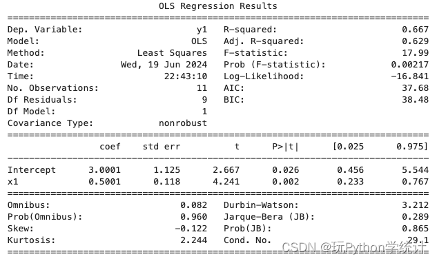
# 拟合回归模型 y1 ~ x1
import pandas as pd
from statsmodels.formula.api import ols
df = pd.read_csv('exercise10_1.csv')

model1 = ols('y1 ~ x1', data = df).fit()
print(model1. summary())
拟合回归模型 y2 ~ x2
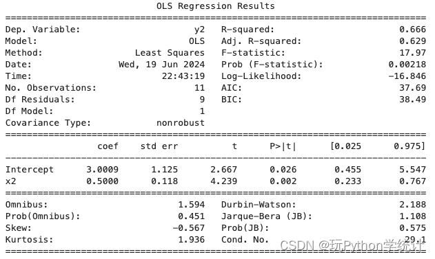
# 拟合回归模型 y2 ~ x2
import pandas as pd
from statsmodels.formula.api import ols
df = pd.read_csv('exercise10_1.csv')

model2 = ols('y2 ~ x2', data = df).fit()
print(model2. summary())
拟合回归模型 y3 ~ x3
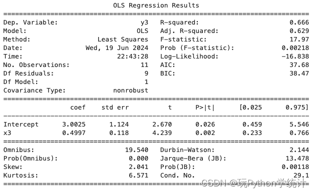
# 拟合回归模型 y3 ~ x3
import pandas as pd
from statsmodels.formula.api import ols
df = pd.read_csv('exercise10_1.csv')

model3 = ols('y3 ~ x3', data = df).fit()
print(model3. summary())
拟合回归模型 y4 ~ x4

# 拟合回归模型 y4 ~ x4
import pandas as pd
from statsmodels.formula.api import ols
df = pd.read_csv('exercise10_1.csv')

model4 = ols('y4 ~ x4', data = df).fit()
print(model4. summary())
最后对4个模型进行诊断,分别绘制出它们的残差和拟合值图。
比较可知,各模型基本相同。但散点图和诊断图均显示,建立的 4 个线性模型中, 只有模型 1 是正确的,其余均不正确,应考虑建立非线性模型。

# 绘制模型诊断图
import pandas as pd
import numpy as np
from statsmodels.formula.api import ols
import statsmodels.api as sm
import matplotlib.pyplot as plt
plt.rcParams['font.sans-serif'] = ['Songti SC'] # 设置中文字体
plt.rcParams['axes.unicode_minus'] = False     # 正常显示负号
df = pd.read_csv('exercise10_1.csv')

model1 = ols('y1 ~ x1', data = df).fit() # 拟合模型
model2 = ols('y2 ~ x2', data = df).fit()
model3 = ols('y3 ~ x3', data = df).fit()
model4 = ols('y4 ~ x4', data = df).fit()

# 绘制残差与拟合值图
plt.subplots(2, 2, figsize = (8, 5))

plt.subplot(221)
plt.scatter(model1.fittedvalues, model1.resid)
plt.xlabel('拟合值')
plt.ylabel('残差')
plt.title('(a)y1与x1残差与拟合值图', fontsize = 10)
plt.axhline(0, ls = '--')

plt.subplot(222)
plt.scatter(model2.fittedvalues, model2.resid)
plt.xlabel('拟合值')
plt.ylabel('残差')
plt.title('(a)y2与x2残差与拟合值图', fontsize = 10)
plt.axhline(0, ls = '--')

plt.subplot(223)
plt.scatter(model3.fittedvalues, model3.resid)
plt.xlabel('拟合值')
plt.ylabel('残差')
plt.title('(a)y3与x3残差与拟合值图', fontsize = 10)
plt.axhline(0, ls = '--')

plt.subplot(224)
plt.scatter(model4.fittedvalues, model4.resid)
plt.xlabel('拟合值')
plt.ylabel('残差')
plt.title('(a)y4与x4残差与拟合值图', fontsize = 10)
plt.axhline(0, ls = '--')

plt.tight_layout()都读到这里了,不妨关注、点赞一下吧!


 291
291

 被折叠的 条评论
为什么被折叠?
被折叠的 条评论
为什么被折叠?
 到【灌水乐园】发言


