


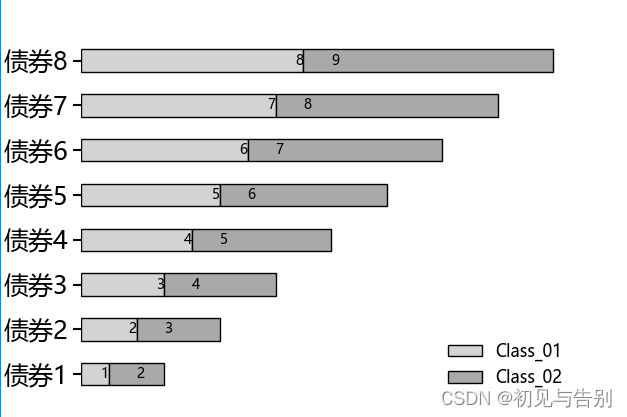
堆叠柱状图横向与纵向
横向柱状图显示
import matplotlib.pyplot as plt
import numpy as np
plt.rcParams['font.sans-serif'] = ['Microsoft YaHei']
plt.rcParams['axes.unicode_minus'] = False
index = ["债券1","债券2","债券3","债券4","债券5","债券6","债券7","债券8"]
class_01= [1,2,3,4,5,6,7,8]
class_02= [2,3,4,5,6,7,8,9]
fig, ax = plt.subplots()
b=ax.barh(index, class_01, height=.5,color='lightgray', ec='k', label='Class_01')
a=ax.barh(index, class_02, height=.5,color='darkgray', ec='k', label='Class_02', left=class_01)
for rect in b:
    w=rect.get_width()
    ax.text(w,rect.get_y()+rect.get_height()/2,'%d'%int(w),ha='right',va='center')
for rect in a:
    w=rect.get_width()
    ax.text(w,rect.get_y()+rect.get_height()/2,'%d'%int(w),ha='left',va='center')
ax.tick_params(direction='out',labelsize=18,length=5.5,width=1.5)
# ax.set_xlim(left=0,right=75)
for spine in ['bottom','left']:
    ax.spines[spine].set_linewidth(1.5)
ax.spines['right'].set_visible(False)
ax.spines['top'].set_visible(False)
ax.legend(frameon=False,fontsize=12)
text_font = {'size':'22','weight':'bold','color':'black'}
plt.xticks([])#关闭x轴
# plt.yticks([])#关闭y轴
# plt.axis('off')#关闭所有刻度
# ax = plt.axes()
ax.spines['top'].set_visible(False)#关闭x,y轴框线刻度
ax.spines['right'].set_visible(False)
ax.spines['bottom'].set_visible(False)
ax.spines['left'].set_visible(False)
plt.show()
纵向柱状图
import matplotlib.pyplot as plt
02.import numpy as np
03.
04.# 构建数据
05.x_data = ['2012', '2013', '2014', '2015', '2016', '2017', '2018']
06.y_data = [58000, 60200, 63000, 71000, 84000, 90500, 107000]
07.y_data2 = [52000, 54200, 51500,58300, 56800, 59500, 62700]
08.# 绘图
09.plt.bar(x=x_data, height=y_data, label='C语言基础', color='steelblue', alpha=0.8)
10.plt.bar(x=x_data, height=y_data2, label='Java基础', color='indianred', alpha=0.8)
11.# 在柱状图上显示具体数值, ha参数控制水平对齐方式, va控制垂直对齐方式
12.for x, y in enumerate(y_data):
13.    plt.text(x, y + 100, '%s' % y, ha='center', va='bottom')
14.for x, y in enumerate(y_data2):
15.    plt.text(x, y + 100, '%s' % y, ha='center', va='top')
16.# 设置标题
17.plt.title("Java与Android图书对比")
18.# 为两条坐标轴设置名称
19.plt.xlabel("年份")
20.plt.ylabel("销量")
21.# 显示图例
22.plt.legend()
23.plt.show()
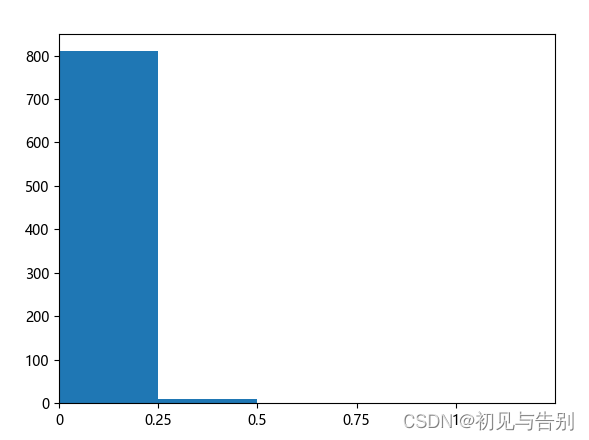
直方图
import matplotlib
import matplotlib.pyplot as plt
matplotlib.rcParams['font.family'] = 'Microsoft YaHei'

interval = [0,0.25,0.5,0.75,1]
width = [5,5,5,5,5]
quantity = [810,9,0,0,0]
fig = plt.figure()
ax1 = fig.add_subplot()
ax1.bar([x+0.5 for x in range(len(interval))], quantity, width=1)
ax1.set_xticks([x for x in range(len(interval))])
ax1.set_xticklabels(interval)
plt.xlim(0,5)
plt.show()
X轴Y轴可以修改代码再执行
Python画图共用一个图例
#!/usr/bin/env python
# -*- coding: utf-8 -*-
# @Time    : 2023/2/17 23:04
# @Author  : Tiger大队队长
# @File    : SZ全局示例测试.py
import matplotlib.pyplot as plt
import numpy as np

font = {'family': 'serif',
        'serif': 'Times New Roman',
        'weight': 'normal',
        'size': 10}
plt.rc('font', **font)

plt.rcParams['font.sans-serif']=['SimHei'] # 用来正常显示中文标签
plt.rcParams['axes.unicode_minus']=False # 用来正常显示负号

waters = ('15min', '30min', '45min', '60min')
GCNRMSE = [4.0902,4.1214,4.1566,4.2004 ]
ConvRMSE = [4.0935,4.1239,4.1309,4.1435]
attRMSE = [4.2437,4.2758,4.3119,4.3276]
ourRMSE= [4.0147,4.0588,4.0990,4.1117]

GCNMAE = [2.7809,2.8283,2.8378,2.8843 ]
ConvMAE = [2.77,2.8082,2.8058,2.786]
attMAE = [2.8879,2.8834,2.9202,2.9179]
ourMAE= [2.6747,2.6925,2.7416,2.7567]

GCNR2 = [0.8464,0.8433,0.8415,0.8381 ]
ConvR2 = [0.8462,0.8439,0.8434,0.8425]
attR2 = [0.8347,0.8322,0.8294,0.8281]
ourR2= [0.8522,0.8489,0.8459,0.845]


bar_width = 0.2  # 条形宽度
index_male = np.arange(len(waters))  #柱状图宽度
fig=plt.figure(figsize=(12, 4),dpi=300)

axes = fig.subplots(1, 3)


axes[0].bar(index_male, height=GCNRMSE, width=bar_width, color='#69c2e3', label='Without GCN')
axes[0].bar(index_male+bar_width, height=ConvRMSE, width=bar_width, color='#CF9E9E', label='Without Conv')
axes[0].bar(index_male+2*bar_width, height=attRMSE, width=bar_width, color='#9cc6a2', label='Without attention')
axes[0].bar(index_male+3*bar_width, height=ourRMSE, width=bar_width, color='#c8e0c8', label='MRSTGCN')

# axes[0,0].legend()  # 显示图例
axes[0].set_xticks(index_male +3*bar_width / 2, waters)  # 让横坐标轴刻度显示,为横坐标轴刻度的位置
axes[0].set_xlabel('Time horizon')  # 纵坐标轴标题
axes[0].set_ylabel('RMSE')  # 纵坐标轴标题
# ax.set_title("SZ-taxi")
axes[0].spines['top'].set_visible(False)#关闭x,y轴框线刻度
axes[0].spines['right'].set_visible(False)
axes[0].grid(linestyle='-.',lw=0.5)
# axes[0].set_ylim(0,6,0.2)

axes[1].bar(index_male, height=GCNMAE, width=bar_width, color='#69c2e3', label='Without GCN')
axes[1].bar(index_male+bar_width, height=ConvMAE, width=bar_width, color='#CF9E9E', label='Without Conv')
axes[1].bar(index_male+2*bar_width, height=attMAE, width=bar_width, color='#9cc6a2', label='Without attention')
axes[1].bar(index_male+3*bar_width, height=ourMAE, width=bar_width, color='#c8e0c8', label='MRSTGCN')
# axes[1].legend()  # 显示图例
axes[1].set_xticks(index_male +3*bar_width / 2, waters)  # 让横坐标轴刻度显示,为横坐标轴刻度的位置
axes[1].set_xlabel('Time horizon')  # 纵坐标轴标题
axes[1].set_ylabel('MAE')  # 纵坐标轴标题
# ax1.set_title("SZ-taxi")
axes[1].spines['top'].set_visible(False)#关闭x,y轴框线刻度
axes[1].spines['right'].set_visible(False)
axes[1].grid(linestyle='-.',lw=0.5)
# axes[1].set_ylim(0,4.5,0.2)


axes[2].bar(index_male, height=GCNR2, width=bar_width, color='#69c2e3', label='Without GCN')
axes[2].bar(index_male+bar_width, height=ConvR2, width=bar_width, color='#CF9E9E', label='Without Conv')
axes[2].bar(index_male+2*bar_width, height=attR2, width=bar_width, color='#9cc6a2', label='Without attention')
axes[2].bar(index_male+3*bar_width, height=ourR2, width=bar_width, color='#c8e0c8', label='MRSTGCN')
# axes[0,2].legend()  # 显示图例
axes[2].set_xticks(index_male +3*bar_width / 2, waters)  # 让横坐标轴刻度显示,为横坐标轴刻度的位置
axes[2].set_xlabel('Time horizon')  # 纵坐标轴标题
axes[2].set_ylabel('R2')  # 纵坐标轴标题
# ax2.set_title("SZ-taxi")
axes[2].spines['top'].set_visible(False)#关闭x,y轴框线刻度
axes[2].spines['right'].set_visible(False)
axes[2].grid(linestyle='-.',lw=0.5)
# axes[2].set_ylim(0,1.3,0.2)


plt.suptitle("SZ-taxi",x=0.6,y=-0.1)#控制整幅图标题以及位置
## 获取最后一个子图的图例信息
#如果是2x4类型的可以改成下面这个
#lines, labels = axes[-1, -1].get_legend_handles_labels()
# 在整个图的底部居中显示图例
#fig.legend(lines, labels, loc='lower center', ncol=4)

# 调整图形布局,使图例不重叠子图
#plt.subplots_adjust(bottom=0.2)
lines, labels = fig.axes[-1].get_legend_handles_labels()
fig.legend(lines, labels, loc = 'upper center',ncol=4) # ncol代表行,图例的位置,bbox_to_anchor=(0.5, 0.92),
plt.savefig("C:/Users/Administrator/Desktop/1.jpg",bbox_inches='tight',dpi=300)
# plt.show()


 5987
5987


 被折叠的 条评论
为什么被折叠?
被折叠的 条评论
为什么被折叠?
 到【灌水乐园】发言


