


Python数据科学库05(pandas)
学习05
数据合并之join
join:默认情况下他是把行索引相同的数据合并到一起


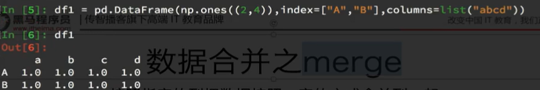
数据合并之merge
merge:按照指定的列把数据按照一定的方式合并到一起

例子:

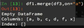
df1与df2进行合并(默认内连接inner**):获得空的DataFrame,即默认情况下取得的是并集,df1全是1,df3全是0,取并集就为空。**
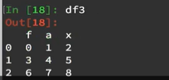
将df3进行从新赋值:

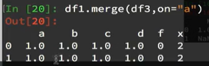
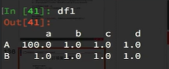
再次进行df1与df3合并:
如果再次将df1的"A"行"a"列的数据赋值100,
并且再次进行合并。发现结果就只有一行了。

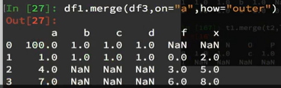
如果将二者合并方式选取为外连接outer,即取并集,结果为:
如果选取左连接,以左边的为主:

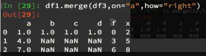
如果选取右连接,以右边的为主:
分组和聚合(重要)
现在我们有一组关于全球星巴克店铺的统计数据,如果我想知道美国的星巴克数量和中国的哪个多,或者我想知道中国每个省份星巴克的数量的情况,那么应该怎么办?
思路:遍历一遍,每次加1 ???
数据来源:https://www.kaggle.com/starbucks/store-locations/data
DataFrameGroupBy对象有很多经过优化的方法

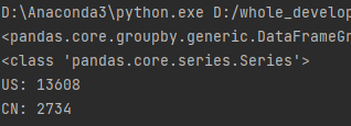
01、美国星巴克数量和中国星巴克数量那个多:
在pandas中类似的分组的操作我们有很简单的方式来完成
df.groupby(by=“columns_name”)
import numpy as np
from matplotlib import pyplot as plt
import pandas as pd
file_path= r’D:\whole_development_of_the_stack_study\RS_Algorithm_Course\为其1年的CV课程\03机器学习-数据科学库\14100_机器学习-数据科学库(HM)\数据分析资料\day05\code\starbucks_store_worldwide.csv’
df= pd.read_csv(file_path)
#print(df.info())
#print(df.head(1))
#国家来分组
grouped = df.groupby(by = “Country”)
print(grouped)
#DataFrameGroupBy 可以进行遍历、调用聚合方法
##进行遍历
#for i,j in grouped:
#print(‘Country:’,i)
#print("-“100)
#print(j,type(j))
#print("”*100)
##也可以直接通过布尔运算来选取
#print(df[df[“Country”]==‘ZA’])
#调用聚合方法
country_count = grouped[“Brand”].count()
print(type(country_count))
print(“US:”,country_count[“US”])
print(“CN:”,country_count[“CN”])
结果:
02、中国每个省份星巴克的数量:
#方法1
import numpy as np
from matplotlib import pyplot as plt
import pandas as pd
file_path= r’D:\whole_development_of_the_stack_study\RS_Algorithm_Course\为其1年的CV课程\03机器学习-数据科学库\14100_机器学习-数据科学库(HM)\数据分析资料\day05\code\starbucks_store_worldwide.csv’
df= pd.read_csv(file_path)
print(df.info())
#print(df.head(1))
#统计中国每个省店铺的数量
china_data = df[df[“Country”]== “CN”]
grouped = china_data.groupby(by = “State/Province”).count()[“Brand”]
print(grouped)
#方法2
#数据按照多个条件进行分组,返回Series
grouped2 = df[“Brand”].groupby(by=[df[“Country”],df[“State/Province”]]).count()
print(grouped2)
print(type(grouped2))

#其中grouped2数据类型为Series,有两个索引列,一个索引是Country,另一个是State/Province
#方法3
#让数据按照多个条件进行分组,返回DataFrame
grouped3 = df[[“Brand”]].groupby(by=[df[“Country”],df[“State/Province”]]).count()
print(grouped3)
print(type(grouped3))

重要
说明,[[ ]]两个中括号,可以将Series转为DataFrame类型

如果我们需要对国家和省份进行分组统计,应该怎么操作呢?
grouped = df.groupby(by=[df[“Country”],df[“State/Province”]])
很多时候我们只希望对获取分组之后的某一部分数据,或者说我们只希望对某几列数据进行分组,这个时候我们应该怎么办呢?
获取分组之后的某一部分数据:
df.groupby(by=[“Country”,“State/Province”])[“Country”].count()
对某几列数据进行分组:
df[“Country”].groupby(by=[df[“Country”],df[“State/Province”]]).count()
观察结果,由于只选择了一列数据,所以结果是一个Series类型
如果我想返回一个DataFrame类型呢?
t1 = df[[“Country”]].groupby(by=[df[“Country”],df[“State/Province”]]).count()t2 = df.groupby(by=[“Country”,“State/Province”])[[“Country”]].count()
以上的两条命令结果一样
和之前的结果的区别在于当前返回的是一个DataFrame类型
那么问题来了:
和之前使用一个分组条件相比,当前的返回结果的前两列是什么?答:复合索引
索引和复合索引
简单的索引操作:
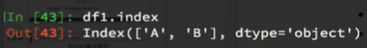
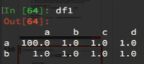
1、获取index:df.index:
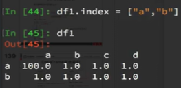
2、指定index :df.index = [‘x’,‘y’]:
3、重新设置index : df.reindex(list(“abcedf”)):

4、指定某一列作为index :df.set_index(“Country”,drop=False)
drop默认是True,即删除设置为index的列。


5、返回index的唯一值:df.set_index(“Country”).index.unique()
index也是有unique()方法的,说明index是可以有重复的。


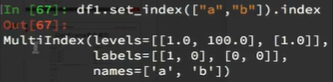
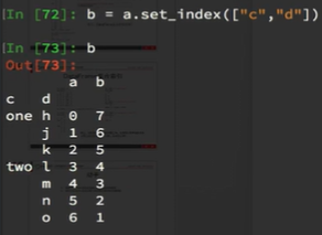
6、假设a为一个DataFrame,那么当a.set_index([“c”,“d”])即设置两个索引的时候是什么样子的结果呢?

例子:
a = pd.DataFrame({‘a’: range(7),‘b’: range(7, 0, -1),‘c’: [‘one’,‘one’,‘one’,‘two’,‘two’,‘two’, ‘two’],‘d’: list(“hjklmno”)})

Series复合索引

我只想取索引h对应值怎么办?
swaplevel可以交换符合索引列的顺序,将内外列交换。

DataFrame复合索引

练习
1、使用matplotlib呈现出店铺总数排名前10的国家
import numpy as np
from matplotlib import pyplot as plt
import pandas as pd
file_path= r’D:\whole_development_of_the_stack_study\RS_Algorithm_Course\为其1年的CV课程\03机器学习-数据科学库\14100_机器学习-数据科学库(HM)\数据分析资料\day05\code\starbucks_store_worldwide.csv’
df= pd.read_csv(file_path)
#1、使用matplotlib呈现出店铺总数排名前10的国家
#准备数据
data1 = df.groupby(by=“Country”).count()[“Brand”].sort_values(ascending=False)[:10]
_x = data1.index
_y = data1.values
#画图
plt.figure(figsize=(20,8),dpi = 80)
plt.bar(range(len(_x)),_y)
plt.xticks(range(len(_x)),_x)
plt.show()

2、使用matplotlib呈现出每个中国每个城市的店铺数量
import pandas as pd
#在程序开头修改配置字典rcParams, matplotlib的缺省配置文件中所使用的字体无法正确显示中文。为了让图表能正确显示中文,可以有几种解决方案。
from pylab import *
mpl.rcParams[‘font.sans-serif’] = [‘SimHei’] #指定默认字体
mpl.rcParams[‘axes.unicode_minus’] = False #解决保存图像是负号’-'显示为方块的问题
file_path= r’D:\whole_development_of_the_stack_study\RS_Algorithm_Course\为其1年的CV课程\03机器学习-数据科学库\14100_机器学习-数据科学库(HM)\数据分析资料\day05\code\starbucks_store_worldwide.csv’
df= pd.read_csv(file_path)
df= df[df[“Country”]==‘CN’]
print(df.head(1))
#1、使用matplotlib呈现出店铺总数排名前10的国家
#准备数据
data1 = df.groupby(by=“City”).count()[“Brand”].sort_values(ascending=False)[:25]
_x = data1.index
_y = data1.values
#画图
plt.figure(figsize=(20,8),dpi = 80)
#plt.bar(range(len(_x)),_y,width=0.3,color=“orange”)
plt.barh(range(len(_x)),_y,height=0.3,color=“orange”)
#plt.xticks(range(len(_x)),_x)
plt.yticks(range(len(_x)),_x)
plt.show()

3、现在我们有全球排名靠前的10000本书的数据,那么请统计一下下面几个问题:
01.不同年份书的数量
02.不同年份书的平均评分情况
收据来源:https://www.kaggle.com/zygmunt/goodbooks-10k
import numpy as np
from matplotlib import pyplot as plt
import pandas as pd
#在程序开头修改配置字典rcParams, matplotlib的缺省配置文件中所使用的字体无法正确显示中文。为了让图表能正确显示中文,可以有几种解决方案。
from pylab import *
mpl.rcParams[‘font.sans-serif’] = [‘SimHei’] #指定默认字体
mpl.rcParams[‘axes.unicode_minus’] = False #解决保存图像是负号’-'显示为方块的问题
file_path= r’D:\whole_development_of_the_stack_study\RS_Algorithm_Course\为其1年的CV课程\03机器学习-数据科学库\14100_机器学习-数据科学库(HM)\数据分析资料\day05\code\books.csv’
df= pd.read_csv(file_path)
#不同年份书的数量
#print(df.head(2))
#print(df.info())
#查看后年份有缺失
#获取年份没有缺失的行
#data1 = df[pd.notnull(df[“original_publication_year”])]
#grouped = data1.groupby(by= “original_publication_year”).count()[“title”]
#print(grouped)
#不同年份书的平均评分情况
#获取年份没有缺失的行
data1 = df[pd.notnull(df[“original_publication_year”])]
grouped=data1[“average_rating”].groupby(by=data1[“original_publication_year”]).mean()
#print(grouped)
#画图
_x=grouped.index
_y=grouped.values
plt.figure(figsize=(20,8),dpi = 80)
plt.plot(range(len(_x)),_y)
print(len(_x))
plt.xticks(list(range(len(_x)))[::10],_x[::10].astype(int),rotation=45)
plt.show()

总结:


 7409
7409


 被折叠的 条评论
为什么被折叠?
被折叠的 条评论
为什么被折叠?
 到【灌水乐园】发言


