


Python可视化-Pandas实验
In:
import pandas as pd
import numpy as np
import matplotlib.pyplot as plt
In:
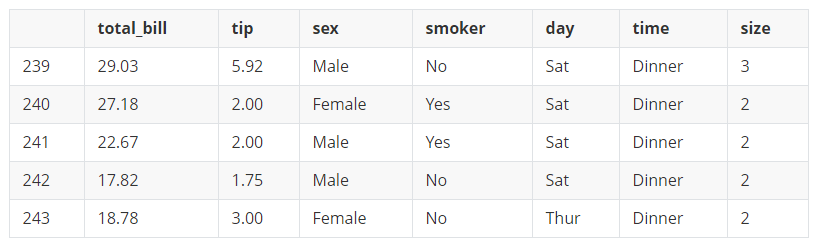
tips = pd.read_table("../../Course/data/tips.csv",sep=',')
tips.tail()  #默认查看后5行
out:
.dataframe tbody tr th {
    vertical-align: top;
}

.dataframe thead th {
    text-align: right;
}
In:
help(tips.plot)
out:
Help on PlotAccessor in module pandas.plotting._core object:
class PlotAccessor(pandas.core.base.PandasObject)
| PlotAccessor(data)
|
| Make plots of Series or DataFrame using the backend specified by the
| option ``plotting.backend``. By default, matplotlib is used.
|
| Parameters
| ----------
| data : Series or DataFrame
| The object for which the method is called
| x : label or position, default None
| Only used if data is a DataFrame.
| y : label, position or list of label, positions, default None
| Allows plotting of one column versus another. Only used if data is a
| DataFrame.
| kind : str
| - 'line' : line plot (default)
| - 'bar' : vertical bar plot
| - 'barh' : horizontal bar plot
| - 'hist' : histogram
| - 'box' : boxplot
| - 'kde' : Kernel Density Estimation plot
| - 'density' : same as 'kde'
| - 'area' : area plot
| - 'pie' : pie plot
| - 'scatter' : scatter plot
| - 'hexbin' : hexbin plot
| figsize : a tuple (width, height) in inches
| use_index : bool, default True
| Use index as ticks for x axis
| title : string or list
| Title to use for the plot. If a string is passed, print the string
| at the top of the figure. If a list is passed and `subplots` is
| True, print each item in the list above the corresponding subplot.
| grid : bool, default None (matlab style default)
| Axis grid lines
| legend : False/True/'reverse'
| Place legend on axis subplots
| style : list or dict
| matplotlib line style per column
| logx : bool or 'sym', default False
| Use log scaling or symlog scaling on x axis
| .. versionchanged:: 0.25.0
|
| logy : bool or 'sym' default False
| Use log scaling or symlog scaling on y axis
| .. versionchanged:: 0.25.0
|
| loglog : bool or 'sym', default False
| Use log scaling or symlog scaling on both x and y axes
| .. versionchanged:: 0.25.0
|
| xticks : sequence
| Values to use for the xticks
| yticks : sequence
| Values to use for the yticks
| xlim : 2-tuple/list
| ylim : 2-tuple/list
| rot : int, default None
| Rotation for ticks (xticks for vertical, yticks for horizontal
| plots)
| fontsize : int, default None
| Font size for xticks and yticks
| colormap : str or matplotlib colormap object, default None
| Colormap to select colors from. If string, load colormap with that
| name from matplotlib.
| colorbar : bool, optional
| If True, plot colorbar (only relevant for 'scatter' and 'hexbin'
| plots)
| position : float
| Specify relative alignments for bar plot layout.
| From 0 (left/bottom-end) to 1 (right/top-end). Default is 0.5
| (center)
| table : bool, Series or DataFrame, default False
| If True, draw a table using the data in the DataFrame and the data
| will be transposed to meet matplotlib's default layout.
| If a Series or DataFrame is passed, use passed data to draw a
| table.
| yerr : DataFrame, Series, array-like, dict and str
| See :ref:`Plotting with Error Bars <visualization.errorbars>` for
| detail.
| xerr : DataFrame, Series, array-like, dict and str
| Equivalent to yerr.
| mark_right : bool, default True
| When using a secondary_y axis, automatically mark the column
| labels with "(right)" in the legend
| `**kwds` : keywords
| Options to pass to matplotlib plotting method
|
| Returns
| -------
| :class:`matplotlib.axes.Axes` or numpy.ndarray of them
| If the backend is not the default matplotlib one, the return value
| will be the object returned by the backend.
|
| Notes
| -----
| - See matplotlib documentation online for more on this subject
| - If `kind` = 'bar' or 'barh', you can specify relative alignments
| for bar plot layout by `position` keyword.
| From 0 (left/bottom-end) to 1 (right/top-end). Default is 0.5
| (center)
|
| Method resolution order:
| PlotAccessor
| pandas.core.base.PandasObject
| pandas.core.accessor.DirNamesMixin
| builtins.object
|
| Methods defined here:
|
| __call__(self, *args, **kwargs)
| Call self as a function.
|
| __init__(self, data)
| Initialize self. See help(type(self)) for accurate signature.
|
| area(self, x=None, y=None, **kwargs)
| Draw a stacked area plot.
|
| An area plot displays quantitative data visually.
| This function wraps the matplotlib area function.
|
| Parameters
| ----------
| x : label or position, optional
| Coordinates for the X axis. By default uses the index.
| y : label or position, optional
| Column to plot. By default uses all columns.
| stacked : bool, default True
| Area plots are stacked by default. Set to False to create a
| unstacked plot.
| **kwds : optional
| Additional keyword arguments are documented in
| :meth:`DataFrame.plot`.
|
| Returns
| -------
| matplotlib.axes.Axes or numpy.ndarray
| Area plot, or array of area plots if subplots is True.
|
| See Also
| --------
| DataFrame.plot : Make plots of DataFrame using matplotlib / pylab.
|
| Examples
| --------
| Draw an area plot based on basic business metrics:
|
| .. plot::
| :context: close-figs
|
| >>> df = pd.DataFrame({
| ... 'sales': [3, 2, 3, 9, 10, 6],
| ... 'signups': [5, 5, 6, 12, 14, 13],
| ... 'visits': [20, 42, 28, 62, 81, 50],
| ... }, index=pd.date_range(start='2018/01/01', end='2018/07/01',
| ... freq='M'))
| >>> ax = df.plot.area()
|
| Area plots are stacked by default. To produce an unstacked plot,
| pass ``stacked=False``:
|
| .. plot::
| :context: close-figs
|
| >>> ax = df.plot.area(stacked=False)
|
| Draw an area plot for a single column:
|
| .. plot::
| :context: close-figs
|
| >>> ax = df.plot.area(y='sales')
|
| Draw with a different `x`:
|
| .. plot::
| :context: close-figs
|
| >>> df = pd.DataFrame({
| ... 'sales': [3, 2, 3],
| ... 'visits': [20, 42, 28],
| ... 'day': [1, 2, 3],
| ... })
| >>> ax = df.plot.area(x='day')
|
| bar(self, x=None, y=None, **kwargs)
| Vertical bar plot.
|
| A bar plot is a plot that presents categorical data with
| rectangular bars with lengths proportional to the values that they
| represent. A bar plot shows comparisons among discrete categories. One
| axis of the plot shows the specific categories being compared, and the
| other axis represents a measured value.
|
| Parameters
| ----------
| x : label or position, optional
| Allows plotting of one column versus another. If not specified,
| the index of the DataFrame is used.
| y : label or position, optional
| Allows plotting of one column versus another. If not specified,
| all numerical columns are used.
| **kwds
| Additional keyword arguments are documented in
| :meth:`DataFrame.plot`.
|
| Returns
| -------
| matplotlib.axes.Axes or np.ndarray of them
| An ndarray is returned with one :class:`matplotlib.axes.Axes`
| per column when ``subplots=True``.
|
| See Also
| --------
| DataFrame.plot.barh : Horizontal bar plot.
| DataFrame.plot : Make plots of a DataFrame.
| matplotlib.pyplot.bar : Make a bar plot with matplotlib.
|
| Examples
| --------
| Basic plot.
|
| .. plot::
| :context: close-figs
|
| >>> df = pd.DataFrame({'lab':['A', 'B', 'C'], 'val':[10, 30, 20]})
| >>> ax = df.plot.bar(x='lab', y='val', rot=0)
|
| Plot a whole dataframe to a bar plot. Each column is assigned a
| distinct color, and each row is nested in a group along the
| horizontal axis.
|
| .. plot::
| :context: close-figs
|
| >>> speed = [0.1, 17.5, 40, 48, 52, 69, 88]
| >>> lifespan = [2, 8, 70, 1.5, 25, 12, 28]
| >>> index = ['snail', 'pig', 'elephant',
| ... 'rabbit', 'giraffe', 'coyote', 'horse']
| >>> df = pd.DataFrame({'speed': speed,
| ... 'lifespan': lifespan}, index=index)
| >>> ax = df.plot.bar(rot=0)
|
| Instead of nesting, the figure can be split by column with
| ``subplots=True``. In this case, a :class:`numpy.ndarray` of
| :class:`matplotlib.axes.Axes` are returned.
|
| .. plot::
| :context: close-figs
|
| >>> axes = df.plot.bar(rot=0, subplots=True)
| >>> axes[1].legend(loc=2) # doctest: +SKIP
|
| Plot a single column.
|
| .. plot::
| :context: close-figs
|
| >>> ax = df.plot.bar(y='speed', rot=0)
|
| Plot only selected categories for the DataFrame.
|
| .. plot::
| :context: close-figs
|
| >>> ax = df.plot.bar(x='lifespan', rot=0)
|
| barh(self, x=None, y=None, **kwargs)
| Make a horizontal bar plot.
|
| A horizontal bar plot is a plot that presents quantitative data with
| rectangular bars with lengths proportional to the values that they
| represent. A bar plot shows comparisons among discrete categories. One
| axis of the plot shows the specific categories being compared, and the
| other axis represents a measured value.
|
| Parameters
| ----------
| x : label or position, default DataFrame.index
| Column to be used for categories.
| y : label or position, default All numeric columns in dataframe
| Columns to be plotted from the DataFrame.
| **kwds
| Keyword arguments to pass on to :meth:`DataFrame.plot`.
|
| Returns
| -------
| :class:`matplotlib.axes.Axes` or numpy.ndarray of them
|
| See Also
| --------
| DataFrame.plot.bar: Vertical bar plot.
| DataFrame.plot : Make plots of DataFrame using matplotlib.
| matplotlib.axes.Axes.bar : Plot a vertical bar plot using matplotlib.
|
| Examples
| --------
| Basic example
|
| .. plot::
| :context: close-figs
|
| >>> df = pd.DataFrame({'lab':['A', 'B', 'C'], 'val':[10, 30, 20]})
| >>> ax = df.plot.barh(x='lab', y='val')
|
| Plot a whole DataFrame to a horizontal bar plot
|
| .. plot::
| :context: close-figs
|
| >>> speed = [0.1, 17.5, 40, 48, 52, 69, 88]
| >>> lifespan = [2, 8, 70, 1.5, 25, 12, 28]
| >>> index = ['snail', 'pig', 'elephant',
| ... 'rabbit', 'giraffe', 'coyote', 'horse']
| >>> df = pd.DataFrame({'speed': speed,
| ... 'lifespan': lifespan}, index=index)
| >>> ax = df.plot.barh()
|
| Plot a column of the DataFrame to a horizontal bar plot
|
| .. plot::
| :context: close-figs
|
| >>> speed = [0.1, 17.5, 40, 48, 52, 69, 88]
| >>> lifespan = [2, 8, 70, 1.5, 25, 12, 28]
| >>> index = ['snail', 'pig', 'elephant',
| ... 'rabbit', 'giraffe', 'coyote', 'horse']
| >>> df = pd.DataFrame({'speed': speed,
| ... 'lifespan': lifespan}, index=index)
| >>> ax = df.plot.barh(y='speed')
|
| Plot DataFrame versus the desired column
|
| .. plot::
| :context: close-figs
|
| >>> speed = [0.1, 17.5, 40, 48, 52, 69, 88]
| >>> lifespan = [2, 8, 70, 1.5, 25, 12, 28]
| >>> index = ['snail', 'pig', 'elephant',
| ... 'rabbit', 'giraffe', 'coyote', 'horse']
| >>> df = pd.DataFrame({'speed': speed,
| ... 'lifespan': lifespan}, index=index)
| >>> ax = df.plot.barh(x='lifespan')
|
| box(self, by=None, **kwargs)
| Make a box plot of the DataFrame columns.
|
| A box plot is a method for graphically depicting groups of numerical
| data through their quartiles.
| The box extends from the Q1 to Q3 quartile values of the data,
| with a line at the median (Q2). The whiskers extend from the edges
| of box to show the range of the data. The position of the whiskers
| is set by default to 1.5*IQR (IQR = Q3 - Q1) from the edges of the
| box. Outlier points are those past the end of the whiskers.
|
| For further details see Wikipedia's
| entry for `boxplot <https://en.wikipedia.org/wiki/Box_plot>`__.
|
| A consideration when using this chart is that the box and the whiskers
| can overlap, which is very common when plotting small sets of data.
|
| Parameters
| ----------
| by : string or sequence
| Column in the DataFrame to group by.
| **kwds : optional
| Additional keywords are documented in
| :meth:`DataFrame.plot`.
|
| Returns
| -------
| :class:`matplotlib.axes.Axes` or numpy.ndarray of them
|
| See Also
| --------
| DataFrame.boxplot: Another method to draw a box plot.
| Series.plot.box: Draw a box plot from a Series object.
| matplotlib.pyplot.boxplot: Draw a box plot in matplotlib.
|
| Examples
| --------
| Draw a box plot from a DataFrame with four columns of randomly
| generated data.
|
| .. plot::
| :context: close-figs
|
| >>> data = np.random.randn(25, 4)
| >>> df = pd.DataFrame(data, columns=list('ABCD'))
| >>> ax = df.plot.box()
|
| density = kde(self, bw_method=None, ind=None, **kwargs)
|
| hexbin(self, x, y, C=None, reduce_C_function=None, gridsize=None, **kwargs)
| Generate a hexagonal binning plot.
|
| Generate a hexagonal binning plot of `x` versus `y`. If `C` is `None`
| (the default), this is a histogram of the number of occurrences
| of the observations at ``(x[i], y[i])``.
|
| If `C` is specified, specifies values at given coordinates
| ``(x[i], y[i])``. These values are accumulated for each hexagonal
| bin and then reduced according to `reduce_C_function`,
| having as default the NumPy's mean function (:meth:`numpy.mean`).
| (If `C` is specified, it must also be a 1-D sequence
| of the same length as `x` and `y`, or a column label.)
|
| Parameters
| ----------
| x : int or str
| The column label or position for x points.
| y : int or str
| The column label or position for y points.
| C : int or str, optional
| The column label or position for the value of `(x, y)` point.
| reduce_C_function : callable, default `np.mean`
| Function of one argument that reduces all the values in a bin to
| a single number (e.g. `np.mean`, `np.max`, `np.sum`, `np.std`).
| gridsize : int or tuple of (int, int), default 100
| The number of hexagons in the x-direction.
| The corresponding number of hexagons in the y-direction is
| chosen in a way that the hexagons are approximately regular.
| Alternatively, gridsize can be a tuple with two elements
| specifying the number of hexagons in the x-direction and the
| y-direction.
| **kwds
| Additional keyword arguments are documented in
| :meth:`DataFrame.plot`.
|
| Returns
| -------
| matplotlib.AxesSubplot
| The matplotlib ``Axes`` on which the hexbin is plotted.
|
| See Also
| --------
| DataFrame.plot : Make plots of a DataFrame.
| matplotlib.pyplot.hexbin : Hexagonal binning plot using matplotlib,
| the matplotlib function that is used under the hood.
|
| Examples
| --------
| The following examples are generated with random data from
| a normal distribution.
|
| .. plot::
| :context: close-figs
|
| >>> n = 10000
| >>> df = pd.DataFrame({'x': np.random.randn(n),
| ... 'y': np.random.randn(n)})
| >>> ax = df.plot.hexbin(x='x', y='y', gridsize=20)
|
| The next example uses `C` and `np.sum` as `reduce_C_function`.
| Note that `'observations'` values ranges from 1 to 5 but the result
| plot shows values up to more than 25. This is because of the
| `reduce_C_function`.
|
| .. plot::
| :context: close-figs
|
| >>> n = 500
| >>> df = pd.DataFrame({
| ... 'coord_x': np.random.uniform(-3, 3, size=n),
| ... 'coord_y': np.random.uniform(30, 50, size=n),
| ... 'observations': np.random.randint(1,5, size=n)
| ... })
| >>> ax = df.plot.hexbin(x='coord_x',
| ... y='coord_y',
| ... C='observations',
| ... reduce_C_function=np.sum,
| ... gridsize=10,
| ... cmap="viridis")
|
| hist(self, by=None, bins=10, **kwargs)
| Draw one histogram of the DataFrame's columns.
|
| A histogram is a representation of the distribution of data.
| This function groups the values of all given Series in the DataFrame
| into bins and draws all bins in one :class:`matplotlib.axes.Axes`.
| This is useful when the DataFrame's Series are in a similar scale.
|
| Parameters
| ----------
| by : str or sequence, optional
| Column in the DataFrame to group by.
| bins : int, default 10
| Number of histogram bins to be used.
| **kwds
| Additional keyword arguments are documented in
| :meth:`DataFrame.plot`.
|
| Returns
| -------
| class:`matplotlib.AxesSubplot`
| Return a histogram plot.
|
| See Also
| --------
| DataFrame.hist : Draw histograms per DataFrame's Series.
| Series.hist : Draw a histogram with Series' data.
|
| Examples
| --------
| When we draw a dice 6000 times, we expect to get each value around 1000
| times. But when we draw two dices and sum the result, the distribution
| is going to be quite different. A histogram illustrates those
| distributions.
|
| .. plot::
| :context: close-figs
|
| >>> df = pd.DataFrame(
| ... np.random.randint(1, 7, 6000),
| ... columns = ['one'])
| >>> df['two'] = df['one'] + np.random.randint(1, 7, 6000)
| >>> ax = df.plot.hist(bins=12, alpha=0.5)
|
| kde(self, bw_method=None, ind=None, **kwargs)
| Generate Kernel Density Estimate plot using Gaussian kernels.
|
| In statistics, `kernel density estimation`_ (KDE) is a non-parametric
| way to estimate the probability density function (PDF) of a random
| variable. This function uses Gaussian kernels and includes automatic
| bandwidth determination.
|
| .. _kernel density estimation:
| https://en.wikipedia.org/wiki/Kernel_density_estimation
|
| Parameters
| ----------
| bw_method : str, scalar or callable, optional
| The method used to calculate the estimator bandwidth. This can be
| 'scott', 'silverman', a scalar constant or a callable.
| If None (default), 'scott' is used.
| See :class:`scipy.stats.gaussian_kde` for more information.
| ind : NumPy array or integer, optional
| Evaluation points for the estimated PDF. If None (default),
| 1000 equally spaced points are used. If `ind` is a NumPy array, the
| KDE is evaluated at the points passed. If `ind` is an integer,
| `ind` number of equally spaced points are used.
| **kwds : optional
| Additional keyword arguments are documented in
| :meth:`pandas.%(this-datatype)s.plot`.
|
| Returns
| -------
| matplotlib.axes.Axes or numpy.ndarray of them
|
| See Also
| --------
| scipy.stats.gaussian_kde : Representation of a kernel-density
| estimate using Gaussian kernels. This is the function used
| internally to estimate the PDF.
|
| Examples
| --------
| Given a Series of points randomly sampled from an unknown
| distribution, estimate its PDF using KDE with automatic
| bandwidth determination and plot the results, evaluating them at
| 1000 equally spaced points (default):
|
| .. plot::
| :context: close-figs
|
| >>> s = pd.Series([1, 2, 2.5, 3, 3.5, 4, 5])
| >>> ax = s.plot.kde()
|
| A scalar bandwidth can be specified. Using a small bandwidth value can
| lead to over-fitting, while using a large bandwidth value may result
| in under-fitting:
|
| .. plot::
| :context: close-figs
|
| >>> ax = s.plot.kde(bw_method=0.3)
|
| .. plot::
| :context: close-figs
|
| >>> ax = s.plot.kde(bw_method=3)
|
| Finally, the `ind` parameter determines the evaluation points for the
| plot of the estimated PDF:
|
| .. plot::
| :context: close-figs
|
| >>> ax = s.plot.kde(ind=[1, 2, 3, 4, 5])
|
| For DataFrame, it works in the same way:
|
| .. plot::
| :context: close-figs
|
| >>> df = pd.DataFrame({
| ... 'x': [1, 2, 2.5, 3, 3.5, 4, 5],
| ... 'y': [4, 4, 4.5, 5, 5.5, 6, 6],
| ... })
| >>> ax = df.plot.kde()
|
| A scalar bandwidth can be specified. Using a small bandwidth value can
| lead to over-fitting, while using a large bandwidth value may result
| in under-fitting:
|
| .. plot::
| :context: close-figs
|
| >>> ax = df.plot.kde(bw_method=0.3)
|
| .. plot::
| :context: close-figs
|
| >>> ax = df.plot.kde(bw_method=3)
|
| Finally, the `ind` parameter determines the evaluation points for the
| plot of the estimated PDF:
|
| .. plot::
| :context: close-figs
|
| >>> ax = df.plot.kde(ind=[1, 2, 3, 4, 5, 6])
|
| line(self, x=None, y=None, **kwargs)
| Plot Series or DataFrame as lines.
|
| This function is useful to plot lines using DataFrame's values
| as coordinates.
|
| Parameters
| ----------
| x : int or str, optional
| Columns to use for the horizontal axis.
| Either the location or the label of the columns to be used.
| By default, it will use the DataFrame indices.
| y : int, str, or list of them, optional
| The values to be plotted.
| Either the location or the label of the columns to be used.
| By default, it will use the remaining DataFrame numeric columns.
| **kwds
| Keyword arguments to pass on to :meth:`DataFrame.plot`.
|
| Returns
| -------
| :class:`matplotlib.axes.Axes` or :class:`numpy.ndarray`
| Return an ndarray when ``subplots=True``.
|
| See Also
| --------
| matplotlib.pyplot.plot : Plot y versus x as lines and/or markers.
|
| Examples
| --------
|
| .. plot::
| :context: close-figs
|
| >>> s = pd.Series([1, 3, 2])
| >>> s.plot.line()
|
| .. plot::
| :context: close-figs
|
| The following example shows the populations for some animals
| over the years.
|
| >>> df = pd.DataFrame({
| ... 'pig': [20, 18, 489, 675, 1776],
| ... 'horse': [4, 25, 281, 600, 1900]
| ... }, index=[1990, 1997, 2003, 2009, 2014])
| >>> lines = df.plot.line()
|
| .. plot::
| :context: close-figs
|
| An example with subplots, so an array of axes is returned.
|
| >>> axes = df.plot.line(subplots=True)
| >>> type(axes)
| <class 'numpy.ndarray'>
|
| .. plot::
| :context: close-figs
|
| The following example shows the relationship between both
| populations.
|
| >>> lines = df.plot.line(x='pig', y='horse')
|
| pie(self, **kwargs)
| Generate a pie plot.
|
| A pie plot is a proportional representation of the numerical data in a
| column. This function wraps :meth:`matplotlib.pyplot.pie` for the
| specified column. If no column reference is passed and
| ``subplots=True`` a pie plot is drawn for each numerical column
| independently.
|
| Parameters
| ----------
| y : int or label, optional
| Label or position of the column to plot.
| If not provided, ``subplots=True`` argument must be passed.
| **kwds
| Keyword arguments to pass on to :meth:`DataFrame.plot`.
|
| Returns
| -------
| matplotlib.axes.Axes or np.ndarray of them
| A NumPy array is returned when `subplots` is True.
|
| See Also
| --------
| Series.plot.pie : Generate a pie plot for a Series.
| DataFrame.plot : Make plots of a DataFrame.
|
| Examples
| --------
| In the example below we have a DataFrame with the information about
| planet's mass and radius. We pass the the 'mass' column to the
| pie function to get a pie plot.
|
| .. plot::
| :context: close-figs
|
| >>> df = pd.DataFrame({'mass': [0.330, 4.87 , 5.97],
| ... 'radius': [2439.7, 6051.8, 6378.1]},
| ... index=['Mercury', 'Venus', 'Earth'])
| >>> plot = df.plot.pie(y='mass', figsize=(5, 5))
|
| .. plot::
| :context: close-figs
|
| >>> plot = df.plot.pie(subplots=True, figsize=(6, 3))
|
| scatter(self, x, y, s=None, c=None, **kwargs)
| Create a scatter plot with varying marker point size and color.
|
| The coordinates of each point are defined by two dataframe columns and
| filled circles are used to represent each point. This kind of plot is
| useful to see complex correlations between two variables. Points could
| be for instance natural 2D coordinates like longitude and latitude in
| a map or, in general, any pair of metrics that can be plotted against
| each other.
|
| Parameters
| ----------
| x : int or str
| The column name or column position to be used as horizontal
| coordinates for each point.
| y : int or str
| The column name or column position to be used as vertical
| coordinates for each point.
| s : scalar or array_like, optional
| The size of each point. Possible values are:
|
| - A single scalar so all points have the same size.
|
| - A sequence of scalars, which will be used for each point's size
| recursively. For instance, when passing [2,14] all points size
| will be either 2 or 14, alternatively.
|
| c : str, int or array_like, optional
| The color of each point. Possible values are:
|
| - A single color string referred to by name, RGB or RGBA code,
| for instance 'red' or '#a98d19'.
|
| - A sequence of color strings referred to by name, RGB or RGBA
| code, which will be used for each point's color recursively. For
| instance ['green','yellow'] all points will be filled in green or
| yellow, alternatively.
|
| - A column name or position whose values will be used to color the
| marker points according to a colormap.
|
| **kwds
| Keyword arguments to pass on to :meth:`DataFrame.plot`.
|
| Returns
| -------
| :class:`matplotlib.axes.Axes` or numpy.ndarray of them
|
| See Also
| --------
| matplotlib.pyplot.scatter : Scatter plot using multiple input data
| formats.
|
| Examples
| --------
| Let's see how to draw a scatter plot using coordinates from the values
| in a DataFrame's columns.
|
| .. plot::
| :context: close-figs
|
| >>> df = pd.DataFrame([[5.1, 3.5, 0], [4.9, 3.0, 0], [7.0, 3.2, 1],
| ... [6.4, 3.2, 1], [5.9, 3.0, 2]],
| ... columns=['length', 'width', 'species'])
| >>> ax1 = df.plot.scatter(x='length',
| ... y='width',
| ... c='DarkBlue')
|
| And now with the color determined by a column as well.
|
| .. plot::
| :context: close-figs
|
| >>> ax2 = df.plot.scatter(x='length',
| ... y='width',
| ... c='species',
| ... colormap='viridis')
|
| ----------------------------------------------------------------------
| Methods inherited from pandas.core.base.PandasObject:
|
| __repr__(self)
| Return a string representation for a particular object.
|
| __sizeof__(self)
| Generates the total memory usage for an object that returns
| either a value or Series of values
|
| ----------------------------------------------------------------------
| Methods inherited from pandas.core.accessor.DirNamesMixin:
|
| __dir__(self)
| Provide method name lookup and completion
| Only provide 'public' methods.
|
| ----------------------------------------------------------------------
| Data descriptors inherited from pandas.core.accessor.DirNamesMixin:
|
| __dict__
| dictionary for instance variables (if defined)
|
| __weakref__
| list of weak references to the object (if defined)
- kind : str
- ‘line’ : line plot (default)
- ‘bar’ : vertical bar plot
- ‘barh’ : horizontal bar plot
- ‘hist’ : histogram
- ‘box’ : boxplot
- ‘kde’ : Kernel Density Estimation plot
- ‘density’ : same as ‘kde’
- ‘area’ : area plot
- ‘pie’ : pie plot
- ‘scatter’ : scatter plot
- ‘hexbin’ : hexbin plot
In:
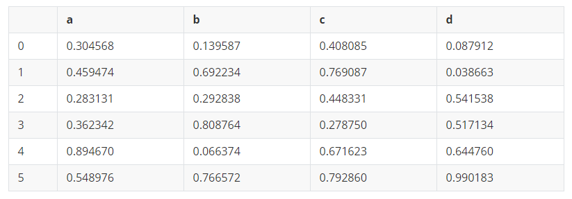
df1 = pd.DataFrame(np.random.rand(6,4),columns=list('abcd'))
df1
out:
.dataframe tbody tr th {
    vertical-align: top;
}

.dataframe thead th {
    text-align: right;
}
In:
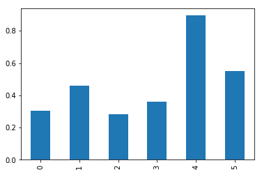
#柱状图
df1.a.plot(kind='bar')
out:
<matplotlib.axes._subplots.AxesSubplot at 0x28a0ad37588>
In:
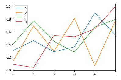
#折线图
df1.plot(kind='line')
out:
<matplotlib.axes._subplots.AxesSubplot at 0x28a0b40f948>
In:
#直方图
df1.a.plot(kind='hist')
out:
<matplotlib.axes._subplots.AxesSubplot at 0x28a0452f6c8>

In:
#饼图
df1.a.plot(kind='pie')
out:
<matplotlib.axes._subplots.AxesSubplot at 0x28a0b491b08>

In:
#箱线图
df1.boxplot()
out:
<matplotlib.axes._subplots.AxesSubplot at 0x28a0b4fa588>

In:
#散点图
df1.plot.scatter('a','b')
out:
<matplotlib.axes._subplots.AxesSubplot at 0x28a0c68e688>

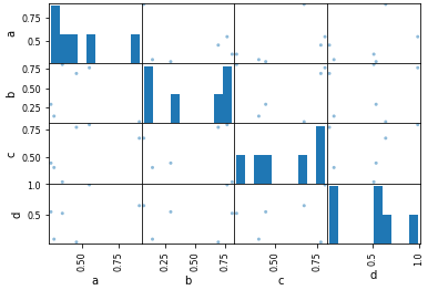
In:
#散点图矩阵
pd.plotting.scatter_matrix(df1)
out:
array([[<matplotlib.axes._subplots.AxesSubplot object at 0x0000028A0C6EA748>,
        <matplotlib.axes._subplots.AxesSubplot object at 0x0000028A0AE1D8C8>,
        <matplotlib.axes._subplots.AxesSubplot object at 0x0000028A0C67D248>,
        <matplotlib.axes._subplots.AxesSubplot object at 0x0000028A0C670B88>],
       [<matplotlib.axes._subplots.AxesSubplot object at 0x0000028A09FA9708>,
        <matplotlib.axes._subplots.AxesSubplot object at 0x0000028A0C7EBD88>,
        <matplotlib.axes._subplots.AxesSubplot object at 0x0000028A0C823D08>,
        <matplotlib.axes._subplots.AxesSubplot object at 0x0000028A0C85CDC8>],
       [<matplotlib.axes._subplots.AxesSubplot object at 0x0000028A0C8669C8>,
        <matplotlib.axes._subplots.AxesSubplot object at 0x0000028A0C89DB88>,
        <matplotlib.axes._subplots.AxesSubplot object at 0x0000028A0C907148>,
        <matplotlib.axes._subplots.AxesSubplot object at 0x0000028A0C93E208>],
       [<matplotlib.axes._subplots.AxesSubplot object at 0x0000028A0C975348>,
        <matplotlib.axes._subplots.AxesSubplot object at 0x0000028A0C9AD448>,
        <matplotlib.axes._subplots.AxesSubplot object at 0x0000028A0C9E6548>,
        <matplotlib.axes._subplots.AxesSubplot object at 0x0000028A0CA24E88>]],
      dtype=object)


 635
635


 被折叠的 条评论
为什么被折叠?
被折叠的 条评论
为什么被折叠?
 到【灌水乐园】发言


