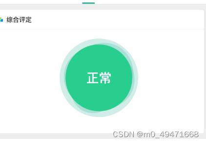
<div class="circle-outside">
<div class="circle-inside">
<div class="circle-text">正常</div>
</div>
</div>
.circle-outside {
width: 200px;
height: 200px;
background-color: rgba(203, 238, 231);
border-radius: 50%;
}
.circle-inside {
text-align: center;
width: 180px;
height: 180px;
border-radius: 50%;
background-color: rgba(41, 205, 142);
position: relative;
top: 10px;
left: 10px;
}
.circle-text {
text-align: center;
line-height: 180px; /* 与容器高度相等 */
color: #fff;
font-size: 32px;
}
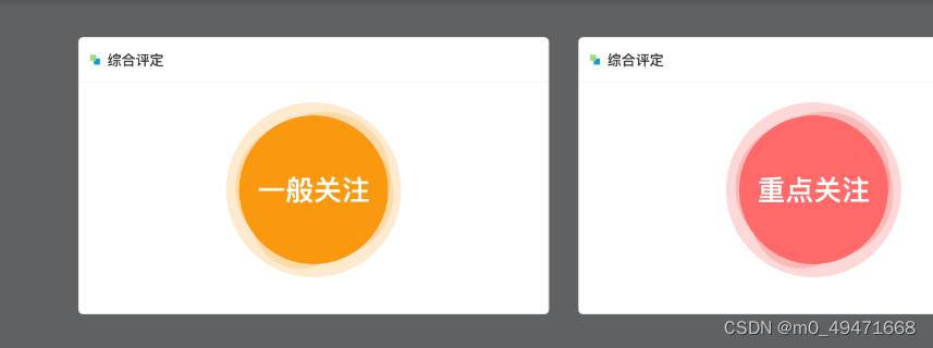
.circle-outside {
width: 200px;
height: 200px;
background-color: rgba(249, 203, 214);
border-radius: 50%;
}
.circle-inside {
text-align: center;
width: 180px;
height: 180px;
border-radius: 50%;
background-color: rgba(255, 106, 107);
position: relative;
top: 10px;
left: 10px;
}
.circle-outside {
width: 200px;
height: 200px;
background-color: rgba(253, 231, 210);
border-radius: 50%;
}
.circle-inside {
text-align: center;
width: 180px;
height: 180px;
border-radius: 50%;
background-color: rgba(250, 152, 15);
position: relative;
top: 10px;
left: 10px;
}


 这篇文章展示了三种不同背景颜色的CSS圆圈布局,每个圆圈内部有一个文本,通过CSS样式实现颜色变化和位置调整,体现了响应式设计在UI/UX中的应用。


 8411
8411

 被折叠的 条评论
为什么被折叠?
被折叠的 条评论
为什么被折叠?
 到【灌水乐园】发言


