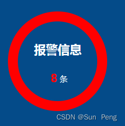
1、思路:
就是两个圆叠在一起,大的在下面,小的在上面
2、实现:
<div class="main">
<div class="circle">
<h2>报警信息</h2>
<span><strong>8</strong>条</span>
</div>
</div>
<style lang="scss">
.circle {
position: relative;
width: 200px;
height: 200px;
border-radius: 50%;
background: red;
text-align: center;
margin: 0 auto;
h2 {
position: absolute;
top: 30%;
left: 50%;
z-index: 999;
transform: translateX(-50%);
}
span {
position: absolute;
top: 60%;
left: 50%;
z-index: 999;
transform: translateX(-50%);
strong {
font-size: 24px;
color: red;
padding: 0 5px;
}
}
}
.circle::after { //小的圆
content: '';
width: 160px;
height: 160px;
background:
position: absolute; //通过定位来实现两个圆心在同一位置
top: 50%;
left: 50%;
border-radius: 50%;
transform: translate(-50%, -50%);
z-index: 10;
}
</style>
3、效果:


 8338
8338


 被折叠的 条评论
为什么被折叠?
被折叠的 条评论
为什么被折叠?
 到【灌水乐园】发言


