


文章目录
初识Material Design
由谷歌发明的一套全新的界面设计语言。包含了视觉,运动,互动效果等特性。Design Support库,将Material Design中最具代表性的一些控件和效果进行了封装。
Toolbar
继承了ActionBar的所有功能,而且灵活度很高,可以配合其他控件来完成Material Design的效果。
基本步骤:
1.更改程序的ActionBar主题
2.在布局中添加Toolbar控件
3.活动中设置支持动作栏
修改res/values/themes.xml中代码 将默认主题改为Toolbar 将ActionBar隐藏起来
<resources>
    <!-- Base application theme. -->
    <!-- Theme.AppCompat.Light.NoActionBar 淡色主题 -->
    <!-- Theme.AppCompat.NoActionBar 深色主题 -->
    <style name="Theme.Material" parent="Theme.AppCompat.Light.NoActionBar">
        <!-- Customize your theme here. -->
        <item name="colorPrimary">@color/colorPrimary</item>
        <item name="colorPrimaryDark">@color/colorPrimaryDark</item>
        <item name="colorAccent">@color/colorAccent</item>
    </style>
</resources>

使用Toolbar代替Actionbar
<FrameLayout xmlns:android="http://schemas.android.com/apk/res/android"
    xmlns:app="http://schemas.android.com/apk/res-auto"
    android:layout_width="match_parent"
    android:layout_height="match_parent">

    <!-- android:theme 设置Toolbar的主题风格-->
    <!-- app:popupTheme 单独指定弹出的菜单项的主题-->
    <androidx.appcompat.widget.Toolbar
        android:layout_width="match_parent"
        android:layout_height="?attr/actionBarSize"
        android:id="@+id/toolbar"
        android:background="?attr/colorPrimary"
        android:theme="@style/ThemeOverlay.AppCompat.Dark.ActionBar"
        app:popupTheme="@style/ThemeOverlay.AppCompat.Light"/>

</FrameLayout>
xmlns:app指定了一个新的命名空间,可以调用app的方法,为了兼容之前的老系统。接下来定义了一个ToolBar控件,将其高度设为actionBar的高度。
Toolbar toolbar = findViewById(R.id.toolbar);
setSupportActionBar(toolbar);
调用setSupportActionBar将toolbar传入。
修改标题栏显示的文字内容
<activity android:name=".MainActivity"
          android:label="文字内容">
</activity>
添加Action按钮
<menu xmlns:android="http://schemas.android.com/apk/res/android"
    xmlns:app="http://schemas.android.com/apk/res-auto">
    <item
        android:id="@+id/backup"
        android:icon="@drawable/ico_1"
        android:title="Backup"
        app:showAsAction="always"/>

    <item
        android:id="@+id/delete"
        android:icon="@drawable/ico_2"
        android:title="Delete"
        app:showAsAction="ifRoom"/>

    <item
        android:id="@+id/settings"
        android:icon="@drawable/ico_3"
        android:title="Settings"
        app:showAsAction="never"/>

</menu>
通过item来指定action按钮,app:showAsAction来指定按钮的显示位置,这里使用app命名空间,为了能够兼容低版本。always表示永远显示在toolbar中,如果屏幕不够则不显示;ifRoom表示屏幕空间充足的情况下显示在toolbar上,不足显示在菜单当中;never表示永远显示在菜单中。
注意:toolbar的action按钮只会显示图标,菜单中的action按钮只会显示文字。
加载文件
public boolean onCreateOptionsMenu(Menu menu) {
    //加载菜单文件
    getMenuInflater().inflate(R.menu.toolbar, menu);
    return true;
}
注册点击事件
@Override
    public boolean onOptionsItemSelected(@NonNull MenuItem item) {
        switch (item.getItemId()) {
            case R.id.backup:
                Toast.makeText(this, "Backup",Toast.LENGTH_SHORT).show();
                break;
            case R.id.delete:
                Toast.makeText(this, "Delete", Toast.LENGTH_SHORT).show();
                break;
            case R.id.settings:
                Toast.makeText(this, "Settings", Toast.LENGTH_SHORT).show();
                break;
            default:
                break;
        }
        return true;
    }
滑动菜单
DrawerLayout
将一些菜单选项隐藏起来,通过滑动的方式将菜单显示。节省屏幕位置,又实现了很好的动画效果。
DrawerLayout是一个布局,在布局中允许放入两个直接子控件,第一个子控件是主屏幕中显示的内容,第二个是滑动菜单中显示的内容。
<androidx.drawerlayout.widget.DrawerLayout
    xmlns:android="http://schemas.android.com/apk/res/android"
    xmlns:app="http://schemas.android.com/apk/res-auto"
    android:id="@+id/drawer_layout"
    android:layout_width="match_parent"
    android:layout_height="match_parent">

    <FrameLayout xmlns:android="http://schemas.android.com/apk/res/android"
        xmlns:app="http://schemas.android.com/apk/res-auto"
        android:layout_width="match_parent"
        android:layout_height="match_parent">

        <!-- android:theme 设置Toolbar的主题风格-->
        <!-- app:popupTheme 单独指定弹出的菜单项的主题-->
        <androidx.appcompat.widget.Toolbar
            android:layout_width="match_parent"
            android:layout_height="?attr/actionBarSize"
            android:id="@+id/toolbar"
            android:background="?attr/colorPrimary"
            android:theme="@style/ThemeOverlay.AppCompat.Dark.ActionBar"
            app:popupTheme="@style/ThemeOverlay.AppCompat.Light"/>
    </FrameLayout>

    <TextView
        android:layout_width="match_parent"
        android:layout_height="match_parent"
        android:layout_gravity="start"
        android:text="This is menu"
        android:textSize="30sp"
        android:background="#FFF"/>

</androidx.drawerlayout.widget.DrawerLayout>
DrawerLayout里设置了两个直接子控件,第一个是FrameLayout,用于作为主屏幕中显示的内容。第二个子控件使用了一个TextView,用于作为滑动菜单中显示的内容。这里用什么都可以,DrawerLayout并没有限制只能使用的固定控件。
关于第二个控件 android:layout_gravity需要注意,这个属性是必须指定的,用于指定滑动菜单在屏幕的左边还是右边,left表示在左边,right在右边,start则会根据系统的语言进行判断。
添加导航按钮,用户点击按钮后滑动菜单展现。
mDrawerLayout = findViewById(R.id.drawer_layout);
ActionBar actionBar = getSupportActionBar();
if(actionBar != null) {
    //让导航按钮显示
    actionBar.setDisplayHomeAsUpEnabled(true);
    //设置导航按钮图标
    actionBar.setHomeAsUpIndicator(R.drawable.icon_4);
}
实际上,Toolbar最左侧的按钮叫做HomeAsUp按钮,默认是一个返回的箭头,含义是返回上一个活动,在这里对它进行了修改。
case android.R.id.home:
    //使滑动菜单显示出来
    mDrawerLayout.openDrawer(GravityCompat.START);
    break;
注册点击事件,该按钮的id为android.R.id.home,最后调用函数将滑动菜单显示出来。
NavigationView
NavigationView是Design Support库的控件,不仅严格按照Material Design来设计,而且可以将滑动菜单页面的实现变得非常简单。
添加依赖
implementation 'com.android.support:design:28.0.0'
implementation 'de.hdodenhof:circleimageview:3.1.0'
第一个为Design Support库,第二个是一个开源项目,可以轻松实现图片圆形化的功能。项目地址,Design Support已经迁移到AndroidX中。迁移后的地址
implementation ‘com.google.android.material:material:1.0.0’
使用NavigationView前提。menu和headerLayout,menu用来显示具体的菜单项,headerLayout用来显示头部布局的。
菜单布局文件
<menu xmlns:android="http://schemas.android.com/apk/res/android">
    <group android:checkableBehavior="single">
        <item
            android:id="@+id/nav_call"
            android:icon="@drawable/icon_3"
            android:title="Call"/>

        <item
            android:id="@+id/nav_friends"
            android:icon="@drawable/icon_5"
            android:title="Friends"/>

        <item
            android:id="@+id/nav_location"
            android:icon="@drawable/icon_6"
            android:title="Location"/>

        <item
            android:id="@+id/nav_mail"
            android:icon="@drawable/icon_1"
            android:title="Mail"/>

        <item
            android:id="@+id/nav_task"
            android:icon="@drawable/icon_2"
            android:title="Task"/>
    </group>

</menu>
在menu中嵌套一个group标签,将checkableBehavior指定为single,表示组中所有菜单项只能单选。随后定义五个item,设置五个按钮。
<RelativeLayout xmlns:android="http://schemas.android.com/apk/res/android"
    android:padding="10dp"
    android:background="?attr/colorPrimary"
    android:layout_width="match_parent"
    android:layout_height="180dp">

    <de.hdodenhof.circleimageview.CircleImageView
        android:layout_width="70dp"
        android:layout_height="70dp"
        android:id="@+id/icon_image"
        android:src="@drawable/icon"
        android:layout_centerInParent="true"/>

    <TextView
        android:layout_width="wrap_content"
        android:layout_height="wrap_content"
        android:id="@+id/mail"
        android:layout_alignParentBottom="true"
        android:text="Judicious_x@mail.com"
        android:textColor="#FFF"
        android:textSize="14sp"/>

    <TextView
        android:layout_width="wrap_content"
        android:layout_height="wrap_content"
        android:id="@+id/username"
        android:layout_above="@+id/mail"
        android:text="Judicious_x"
        android:textColor="#FFF"
        android:textSize="14sp"/>

</RelativeLayout>
CircleImageView是将图片圆形化的控件,基本与imageView用法相似。
<androidx.drawerlayout.widget.DrawerLayout
    xmlns:android="http://schemas.android.com/apk/res/android"
    xmlns:app="http://schemas.android.com/apk/res-auto"
    android:id="@+id/drawer_layout"
    android:layout_width="match_parent"
    android:layout_height="match_parent">

    <FrameLayout
        android:layout_width="match_parent"
        android:layout_height="match_parent">

        <!-- android:theme 设置Toolbar的主题风格-->
        <!-- app:popupTheme 单独指定弹出的菜单项的主题-->
        <androidx.appcompat.widget.Toolbar
            android:layout_width="match_parent"
            android:layout_height="?attr/actionBarSize"
            android:id="@+id/toolbar"
            android:background="?attr/colorPrimary"
            android:theme="@style/ThemeOverlay.AppCompat.Dark.ActionBar"
            app:popupTheme="@style/ThemeOverlay.AppCompat.Light"/>
    </FrameLayout>

    <android.support.design.widget.NavigationView
        android:layout_width="match_parent"
        android:layout_height="match_parent"
        android:id="@+id/nav_view"
        android:layout_gravity="start"
        app:menu="@menu/nav_menu"
        app:headerLayout="@layout/nav_header"/>

</androidx.drawerlayout.widget.DrawerLayout>
设置NavigationView,通过app:menu与app:headerLayout进行设置。
@Override
    protected void onCreate(Bundle savedInstanceState) {
        ...
        NavigationView navigationView = findViewById(R.id.nav_view);
        //将call设置为默认选中
        navigationView.setCheckedItem(R.id.nav_call);
        //注册监听
        navigationView.setNavigationItemSelectedListener(new NavigationView.OnNavigationItemSelectedListener() {
            @Override
            public boolean onNavigationItemSelected(MenuItem menuItem) {
                //关闭滑动菜单
                mDrawerLayout.closeDrawers();
                return true;
            }
        });
    }
悬浮按钮和可交互提示
FloatingActionButton
FloatingActionButton是Design Support库提供的一个控件,可以帮助我们较轻松的实现悬浮按钮效果。
<FrameLayout
        android:layout_width="match_parent"
        android:layout_height="match_parent">
        ...
        <com.google.android.material.floatingactionbutton.FloatingActionButton
            android:layout_width="wrap_content"
            android:layout_height="wrap_content"
            android:id="@+id/fab"
            android:layout_gravity="bottom|end"
            android:layout_margin="16dp"
            android:src="@drawable/ic1"/>

    </FrameLayout>
添加了一个FloatingActionButton,其中android:layout_gravity中的end与之前遇到的start类似,根据系统语言判断按钮位置。android:layout_margin给控件的四周留边距。
该悬浮按钮下部还有阴影,因为该按钮是悬浮在当前界面上的,还可以设置悬浮的高度。
app:elevation="8dp"
高度值越大,投影范围越大,但是投影效果越淡。高度值越小,投影范围越小,但是投影效果越浓。
设置点击事件。
FloatingActionButton fab = findViewById(R.id.fab);
fab.setOnClickListener(new View.OnClickListener() {
    @Override
    public void onClick(View view) {
         Toast.makeText(MainActivity.this,"你点到我了", Toast.LENGTH_SHORT).show();
	}
});
它和button没什么两样。
Snackbar——更加先进的提示工具
Snackbar不是Toast的替代品,它们两者之间有着不同的应用场景。Toast是告诉用户现在发生了什么事,用户只能被动的接收这个事,没有什么办法能让用户选择。Snackbar则在这方面做了扩展,它允许在提示中添加一个可交互的按钮,当用户点击按钮后可以执行一下额外的逻辑操作。
它的用法与Toast相似,额外增加了一个按钮的点击事件。
FloatingActionButton fab = findViewById(R.id.fab);
fab.setOnClickListener(new View.OnClickListener() {
    @Override
    public void onClick(View view) {
        Snackbar.make(view, "Data delete", Snackbar.LENGTH_SHORT)
                .setAction("点击", new View.OnClickListener() {
                    @Override
                    public void onClick(View view) {
                        Toast.makeText(MainActivity.this,"你点到我了", Toast.LENGTH_SHORT).show();
                    }
                 })
                .show();
    }
});
调用Snackbar.make来创建一个Snackbar对象,第一个参数是一个view,只要是当前界面布局的任意一个都可以,Snackbar会通过这个view来自动查找最外层的布局,用于展示Snackbar。第二个参数是Snackbar中显示的内容,第三个是显示的时长。setAction()设置一个动作,达到可以与用户进行交互的效果,我们在内部设置了一个Toast提示,最后利用show方法让Snackbar显示出来。
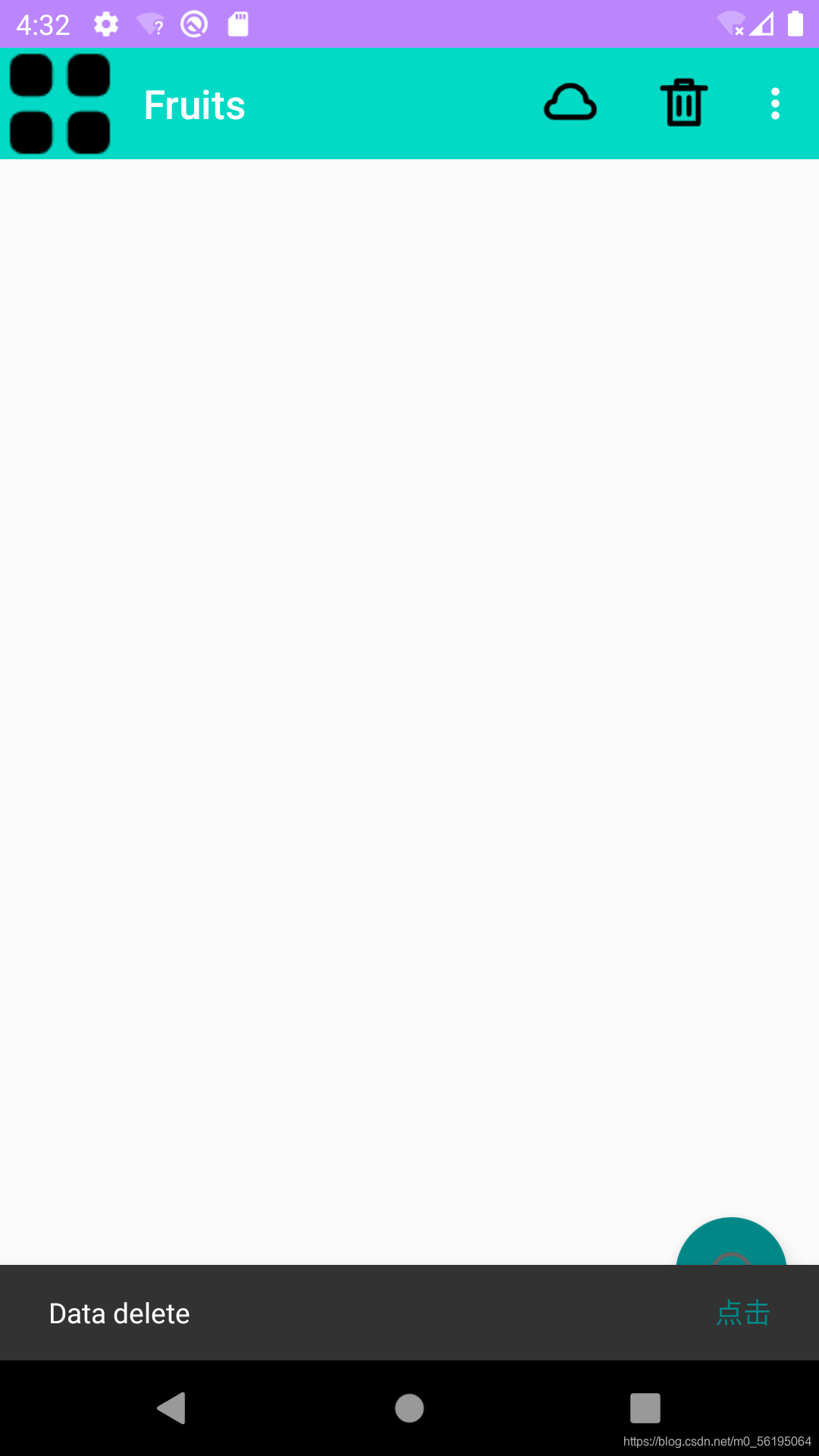
可以看到,Snackbar从底部出现了,上面有我们所设置的文字以及点击按钮。过一段时间后Snackbar会消失,但是它出现时却遮挡住了悬浮按钮,借助CoordinatorLayout就可以解决。
CoordinatorLayout
可以说是一个加强版的FrameLayout,该布局也是由Design Support库提供的。CoordinatorLayout可以监听所有子控件的各种事件,然后自动帮我们做出最为合理的响应。
使用方式也很简单,改变原有的FrameLayout即可。
<androidx.coordinatorlayout.widget.CoordinatorLayout
        ...
</androidx.coordinatorlayout.widget.CoordinatorLayout>
CoordinatorLayout可以监听其所有子控件的各种事件,Snackbar为什么可以被监听到?
因为我们在Snackbar的make()方法中传人了一个参数view,这个参数就是用来指定Snackbar是基于哪个View来触发的,刚才我们传人的是FloatingActionButton本身,而FloatingActionButton 是CoordinatorLayout 中的子控件,因此这个事件就理所应当能被监听到了。
卡片式布局
卡片式布局也是Materials Design中提出的一个新的概念,它可以让页面中的元素看起来就像在卡片中一样,并且还能拥有圆角和投影。
CardView
它是用于实现卡片式布局效果的重要控件,由appcompat-v7库提供。实际上也是一个FrameLayout,只是额外提供了圆角和阴影等效果,看上去会有立体的感觉。
使用Recycleview来填充MaterialTest项目的主页面部分。
添加依赖:
implementation 'androidx.recyclerview:recyclerview:1.0.0'
implementation 'com.github.bumptech.glide:glide:4.12.0'
implementation 'androidx.cardview:cardview:1.0.0'
annotationProcessor 'com.github.bumptech.glide:compiler:4.12.0'
在这里添加了一个Glide库的依赖,这是一个超级强大的图片加载库,它不仅可以用于加载本地图片,还可以加载网络图片、GIF图片、甚至是本地视频。最重要的是用法简单,只需要一行代码就能轻松实现复杂的图片加载功能。项目地址。
<androidx.drawerlayout.widget.DrawerLayout
    ...

    <androidx.coordinatorlayout.widget.CoordinatorLayout
        ...

        <androidx.appcompat.widget.Toolbar
            ...

        <androidx.recyclerview.widget.RecyclerView
            android:layout_width="match_parent"
            android:layout_height="match_parent"
            android:id="@+id/recycler_view"/>

        <com.google.android.material.floatingactionbutton.FloatingActionButton
            ...

    </androidx.coordinatorlayout.widget.CoordinatorLayout>

    <com.google.android.material.navigation.NavigationView
        ...

</androidx.drawerlayout.widget.DrawerLayout>
在CoordinatorLayout中添加了一个RecyclerView。
Fruit类
public class Fruit {
    private String name;
    private int imageId;

    public String getName() {
        return name;
    }

    public int getImageId() {
        return imageId;
    }

    public Fruit(String name, int imageId) {
        this.name = name;
        this.imageId = imageId;
    }
}
布局文件
<androidx.cardview.widget.CardView
    xmlns:android="http://schemas.android.com/apk/res/android"
    xmlns:app="http://schemas.android.com/apk/res-auto"
    android:layout_width="match_parent"
    android:layout_height="wrap_content"
    android:layout_margin="5dp"
    app:cardCornerRadius="4dp">

    <LinearLayout
        android:layout_width="match_parent"
        android:layout_height="wrap_content"
        android:orientation="vertical">

        <ImageView
            android:layout_width="match_parent"
            android:layout_height="100dp"
            android:id="@+id/fruit_image"
            android:scaleType="centerCrop"/>

        <TextView
            android:layout_width="wrap_content"
            android:layout_height="wrap_content"
            android:id="@+id/fruit_name"
            android:layout_gravity="center_horizontal"
            android:layout_margin="5dp"
            android:textSize="16sp"/>

    </LinearLayout>

</androidx.cardview.widget.CardView>
这里我们使用CardView作为子项最外层的布局,从而使得RecyclerView中每个元素都是在卡片中的,其中app:cardCornerRadius属性指定卡片的圆角弧度,数值越大,圆角的弧度也越大。由于CardView是一个FrameLayout,没有什么方便的定位方式,我们在其中嵌套了一个LinearLayout,然后在LinearLayout中放置具体的内容。
ImageView中android:scaleType属性可以指定图片的缩放模式,由于每张照片的长宽比例可能都不一致,为了让所有照片都充满整个Imageview,使用了centerCrop模式。它可以让图片保持原有比例充满ImageView,超出屏幕的部分裁剪掉。
适配器:
public class FruitAdapter extends RecyclerView.Adapter<FruitAdapter.ViewHolder> {
    private Context mContext;

    private List<Fruit> mFruitList;

    static class ViewHolder extends RecyclerView.ViewHolder {
        CardView cardView;
        ImageView fruitImage;
        TextView fruitName;

        public ViewHolder(View itemView) {
            super(itemView);
            cardView = (CardView)itemView;
            fruitImage = itemView.findViewById(R.id.fruit_image);
            fruitName = itemView.findViewById(R.id.fruit_name);
        }
    }

    public FruitAdapter(List<Fruit> list) {
        mFruitList = list;
    }

    @Override
    public FruitAdapter.ViewHolder onCreateViewHolder(ViewGroup parent, int viewType) {
        if(mContext == null) {
            mContext = parent.getContext();
        }
        View view = LayoutInflater.from(parent.getContext()).inflate(R.layout.fruit_item, parent, false);
        return new ViewHolder(view);
    }

    @Override
    public void onBindViewHolder(FruitAdapter.ViewHolder holder, int position) {
        Fruit fruit = mFruitList.get(position);
        holder.fruitName.setText(fruit.getName());
        //使用Glide加载照片 首先通过Glide.with()方法并传入一个Context Activity Fragment参数
        //调用load方法加载图片 可以是一个URL地址 也可以是一个本地路径 或者是资源的id
        //最后调用into将图片设置到具体某一个ImageView中
        Glide.with(mContext).load(fruit.getImageId()).into(holder.fruitImage);

    }

    @Override
    public int getItemCount() {
        return mFruitList.size();
    }
}
这里使用Glide原因是其内部做了许多复杂的操作,其中包括压缩图片,可以使像素高的图片同样得到展示而不会造成内存溢出的危险。
//定义一个水果数组
    private Fruit[] fruits = {new Fruit("Apple", R.drawable.apple), new Fruit("StrawBerry", R.drawable.strawbe)
    ,new Fruit("Cherry", R.drawable.cherry),new Fruit("Mango",R.drawable.mango)
    ,new Fruit("猕猴桃", R.drawable.kifi),new Fruit("胡萝卜", R.drawable.carrot)};

    //定义水果集合
    private List<Fruit> fruitList = new ArrayList<>();

    private FruitAdapter fruitAdapter;

    @Override
    protected void onCreate(Bundle savedInstanceState) {
        ...
        //初始化
        initFruits();
        RecyclerView recyclerView = findViewById(R.id.recycler_view);
        GridLayoutManager layoutManager = new GridLayoutManager(this, 2);
        recyclerView.setLayoutManager(layoutManager);
        fruitAdapter = new FruitAdapter(fruitList);
        recyclerView.setAdapter(fruitAdapter);
    }
在MainActivity中首先定义了一个数组,数组里面存放着Fruit实例,初始化fruitList,采用了网格式布局,传入的参数第一个是Context,第二个是列数。

每个水果都在独立的卡片当中,并且还拥有圆角和投影。但是Toolbar被RecyclerView挡住了,解决这个问题需要借助AppBarLayout。
AppBarLayout
由于RecyclerView和Toolbar都是放置在CoordinatorLayout中的,而CoordinatorLayout是一个加强版的FrameLayout,其内部的控件在不指明的情况下默认在布局左上角,也就产生了遮挡的现象。
这里准备使用Design Support库中的另一个工具——AppBarLayout。AppBarLayout实际上是一个垂直方向的LinearLayout,它在内部做了很多滚动事件的封装,并应用一些Material Design的理念。
AppBarLayout 只有作为 CoordinatorLayout 的直接子 View 时才能正常工作,为了让 AppBarLayout 能够知道何时滚动其子 View,
我们还应该在 CoordinatorLayout 布局中提供一个可滚动 View,我们称之为 Scrolling View。
Scrolling View 和 AppBarLayout 之间的关联,通过将 Scrolling View 的 Behavior 设为 AppBarLayout.ScrollingViewBehavior 来建立。
解决覆盖问题步骤:
- 将Toolbar嵌套在AppBarLayout当中
- 给RecyclerView指定一个布局行为
<androidx.drawerlayout.widget.DrawerLayout
    ...

    <androidx.coordinatorlayout.widget.CoordinatorLayout
        ...

        <com.google.android.material.appbar.AppBarLayout
            android:layout_width="match_parent"
            android:layout_height="wrap_content">

            <!-- android:theme 设置Toolbar的主题风格-->
            <!-- app:popupTheme 单独指定弹出的菜单项的主题-->
            <androidx.appcompat.widget.Toolbar
                android:layout_width="match_parent"
                android:layout_height="?attr/actionBarSize"
                android:id="@+id/toolbar"
                android:background="?attr/colorPrimary"
                android:theme="@style/ThemeOverlay.AppCompat.Dark.ActionBar"
                app:popupTheme="@style/ThemeOverlay.AppCompat.Light"/>

        </com.google.android.material.appbar.AppBarLayout>


        <androidx.recyclerview.widget.RecyclerView
            android:layout_width="match_parent"
            android:layout_height="match_parent"
            android:id="@+id/recycler_view"
            app:layout_behavior="@string/appbar_scrolling_view_behavior"/>

        <com.google.android.material.floatingactionbutton.FloatingActionButton
            ...

    </androidx.coordinatorlayout.widget.CoordinatorLayout>

    <com.google.android.material.navigation.NavigationView
        ...

</androidx.drawerlayout.widget.DrawerLayout>
定义了一个AppBarLayout,将Toolbar嵌套在AppBarLayout当中。在RecyclerView中添加了app:layout_behavior属性,指定了一个布局行为。appbar_scrolling_view_behavior也是由Design Support库提供的。
当RecyclerView滚动的时候就已经将滚动的事件都通知给AppBarLayout了,只是我们还没有进行处理。当AppBarLayout接收到滚动事件时,它内部的子控件其实是可以指定如何去影响这些事件的,通过app:layout_scrollFlags属性就能实现。
<com.google.android.material.appbar.AppBarLayout
    android:layout_width="match_parent"
    android:layout_height="wrap_content">

    <!-- android:theme 设置Toolbar的主题风格-->
    <!-- app:popupTheme 单独指定弹出的菜单项的主题-->
    <androidx.appcompat.widget.Toolbar
        android:layout_width="match_parent"
        android:layout_height="?attr/actionBarSize"
        android:id="@+id/toolbar"
        android:background="?attr/colorPrimary"
        android:theme="@style/ThemeOverlay.AppCompat.Dark.ActionBar"
        app:popupTheme="@style/ThemeOverlay.AppCompat.Light"
        app:layout_scrollFlags="scroll|enterAlways|snap"/>

</com.google.android.material.appbar.AppBarLayout>
在Toolbar中添加了app:layout_scrollFlags属性,并将这个属性指定为scroll|enterAlways|snap。其中,scroll表示当RecyclerView向上滚动的时候,Toolbar会跟着一起向上滚动并实现隐藏;enterAlways表示当RecyclerView向下滚动的时候,Toolbar会跟着一起向下滚动并重新显示;snap表示当Toolbar还没有完全隐藏或显示的时候,会根据当前滚动的距离,自动选择是隐藏还是显示。
下拉刷新
SwipeRefreshLayout是用于实现下拉刷新功能的核心类,它由support-v4库提供的。我们将需要实现下拉刷新功能的控件放置在SwipeRefreshLayout中,就可以实现了。
- 在布局中添加SwipeRefreshLayout
<androidx.swiperefreshlayout.widget.SwipeRefreshLayout
            android:id="@+id/swipe_refresh"
            android:layout_width="match_parent"
            android:layout_height="match_parent"
            app:layout_behavior="@string/appbar_scrolling_view_behavior">

            <androidx.recyclerview.widget.RecyclerView
                android:layout_width="match_parent"
                android:layout_height="match_parent"
                android:id="@+id/recycler_view"
                app:layout_behavior="@string/appbar_scrolling_view_behavior"/>

        </androidx.swiperefreshlayout.widget.SwipeRefreshLayout>
在RecyclerView外添加 就可以让其实现下拉刷新功能。
- 具体实现逻辑
public class MainActivity extends AppCompatActivity {
    private SwipeRefreshLayout swipeRefreshLayout;
    @Override
    protected void onCreate(Bundle savedInstanceState) {
        ...
        swipeRefreshLayout = findViewById(R.id.swipe_refresh);
        //设置下拉刷新进度条的颜色
        swipeRefreshLayout.setColorSchemeResources(R.color.design_default_color_primary);
        //注册监听器
        swipeRefreshLayout.setOnRefreshListener(new SwipeRefreshLayout.OnRefreshListener() {
            @Override
            public void onRefresh() {
                refreshFruits();
            }
        });
    }

    private void refreshFruits() {
        new Thread(new Runnable() {
            @Override
            public void run() {
                try {
                    //让线程睡一会 以便于用户清晰的看到刷新过程
                    Thread.sleep(2000);
                } catch (InterruptedException e) {
                    e.printStackTrace();
                }
                //将线程切回主线程
                runOnUiThread(new Runnable() {
                    @Override
                    public void run() {
                        initFruits();
                        //通知数据发生了变化
                        fruitAdapter.notifyDataSetChanged();
                        //表示刷新事件结束 并隐藏刷新进度条
                        swipeRefreshLayout.setRefreshing(false);
                    }
                });
            }
        }).start();
    }
可折叠式标题栏
CollapsingToolbarLayout
它是一个作用与Toolbar上的布局,也是由Design Support库提供的。可以让Toolbar的效果更加丰富,不仅仅是展示一个标题栏。
但是它是不能独立存在的,它在设计的时候就被限定只能作为AppBarLayout的直接子布局来使用。
<androidx.coordinatorlayout.widget.CoordinatorLayout
    xmlns:android="http://schemas.android.com/apk/res/android"
    xmlns:app="http://schemas.android.com/apk/res-auto"
    android:layout_width="match_parent"
    android:layout_height="match_parent">

    <com.google.android.material.appbar.AppBarLayout
        android:layout_width="match_parent"
        android:layout_height="250dp"
        android:id="@+id/appBar">
        <com.google.android.material.appbar.CollapsingToolbarLayout
            android:layout_width="match_parent"
            android:layout_height="match_parent"
            android:id="@+id/collapsing_toolbar"
            android:theme="@style/ThemeOverlay.AppCompat.Dark.ActionBar"
            app:contentScrim="?attr/colorPrimary"
            app:layout_scrollFlags="scroll|exitUntilCollapsed">

            <ImageView
                android:layout_width="match_parent"
                android:layout_height="match_parent"
                android:id="@+id/fruit_image_view"
                android:scaleType="centerCrop"
                app:layout_collapseMode="parallax"/>

            <androidx.appcompat.widget.Toolbar
                android:layout_width="match_parent"
                android:layout_height="?attr/actionBarSize"
                app:layout_collapseMode="pin"
                android:id="@+id/toolbar"/>

        </com.google.android.material.appbar.CollapsingToolbarLayout>
    </com.google.android.material.appbar.AppBarLayout>

    <androidx.core.widget.NestedScrollView
        android:layout_width="match_parent"
        android:layout_height="match_parent"
        app:layout_behavior="@string/appbar_scrolling_view_behavior">

        <LinearLayout
            android:layout_width="match_parent"
            android:layout_height="wrap_content"
            android:orientation="vertical">

            <androidx.cardview.widget.CardView
                android:layout_width="match_parent"
                android:layout_height="wrap_content"
                android:layout_marginBottom="15sp"
                android:layout_marginLeft="15dp"
                android:layout_marginRight="15dp"
                android:layout_marginTop="35dp"
                app:cardCornerRadius="4dp">

                <TextView
                    android:layout_width="wrap_content"
                    android:layout_height="wrap_content"
                    android:id="@+id/fruit_content_text"
                    android:layout_margin="10dp"/>
            </androidx.cardview.widget.CardView>
        </LinearLayout>
    </androidx.core.widget.NestedScrollView>

    <com.google.android.material.floatingactionbutton.FloatingActionButton
        android:layout_width="wrap_content"
        android:layout_height="wrap_content"
        android:layout_margin="16dp"
        android:src="@drawable/ic1"
        app:layout_anchor="@id/appBar"
        app:layout_anchorGravity="bottom|end"/>

</androidx.coordinatorlayout.widget.CoordinatorLayout>
首先,定义一个CoordinatorLayout作为最外层布局,在其中嵌套一个AppBarLayout,在AppBarLayout中嵌套一个CollapsingToolbarLayout,通过android:theme为其指定了一个ThemeOverlay.AppCompat.Dark.ActionBar的主题。app:contentScrim用于指定CollapsingToolbarLayout在趋于折叠状态以及折叠之后的背景色,app:layout_scrollFlags中scroll表示CollapsingToolbarLayout会随着水果内容的详情滚动一起滚动,exitUntilCollapsed表示当CollapsingToolbarLayout随着滚动完成折叠之后就保留在页面上,不在移除屏幕。
在CollapsingToolbarLayout中定义了一个ImageView和Toolbar,意味着,这个高级版标题栏是由普通标题栏加上图片组合而成的。其中app:layout_collapseMode用于指定当前控件在CollapsingToolbarLayout折叠过程中的折叠模式,其中Toolbar指定为pin,表示在折叠的过程中位置始终保持不变,ImageView指定为parallax,表示会在折叠的过程中产生一定的错位偏移,这种模式的视觉效果会非常好。
以上是标题栏的编写,下面是水果内容详情部分。水果内容详情的最外层布局使用一个NestedScrollView,它和AppBarLayout是平级的。NestedScrollView在允许使用滚动的方式来查看屏幕以外的数据之外还增加了嵌套响应滚动事件的功能。由于CoordinatorLayout本身已经可以响应滚动事件了,因此我们在它内部就需要使用NestedScrollView和RecyclerView这样的布局。还通过app:layout_behavior指定了一个布局行为。
NestedScrollView内部只允许存在一个子布局,因此我们需要嵌套一个LinearLayout,以便于放入具体的内容。
这里我们使用TextView来显示水果的内容详情,并将它放入卡片式布局当中。最后加入了一个悬浮按钮。app:layout_anchor用于设置锚点,这样悬浮按钮就会出现在水果标题栏的区域内, app:layout_anchorGravity用于指定按钮的位置。
编写功能逻辑
public class FruitActivity extends AppCompatActivity {
    public static final String FRUIT_NAME = "fruit_name";
    public static final String FRUIT_IMAGE_ID = "fruit_image_id";


    @Override
    protected void onCreate(Bundle savedInstanceState) {
        super.onCreate(savedInstanceState);
        setContentView(R.layout.activity_fruit);
        //通过Intent获取传入的水果名和水果图片资源的id
        Intent intent = getIntent();
        String fruitName = intent.getStringExtra(FRUIT_NAME);
        int fruitImageId = intent.getIntExtra(FRUIT_IMAGE_ID, 0);
        //获取各个控件的实例
        Toolbar toolbar = findViewById(R.id.toolbar);
        CollapsingToolbarLayout collapsingToolbarLayout = findViewById(R.id.collapsing_toolbar);
        ImageView fruitImageView = findViewById(R.id.fruit_image_view);
        TextView fruitContentText = findViewById(R.id.fruit_content_text);
        //将Toolbar作为ActionBar显示
        setSupportActionBar(toolbar);
        ActionBar actionBar = getSupportActionBar();
        if(actionBar != null) {
            //启用HomeAsUp按钮
            actionBar.setDisplayHomeAsUpEnabled(true);
        }
        //将水果名设置为当前界面的标题
        collapsingToolbarLayout.setTitle(fruitName);
        //使用Glide加载传入的水果图片 并设置到标题栏的ImageView上面
        Glide.with(this).load(fruitImageId).into(fruitImageView);
        //生成一个字符串
        String fruitContent = generateFruitContent(fruitName);
        //显示在TextView上面
        fruitContentText.setText(fruitContent);

    }

    private String generateFruitContent(String fruitName) {
        //将水果名循环500次生成一个长的字符串
        StringBuilder fruitContent = new StringBuilder();
        for(int i = 0; i < 500; i++) {
            fruitContent.append(fruitName);
        }
        return fruitContent.toString();
    }

    @Override
    public boolean onOptionsItemSelected(@NonNull MenuItem item) {
        //处理HomeAsUp按钮的点击事件
        switch (item.getItemId()) {
            case android.R.id.home:
                finish();
                return true;
        }
        return super.onOptionsItemSelected(item);
    }
}
处理RecyclerView点击事件:
@Override
    public FruitAdapter.ViewHolder onCreateViewHolder(ViewGroup parent, int viewType) {
        if(mContext == null) {
            mContext = parent.getContext();
        }
        View view = LayoutInflater.from(parent.getContext()).inflate(R.layout.fruit_item, parent, false);
        final ViewHolder holder = new ViewHolder(view);
        //给CardView注册点击事件监听器
        holder.cardView.setOnClickListener(new View.OnClickListener() {
            @Override
            public void onClick(View view) {
                //获取水果实例 并将所点击项的水果名和水果图片资源id传入intent中
                int position = holder.getAdapterPosition();
                Fruit fruit = mFruitList.get(position);
                Intent intent = new Intent(mContext, FruitActivity.class);
                intent.putExtra(FruitActivity.FRUIT_NAME, fruit.getName());
                intent.putExtra(FruitActivity.FRUIT_IMAGE_ID, fruit.getImageId());
                //启动FruitActivity
                mContext.startActivity(intent);
            }
        });
        return holder;
    }
充分利用系统状态栏空间
使背景栏和状态栏融合,需要借助android:fitsSystemWindows这个属性来实现。在CoordinatorLayout,AppBarLayout,CollapsingToolbarLayout这种嵌套结构的布局中,将android:fitsSystemWindows设置为true,表示该控件会出现在系统状态栏里。
<androidx.coordinatorlayout.widget.CoordinatorLayout
    ...
    android:fitsSystemWindows="true">

    <com.google.android.material.appbar.AppBarLayout
        ...
        android:fitsSystemWindows="true">

        <com.google.android.material.appbar.CollapsingToolbarLayout
            ...
            android:fitsSystemWindows="true">

            <ImageView
                ...
                android:fitsSystemWindows="true"/>

        </com.google.android.material.appbar.CollapsingToolbarLayout>
    </com.google.android.material.appbar.AppBarLayout>
</androidx.coordinatorlayout.widget.CoordinatorLayout>
在程序的主题中将状态栏指定为透明色。只需要改变android:statusBarColor这个属性即可,这个属性从API21,也就是Android5.0开始有的,之前的系统无法指定这个属性。
创建一个values-v21目录,创建一个styles.xml 定义一个FruitActivityTheme主题,继承Theme.Material中所有特性,在FruitActivityTheme中将状态栏指定为透明色。
<resources>
    <style name="FruitActivityTheme" parent="Theme.Material">
        <item name="android:statusBarColor">@android:color/transparent</item>
    </style>
</resources>
在Android5.0之前无法识别这个主题,因此还需要对values/themes.xml修改。
<resources>
    <!-- Base application theme. -->
    <!-- Theme.AppCompat.Light.NoActionBar 淡色主题 -->
    <!-- Theme.AppCompat.NoActionBar 深色主题 -->
    <style name="Theme.Material" parent="Theme.AppCompat.Light.NoActionBar">
        <!-- Customize your theme here. -->
        <item name="colorPrimary">@color/teal_200</item>
        <item name="colorPrimaryDark">@color/purple_200</item>
        <item name="colorAccent">@color/teal_700</item>
    </style>
    <style name="FruitActivityTheme" parent="Theme.Material">
    </style>
</resources>
修改AndroidManifest.xml中代码 让FruitActivity使用该主题。
<activity android:name=".FruitActivity"
    	  android:theme="@style/FruitActivityTheme"></activity>


 7130
7130


 被折叠的 条评论
为什么被折叠?
被折叠的 条评论
为什么被折叠?
 到【灌水乐园】发言


