


目录
1.简介
Matplotlib是一个Python 2D绘图库,可生成绘图,直方图,功率谱,条形图,错误图,散点图等。
2.案例
2.1 简单图形绘制
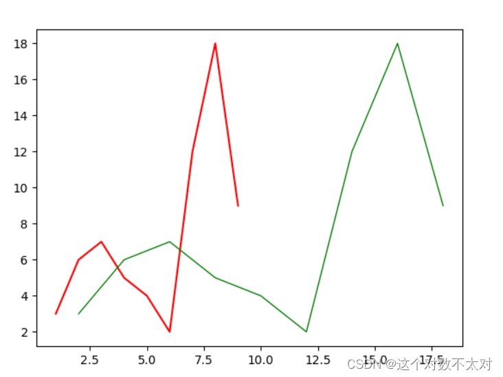
- 折线图
- plot()
import numpy as np
import matplotlib.pyplot as plt

# TODO:折线图
x = np.array([1, 2, 3, 4, 5, 6, 7, 8, 9])
y = np.array([3, 6, 7, 5, 4, 2, 12, 18, 9])
# x和y的折线图
plt.plot(x, y, color="r")
# x平方和y的折线图
plt.plot(x*2,y,color="g",lw=1)
plt.show()
结果如图
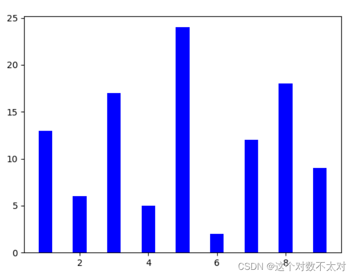
- 绘制柱状图
- bar()
# TODO:柱状图
x = np.array([1, 2, 3, 4, 5, 6, 7, 8, 9])
y = np.array([13, 6, 17, 5, 24, 2, 12, 18, 9])
plt.bar(x,y,0.4,color="b")
plt.show()
结果如图
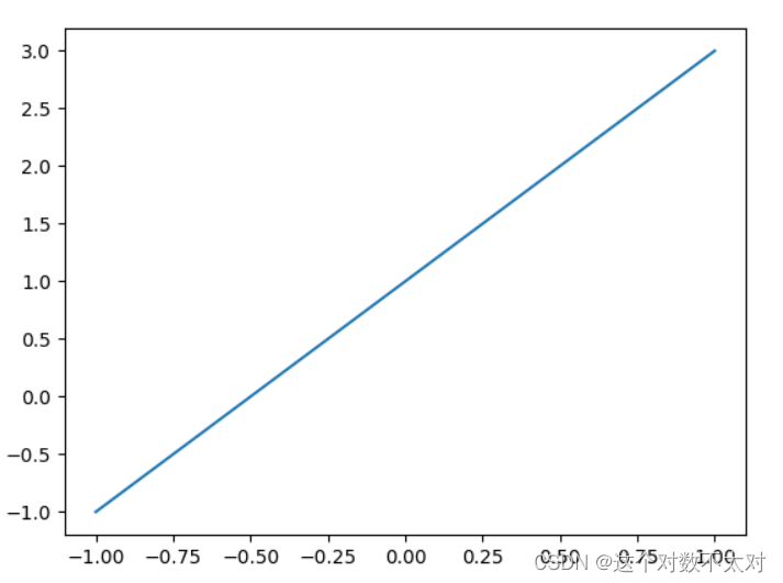
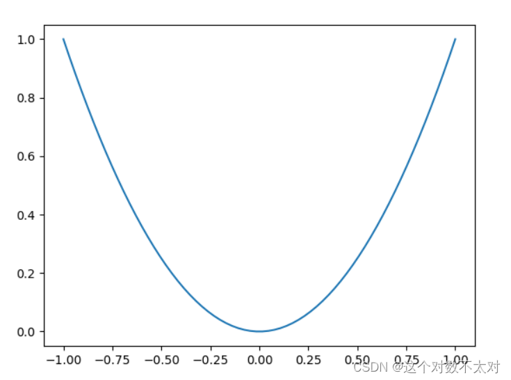
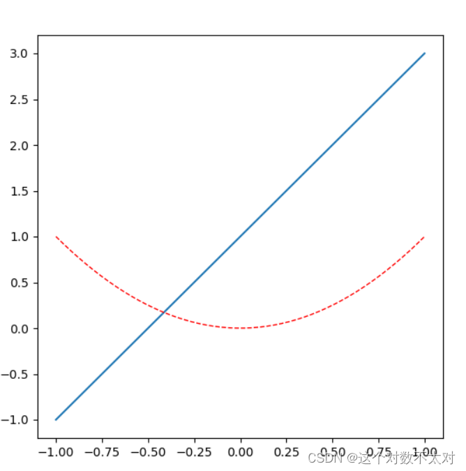
3. 根据函数图像绘制
- plot()
import matplotlib.pyplot as plt
import numpy as np

# 从-1~1之间等间隔采66个数.即所画出来的图形是66个点连接得来的
# 注意:如果点数过小的话会导致画出来二次函数图像不平滑
x = np.linspace(-1, 1,66)
# 绘制y=2x+1函数的图像
y = 2 * x + 1
plt.plot(x, y)
plt.show()

# 绘制x^2函数的图像
y = x**2
plt.plot(x, y)
plt.show()
结果如图
2.2 figure 简单使用
生成画布
import numpy as np
import matplotlib.pyplot as plt

# todo:每个figure上面画一个图像
x = np.linspace(-1, 1, 50)
y1 = 2 * x + 1
# 创建一个画布
plt.figure()
# 在画布上画上一个图像
plt.plot(x, y1)

y2 = x ** 2
plt.figure()
plt.plot(x, y2)

plt.show()
# todo:两个图像画在同一张画布上面
plt.figure(num=3,figsize=(6,6))
plt.plot(x,y1)
plt.plot(x,y2,color="red",lw=1,linestyle='--')
plt.show()
两个图像画在同一张画布 结果如图
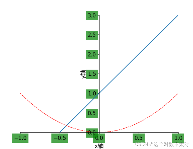
2.3 设置坐标轴
- xlim():x轴取值范围
- xlable():x轴标签名
- xtick():x轴上取点
# todo:设置坐标轴
import matplotlib.pyplot as plt
import numpy as np

# 绘制普通图像
x = np.linspace(-1, 1, 50)
y1 = 2 * x + 1
y2 = x**2

plt.figure()
plt.plot(x, y1)
plt.plot(x, y2, color = 'red', linewidth = 1.0, linestyle = '--')

# 设置坐标轴的取值范围
plt.xlim((-1, 1))
plt.ylim((0, 3))

# 设置坐标轴的lable
#标签里面必须添加字体变量:fontproperties='SimHei',fontsize=14。不然可能会乱码
plt.xlabel('x轴',fontproperties='SimHei',fontsize=14)
plt.ylabel('y轴',fontproperties='SimHei',fontsize=14)

# 设置x坐标轴刻度, 之前为0.25, 修改后为0.5
# 也就是在坐标轴上取5个点,x轴的范围为-1到1所以取5个点之后刻度就变为0.5了
plt.xticks(np.linspace(-1, 1, 5))

# 获取当前的坐标轴, gca = get current axis
ax = plt.gca()
# 设置右边框和上边框
ax.spines['right'].set_color('none')
ax.spines['top'].set_color('none')
# 设置x坐标轴为下边框
ax.xaxis.set_ticks_position('bottom')
# 设置y坐标轴为左边框
ax.yaxis.set_ticks_position('left')
# 设置x轴, y周在(0, 0)的位置
ax.spines['bottom'].set_position(('data', 0))
ax.spines['left'].set_position(('data', 0))

# 设置坐标轴label的大小,背景色等信息
for label in ax.get_xticklabels() + ax.get_yticklabels():
    label.set_fontsize(12)
    label.set_bbox(dict(facecolor = 'green', edgecolor = 'None', alpha = 0.7))

plt.show()
结果如图
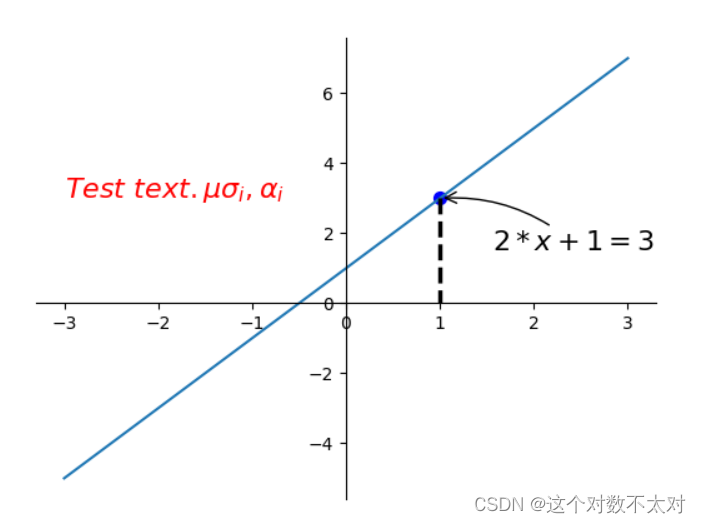
2.4 添加注解和绘制点以及在图形上绘制线或点
#TODO:添加注解和绘制点以及在图形上绘制或点
import matplotlib.pyplot as plt
import numpy as np

# 绘制普通图像
x = np.linspace(-3, 3, 50)
y = 2 * x + 1

plt.figure()
plt.plot(x, y)

# 将上、右边框去掉
ax = plt.gca()
ax.spines['right'].set_color('none')
ax.spines['top'].set_color('none')

# 设置x轴的位置及数据在坐标轴上的位置
ax.xaxis.set_ticks_position('bottom')
ax.spines['bottom'].set_position(('data', 0))
# 设置y轴的位置及数据在坐标轴上的位置
ax.yaxis.set_ticks_position('left')
ax.spines['left'].set_position(('data', 0))

# 定义(x0, y0)点
x0 = 1
y0 = 2 * x0 + 1

# 绘制(x0, y0)点 s:标量或形如shape(n,)数组
plt.scatter(x0, y0, s = 50, color = 'blue')
# 绘制虚线 两个点之间距离  lw:线宽
plt.plot([x0, x0], [y0, 0], 'k--', lw = 2.5)
# 绘制注解一  xycoords and textcoords 是坐标xy与xytext的说明
# arrowprops -- 用于设置箭头的形状,类型为字典类型
plt.annotate(r'$2 * x + 1 = %s$' % y0, xy = (x0, y0), xycoords = 'data', xytext = (+30, -30), \
             textcoords = 'offset points', fontsize = 16, arrowprops = dict(arrowstyle = '->', connectionstyle = 'arc3, rad = .2'))

# 绘制注解二
plt.text(-3, 3, r'$Test\ text. \mu \sigma_i, \alpha_i$', fontdict = {'size': 16, 'color': 'red'})
plt.show()
结果如图
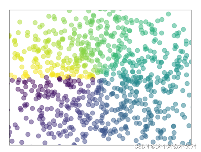
2.5 绘制散点图
- scatter()
import numpy as np
import matplotlib.pyplot as plt

# 数据个数
n = 1024
# 均值为0, 方差为1的随机数
x = np.random.normal(0, 1, n)
y = np.random.normal(0, 1, n)

# 计算颜色值:反切值
color = np.arctan2(y, x)
# 绘制散点图
plt.scatter(x, y, s = 75, c = color, alpha = 0.5)
# 设置坐标轴范围
plt.xlim((-1.5, 1.5))
plt.ylim((-1.5, 1.5))

# 不显示坐标轴的值
plt.xticks(())
plt.yticks(())
plt.show()
结果如图
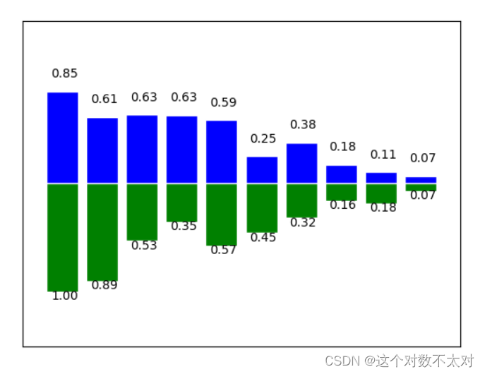
2.6 绘制柱状图
- bar()
import matplotlib.pyplot as plt
import numpy as np

# 数据数目
n = 10
x = np.arange(n)
# 生成数据, 均匀分布(0.5, 1.0)之间 从一个均匀分布[low,high)中随机采样,注意定义域是左闭右开,即包含low,不包含high.
y1 = (1 - x / float(n)) * np.random.uniform(0.5, 1.0, n)
y2 = (1 - x / float(n)) * np.random.uniform(0.5, 1.0, n)

# 绘制柱状图, 向上
plt.bar(x, y1, facecolor = 'blue', edgecolor = 'white')
# 绘制柱状图, 向下
plt.bar(x, -y2, facecolor = 'green', edgecolor = 'white')

#将两个数列形成对应元祖的形式
temp = zip(x, y2)
# 在柱状图上显示具体数值, ha水平对齐, va垂直对齐
for x, y in zip(x, y1):
    plt.text(x + 0.05, y + 0.1, '%.2f' % y, ha = 'center', va = 'bottom')

for x, y in temp:
    plt.text(x + 0.05, -y - 0.1, '%.2f' % y, ha = 'center', va = 'bottom')

# 设置坐标轴范围
plt.xlim(-1, n)
plt.ylim(-1.5, 1.5)
# 去除坐标轴
plt.xticks(())
plt.yticks(())
plt.show()
结果如图
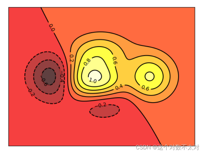
2.7 绘制等高线图
- contourf():等高区域
- contour():等高线
import matplotlib.pyplot as plt
import numpy as np

# 定义等高线高度函数  np.exp: e的x幂次方
def f(x, y):
    return (1 - x / 2 + x ** 5 + y ** 3) * np.exp(- x ** 2 - y ** 2)
# 数据数目
n = 256
# 定义x, y
x = np.linspace(-3, 3, n)
y = np.linspace(-3, 3, n)
# 生成网格数据
X, Y = np.meshgrid(x, y)
# 填充等高线的颜色, 8是等高线分为几部分
plt.contourf(X, Y, f(X, Y), 8, alpha = 0.75, cmap = plt.cm.hot)
# 绘制等高线
C = plt.contour(X, Y, f(X, Y), 8, colors = 'black', linewidth = 0.5)
# 绘制等高线数据
plt.clabel(C, inline = True, fontsize = 10)
# 去除坐标轴
plt.xticks(())
plt.yticks(())
plt.show()
结果如图
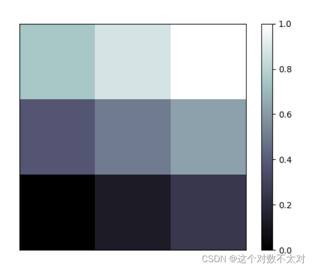
2.8 绘制热力图
- imshow()
#todo:绘制Image,进行热图分析
import matplotlib.pyplot as plt
import numpy as np

# 定义图像数据
a = np.linspace(0, 1, 9).reshape(3, 3)
# 显示图像数据 热图  cmap:将标量数据转换为色彩 interpolation:使用差值法填充
plt.imshow(a, interpolation = 'nearest', cmap = 'bone', origin = 'lower')
# 添加颜色条
plt.colorbar()
# 去掉坐标轴
plt.xticks(())
plt.yticks(())
plt.show()
结果如图
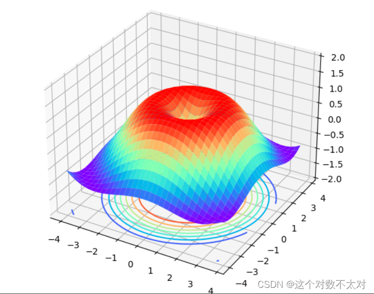
2.9 绘制3D图
- plot_surface():曲面
import matplotlib.pyplot as plt
import numpy as np
from mpl_toolkits.mplot3d import Axes3D
# 定义figure
fig = plt.figure()
# 将figure变为3d
ax = Axes3D(fig)

# 数据数目
n = 256
# 定义x, y
x = np.arange(-4, 4, 0.25)
y = np.arange(-4, 4, 0.25)
# 生成网格数据
X, Y = np.meshgrid(x, y)
# 计算每个点对的长度
R = np.sqrt(X ** 2 + Y ** 2)
# 计算Z轴的高度
Z = np.sin(R)
# 绘制3D曲面
ax.plot_surface(X, Y, Z, rstride = 1, cstride = 1, cmap = plt.get_cmap('rainbow'))
# 绘制从3D曲面到底部的投影
ax.contour(X, Y, Z, zdim = 'z', offset = -2, cmap = 'rainbow')

# 设置z轴的维度
ax.set_zlim(-2, 2)
plt.show()
结果如图
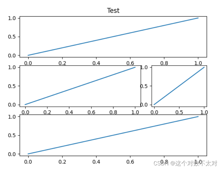
2.10 Figure绘制多图
- subplot()
import matplotlib.pyplot as plt

# 定义figure
plt.figure()
# figure分成3行3列, 取得第一个子图的句柄, 第一个子图跨度为1行3列, 起点是表格(0, 0)
ax1 = plt.subplot2grid((3, 3), (0, 0), colspan = 3, rowspan = 1)
ax1.plot([0, 1], [0, 1])
ax1.set_title('Test')

# figure分成3行3列, 取得第二个子图的句柄, 第二个子图跨度为1行3列, 起点是表格(1, 0)
ax2 = plt.subplot2grid((3, 3), (1, 0), colspan = 2, rowspan = 1)
ax2.plot([0, 1], [0, 1])

# figure分成3行3列, 取得第三个子图的句柄, 第三个子图跨度为1行1列, 起点是表格(1, 2)
ax3 = plt.subplot2grid((3, 3), (1, 2), colspan = 1, rowspan = 1)
ax3.plot([0, 1], [0, 1])

# figure分成3行3列, 取得第四个子图的句柄, 第四个子图跨度为1行3列, 起点是表格(2, 0)
ax4 = plt.subplot2grid((3, 3), (2, 0), colspan = 3, rowspan = 1)
ax4.plot([0, 1], [0, 1])
plt.show()
结果如图
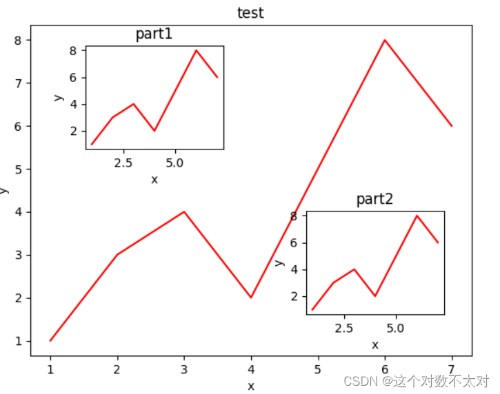
2.11 figure 图的嵌套
import matplotlib.pyplot as plt
# 定义figure
fig = plt.figure()

# 定义数据
x = [1, 2, 3, 4, 5, 6, 7]
y = [1, 3, 4, 2, 5, 8, 6]

# figure的百分比, 从figure 10%的位置开始绘制, 宽高是figure的80%
left, bottom, width, height = 0.1, 0.1, 0.8, 0.8
# 获得绘制的句柄
ax1 = fig.add_axes([left, bottom, width, height])
# 绘制点(x,y)
ax1.plot(x, y, 'r')
ax1.set_xlabel('x')
ax1.set_ylabel('y')
ax1.set_title('test')

# 嵌套方法一
# figure的百分比, 从figure 10%的位置开始绘制, 宽高是figure的80%
left, bottom, width, height = 0.2, 0.6, 0.25, 0.25
# 获得绘制的句柄
ax2 = fig.add_axes([left, bottom, width, height])
# 绘制点(x,y)
ax2.plot(x, y, 'r')
ax2.set_xlabel('x')
ax2.set_ylabel('y')
ax2.set_title('part1')

# 嵌套方法二
plt.axes([bottom, left, width, height])
plt.plot(x, y, 'r')
plt.xlabel('x')
plt.ylabel('y')
plt.title('part2')

plt.show()
结果如图
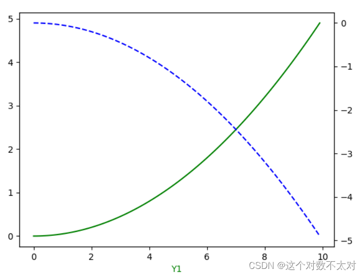
2.12 主次坐标轴
- twinx()
import numpy as np
import matplotlib.pyplot as plt

# 定义数据
x = np.arange(0, 10, 0.1)
y1 = 0.05 * x ** 2
y2 = -1 * y1

# 定义figure
fig, ax1 = plt.subplots()
# 得到ax1的对称轴ax2
ax2 = ax1.twinx()
# 绘制图像
ax1.plot(x, y1, 'g-')
ax2.plot(x, y2, 'b--')

# 设置label
ax1.set_xlabel('X data')
ax1.set_xlabel('Y1', color = 'g')
ax2.set_xlabel('Y2', color = 'b')

plt.show()
结果如图
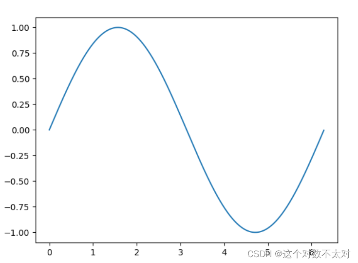
2.13 创建动画
import numpy as np
import matplotlib.pyplot as plt
from matplotlib import animation

# 定义figure
fig, ax = plt.subplots()

# 定义数据
x = np.arange(0, 2 * np.pi, 0.01)
# line, 表示只取返回值中的第一个元素
line, = ax.plot(x, np.sin(x))

# 定义动画的更新
def update(i):
    line.set_ydata(np.sin(x + i/10))
    return line,

# 定义动画的初始值
def init():
    line.set_ydata(np.sin(x))
    return line,

# 创建动画
ani = animation.FuncAnimation(fig = fig, func = update, init_func = init, interval = 10, blit = False, frames = 200)

# 展示动画
plt.show()
结果如图
3.Seaborn
3.1 单变量分布
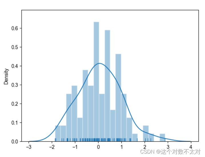
- distplot:seaborn 的 displot() 函数集合了 matplotlib 的 hist() 与核函数估计 kdeplot 的功能,增加了 rugplot 分布观测条显示与利用 scipy 库 fit 拟合参数分布的新颖用途。
# %matplotlib inline (如果在jupyter Notebook上运行一定要加上这行代码)
import numpy as np
import pandas as pd
from scipy import stats, integrate
import matplotlib.pyplot as plt
import seaborn as sns
#过滤掉不想要的警告信息
import warnings
warnings.filterwarnings("ignore", category=Warning)
sns.set(color_codes=True)
np.random.seed(sum(map(ord, "distributions")))
# ord()函数它以一个字符(长度为1的字符串)作为参数,返回对应的ASCII数值,或者Unicode数值,
# 如果所给的Unicode字符超出了你的Python定义范围,则会引发一个TypeError的异常。
# 利用np.random.seed()函数设置相同的seed,每次生成的随机数相同。如果不设置seed,则每次会生成不同的随机数

x = np.random.normal(size=100)
sns.distplot(x, kde=True, bins=20, rug=True)
plt.show()
kde控制是否画kde曲线,bins是分桶数,rug控制是否画样本点(参考rug图可以设定合理的bins)
结果如图
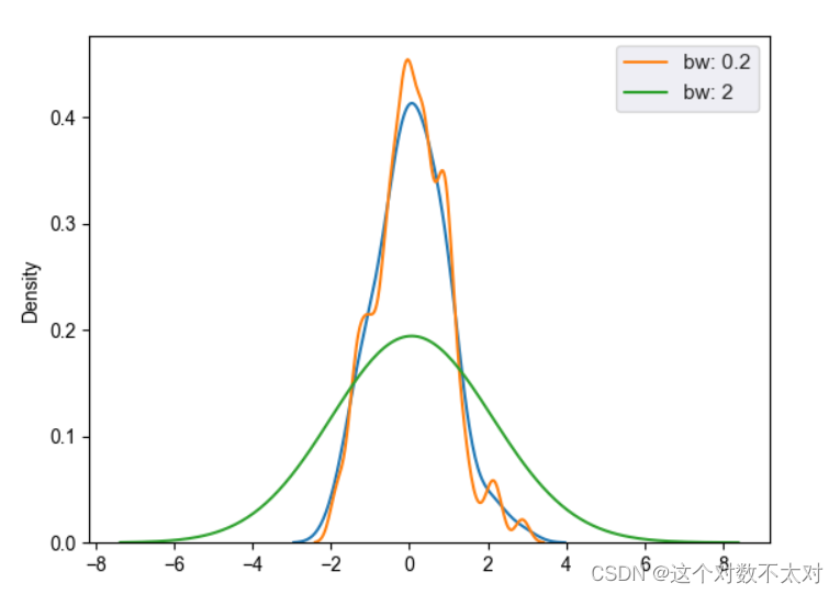
- kdeplot:核密度估计的步骤:每一个观测附近用一个正态分布曲线近似;叠加所有观测的正态分布曲线;归一化bandwidth(bw参数)用于近似的正态分布曲线的宽度。
# %matplotlib inline  (如果在jupyter Notebook上运行一定要加上这行代码)
import numpy as np
import pandas as pd
from scipy import stats, integrate
import matplotlib.pyplot as plt
import seaborn as sns
#过滤掉不想要的警告信息
import warnings
warnings.filterwarnings("ignore", category=Warning)
sns.set(color_codes=True)
np.random.seed(sum(map(ord, "distributions")))
x = np.random.normal(size=100)
sns.kdeplot(x)
sns.kdeplot(x, bw=.2, label="bw: 0.2")
sns.kdeplot(x, bw=2, label="bw: 2")
plt.legend()
plt.show()
结果如图
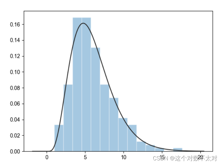
3. 模型参数拟合,distplot的fit参数
import numpy as np
import pandas as pd
from scipy import stats, integrate
import matplotlib.pyplot as plt
import seaborn as sns
sns.set(color_codes=True)
x = np.random.gamma(6, size=200)
#fit控制拟合的参数分布图形
sns.distplot(x, kde=False, fit=stats.gamma)
plt.show()
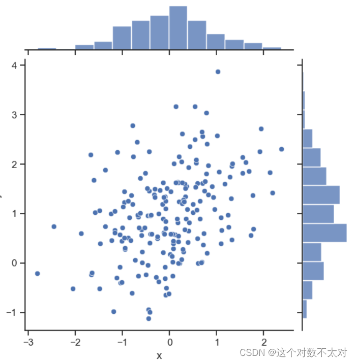
3.2 双变量分布
- jointplot,kind参数默认——散点图
# %matplotlib inline
import numpy as np
import pandas as pd
from scipy import stats, integrate
import matplotlib.pyplot as plt
import seaborn as sns
sns.set(color_codes=True)
np.random.seed(sum(map(ord, "distributions")))
mean, cov = [0, 1], [(1, .5), (.5, 1)]
#两个相关的正态分布
data = np.random.multivariate_normal(mean, cov, 200)
#依据指定的均值和协方差生成数据,生成二维数组
df = pd.DataFrame(data, columns=["x", "y"])
with sns.axes_style("ticks"):
    sns.jointplot(x="x", y="y", data=df)
plt.show()
结果如图
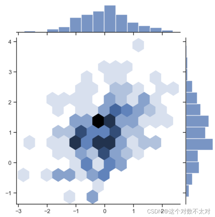
2. jointplot,kind=’hex’——六角箱图
# %matplotlib inline
import numpy as np
import pandas as pd
from scipy import stats, integrate
import matplotlib.pyplot as plt
import seaborn as sns
sns.set(color_codes=True)
np.random.seed(sum(map(ord, "distributions")))
mean, cov = [0, 1], [(1, .5), (.5, 1)]
x, y = np.random.multivariate_normal(mean, cov, 200).T
with sns.axes_style("ticks"):
    sns.jointplot(x=x, y=y, kind="hex")
plt.show()
结果如图
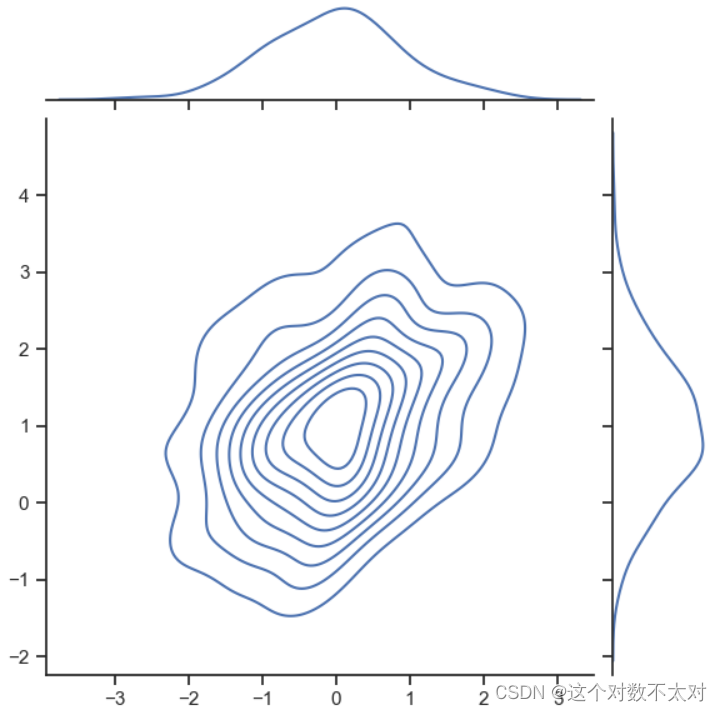
3. jointplot,kind=’kde’——核密度估计图
# %matplotlib inline
import numpy as np
import pandas as pd
from scipy import stats, integrate
import matplotlib.pyplot as plt
import seaborn as sns
sns.set(color_codes=True)
np.random.seed(sum(map(ord, "distributions")))
mean, cov = [0, 1], [(1, .5), (.5, 1)]
x, y = np.random.multivariate_normal(mean, cov, 200).T
with sns.axes_style("ticks"):
    sns.jointplot(x=x, y=y, kind="kde")
plt.show()
结果如图
4. subplots上画kdeplot,rugplot
# %matplotlib inline
import numpy as np
import pandas as pd
from scipy import stats, integrate
import matplotlib.pyplot as plt
import seaborn as sns
sns.set(color_codes=True)
np.random.seed(sum(map(ord, "distributions")))
mean, cov = [0, 1], [(1, .5), (.5, 1)]
x, y = np.random.multivariate_normal(mean, cov, 200).T
data = np.random.multivariate_normal(mean, cov, 200)
df = pd.DataFrame(data, columns=["x", "y"])
f, ax = plt.subplots(figsize=(6, 6))
sns.kdeplot(df.x, df.y, ax=ax)
sns.rugplot(df.x, color="g", ax=ax)
sns.rugplot(df.y, vertical=True, ax=ax)
plt.show()
- cubehelix_palette,梦幻效果
# %matplotlib inline
import numpy as np
import pandas as pd
from scipy import stats, integrate
import matplotlib.pyplot as plt
import seaborn as sns
sns.set(color_codes=True)
np.random.seed(sum(map(ord, "distributions")))
mean, cov = [0, 1], [(1, .5), (.5, 1)]
data = np.random.multivariate_normal(mean, cov, 200)
df = pd.DataFrame(data, columns=["x", "y"])
x, y = np.random.multivariate_normal(mean, cov, 200).T
f, ax = plt.subplots(figsize=(6, 6))
cmap = sns.cubehelix_palette(as_cmap=True, dark=1, light=0)
sns.kdeplot(df.x, df.y, cmap=cmap, n_levels=60, shade=True)
plt.show()
- plot_joint和jointplot联合使用,同时画散点和二维kde
# %matplotlib inline
import numpy as np
import pandas as pd
from scipy import stats, integrate
import matplotlib.pyplot as plt
import seaborn as sns
sns.set(color_codes=True)
np.random.seed(sum(map(ord, "distributions")))
mean, cov = [0, 1], [(1, .5), (.5, 1)]
data = np.random.multivariate_normal(mean, cov, 200)
df = pd.DataFrame(data, columns=["x", "y"])

g = sns.jointplot(x="x", y="y", data=df, kind="kde", color="y")
g.plot_joint(plt.scatter, c="m", s=30, linewidth=1, marker="+")
g.ax_joint.collections[0].set_alpha(0)  #画背景网格线
g.set_axis_labels("$X$", "$Y$")
plt.show()
3.3 数据集中特征的两两关系
- pairplot,默认对角线histgram,非对角线kdeplot
# %matplotlib inline
import numpy as np
import pandas as pd
from scipy import stats, integrate
import matplotlib.pyplot as plt
import seaborn as sns
#需要连接网络
sns.set(color_codes=True)
iris = sns.load_dataset("iris")
print(iris.head())

sns.set(color_codes=True)
iris = sns.load_dataset("iris")
sns.pairplot(iris);
plt.show()
- map_diag定义对角线单个属性图,map_offdiag定义非对角线两个属性关系图
# %matplotlib inline
import numpy as np
import pandas as pd
from scipy import stats, integrate
import matplotlib.pyplot as plt
import seaborn as sns
sns.set(color_codes=True)

iris = sns.load_dataset("iris")
g = sns.PairGrid(iris)
g.map_diag(sns.kdeplot)
g.map_offdiag(sns.kdeplot, cmap="Blues_d", n_levels=20)
plt.show()


 1684
1684


 被折叠的 条评论
为什么被折叠?
被折叠的 条评论
为什么被折叠?
 到【灌水乐园】发言


