


有大佬有更好的方法,请狠狠踢我,我很爱学习的!!
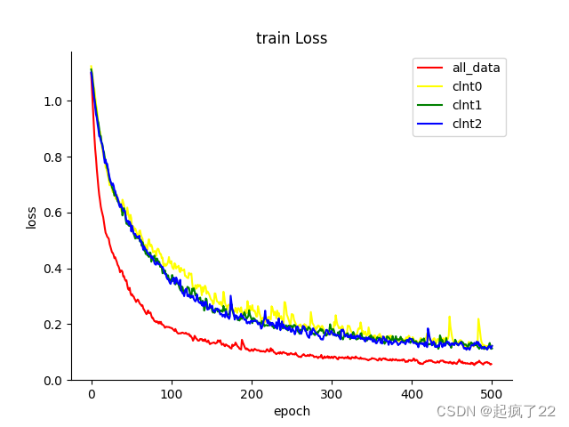
写论文时,我们可能需要这样的:
但是tensorboard展示的是这样的(虽然tensorboard可以导出svg,但是使用visio去除不了背景,同门亲手验证的): 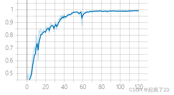
办法就是从tensorboard导出csv,然后自己用python画,还能设置标签:
import matplotlib.pyplot as plt
import pandas as pd

#做平滑处理,我觉得应该可以理解为减弱毛刺,,吧  能够更好地看数据走向
def tensorboard_smoothing(x,smooth=0.99):
    x = x.copy()
    weight = smooth
    for i in range(1,len(x)):
        x[i] = (x[i-1] * weight + x[i]) / (weight + 1)
        weight = (weight + 1) * smooth
    return x

if __name__ == '__main__':

    fig, ax1 = plt.subplots(1, 1)    # a figure with a 1x1 grid of Axes

    #设置上方和右方无框
    ax1.spines['top'].set_visible(False)                   # 不显示图表框的上边框
    ax1.spines['right'].set_visible(False)

    len_mean = pd.read_csv("run-FedDC_0.01Resnet18_S20_F1.000000_Lr0.001000_1_1.000000_B16_E5_W0.000100_a0.010000_seed0_lrdecay0.998000_Accuracy_train_Current cloud-tag-Accuracy_train.csv")


    #设置折线颜色,折线标签
    #使用平滑处理
    ax1.plot(len_mean['Step'], tensorboard_smoothing(len_mean['Value'], smooth=0.6), color="red",label='all_data')
    #不使用平滑处理
    # ax1.plot(len_mean['Step'], len_mean['Value'], color="red",label='all_data')


    #s设置标签位置,lower upper left right,上下和左右组合
    plt.legend(loc = 'lower right')


    ax1.set_xlabel("epoch")
    ax1.set_ylabel("accuracy")
    ax1.set_title("test Accuracy")
    plt.show()
    #保存图片,也可以是其他格式,如pdf
    fig.savefig(fname='./a2'+'.png', format='png')
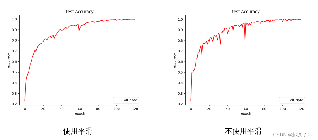
要不要使用平滑,可以看一下下面的图:
 突然发现我在tensorboard的图也平滑了。。
参考:


 997
997


 被折叠的 条评论
为什么被折叠?
被折叠的 条评论
为什么被折叠?
 到【灌水乐园】发言


