


一、基本函数
创建画布与创建子图


绘图主体


保存和展示图形

二、pyplot动态rc参数
1、简介


2、绘图参数——颜色控制color

3、绘图参数——线型linestyle

4、绘图参数——点型marker


三、例题:中国历年GDP增长线
from matplotlib import pyplot as plt

plt.rcParams['font.sans-serif'] = ['FangSong'] # 指定默认字体
plt.rcParams['axes.unicode_minus'] = False # 解决保存图像是负号'-'显示为方块的问题
plt.rcParams['lines.marker']='o'
years = [1950, 1960, 1970, 1980, 1990, 2000, 2010, 2020]
gdp = [300.2, 597.17, 926.03, 1911.49, 3608.58, 12113.50, 60871.60, 147227.00]

# 创建一幅线图, x轴是年份, y轴是gdp
plt.plot(years, gdp, color='green', linestyle='solid')
plt.title("中国历年GDP增长曲线")       # 给图形添加一个标题
plt.ylabel("亿美元")   # 给y轴加标题
plt.xlabel("年度")       # 给x轴加标题

plt.show()               #显示图形
四、pyplot的其他对象
1、网格线

2、坐标轴、标题、图标识

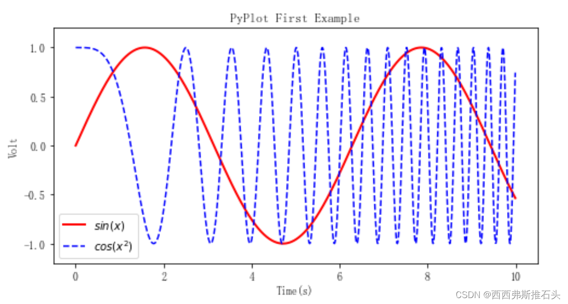
3、例题:三角函数绘图
import math
import matplotlib.pyplot as plt

X = [ i / 100  for i in range(0, 1000) ]
Y = [ math.sin(x) for x in X ]
Z = [ math.cos(x**2) for x in X ]

plt.figure(figsize=(8,4))#创建一个空白画布
plt.plot( X , Y , label="$sin(x)$" , color="red" , linewidth=2 )
plt.plot( X , Z , "b--" , label="$cos(x^2)$" )
plt.xlabel("Time(s)")
plt.ylabel("Volt") #y轴名称
plt.title("PyPlot First Example")#标题
plt.ylim(-1.2,1.2)#y轴范围
plt.legend() #指定当前图形的图例
plt.show()#展示
展示结果:


 3896
3896


 被折叠的 条评论
为什么被折叠?
被折叠的 条评论
为什么被折叠?
 到【灌水乐园】发言


