


前言
本篇博客主要记录Pandas库的学习以及数据可视化的实现。
DataFrame是一种灵活且功能强大的数据结构,广泛应用于数据分析和科学计算领域,尤其是在Python的Pandas库和Apache Spark中。DataFrame类似于一个二维表格,拥有行和列,每一列可以是不同的数据类型(如整数、浮点数、字符串、布尔值等),类似于电子表格或关系型数据库中的表格。
Pandas库
在上一篇中,我们已经得到了结果的json文件,下面要对这个文件做一些处理以便于我们后续的使用。
json文件在转变成Dataframe格式时,会把每一个键值对识别成一个列属性。但是对于type_stats属性,成了很长的列表形式。我们希望将它分开成独立的列属性。
# 定义一个转换函数,将分数字符串转换为小数并保留两位小数
def convert_fraction_to_decimal(fraction_str):
    try:
        numerator, denominator = map(int, fraction_str.split('/'))
        return round(numerator / denominator, 2)
    except (ValueError, ZeroDivisionError):
        return None
# 提取type_stats列并转换为新的DataFrame
type_stats_df = pd.DataFrame(df['type_stats'].tolist())
#第一个apply作用于每一列,第二个apply作用于每一列的每一行元素
type_stats_df = type_stats_df.apply(lambda col: col.apply(lambda x: convert_fraction_to_decimal(x)))
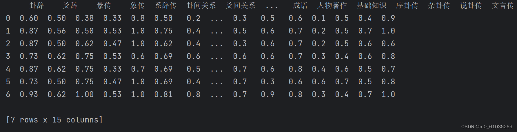
得到分开的列属性之后,与原本的两列属性进行合并。并对数据做进一步处理。
# 将转换后的DataFrame与原始DataFrame合并,如果需要的话
df_with_scores = pd.concat([df, type_stats_df], axis=1)
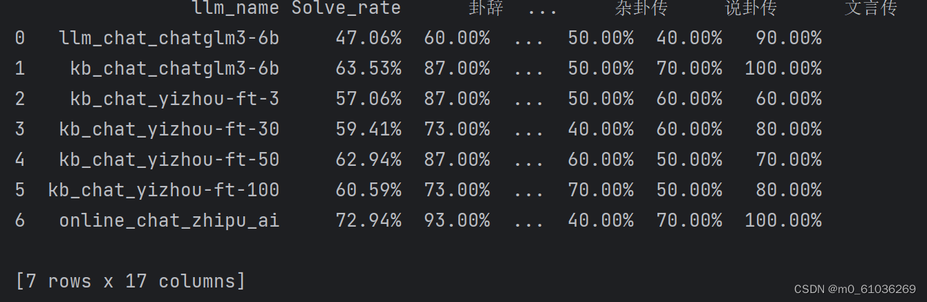
df_with_scores.iloc[:, 2:] = df_with_scores.iloc[:, 2:].applymap(lambda x: f"{x:.2%}")
# 将'Solve_rate'列的字符串转换为浮点数
df_with_scores['Solve_rate'] = df_with_scores['Solve_rate'].astype(float)
# 将'Solve_rate'列的浮点数转换为百分数形式的字符串
df_with_scores['Solve_rate'] = df_with_scores['Solve_rate'].apply(lambda x: f"{x:.2%}")
# 移除百分号并转换为浮点数
df_with_scores.iloc[:, 1:] = df_with_scores.iloc[:, 1:].applymap(
lambda x: float(x.strip('%')) if isinstance(x, str) else x
)

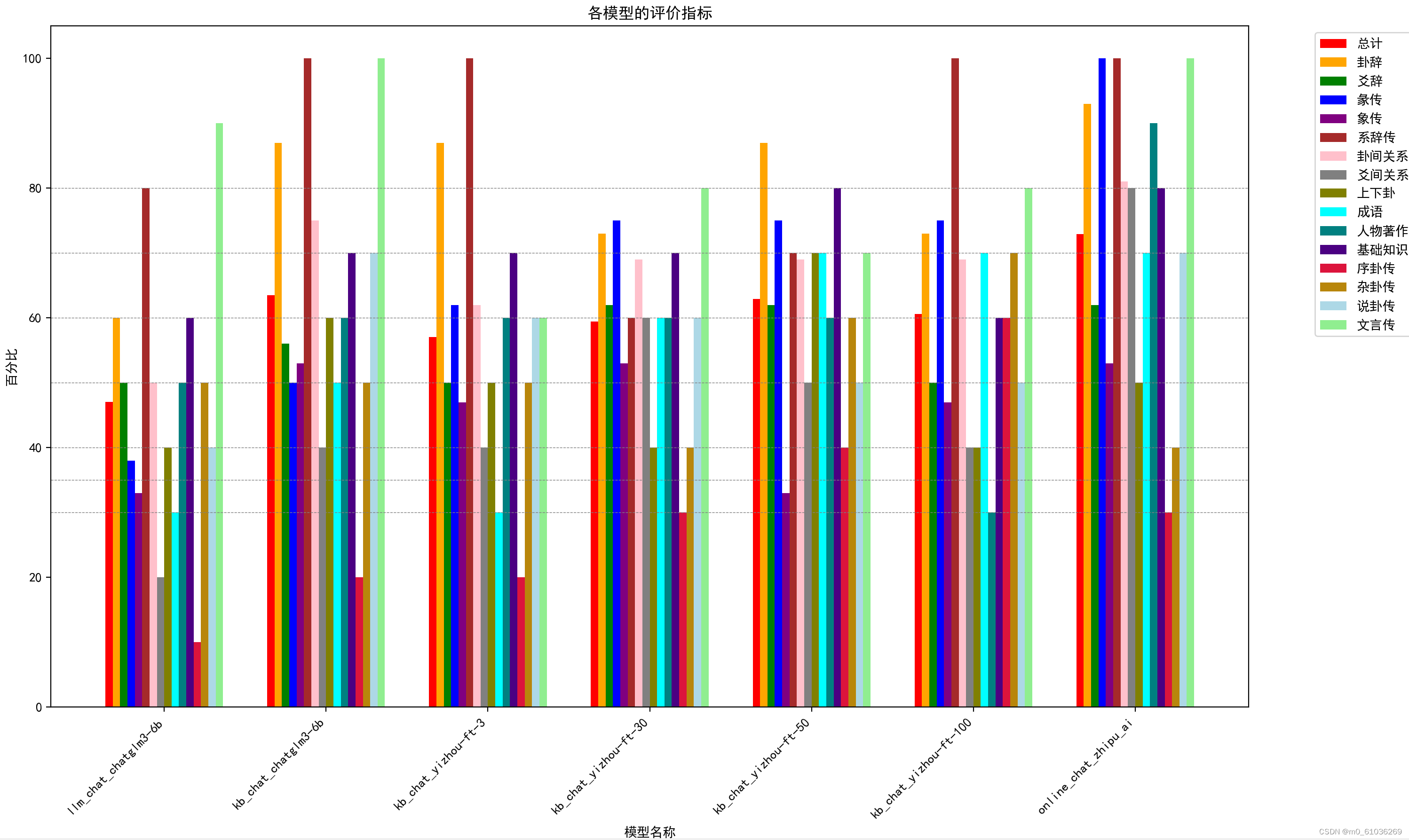
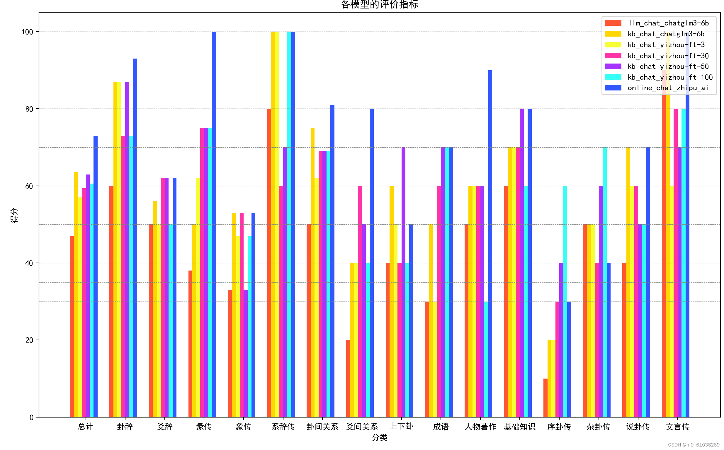
可视化数据
做了两种训练效果的对比图。
图一展示不同模型的正确率;图二展示每个模型在不同题型的正确率。
 # 计算每个模型柱的位置
    indices = np.arange(len(df)) * (len(df.columns[1:]) * (bar_width) + group_spacing)

    # 绘制每个指标的柱状图/一次循环画出一个类别所有模型的柱状图
    for i, column in enumerate(df.columns[1:]):
        bar_positions = indices + i * bar_width
        ax.bar(bar_positions, df[column], width=bar_width, label=column, color=colors[column])

    # 设置x轴的位置在模型名称的中间
    ax.set_xticks(indices + (len(df.columns[1:]) * bar_width) / 2 - bar_width / 2)
    ax.set_xticklabels(df["llm_name"], rotation=45, ha='right')
attributes = df.columns[1:]
    bar_width = 0.1
    index = np.arange(len(attributes))

    fig, ax = plt.subplots(figsize=(14, 8))

    #同样的道理,这里一次绘画出一个模型的所有类别的柱状图
    for i, model in enumerate(df['llm_name']):
        values = df.loc[i, attributes]
        ax.bar(index + i * bar_width, values, bar_width, label=model, color=colors[i])
代码
注:正式代码会进一步提高封装性和可读性
import json

import numpy as np
import pandas as pd
import matplotlib.pyplot as plt


filename = '../../statistic/solve_rate/solve_rate.json'

# 使用with语句打开文件,确保最后文件会被正确关闭
with open(filename, 'r', encoding='utf-8') as file:
    # 读取并解析JSON数据
    json_data = json.load(file)

# 将JSON数据转换为DataFrame
df = pd.DataFrame(json_data)

# 定义一个列名列表,列出想要删除的列
columns_to_drop = ['Tot_problem_nums', 'Solved_problem_nums']

# 使用drop函数删除指定的列,inplace=True表示直接在原DataFrame上修改
df.drop(columns=columns_to_drop, inplace=True)

# 提取type_stats列并转换为新的DataFrame
type_stats_df = pd.DataFrame(df['type_stats'].tolist())
df = df[['llm_name', 'Solve_rate']]


# 定义一个转换函数,将分数字符串转换为小数并保留两位小数
def convert_fraction_to_decimal(fraction_str):
    try:
        numerator, denominator = map(int, fraction_str.split('/'))
        return round(numerator / denominator, 2)
    except (ValueError, ZeroDivisionError):
        return None


type_stats_df = type_stats_df.apply(lambda col: col.apply(lambda x: convert_fraction_to_decimal(x)))
# 将转换后的DataFrame与原始DataFrame合并
df_with_scores = pd.concat([df, type_stats_df], axis=1)
# 将'Solve_rate'列的字符串转换为浮点数
df_with_scores['Solve_rate'] = df_with_scores['Solve_rate'].astype(float)
df_with_scores.iloc[:, 1:] = df_with_scores.iloc[:, 1:].applymap(lambda x: f"{x:.2%}")


# 移除百分号并转换为浮点数
df_with_scores.iloc[:, 1:] = df_with_scores.iloc[:, 1:].applymap(
    lambda x: float(x.strip('%')) if isinstance(x, str) else x
)

df_with_scores.rename(columns={'Solve_rate': '总计'}, inplace=True)
df=df_with_scores

# 定义颜色
colors = {"总计": "red", "卦辞": "orange", "爻辞": "green",
          "彖传": "blue", "象传": "purple", "系辞传": "brown",
          "卦间关系": "pink", "爻间关系": "gray", "上下卦": "olive",
          "成语": "cyan", "人物著作": "teal", "基础知识": "indigo",
          "序卦传": "crimson", "杂卦传": "darkgoldenrod",
          "说卦传": "lightblue", "文言传": "lightgreen"}
# 设置中文字体
plt.rcParams['font.sans-serif'] = ['SimHei']  # 用来正常显示中文标签
plt.rcParams['axes.unicode_minus'] = False  # 用来正常显示负号


def draw_pict1(df):
    # 设置图形的大小
    fig, ax = plt.subplots(figsize=(17, 10))

    # 定义柱的宽度和间隔
    bar_width = 0.05
    group_spacing = 0.3

    # 计算每个模型柱的位置
    indices = np.arange(len(df)) * (len(df.columns[1:]) * (bar_width) + group_spacing)

    # 绘制每个指标的柱状图
    for i, column in enumerate(df.columns[1:]):
        bar_positions = indices + i * bar_width
        ax.bar(bar_positions, df[column], width=bar_width, label=column, color=colors[column])

    # 设置x轴的位置在模型名称的中间
    ax.set_xticks(indices + (len(df.columns[1:]) * bar_width) / 2 - bar_width / 2)
    ax.set_xticklabels(df["llm_name"], rotation=45, ha='right')

    # 添加图表标题和标签
    ax.set_title('各模型的评价指标')
    ax.set_xlabel('模型名称')
    ax.set_ylabel('百分比')
    # 添加水平虚线
    for y in [30, 35, 40, 50, 60, 70, 80]:
        ax.axhline(y=y, color='gray', linestyle='--', linewidth=0.5)
    # 添加图例,并将图例放置在图表的右侧
    ax.legend(bbox_to_anchor=(1.05, 1), loc='upper left')

    # 显示图表
    plt.tight_layout()
    plt.show()

def draw_pict2(df):
    colors = [
        "#FF5733", "#FFD700", "#F6FF33", "#FF33A6", "#A633FF", "#33FFF6", "#3357FF"
    ]


    attributes = df.columns[1:]


    bar_width = 0.1
    index = np.arange(len(attributes))

    fig, ax = plt.subplots(figsize=(14, 8))

    for i, model in enumerate(df['llm_name']):
        values = df.loc[i, attributes]
        ax.bar(index + i * bar_width, values, bar_width, label=model, color=colors[i])

    ax.set_xlabel('分类')
    ax.set_ylabel('得分')
    ax.set_title('各模型的评价指标')
    ax.set_xticks(index + bar_width * (len(df['llm_name']) / 2))
    ax.set_xticklabels(attributes)
    # 添加水平虚线
    for y in [30, 35, 40, 50, 60, 70, 80,100]:
        ax.axhline(y=y, color='gray', linestyle='--', linewidth=0.5)
    ax.legend(loc='upper right')

    plt.show()


draw_pict1(df)
draw_pict2(df)


 246
246

 被折叠的 条评论
为什么被折叠?
被折叠的 条评论
为什么被折叠?
 到【灌水乐园】发言


