


1.router文件 index.js配置路由表,把移动端和PC端路由表拆分出来
import { createRouter, createWebHashHistory } from 'vue-router';
import { ref, watch } from "vue";
/* web */
import Home from "views/appWeb/home/Home.vue";
// PC端路由
const routesPc = [
{
path: "/",
redirect: "/home"
},
{
path: "/home",
name: "home",
component: Home,
}
]
// 移动端路由表
const routesMB = [
{
path: '/',
name: 'home',
component: () => import('views/appMobile/home/Home.vue')
},
]
// 声明变量用来接routers
var routes = [];
const screenWidth = ref()
// 获取页面宽度
screenWidth.value = document.body.clientWidth
if (screenWidth.value <= 758) {
console.log('is Mobile');
routes = routesMB
} else {
routes = routesPc
}
window.onresize = () => {
screenWidth.value = document.body.clientWidth;
};
// 监听页面宽度
watch(screenWidth, (newVal, oldVal) => {
let timer = setTimeout(() => {
if (newVal <= 758) {
// 小于758就是移动端 就把移动端路由表赋给routes
console.log('is Mobile');
routes = routesMB
window.location.reload()
} else {
// 大于就是pc端,把pc端路由表赋给routes
routes = routesPc
window.location.reload()
}
// 重绘页面
}, 500)
return () => {
// 清除定时器
clearTimeout(timer)
}
}, {
// 深度清除
deep: true,
})
const router = createRouter({
routes,
history: createWebHashHistory()
})
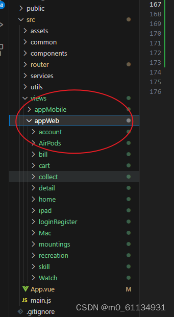
export default router;2. appWeb(PC端代码) appMobile(移动端代码)
3.app.vue
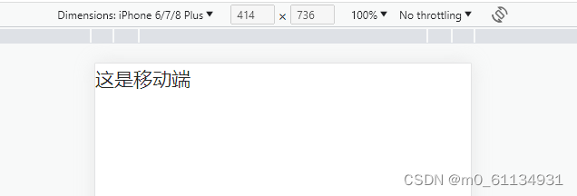
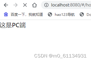
<template>
 <div id="app" v-if="isMobile">
   <h2>这是移动端</h2>
</div>
<div id="app" v-else>
   <h2>这是PC端</h2>
</div>
</template>

<script setup>
import { onMounted, ref } from "vue";


// 判断是pc还是移动端
const isMobile = ref(false);

const handleResize = () => {
  isMobile.value = window.matchMedia('(max-width: 768px)').matches;
};

onMounted(() => {
  handleResize(); // 初始化时执行一次
  window.addEventListener('resize', handleResize);

  // 移动端适配  如果为移动端则执行函数进行适配
  if (isMobile) {
    (function (doc, win) {
      let docEl = doc.documentElement, // 获取html
        resizeEvt = "orientationchange" in window ? "orientationchange" : "resize",
        width = 750, // 设计稿宽,用时只需要修改这一处
        recalc = function () {
          const clientWidth = docEl.clientWidth; // 获取设备尺寸
          if (!clientWidth) return; // 如果没有值,回去
          if (clientWidth > width) {
            // 如果超过设计稿宽度,就给一个固定值
            docEl.style.fontSize = "100px";
            // docEl.style.width = width + "px";
            docEl.style.margin = "0 auto";
          } else {
            docEl.style.fontSize = 100 * (clientWidth / width) + "px";
            docEl.style.width = "";
            docEl.style.margin = "";
          }
        };
      if (!doc.addEventListener) return; // 如果没有这个方法,中断函数
      win.addEventListener(resizeEvt, recalc, false); // 改变大小时调整一下
      doc.addEventListener("DOMContentLoaded", recalc, false); // 加载完成时调整
    })(document, window);
  }
});

</script>

<style lang="less" scoped>
@import 'assets/reset.css';
#app{
  background: #fff;
}
</style>
4.效果图
5.设配不同屏幕大小px在浏览器中直接转为rem
安装 postcss-pxtorem
npm install postcss-pxtorem --save-dev
6.创建postcss.config.js文件
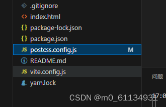
代码
export default {
    plugins: {
      "postcss-pxtorem": {
        rootValue: 192, // 根据设计图尺寸写,设计图是1920,就写192
        unitPrecision: 5, //允许REM单位增长到的十进制数字,小数点后保留的位数。
        propList: ['*'], // 需要被转换的属性
        exclude: /node_modules/, // 排除文件夹
        mediaQuery: false,  //(布尔值)允许在媒体查询中转换px。
        selectorBlackList: ['.van'] // 不进行px转换的选择器
      }
    }
  }
7.utils
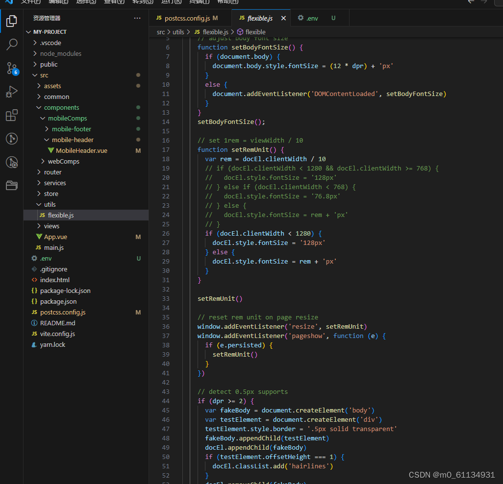
代码
export function flexible(window, document) {
    var docEl = document.documentElement
    var dpr = window.devicePixelRatio || 1

    // adjust body font size
    function setBodyFontSize() {
      if (document.body) {
        document.body.style.fontSize = (12 * dpr) + 'px'
      }
      else {
        document.addEventListener('DOMContentLoaded', setBodyFontSize)
      }
    }
    setBodyFontSize();

    // set 1rem = viewWidth / 10
    function setRemUnit() {
      var rem = docEl.clientWidth / 10
      // if (docEl.clientWidth < 1280 && docEl.clientWidth >= 768) {
      //   docEl.style.fontSize = '128px'
      // } else if (docEl.clientWidth < 768) {
      //   docEl.style.fontSize = '76.8px'
      // } else {
      //   docEl.style.fontSize = rem + 'px'
      // }
      if (docEl.clientWidth < 1280) {
        docEl.style.fontSize = '128px'
      } else {
        docEl.style.fontSize = rem + 'px'
      }
    }

    setRemUnit()

    // reset rem unit on page resize
    window.addEventListener('resize', setRemUnit)
    window.addEventListener('pageshow', function (e) {
      if (e.persisted) {
        setRemUnit()
      }
    })

    // detect 0.5px supports
    if (dpr >= 2) {
      var fakeBody = document.createElement('body')
      var testElement = document.createElement('div')
      testElement.style.border = '.5px solid transparent'
      fakeBody.appendChild(testElement)
      docEl.appendChild(fakeBody)
      if (testElement.offsetHeight === 1) {
        docEl.classList.add('hairlines')
      }
      docEl.removeChild(fakeBody)
    }
  }
8.min.js导入
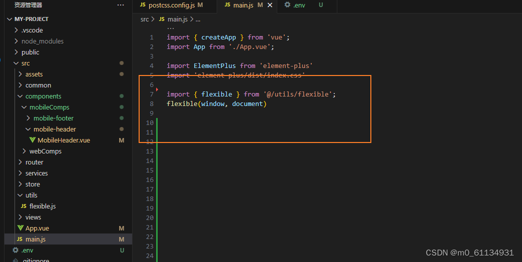
import { flexible } from '@/utils/flexible'; //根据自己的路径修改
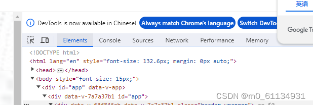
flexible(window, document)10.注释这行代码否则font-size始终是100px
注释前

注释后拖动屏幕

10.移动端设计图375px会出现以下情况, 可以将px改为Px,Px不会转为rem,正常显示字体大小62px,移动端字体大小又偏差问题不大,盒子尽量用百分比或者弹性布局(可自适应单位)

使用px

使用Px


 1847
1847

 被折叠的 条评论
为什么被折叠?
被折叠的 条评论
为什么被折叠?
 到【灌水乐园】发言


