


import plotly.figure_factory as ff
z = [[1000, 2500, 6000, 6000, 9000], [2000, 1000, 3000, 8000,
1000], [1500, 6000, 4000, 8000, 1200], [8000, 1000, 5000,
6000, 6000], [6000, 1000, 4500, 4500, 5500]]
x = [1000, 2500, 6000, 6000, 9000]
y = ['济南', '北京', '成都', '武汉', '深圳']
z_text = [[1000, 2500, 6000, 6000, 9000], [2000, 1000, 3000, 8000,
1000], [1500, 6000, 4000, 8000, 1200], [8000, 1000, 5000,
6000, 6000], [6000, 1000, 4500, 4500, 5500]]
fig = ff.create_annotated_heatmap(
z,
x=x,
y=y,
annotation_text=z_text,
colorscale='Viridis')
fig.show()
import matplotlib.pyplot as plt
import pandas as pd
plt.scatter(df["Total price"], df["Total price"], c=color[1], edgecolors='r')
plt.xlim(0,10000)
plt.ylim(0,10000)
plt.title("房价分析")
plt.xlabel("x")
plt.ylabel("y")
plt.show()

import numpy as np
import matplotlib.pyplot as plt
import random
name = [df["商品号"]]
num = [12/df["销售数量"]*100]
plt.rcParams["font.sans-serif"] = ["SimHei"]
plt.rcParams["axes.unicode_minus"] = False
for i in range(len(name)):
plt.bar(name[i], num[i])
plt.title("销量分析")
plt.xlabel("商品名")
plt.ylabel("订单转化率")
plt.show()

import pandas as pd
import numpy as np
import matplotlib.pyplot as plt
data = pd.read_excel(r"C:\Users\zxm\Desktop\51job.xlsx")
x = data['city'].head(100).values
y = data['最高薪资'].head(100).values
sizes = np.random.rand(100) * 800
plt.scatter(x, y, sizes, alpha=0.8)
plt.show()

import plotly.figure_factory as ff
z = [[1000, 2500, 6000, 6000, 9000], [2000, 1000, 3000, 8000,
1000], [1500, 6000, 4000, 8000, 1200], [8000, 1000, 5000,
6000, 6000], [6000, 1000, 4500, 4500, 5500]]
x = [1000, 2500, 6000, 6000, 9000]
y = ['济南', '北京', '成都', '武汉', '深圳']
z_text = [[1000, 2500, 6000, 6000, 9000], [2000, 1000, 3000, 8000,
1000], [1500, 6000, 4000, 8000, 1200], [8000, 1000, 5000,
6000, 6000], [6000, 1000, 4500, 4500, 5500]]
fig = ff.create_annotated_heatmap(
z,
x=x,
y=y,
annotation_text=z_text,
colorscale='Viridis')
fig.show()

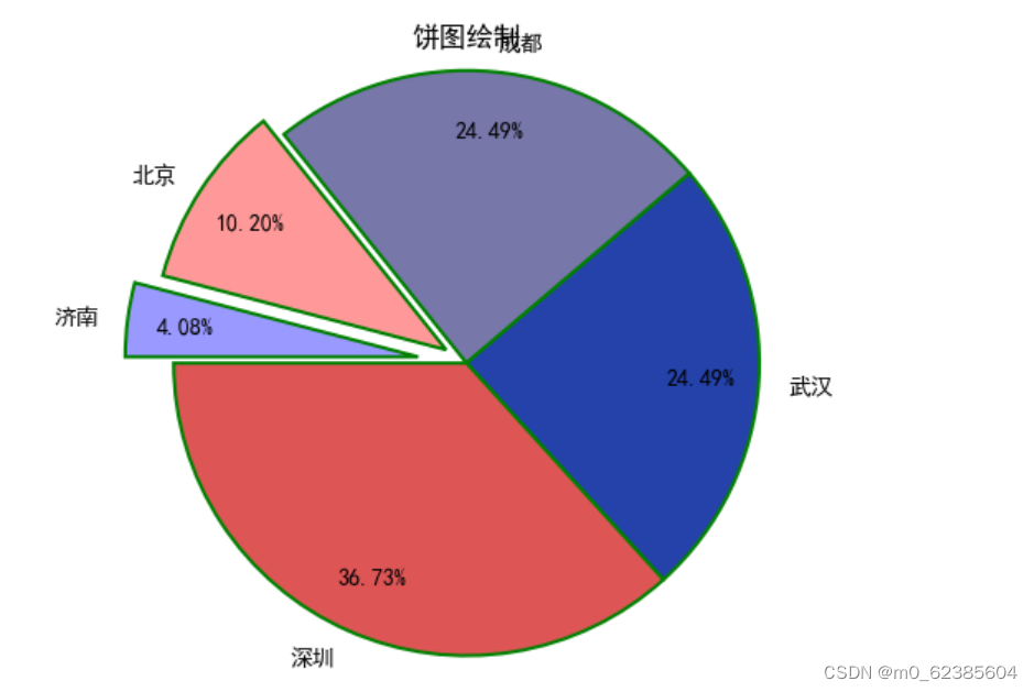
import matplotlib.pyplot as plt
plt.rcParams['font.sans-serif']=['SimHei']
plt.rcParams['axes.unicode_minus']=False
data = [1000, 2500, 6000, 6000, 9000]
labels = ['济南', '北京', '成都', '武汉', '深圳']
explode = [0.2, 0.1, 0, 0, 0]
colors = ['#9999ff', '#ff9999', '#7777aa', '#2442aa', '#dd5555']
plt.pie(x = data,explode = explode,labels = labels,colors = colors,autopct = '%.2f%%',pctdistance = 0.8,
labeldistance = 1.1,
startangle = 180,
radius = 1.2,
counterclock = False,
wedgeprops = {'linewidth' : 1.5, 'edgecolor' : 'green'},
textprops = {'fontsize' : 10, 'color' : 'black'},
)
plt.title('饼图绘制')
plt.show()


 386
386


 被折叠的 条评论
为什么被折叠?
被折叠的 条评论
为什么被折叠?
 到【灌水乐园】发言


