


不要憎恨你的敌人,那会影响你的判断力。
——《教父》

目录
一、前言
在我们的 html 学习过程中,会用到并见识到各种各样的实例,以及各种插件,并且有些 web 网页中的小插件又非常的吸引眼球,提升 web 网页的层次,显得非常好看并且非常使用。在本系列中,我将持续为大家更新有趣且使用的 html 实例,放在 web 网页中,凸显效果。
特点一:都是符合学校或者学生考试期末作业的水平,都是最基础的简单的 html 样例,提升web网页整理效果,都是 div+css 框架原创代码写的,内容包括 js / css,也包含 视频+音乐+flash 等元素的插入…
特点二:内容包括多种丰富类型,例如: 倒计时,404页面,Blog顶置卡片设计 (css+js),To-Do-List设计 (css+js),火柴盒动画 (css),日历便签设计 (css+js),搜索框设计 (css+js),卡片式图片展示 (css+js),咖啡选择 (css+js)……
可满足多种需求,欢迎大家下载!

二、往期作品回顾
有趣的HTML实例(一) 倒计时_Enovo_飞鱼的博客-CSDN博客
有趣的HTML实例(二) 404页面_Enovo_飞鱼的博客-CSDN博客
有趣的HTML实例(三) 加载页面动画_Enovo_飞鱼的博客-CSDN博客
有趣的HTML实例(四) 旋转菜单_Enovo_飞鱼的博客-CSDN博客
有趣的HTML实例(五) 加载页面动画Ⅱ(css)_Enovo_飞鱼的博客-CSDN博客
有趣的HTML实例(六) 卡片翻转时钟_Enovo_飞鱼的博客-CSDN博客
有趣的HTML实例(七) 注册登录界面Ⅱ(css+js)_Enovo_飞鱼的博客-CSDN博客
有趣的HTML实例(八) 一个很有趣的动态背景(css+js)_Enovo_飞鱼的博客-CSDN博客
有趣的HTML实例(九) 文本变形动画(css+js)_Enovo_飞鱼的博客-CSDN博客
有趣的HTML实例(十) 悬停时有旋转效果的图标_Enovo_飞鱼的博客-CSDN博客
有趣的HTML实例(十一) 烟花特效(css+js)_Enovo_飞鱼的博客-CSDN博客
有趣的HTML实例(十二) 早安、晚安动画(css+js)_Enovo_飞鱼的博客-CSDN博客
有趣的HTML实例(十三) 咖啡选择(css+js)_Enovo_飞鱼的博客-CSDN博客
三、作品介绍
1.作品简介 :HTML响应式布局网站源码!兼容 pc 以及移动端,内涵 js 交互,ui 交互。直接点击即可查看效果!
2.作品编辑:个人主页网页设计题材,代码为 html+css 布局制作,作品下载后可使用任意HTML编辑软件(例如:DW、HBuilder、Vscode 、Sublime 所有编辑器均可使用)。
3.作品技术:使用DIV+CSS制作了网页背景图、鼠标经过及选中导航变色效果、下划线等。
四、本期代码介绍
一款简单的 HTML+ CSS+JS 窗边风景动画(css+js) 实例
1、HTML
2、CSS
3、JS
4、舒适的画面感
5、床边风景动画
6、白天夜晚点击效果
可通用多种不同情景,放置在web网页上,可以作为跳转页面之后使用
五、效果显示


可使用在多种情景下,提升层次轮廓效果、美化界面、自定义文字修改——>
根据需求修改
六、编码实现
显示完整代码
注意路径(⊙o⊙)?
o(* ̄▽ ̄*)ブ
index.html
<!DOCTYPE html>
<html lang="en">
<head>
  <meta charset="UTF-8">
  <title>Enovo窗边风景动画</title>
  <link rel="stylesheet" href="./style.css">
</head>
<body>
  <!-- 窗户 -->
  <div class="window-top" id="window-top"></div>
  <div class="window-square" id="window-main"></div>

  <!-- 窗框线 -->
  <div class="inner-line-hz-one"></div>
  <div class="inner-line-hz-two"></div>
  <div class="inner-line-hz-three"></div>
  <div class="inner-line-vt"></div>
  <div class="floor-line"></div>

  <!-- 植物 -->
  <div class="plant-one"></div>
  <div class="plant-two"></div>
  <div class="plant-two-shadow"></div>
  <div class="flower-blue-leaf"></div>
  <div class="flower-blue-line"></div>
  <div class="flower-blue-leaf-two"></div>
  <div class="flower-blue-line-two"></div>
  <div class="plant-shadow"></div>

  <!-- 植物的茎 -->
  <div class="root-one"></div>
  <div class="root-two"></div>
  <div class="root-three"></div>
  <div class="root-four"></div>
  <div class="root-five"></div>
  <div class="root-six"></div>

  <!-- 叶子 -->
  <div class="main-leaf-one"></div>
  <div class="main-leaf-two"></div>
  <div class="main-leaf-three"></div>
  <div class="main-leaf-four"></div>
  <div class="main-leaf-five"></div>
  <div class="main-leaf-six"></div>

  <!-- 云彩 -->
  <div class="cloud-one c"></div>
  <div class="cloud-two c"></div>
  <div class="cloud-three c"></div>
  <div class="cloud-ball-one c"></div>
  <div class="cloud-ball-two c"></div>
  <div class="cloud-ball-three c"></div>
  <div class="cloud-ball-four c"></div>
  <div class="cloud-ball-five c"></div>
  <div class="cloud-ball-six c"></div>

  <!-- 灯 -->
  <div class="lamp" id="light-switch"></div>
  <div class="lamp-wire"></div>
  <div class="lamp-shadow"></div>

  <!-- 夜晚部分-星星 -->
  <div class="star-one s"></div>
  <div class="star-two s"></div>
  <div class="star-three s"></div>
  <div class="star-four s"></div>
  <div class="star-five s"></div>
  <div class="star-six s"></div>

  <!-- 月亮 -->
  <div class="moon"></div>
  <div class="moon-crater"></div>

  <!-- 灯光 -->
  <div class="light-source"></div>

  <!-- partial -->
  <script src="./script.js"></script>
</body>
</html>
style.css
/* 设置需要用的参数 */
:root {
  --page-background: #fef5e7;
  --light-purple: #adbdfc;
  /* 窗户部分用到的参数 */
  --window-top-height: 45;
  --window-top-width: 40;
  --window-day-background: #d6eaf8;
  --window-square-height: 40;
  --window-square-width: 40;
  --floor-line-height: 1;
  --floor-line-width: 80;
  --inner-line-vt-width: 62;
  /* 植物部分用到的参数 */
  --plant-one-height: 6;
  --plant-one-width: 9;
  --plant-two-shadow-height: .5;
  --plant-two-shadow-width: 4;
  --flower-blue-height: 6;
  --flower-blue-width: 3;
  --flower-blue-line-height: .2;
  --flower-blue-line-width: 5;
  --flower-two-blue-height: 7;
  --flower-two-blue-width: 4.5;
  --root-height: 10;
  --root-width: 33;
  /* 叶子部分需要的参数 */
  --main-leaf-height: 8;
  --main-leaf-width: 8;
  /* 云彩部分用到的参数 */
  --cloud-base-height: 8;
  --cloud-base-width: 17;
  --cloud-ball-height: 5;
  --cloud-ball-width: 5;
  /* 灯部分用到的参数 */
  --lamp-height: 15;
  --lamp-width: 19;
  --lamp-wire-height: 70;
  --lamp-wire-width: .1;
  /* 星星部分用到的参数 */
  --star-height: 1.2;
  --star-width: 1.2;
  /* 灯光部分需要的参数 */
  --light-source-height: 20;
  --light-source-width: 20;
  /* 月亮部分需要的参数 */
  --moon-height: 10;
  --moon-width: 10;
}

/* 页面主体背景、位置 */
body {
  position: fixed;
  top: 55%;
  left: 50%;
  transform: translate(-50%, -50%);
  background: var(--page-background);
}

/* 窗户 */
.window-square {
  height: calc(var(--window-square-height) * 1vmin);
  width: calc(var(--window-square-width) * 1vmin);
  background: var(--window-day-background);
}

.window-top {
  height: calc(var(--window-top-height) * 1vmin);
  width: calc(var(--window-top-width) * 1vmin);
  border-radius: 50%;
  position: fixed;
  top: -55%;
  background: linear-gradient(to bottom, var(--window-day-background) 50%, transparent 50%);
}

/* 窗框 + 地面 */
.floor-line {
  position: fixed;
  left: -45%;
  height: calc(var(--floor-line-height) / 3 * 1vmin);
  width: calc(var(--floor-line-width) * 1vmin);
  background: #AAA;
  border-radius: 1rem;
}

.inner-line-hz-one,
.inner-line-hz-two,
.inner-line-hz-three,
.inner-line-vt {
  position: fixed;
  top: -5%;
  height: calc(var(--floor-line-height) / 6 * 1vmin);
  width: calc(var(--window-square-width) * 1vmin);
  background: #AAA;
}

.inner-line-hz-one {
  top: 33%;
}

.inner-line-hz-two {
  top: 70%;
}

.inner-line-vt {
  top: 22.4%;
  left: -27%;
  transform: rotate(90deg);
  width: calc(var(--inner-line-vt-width) * 1vmin);
}

/* 花盆 */
.plant-one {
  position: fixed;
  bottom: -1%;
  right: -8%;
  height: calc(var(--plant-one-height) * 1vmin);
  width: calc(var(--plant-one-width) * 1vmin);
  background: linear-gradient(to bottom, #000 6%, #ba4a00 12%);
  border-radius: 13%;
  clip-path: polygon(0 0, 100% 0, 80% 100%, 19% 100%);
}

.plant-two {
  position: fixed;
  bottom: -5.2%;
  right: -12%;
  z-index: 999;
  height: calc(var(--plant-one-height) / 1.5 * 1vmin);
  width: calc(var(--plant-one-width) / 2 * 1vmin);
  background: linear-gradient(to bottom, #000 5%, #eb8fbb 10%);
  border-radius: 10%;
  clip-path: polygon(0 0, 100% 0, 80% 100%, 19% 100%);
}

/* 花盆的阴影 */
.plant-two-shadow {
  height: calc(var(--plant-two-shadow-height) * 1vmin);
  width: calc(var(--plant-two-shadow-width) * 1vmin);
  background: #000;
  position: fixed;
  z-index: -1;
  bottom: -4.9%;
  right: -15%;
  border-radius: 50%;
  box-shadow: 0px 0px 1px 0px #000;
}

/* 植物叶子 */
.flower-blue-leaf {
  position: fixed;
  height: calc(var(--flower-blue-height) * 1vmin);
  width: calc(var(--flower-blue-width) * 1vmin);
  background: #6e8ce9;
  border-radius: 95% 0;
  transform: rotate(185deg);
  border-left: 1px solid #111;
  border-right: 1px solid #111;
  bottom: 4.3%;
  right: -16%;
}

.flower-blue-line {
  position: fixed;
  height: calc(var(--flower-blue-line-height) * 1vmin);
  width: calc(var(--flower-blue-line-width) * 1vmin);
  background: #333;
  bottom: 10%;
  right: -17.4%;
  transform: rotate(-63deg);
}

.flower-blue-leaf-two {
  position: fixed;
  height: calc(var(--flower-two-blue-height) * 1vmin);
  width: calc(var(--flower-two-blue-width) * 1vmin);
  border-left: 1px solid #111;
  border-right: 1px solid #111;
  background: #6e8ce9;
  border-radius: 95% 0;
  transform: rotate(-48deg);
  bottom: 5.5%;
  right: -10%;
}

.flower-blue-line-two {
  position: fixed;
  height: calc(var(--flower-blue-line-height) * 1vmin);
  width: calc(var(--flower-blue-line-width) * 1vmin);
  background: #333;
  bottom: 10%;
  right: -12%;
  transform: rotate(70deg);
}

/* 植物的茎 */
.root-one {
  position: fixed;
  height: calc(var(--root-height) * 1vmin);
  width: calc(var(--root-width) * 1vmin);
  top: 35%;
  right: -49%;
  z-index: 88;
  border: 1px solid #000;
  border-color: #000 transparent transparent transparent;
  border-radius: 50% / calc(var(--root-height) / 6 * 1vmin) calc(var(--root-height) * 1vmin) 0 0;
  transform: rotate(-90deg);
}

.root-two {
  position: fixed;
  height: calc(var(--root-height) * 1vmin);
  width: calc(var(--root-width) / 1.9 * 1vmin);
  top: 59%;
  right: -2.8%;
  z-index: 88;
  border: 1px solid #000;
  border-color: #000 transparent transparent transparent;
  border-radius: 60% / calc(var(--root-height) * 1vmin) calc(var(--root-height) / 3.5 * 1vmin) 0 0;
  transform: rotate(69deg);
}

.root-three {
  position: fixed;
  height: calc(var(--root-height) * 1vmin);
  width: calc(var(--root-width) / 1.5 * 1vmin);
  top: 45%;
  right: -8.1%;
  z-index: 88;
  border: 1px solid #000;
  border-color: #000 transparent transparent transparent;
  border-radius: 60% / calc(var(--root-height) * 1vmin) calc(var(--root-height) / 14 * 1vmin) 0 0;
  transform: rotate(81deg);
}

.root-four {
  position: fixed;
  height: calc(var(--root-height) * 1vmin);
  width: calc(var(--root-width) / 2.7 * 1vmin);
  top: 17%;
  right: -19%;
  z-index: 80;
  border: 1px solid #000;
  border-color: #000 transparent transparent transparent;
  border-radius: 60% / calc(var(--root-height) * 1vmin) calc(var(--root-height) / 8 * 1vmin) 0 0;
  transform: rotate(-85deg);
}

.root-five {
  position: fixed;
  height: calc(var(--root-height) * 1vmin);
  width: calc(var(--root-width) / 1.5 * 1vmin);
  top: 39%;
  right: -39.3%;
  z-index: 88;
  border: 1px solid #000;
  border-color: #000 transparent transparent transparent;
  border-radius: 50% / calc(var(--root-height) / 1.45 * 1vmin) calc(var(--root-height) * 1vmin) 0 0;
  transform: rotate(-60deg);
}

.root-six {
  position: fixed;
  height: calc(var(--root-height) * 1vmin);
  width: calc(var(--root-width) / 1.65 * 1vmin);
  top: 57%;
  right: -38%;
  z-index: 88;
  border: solid 1px #000;
  border-color: #000 transparent transparent transparent;
  border-radius: 50% / calc(var(--root-height) / 1.6 * 1vmin) calc(var(--root-height) * 1vmin) 0 0;
  transform: rotate(-60deg);
}

/* 叶子 */
.main-leaf-one {
  position: fixed;
  top: 28%;
  right: 8%;
  z-index: 50;
  height: calc(var(--main-leaf-height) * 1vmin);
  width: calc(var(--main-leaf-width) * 1vmin);
  border-radius: 85% 5%;
  border-left: .5px solid #111;
  border-bottom: .5px solid #111;
  background: #4d8473;
  transform: rotate(93deg);
}

.main-leaf-two {
  position: fixed;
  top: 48%;
  right: 8%;
  z-index: 50;
  height: calc(var(--main-leaf-height) * 1vmin);
  width: calc(var(--main-leaf-width) * 1vmin);
  border-radius: 85% 0%;
  border-left: 1px solid #111;
  border-bottom: 1px solid #111;
  background: #4d8473;
  transform: rotate(85deg);
}

.main-leaf-three {
  position: fixed;
  top: 0%;
  right: -8.5%;
  z-index: 50;
  height: calc(var(--main-leaf-height) * 1.1 * 1vmin);
  width: calc(var(--main-leaf-width) * 1.3 * 1vmin);
  border-radius: 95% 10%;
  border-right: 1px solid #111;
  border-top: 1px solid #111;
  background: #4d8473;
  transform: rotate(-35deg);
}

.main-leaf-four {
  position: fixed;
  top: 1%;
  right: -19%;
  z-index: 55;
  height: calc(var(--main-leaf-height) * 1.3 * 1vmin);
  width: calc(var(--main-leaf-width) * 1.2 * 1vmin);
  border-radius: 85% 5%;
  border-right: 1px solid #111;
  border-top: 1px solid #111;
  background: #4d8473;
  transform: rotate(-10deg);
}

.main-leaf-five {
  position: fixed;
  top: 21%;
  right: -26%;
  z-index: 55;
  height: calc(var(--main-leaf-height) * 1.3 * 1vmin);
  width: calc(var(--main-leaf-width) * 1vmin);
  border-radius: 85% 5%;
  border-right: 1px solid #111;
  border-top: 1px solid #111;
  background: #4d8473;
  transform: rotate(18deg);
}

.main-leaf-six {
  position: fixed;
  top: 46%;
  right: -30%;
  z-index: 55;
  height: calc(var(--main-leaf-height) / 1.2 * 1vmin);
  width: calc(var(--main-leaf-width) * 1.5 * 1vmin);
  border-radius: 95% 0%;
  border-right: 1px solid #111;
  border-top: 1px solid #111;
  background: #4d8473;
  transform: rotate(-8deg);
}

/* 云彩 */
.cloud-one {
  height: calc(var(--cloud-base-height) / 1.2 * 1vmin);
  width: calc(var(--cloud-base-width) * 1vmin);
  position: fixed;
  top: 50%;
  left: 0%;
  border-radius: 50%;
  background: linear-gradient(to bottom, #fff 50%, transparent 50%);
  animation: cloud 4s infinite;
}

.cloud-two {
  width: calc(var(--cloud-base-width) * 1vmin);
  height: calc(var(--cloud-base-height) / 1.3 * 1vmin);
  background: #fff;
  position: fixed;
  top: 0%;
  left: 0%;
  border-radius: 50%;
  background: linear-gradient(to bottom, #fff 50%, transparent 50%);
  animation: cloud 4s infinite;
}

.cloud-three {
  width: calc(var(--cloud-base-width) * 1.1 * 1vmin);
  height: calc(var(--cloud-base-height) / 1.2 * 1vmin);
  position: fixed;
  top: -30%;
  right: 5%;
  border-radius: 50%;
  background: linear-gradient(to bottom, #fff 50%, transparent 50%);
  animation: cloud 4s infinite;
}

.cloud-ball-one {
  position: fixed;
  height: calc(var(--cloud-ball-height) * 1.5 * 1vmin);
  width: calc(var(--cloud-ball-width) * 1.5 * 1vmin);
  background: linear-gradient(to bottom, #fff 50%, transparent 50%);
  border-radius: 50%;
  z-index: 99;
  top: 48%;
  animation: cloud 4s infinite;
}

.cloud-ball-two {
  position: fixed;
  height: calc(var(--cloud-ball-height) * 2 * 1vmin);
  width: calc(var(--cloud-ball-width) * 2 * 1vmin);
  background: linear-gradient(to bottom, #fff 50%, transparent 50%);
  border-radius: 50%;
  z-index: 99;
  top: 45%;
  left: 10%;
  animation: cloud 4s infinite;
}

.cloud-ball-three {
  position: fixed;
  height: calc(var(--cloud-ball-height) * 1.5 * 1vmin);
  width: calc(var(--cloud-ball-width) * 1.3 * 1vmin);
  background: linear-gradient(to bottom, #fff 50%, transparent 50%);
  border-radius: 50%;
  z-index: 99;
  top: -32%;
  left: 54%;
  animation: cloud 4s infinite;
}

.cloud-ball-four {
  position: fixed;
  height: calc(var(--cloud-ball-height) * 2 * 1vmin);
  width: calc(var(--cloud-ball-width) * 2 * 1vmin);
  background: linear-gradient(to bottom, #fff 50%, transparent 50%);
  border-radius: 50%;
  z-index: 99;
  top: -35%;
  left: 65%;
  animation: cloud 4s infinite;
}

.cloud-ball-five {
  position: fixed;
  height: calc(var(--cloud-ball-height) * 1.5 * 1vmin);
  width: calc(var(--cloud-ball-width) * 1.5 * 1vmin);
  background: linear-gradient(to bottom, #fff 50%, transparent 50%);
  border-radius: 50%;
  z-index: 99;
  top: -3%;
  left: 5%;
  animation: cloud 4s infinite;
}

.cloud-ball-six {
  position: fixed;
  height: calc(var(--cloud-ball-height) * 2 * 1vmin);
  width: calc(var(--cloud-ball-width) * 2 * 1vmin);
  background: linear-gradient(to bottom, #fff 50%, transparent 50%);
  border-radius: 50%;
  z-index: 99;
  top: -5%;
  left: 15%;
  animation: cloud 4s infinite;
}

@-webkit-keyframes cloud {
  0% {
    -webkit-transform: translate(0px, 0px);
    transform: translate(0px, 0px);
  }
  25% {
    -webkit-transform: translate(2px, 2px);
    transform: translate(2px, 2px);
  }
  50% {
    -webkit-transform: translate(0px, 0px);
    transform: translate(0px, 0px);
  }
  75% {
    -webkit-transform: translate(-1px, -1px);
    transform: translate(-1px, -1px);
  }
  100% {
    -webkit-transform: translate(0px, 0px);
    transform: translate(0px, 0px);
  }
}

@keyframes cloud {
  0% {
    -webkit-transform: translate(0px, 0px);
    transform: translate(0px, 0px);
  }
  25% {
    -webkit-transform: translate(2px, 2px);
    transform: translate(2px, 2px);
  }
  50% {
    -webkit-transform: translate(0px, 0px);
    transform: translate(0px, 0px);
  }
  75% {
    -webkit-transform: translate(-1px, -1px);
    transform: translate(-1px, -1px);
  }
  100% {
    -webkit-transform: translate(0px, 0px);
    transform: translate(0px, 0px);
  }
}

/* 灯 */
.lamp {
  position: fixed;
  height: calc(var(--lamp-height) * 1vmin);
  width: calc(var(--lamp-width) * 1vmin);
  top: -31%;
  right: -5%;
  z-index: 999;
  border-radius: 50%;
  background: linear-gradient(to bottom, #eb8fbb 42%, #000 43%, transparent 45%);
}

.lamp:hover {
  /* 触碰到灯时,鼠标箭头会变成小手 */
  cursor: pointer;
}

.lamp-wire {
  position: fixed;
  top: -206%;
  right: 18%;
  z-index: 9999;
  height: calc(var(--lamp-wire-height) * 1vmin);
  width: calc(var(--lamp-wire-width) * 1vmin);
  background: #444;
}

.lamp-shadow {
  height: calc(var(--lamp-width) / 1.01 * 1vmin);
  width: calc(var(--plant-two-shadow-width) / 3.4 * 1vmin);
  background: #222;
  position: fixed;
  z-index: 100;
  top: -38%;
  right: 17.3%;
  border-radius: 90% 50%;
  transform: rotate(89deg);
}

/* 夜晚部分的背景 */
.night {
  background: #120326;
}

/* 切换时需要隐藏云部分 */
.hide-cloud {
  visibility: hidden;
}

/* 星星 */
.star-one,
.star-two,
.star-three,
.star-four,
.star-five,
.star-six {
  position: fixed;
  height: calc(var(--star-height) * 1vmin);
  width: calc(var(--star-width) * 1vmin);
  clip-path: polygon(50% 0%, 61% 35%, 98% 35%, 68% 57%, 79% 91%, 50% 70%, 21% 91%, 32% 57%, 2% 35%, 39% 35%);
  background: #fff;
  border: 1px solid #eee;
  /* 先隐藏,后面通过 js 使之显示出来 */
  visibility: hidden;
}

.star-one {
  top: 50%;
  left: 60%;
  transform: rotate(45deg);
  animation: twinkle 2s infinite linear;
}

.star-two {
  top: 60%;
  left: 20%;
  transform: rotate(80deg);
  animation: twinkle 4s infinite linear;
}

.star-three {
  top: 10%;
  left: 40%;
  transform: rotate(20deg);
  animation: twinkle 2s infinite linear;
}

.star-four {
  top: -40%;
  left: 60%;
  transform: rotate(45deg);
  animation: twinkle 1s infinite linear;
}

.star-five {
  top: 30%;
  left: 20%;
  transform: rotate(45deg);
  animation: twinkle 3s infinite linear;
}

.star-six {
  top: -10%;
  left: 80%;
  transform: rotate(45deg);
  animation: twinkle 1s infinite linear;
}

@-webkit-keyframes twinkle {
  0% {
    opacity: 1;
  }
  25% {
    opacity: 0.3;
  }
  50% {
    opacity: 0.8;
  }
  75% {
    opacity: 0.5;
  }
  100% {
    opacity: 0.8;
  }
}

@keyframes twinkle {
  0% {
    opacity: 1;
  }
  25% {
    opacity: 0.3;
  }
  50% {
    opacity: 0.8;
  }
  75% {
    opacity: 0.5;
  }
  100% {
    opacity: 0.8;
  }
}

/* 灯光 */
.light-source {
  position: fixed;
  top: -65%;
  right: -28.5%;
  filter: brightness(105%);
  z-index: 100;
  height: calc(var(--light-source-height) * 1vmin);
  width: calc(var(--lamp-width) / 1.02 * 1vmin);
  border-bottom: calc(var(--light-source-height) * 2.32 * 1vmin) solid #f9e79f;
  opacity: 0.6;
  border-left: calc(var(--lamp-width) / 2 * 1vmin) solid transparent;
  border-right: calc(var(--lamp-width) / 2 * 1vmin) solid transparent;
  border-top: 0;
  visibility: hidden;
  animation: twinkle 10s infinite linear;
}

.show-light,
.show-moon,
.show-star {
  visibility: visible !important;
}

/* 月亮 */
.moon {
  height: calc(var(--moon-height) * 1vmin);
  width: calc(var(--moon-width) * 1vmin);
  position: fixed;
  background: linear-gradient(-45deg, #fff 40%, #eee 80%);
  border-radius: 50%;
  top: -33%;
  left: 13%;
  box-shadow: 0px 0px 5px 1px #fff;
  visibility: hidden;
}
script.js
/* 根据 id 选择 */
const lamp = document.getElementById("light-switch");
const topWindow = document.getElementById("window-top");
const mainWindow = document.getElementById("window-main");

/* css 选择 */
const lightSource = document.querySelector(".light-source");
const moon = document.querySelector(".moon");
const clouds = document.querySelectorAll(".c");
const stars = document.querySelectorAll(".s");

/* 事件监听 */
lamp.addEventListener("click", () => {
  topWindow.classList.toggle("night");
  mainWindow.classList.toggle("night");
  clouds.forEach(c => c.classList.toggle("hide-cloud"));
  lightSource.classList.toggle("show-light");
  moon.classList.toggle("show-moon");
  stars.forEach(s => s.classList.toggle("show-star"));
});
七、获取源码
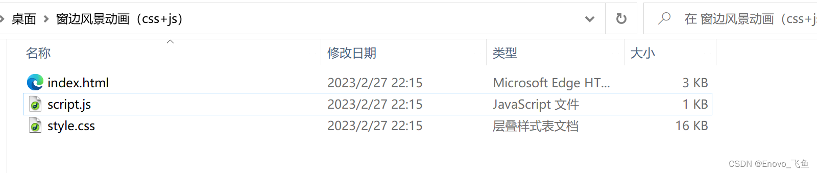
老规矩,先给朋友们看一下完整文件夹,
正确的文件如下图 ,复制源码的朋友们请注意了!!!
公众号获取源码
第一步,通过微信公众号下载源码压缩包,解压并打开文件夹,即为上图样式(复制源码请注意路径及文件名)
第二步,点击 html 文件 打开即可查看
2023年第二十四期,希望得到大家的喜欢🙇
也是新的系列,将会持续更新,🙇
希望大家有好的意见或者建议,欢迎私信
以上就是本篇文章的全部内容了
~ 关注我,点赞博文~ 每天带你涨知识!
1.看到这里了就 [点赞+好评+收藏] 三连 支持下吧,你的「点赞,好评,收藏」是我创作的动力。
2.关注我 ~ 每天带你学习 :各种前端插件、3D炫酷效果、图片展示、文字效果、以及整站模板 、HTML模板 、C++、数据结构、Python程序设计、Java程序设计、爬虫等! 「在这里有好多 开发者,一起探讨 前端 开发 知识,互相学习」!
3.以上内容技术相关问题可以相互学习,可 关 注 ↓公 Z 号 获取更多源码 !
获取源码?私信?关注?点赞?收藏?
👍+✏️+⭐️+🙇
有需要源码的小伙伴可以 关注下方微信公众号 " Enovo开发工厂 ",回复 关键词 " a-wbg "


 753
753


 被折叠的 条评论
为什么被折叠?
被折叠的 条评论
为什么被折叠?
 到【灌水乐园】发言


