


XButton, XConstraintLayout, XEditText, XFrameLayout, XImageView, XLinearLayout, XRelativeLayout, XTextView, XCheckBox, XView, XRadioButton …
上面的所有的控件都支持下面表格中的属性,表格中仅以XButtonCustom举例。
| 属性名称 | 示例 |
| — | — |
| XButtonCustom_corner | 圆角度数 |
| XButtonCustom_corner_type | 圆角类型,默认 all。left_top,left_bottom,right_top,right_bottom |
| XButtonCustom_solid_color | 背景填充颜色,当没有设置渐变填充时生效 |
| XButtonCustom_shadow_color | 外阴影色值 |
| XButtonCustom_shadow_radius | 外阴影半径 |
| XButtonCustom_shadow_dx | 外阴影x方向偏移 |
| XButtonCustom_shadow_dy | 外阴影y方向偏移 |
| XButtonCustom_solid_gradient | 渐变类型,linear, radial, sweep |
| XButtonCustom_gradient_start_color | 渐变起始颜色 |
| XButtonCustom_gradient_center_color | 渐变中间颜色 |
| XButtonCustom_gradient_end_color | 渐变结束颜色 |
| XButtonCustom_gradient_orientation | 渐变的方向 |
| XButtonCustom_gradient_radius | 渐变角度 |
| XButtonCustom_stroke_color | 描边颜色 |
| XButtonCustom_stroke_border | 描边宽度 |
| XButtonCustom_blur_type | 模糊类型,默认为normal。outer,solid,inner |
| XButtonCustom_blur_radius | 模糊半径 |
| XButtonCustom_blur_color | 模糊颜色 |
| XButtonCustom_state | selector类型,默认none。pressed, selected, checked。选定上述状态时,触发state前缀的属性 |
| XButtonCustom_stated_corner | state触发的圆角 |
| XButtonCustom_corner_type | state触发时的圆角类型,默认 all。left_top,left_bottom,right_top,right_bottom |
| XButtonCustom_stated_solid_color | state出发时背景填充颜色,当没有设置渐变填充时生效 |
| XButtonCustom_stated_shadow_color | 外阴影色值 |
| XButtonCustom_stated_shadow_radius | 外阴影半径 |
| XButtonCustom_stated_shadow_dx | 外阴影x方向偏移 |
| XButtonCustom_stated_shadow_dy | 外阴影y方向偏移 |
| XButtonCustom_stated_blur_type | 模糊类型,默认为normal。outer,solid,inner |
| XButtonCustom_stated_blur_radius | 模糊半径 |
| XButtonCustom_stated_blur_color | 模糊颜色 |
| XButtonCustom_stated_solid_gradient | 渐变类型,linear, radial, sweep |
| XButtonCustom_stated_gradient_start_color | 渐变起始颜色 |
| XButtonCustom_stated_gradient_center_color | 渐变中间颜色 |
| XButtonCustom_stated_gradient_end_color | 渐变结束颜色 |
| XButtonCustom_stated_gradient_orientation | 渐变的方向 |
| XButtonCustom_stated_gradient_radius | 渐变角度 |
| XButtonCustom_stated_stroke_color | 描边颜色 |
| XButtonCustom_stated_stroke_border | 描边宽度 |
| XButtonCustom_drawable | 正常情况下显示的drawable |
| XButtonCustom_stated_drawable | 在特定状态下显示的drawable, 如: selector |
上述的字段在代码中的修改方式,支持的修改的字段在
IDrawableEditTransition接口中定义
// 获取IDrawableEditTransition
XWidgetParser.getDrawableEditTransition(v)
?.beginNormalTransition
?.setCorner(10)
?.commit()
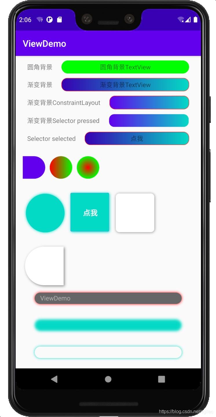
示例
集成
- 在project build.gradle 中加入
allprojects {
repositories {
maven { url ‘https://jitpack.io’ }
}
}
- 在要使用的module 的 build.gradle 中加入
implementation ‘com.github.shilec:XWidget:1.2.2’
- 添加混淆


 110
110


 被折叠的 条评论
为什么被折叠?
被折叠的 条评论
为什么被折叠?
 到【灌水乐园】发言


