


import numpy as np
import pandas as pd
from pandas import Series, DataFrame
import matplotlib.pyplot as plt

%matplotlib inline

import seaborn as sns
1.简单绘图plot
a = [1, 2, 3]
b = [4, 5, 6]
plt.plot(a, b)
%timeit np.arange(10)
plt.plot(a, b, '--')
eg:
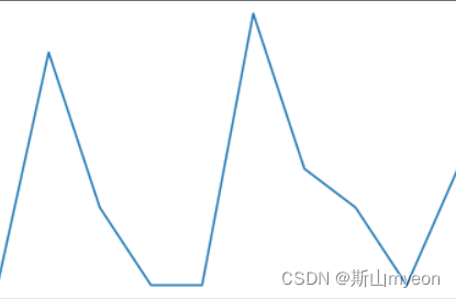
t = np.arange(0.0, 2.0, 0.1)
s = np.sin(t*np.pi)
plt.plot(t,s,'r--',label='aaaa')
plt.plot(t*2, s, 'b--', label='bbbb')
plt.xlabel('this is x')
plt.ylabel('this is y')
plt.title('this is a demo')
plt.legend()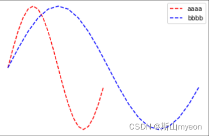
2.简单绘图subplot
eg:
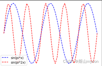
x = np.linspace(0.0, 5.0)
y1 = np.sin(np.pi*x)
y2 = np.sin(np.pi*x*2)

plt.plot(x, y1, 'b--', label='sin(pi*x)')
plt.ylabel('y1 value')
plt.plot(x, y2, 'r--', label='sin(pi*2x)')
plt.ylabel('y2 value')
plt.xlabel('x value')
plt.title('this is x-y value')
plt.legend()

plt.show()
plt.subplot(221)
plt.plot(x, y1, 'b--')
plt.ylabel('y1')
plt.subplot(222)
plt.plot(x, y2, 'r--')
plt.ylabel('y2')
plt.xlabel('x')
plt.subplot(223)
plt.plot(x, y1, 'r*')
plt.subplot(224)
plt.plot(x, y1, 'b*')

plt.show() 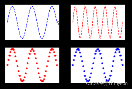
figure, ax = plt.subplots(2,2)
ax[0][0].plot(x, y1)
ax[0][1].plot(x, y2)
plt.show()
(四个此图)
3.绘图之Series
eg:
s1 = Series(np.random.randn(1000)).cumsum()
s2 = Series(np.random.randn(1000)).cumsum()

s1.plot(kind='line',grid=True, label='S1', title='This is Series')
s2.plot(label='S2')

plt.legend()
plt.show()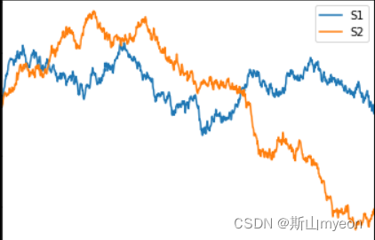
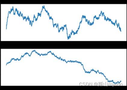
fig, ax = plt.subplots(2,1)

ax

ax[0].plot(s1)

ax[1].plot(s2)

plt.show()
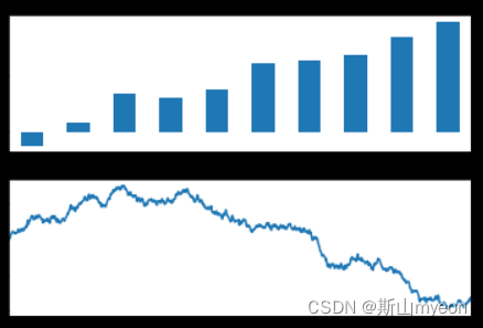
fig, ax = plt.subplots(2,1)

s1[0:10].plot(ax=ax[0], label='S1', kind='bar')
s2.plot(ax=ax[1], label='S2')

plt.show()
4.绘图之DataFrame
eg:
df = DataFrame(
np.random.randint(1,10,40).reshape(10,4),
columns=['A','B','C','D']
)
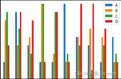
df.plot(kind='bar')
plt.show()
df.plot(kind='barh')
plt.show()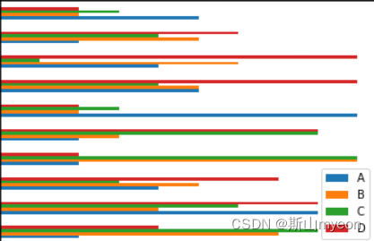
df.plot(kind='bar', stacked=True)

plt.show()

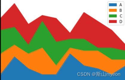
df.plot(kind='area')

plt.show()
a = df.iloc[5]
type(a)
df.iloc[5].plot()
plt.show()

for i in df.index:
    df.iloc[i].plot(label=str(i))
plt.legend()
plt.show()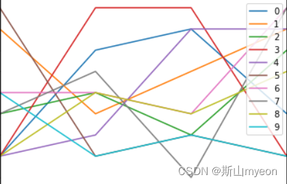
df['A'].plot()

plt.show()
df.plot()
plt.show()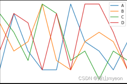
df.T.plot()
plt.show()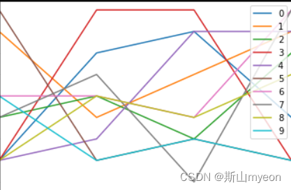
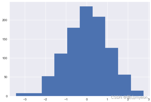
5.Matplotlib直方图和密度图
eg:直方图
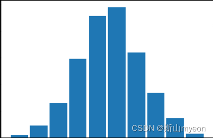
s = Series(np.random.randn(1000))
plt.hist(s, rwidth=0.9)
plt.show()
a = np.arange(10)
plt.hist(a,rwidth=0.9)
plt.show()

re = plt.hist(s, rwidth=0.9)
plt.show()
plt.hist(s, rwidth=0.9,bins=20, color='r')
plt.show()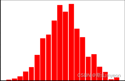
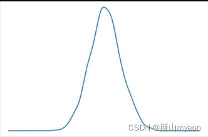
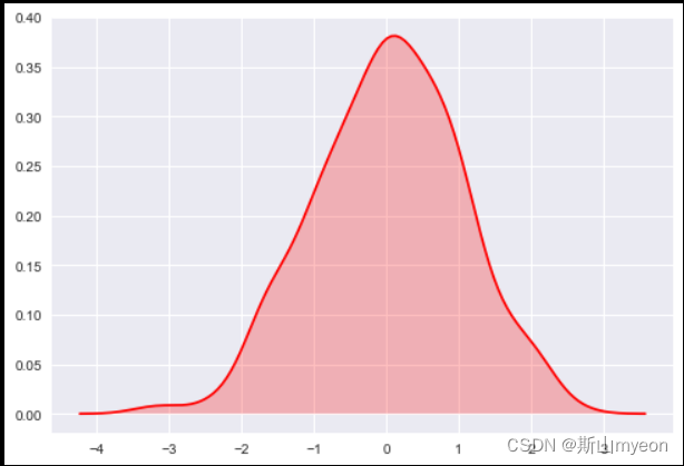
eg:密度图
s.plot(kind='kde')
plt.show()
6.Seaborn直方图和密度图
eg:
s1 = Series(np.random.randn(1000))
plt.hist(s1)

s1.plot(kind='kde')
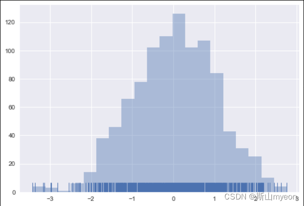
sns.distplot(s1, bins=20, hist=True, kde=False, rug=True)
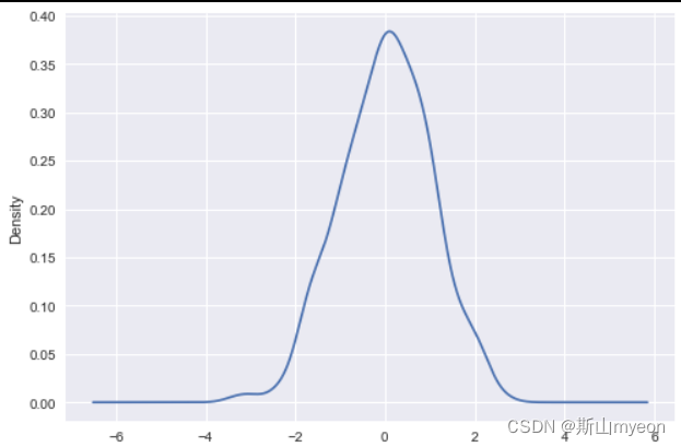
sns.kdeplot(s1, shade=True, color='r')
sns.plt.hist(s1)
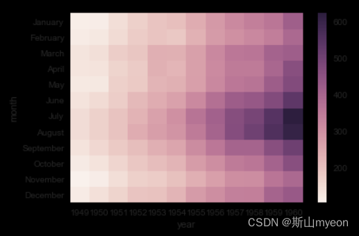
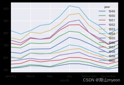
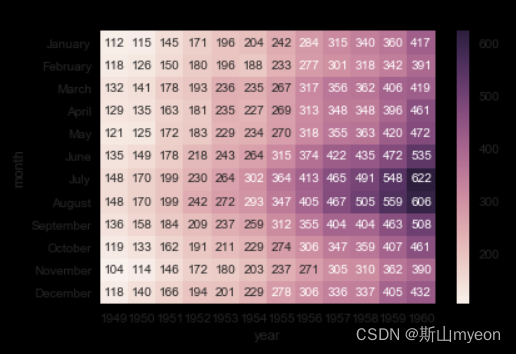
7.Seaborn柱状图和热力图
df = sns.load_dataset('flights')

df = df.pivot(index='month', columns='year', values='passengers')

sns.heatmap(df)
df.plot()
sns.heatmap(df, annot=True, fmt='d')
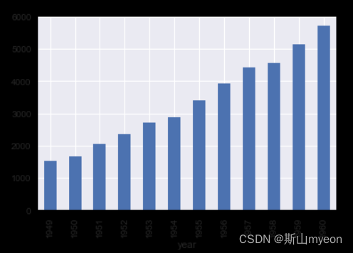
s = df.sum()

sns.barplot(x=s.index, y=s.values)
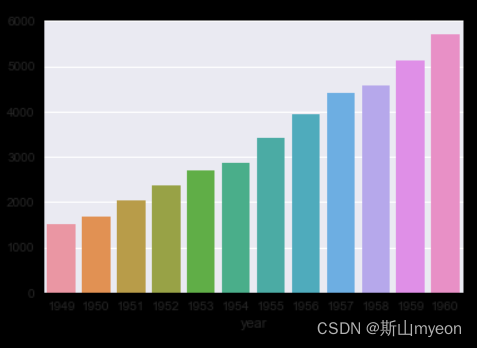
s.plot(kind='bar')
8.Seaborn设置图形显示效果
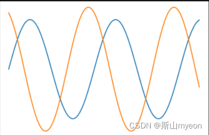
x = np.linspace(0,14,100)
y1 = np.sin(x)
y2 = np.sin(x+2)*1.25

def sinplot():
    plt.plot(x, y1)
    plt.plot(x, y2)

sinplot()
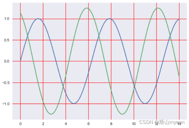
style = ['darkgrid', 'dark', 'white','whitegrid', 'tricks']
sns.set_style(style[0], {'grid.color': 'red'})
sinplot()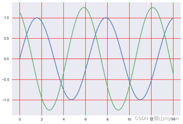
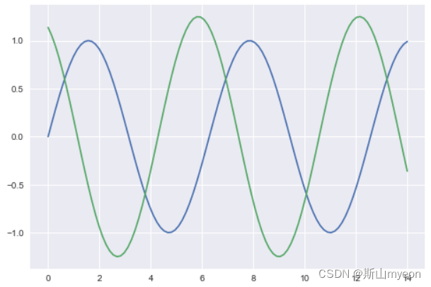
sns.axes_style()
sinplot()
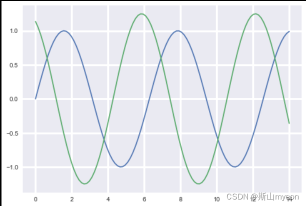
sns.set()
sinplot()
context = ['paper', 'notebook', 'talk', 'poster']
sns.set_context(context[1], rc={'grid.linewidth': 3.0})
sinplot()

sns.set()
sns.plotting_context()
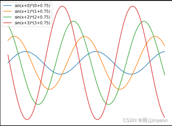
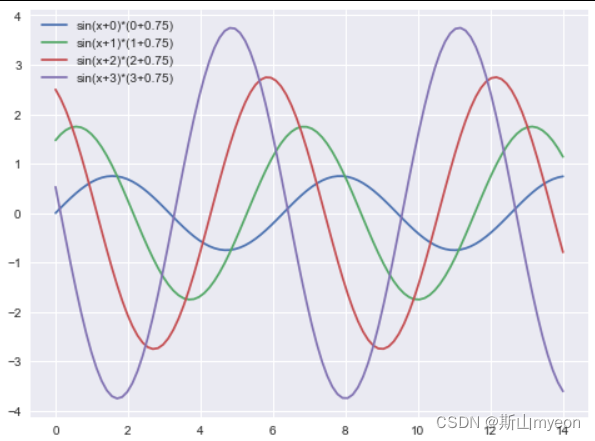
9.seaborn强大的调色功能
def sinplot():
    x = np.linspace(0,14,100)
    plt.figure(figsize=(8,6))
    for i in range(4):
        plt.plot(x, np.sin(x+i)*(i+0.75), label='sin(x+%s)*(%s+0.75)'% (i,i))
    plt.legend()

sinplot()
import seaborn as sns
sinplot()
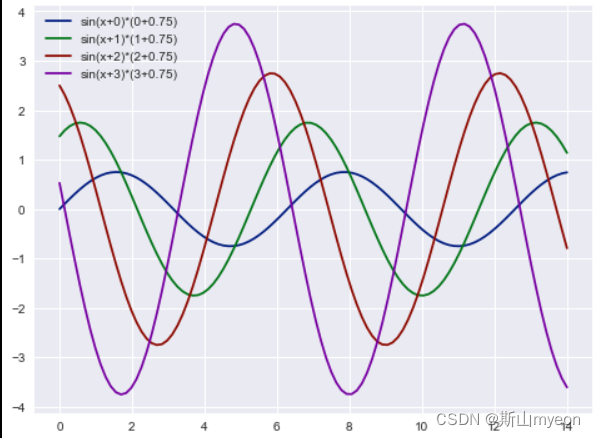
sns.color_palette()   #RGB
sns.palplot(sns.color_palette())
pal_style = ['deep', 'muted', 'pastel', 'bright', 'dark','colorblind']
sns.palplot(sns.color_palette('dark'))
sns.set_palette(sns.color_palette('dark'))
sinplot()
10.Matplotlib和Seaborn对比
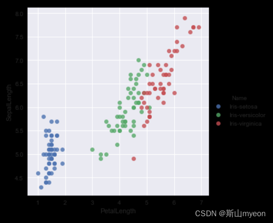
iris = pd.read_csv('../homework/iris.csv')
iris.head()
### 需求:画一个花瓣(petal)和花萼(sepal)长度的散点图,并且点的颜色要区分鸢尾花的种类

iris.Name.unique()
color_map = dict(zip(iris.Name.unique(), ['blue','green','red']))

for species, group in iris.groupby('Name'):
    plt.scatter(group['PetalLength'], group['SepalLength'],
                color=color_map[species],
                alpha=0.3, edgecolor=None,
                label=species)
plt.legend(frameon=True, title='Name')
plt.xlabel('petalLength')
plt.ylabel('sepalLength')
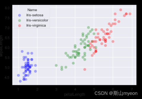
sns.lmplot('PetalLength', 'SepalLength', iris, hue='Name', fit_reg=False)
matplotlib和seaborn都是Python中常用的数据可视化库,但它们有一些区别。
matplotlib是一个基础的绘图库,提供了各种绘图函数和工具,可以绘制各种类型的图表,包括线图、散点图、柱状图、饼图等等。matplotlib的优点是灵活性高,可以自定义绘图的各种属性,但缺点是有些绘图需要较多的代码。
seaborn是在matplotlib基础上进行了封装和扩展,提供了更高级的绘图函数和工具,可以快速绘制各种类型的统计图表,包括热力图、密度图、箱线图等等。seaborn的优点是绘图简单、美观,适合快速绘制各种统计图表,但缺点是灵活性相对较低,自定义绘图属性需要一定的学习成本。
因此,matplotlib适合需要自定义绘图属性的场景,而seaborn适合快速绘制各种统计图表的场景。


 3370
3370


 被折叠的 条评论
为什么被折叠?
被折叠的 条评论
为什么被折叠?
 到【灌水乐园】发言


