


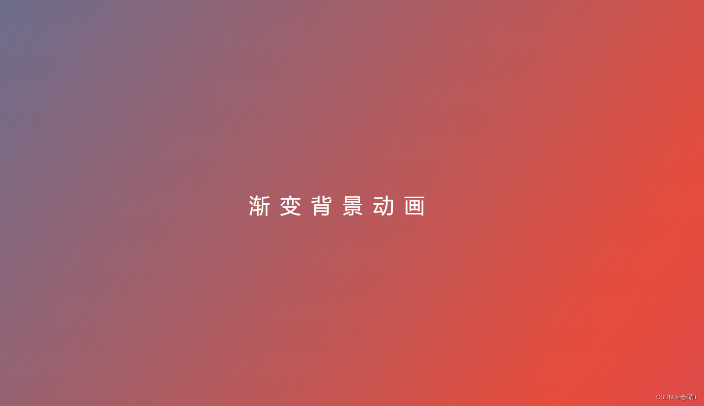
<!DOCTYPE html>
<html lang="zh">
<head>
    <meta charset="UTF-8">
    <meta http-equiv="X-UA-Compatible" content="IE=edge">
    <meta name="viewport" content="width=device-width, initial-scale=1.0">
    <title>渐变背景动画</title>
    <style>
        * {
            margin: 0;
            padding: 0;
        }
        body {
            /* 100%窗口高度 */
            height: 100vh;
            /* 弹性布局 水平垂直居中 */
            display: flex;
            justify-content: center;
            align-items: center;
            /* 渐变背景 */
            background: linear-gradient(125deg ,#2c3e50,#27ae60,#2980b9,#e74c3c,#8e44ad);
            /* 制定背景图像的大小 */
            background-size: 500%;
            animation: bgani 15s linear infinite;

        }
        .text {
            color: #fff;
            font-size: 30px;
            /* 字间距 */
            letter-spacing: 15px;
        }
        @keyframes bgani {
            0%,100% {
                background-position: 0% 50%;

            }
            50% {
                background-position: 100% 50%;
            }
        }
    </style>
</head>
<body>
    <div class="text">渐变背景动画</div>
</body>
</html>
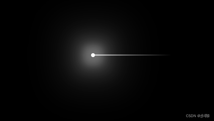
<!DOCTYPE html>
<html lang="zh">
<head>
    <meta charset="UTF-8">
    <meta http-equiv="X-UA-Compatible" content="IE=edge">
    <meta name="viewport" content="width=device-width, initial-scale=1.0">
    <title>Document</title>
    <style>
        body {
            background-color: black;
        }
        span {
            position: absolute;
            top: 50%;
            left: 50%;
            width: 10px;
            height: 10px;
            background-color: #fff;
            border-radius: 50%;
            box-shadow: 0 0 20px 20px rgba(225,225,225,.3),
                        0 0 40px 40px rgba(225,225,225,.2),
                        0 0 80px 80px rgba(225,225,225,.1);
        }
        /* 拖尾效果 */
        span::after {
            content: "";
            width: 200px;
            height: 2px;
            position: absolute;
            top: 50%;
            transform: translateY(-50%);
            background:linear-gradient(to right,#fff,rgba(225,225,225,.5),transparent) ;
        }
    </style>
</head>
<body>
    <span></span>
</body>
</html>

<!DOCTYPE html>
<html lang="zh">
<head>
    <meta charset="UTF-8">
    <meta http-equiv="X-UA-Compatible" content="IE=edge">
    <meta name="viewport" content="width=device-width, initial-scale=1.0">
    <title>Document</title>
    <style>
        * {
            margin: 0;
            padding: 0;
        }
        body {
            height: 100vh;
            background: #222;
            display: flex;
            justify-content: center;
            align-items: center;
        }
        h1 {
            font-size: 112px;
            text-transform: uppercase;
            /* background: linear-gradient(to right,#ff69b3,#fe0000,#ffa401,#ffff01,#008102,#40e1d2,#410098,#9400d4) no-repeat; */
            background: linear-gradient(120deg,rgba(255,255,255,0) 100px ,rgba(255,255,255,1) 180px ,rgba(255,255,255,0) 260px);
            background-clip: text;
            -webkit-background-clip: text;
            color: rgba(225,225,225,.3);
            animation: move 3s linear infinite;
        }
        @keyframes move {
            0% {
                background-position:-160px,0;
            }
            100% {
                background-position: 600px,0;
            }
        }
    </style>
</head>
<body>
    <h1>helloworld</h1>
</body>
</html>
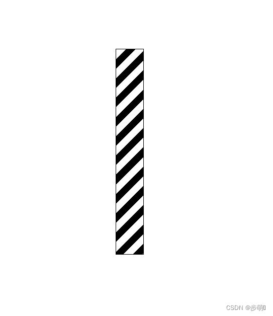
<!DOCTYPE html>
<html lang="zh">
<head>
    <meta charset="UTF-8">
    <meta http-equiv="X-UA-Compatible" content="IE=edge">
    <meta name="viewport" content="width=device-width, initial-scale=1.0">
    <title>Document</title>
    <style>
        * {
            margin: 0;
            padding: 0;
        }
        body {
            height: 100vh;
        }
        .wrap {
            width: 40px;
            height: 300px;
            border: 1px solid;
            margin: 100px auto;
            overflow: hidden;
        }
        .wrap .inner {
            height: 600px;
            background: repeating-linear-gradient(135deg,black 0px,black 10px,white 10px,white 20px);
            animation: move 5s linear infinite;
        }
        @keyframes move {
            100% {
                margin-top: -300px;
            }
        }
    </style>
</head>
<body>
    <div class="wrap">
        <div class="inner"></div>
    </div>
</body>
</html>

<!DOCTYPE html>
<html lang="zh">
<head>
    <meta charset="UTF-8">
    <meta http-equiv="X-UA-Compatible" content="IE=edge">
    <meta name="viewport" content="width=device-width, initial-scale=1.0">
    <title>Document</title>
    <style>
        * {
            margin: 0;
            padding: 0;
        }
        body {
            height: 100vh;
            background: #222;
            display: flex;
            justify-content: center;
            align-items: center;
        }
        h1 {
            position: relative;
            font-size: 112px;
            text-transform: uppercase;
            color: #333;
        }
        h1::after {
            content: "helloworld";
            position: absolute;
            top: 0;
            left: 0;
            color: transparent;
            background: linear-gradient(to right,#ff69b3,#fe0000,#ffa401,#ffff01,#008102,#40e1d2,#410098,#9400d4);
            background-clip: text;
            -webkit-background-clip: text;
            clip-path: circle(100px at 0% 50%);
            animation: move 5s infinite;
        }
        @keyframes move {
            0%,100% {
                clip-path: circle(100px at 0% 50%);
            }
            50% {
                clip-path: circle(100px at 100% 50%);
            }
        }
    </style>
</head>
<body>
    <h1>helloworld</h1>
</body>
</html>
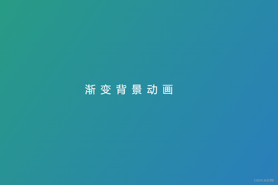
<!DOCTYPE html>
<html lang="zh">
<head>
<meta charset="UTF-8">
<meta http-equiv="X-UA-Compatible" content="IE=edge">
<meta name="viewport" content="width=device-width, initial-scale=1.0">
<title>Document</title>
<style>
* {
margin: 0;
padding: 0;
}
/* 渐变背景动画 */
body {
height: 100vh;
background: linear-gradient(125deg ,#2c3e50,#27ae60,#2980b9,#e74c3c,#8e44ad);
background-size: 500%;
animation: bgmove 10s linear infinite;
overflow: hidden;
}
@keyframes bgmove {
0%,100% {
background-position: 0% 50%;
}
50% {
background-position: 100% 50%;
}
}
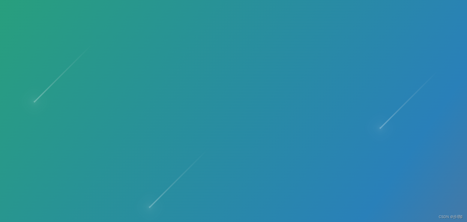
/* 流星发光,拖尾,动画 */
span {
width: 4px;
height: 4px;
background-color: #fff;
position: absolute;
/* top: 50%;
left: 50%; */
border-radius: 50%;
/* 发光效果 */
box-shadow: 0 0 4px 4px rgba(225,225,225,.1),
0 0 8px 8px rgba(225,225,225,.1),
0 0 20px 20px rgba(225,225,225,.1);
transform: rotate(315deg);
animation: starmove 3s linear infinite;
}
/* 拖尾效果 */
span::after {
content: "";
width: 200px;
height: 3px;
background: linear-gradient(to right, #fff,rgba(225,225,225,.6),rgba(225,225,225,.3),transparent);
position: absolute;
top: 50%;
transform: translateY(-50%);
}
@keyframes starmove {
0% {
transform:rotate(315deg) translateX(0);
opacity: 1;
}
100% {
transform:rotate(315deg) translateX(-500px);
opacity: 0;
}
}
/* 复制流星 */
span:nth-child(1){
top: 20%;
right: 10%;
}
span:nth-child(2) {
/* left: initial; */
top: 50%;
right: 50%;
}
span:nth-child(3) {
/* left: initial; */
top: 10%;
right: 70%;
}
</style>
</head>
<body>
<div>
<span></span>
<span></span>
<span></span>
</div>
</body>
</html>
扫光效果
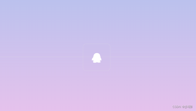
<!DOCTYPE html>
<html lang="zh">
<head>
    <meta charset="UTF-8">
    <meta http-equiv="X-UA-Compatible" content="IE=edge">
    <meta name="viewport" content="width=device-width, initial-scale=1.0">
    <link rel="stylesheet" href="https://cdnjs.cloudflare.com/ajax/libs/font-awesome/4.7.0/css/font-awesome.min.css" integrity="sha512-SfTiTlX6kk+qitfevl/7LibUOeJWlt9rbyDn92a1DqWOw9vWG2MFoays0sgObmWazO5BQPiFucnnEAjpAB+/Sw==" crossorigin="anonymous" referrerpolicy="no-referrer" />
    <title>Document</title>
    <style>
        * {
            margin: 0;
            padding: 0;
            box-sizing: border-box;
        }
        body {
            width: 100vw;
            height: 100vh;
            background-image: linear-gradient(to top, #fbc2eb 0%, #a6c1ee 100%);
            background-size: 300%;
            background-position: 50% 50%;
        }
        .main::before {
            content: "";
            width: 100%;
            height: 50%;
            position: absolute;
            bottom: 0;
            border-top: 1px solid rgba(225,225,225,.5);
        }
        a {
            position: absolute;
            top: 44%;
            left: 44%;
            /* transform: translate(-50%,-50%); */
            width: 80px;
            height: 80px;
            color: #fff;
            border: 1px solid rgba(225,225,225,.4);
            border-radius: 10px;
            text-align: center;
            line-height: 80px;
            text-decoration: none;
            font-size: 28px;
            backdrop-filter: blur(2px);
            transition: all .5s;
            overflow: hidden;
        }
        a:hover {
            transform: translateY(-20px);
        }
        /* 扫光 */
        a::before {
            content: "";
            position: absolute;
            top: 0;
            left: 0;
            width: 50px;
            height: 100%;
            background-color: #fff;
            transform: skewX(45deg) translateX(150px);
            transition: all 0.5s;
        }
        a:hover::before {
            transform: skewX(45deg) translateX(-150px);
        }


    </style>
</head>
<body>
    <div class="main">
        <a href="#"><i class="fa fa-qq"></i></a>
    </div>
</body>
</html>
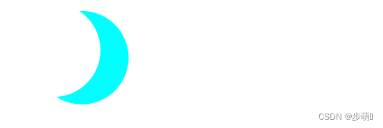
<!DOCTYPE html>
<html lang="en">
<head>
    <meta charset="UTF-8">
    <meta http-equiv="X-UA-Compatible" content="IE=edge">
    <meta name="viewport" content="width=device-width, initial-scale=1.0">
    <title>Document</title>
    <style>
        .moon {
            width: 100px;
            height: 100px;
            /* background-color: pink; */
            border-radius: 50%;
            box-shadow: 30px 8px 0 cyan;
        }
    </style>
</head>
<body>
    <div class="moon"></div>
</body>
</html>
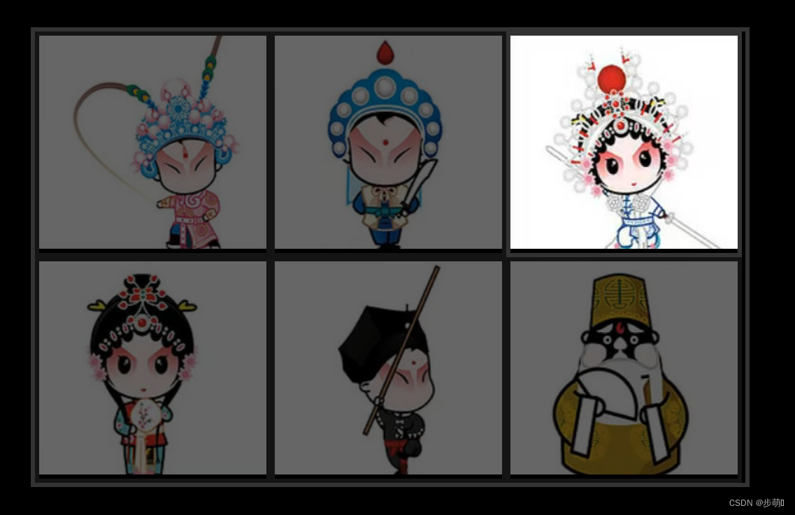
<!DOCTYPE html>
<html lang="en">
<head>
    <meta charset="UTF-8">
    <meta http-equiv="X-UA-Compatible" content="IE=edge">
    <meta name="viewport" content="width=device-width, initial-scale=1.0">
    <title>Document</title>
    <style>
        * {
            margin: 0;
            padding: 0;
            list-style: none;
        }
        body {
            background-color: #000;
        }
        .wrap {
            width: 750px;
            overflow: hidden;
            margin: 100px auto;
            border: 5px solid #333;
        }
        .wrap li {
            float: left;
            border: 5px solid #333;
        }
        .wrap li img {
            width: 240px;
            height: 225px;
        }

    </style>
    <script src="https://apps.bdimg.com/libs/jquery/2.1.4/jquery.min.js"></script>
    <script>
        $(function() {
            $('.wrap li').mouseenter(function() {
                $(this).css('opacity',1).siblings('li').css('opacity',0.4);
            })
            $('.wrap').mouseleave(function() {
                $(this).find('li').css('opacity',1);
            })
        })
    </script>
</head>
<body>
    <ul class="wrap">
        <li><img src="../img/q1.jpg" alt=""></li>
        <li><img src="../img/q2.jpg" alt=""></li>
        <li><img src="../img/q3.jpg" alt=""></li>
        <li><img src="../img/q4.jpg" alt=""></li>
        <li><img src="../img/q5.jpg" alt=""></li>
        <li><img src="../img/q6.jpg" alt=""></li>
    </ul>
</body>
</html>
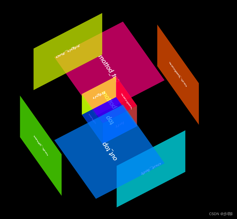
<!DOCTYPE html>
<html lang="en">
    <head>
        <meta charset="UTF-8" />
        <meta http-equiv="X-UA-Compatible" content="IE=edge" />
        <meta name="viewport" content="width=device-width, initial-scale=1.0" />
        <title>正方体</title>
        <style>
            * {
                margin: 0;
                padding: 0;
                background-color: #000;
            }
            /*盒子*/
            .content {
                margin: 200px;
                width: 200px;
                height: 200px;
                position: relative;
                transform: perspective(400px);
                transform-style: preserve-3d;
                background: transparent;
                animation: play 5s linear infinite;
            }
            /*内层正方体*/
            .content div {
                width: 100px;
                height: 100px;
                position: absolute;
                color: #fff;
                text-align: center;
                line-height: 100px;
                left: 50px;
                top: 50px;
            }
            /*外层正方体


*/
            .content span {
                width: 200px;
                height: 200px;
                position: absolute;
                color: #fff;
                text-align: center;
                line-height: 200px;
                transition: all 1s;
            }
            .left {
                transform: translateX(-50px) rotateY(90deg);
                background: hsla(180, 100%, 50%, 0.7);
            }
            .right {
                transform: translateX(50px) rotateY(-90deg);
                background: hsla(60, 100%, 50%, 0.7);
            }

            .before {
                transform: translateZ(50px);
                background: hsla(0, 100%, 50%, 0.7);
            }
            .after {
                transform: translateZ(-50px);
                background: hsla(120, 100%, 50%, 0.7);
            }

            .top {
                transform: translateY(-50px) rotateX(90deg);
                background: hsla(240, 100%, 50%, 0.7);
            }
            .bottom {
                transform: translateY(50px) rotateX(-90deg);
                background: hsla(300, 100%, 50%, 0.7);
            }

            /* 外层 */
            .out_left {
                transform: translateX(-100px) rotateY(90deg);
                background: hsla(183, 100%, 50%, 0.7);
            }
            .out_right {
                transform: translateX(100px) rotateY(-90deg);
                background: hsla(69, 100%, 50%, 0.7);
            }

            .out_before {
                transform: translateZ(100px);
                background: hsla(20, 100%, 50%, 0.7);
            }
            .out_after {
                transform: translateZ(-100px);
                background: hsla(100, 100%, 50%, 0.7);
            }

            .out_top {
                transform: translateY(-100px) rotateX(90deg);
                background: hsla(210, 100%, 50%, 0.7);
            }
            .out_bottom {
                transform: translateY(100px) rotateX(-90deg);
                background: hsla(330, 100%, 50%, 0.7);
            }

            /* 悬浮外层时改变外层的偏移量, */
            .content:hover .out_left {
                transform: translateX(-200px) rotateY(90deg);
            }
            .content:hover .out_right {
                transform: translateX(200px) rotateY(-90deg);
            }
            .content:hover .out_before {
                transform: translateZ(200px);
            }
            .content:hover .out_after {
                transform: translateZ(-200px);
            }
            .content:hover .out_top {
                transform: translateY(-200px) rotateX(90deg);
            }
            .content:hover .out_bottom {
                transform: translateY(200px) rotateX(-90deg);
            }

            @keyframes play {
                0% {
                    transform: rotateX(0deg) rotateY(0deg);
                }
                100% {
                    transform: rotateX(-360deg) rotateY(360deg);
                }
            }
        </style>
    </head>
    <body>
        <div class="content">
            <!-- 外层 -->
            <span class="out_left">out_left</span>
            <span class="out_top">out_top</span>
            <span class="out_before">out_before</span>
            <span class="out_right">out_right</span>
            <span class="out_bottom">out_bottom</span>
            <span class="out_after">out_after</span>

            <div class="left">left</div>
            <div class="top">top</div>
            <div class="before">before</div>
            <div class="right">right</div>
            <div class="bottom">bottom</div>
            <div class="after">after</div>
        </div>
    </body>
</html>


 1999
1999


 被折叠的 条评论
为什么被折叠?
被折叠的 条评论
为什么被折叠?
 到【灌水乐园】发言


