


1.今天主要掌握三点
(1)offset()属性的使用
(2)$(window).width()获取视口宽度
(3)!important 中的权重使用 https://www.runoob.com/css/css-important.html
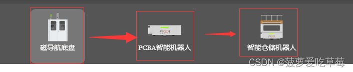
2.效果图:
(1)说明:当鼠标移动到当前的区域时,让背景色显示出来,往左右移动时有左右移动动画效果,以及移入时下华夏从左出来,移除时下划线从右消失的原理。
3.html代码结构
<div class="sub-menu-module js-sub-menu">
            <!--移动背景颜色-->
            <div class="active-bg" style="left:0px; display: none;"></div>
            <div class="sub-menu">
                <ul class="sub-menu-item">
                    <li>
                        <a href="">
                            <div class="menu-list">
                                <img src="images/ewm1.png" alt="">
                                <p class="menu-des">智能机器人1</p>
                            </div>
                        </a>
                    </li>
                    <li>
                        <a href="">
                            <div class="menu-list">
                                <img src="images/zp1.png" alt="">
                                <p class="menu-des ">智能机器人2</p>
                            </div>
                        </a>
                    </li>
                    <li>
                        <a href="">
                            <div class="menu-list ">
                                <img src="images/zp2.png" alt="">
                                <p class="menu-des">智能机器人3</p>
                            </div>
                        </a>
                    </li>

                </ul>
            </div>
        </div>
4.less样式:
.sub-menu-module {
        height: 120px;
        background: rgba(44, 42, 42, 0.8);
        margin: auto;
        position: relative;
        top: -1px;
        .active-bg{
            position: absolute;
            top: 10px;
            width: 110px;
            height: 110px;
            background: rgba(255, 255, 255, 0.2);
            border-radius: 12px 12px 12px 12px;
            transition: all 0.3s linear;
            display: block;
        }

        .sub-menu {
            width: 1300px;
            margin: auto;
        }

        .sub-menu-item {
            margin: auto;
            text-align: center;
            overflow: hidden;
        }

        li {
            display: inline-block;
            text-align: center;
            padding: 10px 50px 0;
            color: #fff;
            line-height: 10px;

            a {
                cursor: pointer;
            }

            .menu-list {
                width: 110px;
                height: 110px;
                cursor: pointer;
                text-align: center;
                display: inline-block;
                position: relative;

                img {
                    width: 70px;
                    height: 70px;
                    margin-bottom: -10px;
                }

                .menu-des {
                    position: relative;
                    display: inline-block;
                    line-height: 34px;
                    white-space: nowrap;
                    font-size: 14px;
                    color: #fff !important;

                    &:after {
                        width: 0;
                        height: 1px;
                        background: #ffffff;
                        position: absolute;
                        right: 0;
                        content: '';
                        display: block;
                        transition: all 0.5s linear;
                    }

                }

                &:hover {
                    .menu-des {
                        &:after {
                            left: 0 !important;
                            width: 100%;
                            transition: all 0.5s linear;
                        }
                    }
                }
            }
        }
    }
5.jquer代码:
 $(function () {
            var activeBg = $(".active-bg");
            var menuList = $(".menu-list");
            menuList.mouseenter(function () {
                var width = $(this).width();   //menu-list的宽度
                var offsetLeft = $(this).offset().left;  //相对于视口从左到右的距离
                // var windowWidth = $(window).width();   //视口宽度(视情况而定)
                // 背景移动距离
                activeBg.css('left',offsetLeft).show();
            });

            menuList.mouseleave(function () {
                // activeBg.hide();
            });
        });
7.总结+案例代码结构解析:
(1)以上是一个完整案例全部代码。
(2)我们需要最先设置好一个架构为背景色做移动的效果,
<div class="active-bg" style="left:0px; display: none;"></div>(3)同时在给背景色添加一个移动的动画效果
.active-bg{
            position: absolute;
            top: 10px;
            width: 110px;
            height: 110px;
            background: rgba(255, 255, 255, 0.2);
            border-radius: 12px 12px 12px 12px;
            transition: all 0.3s linear;
            display: block;
        }
(4)下划线hover效果一开始从左出现,离开hover时下划线从右消失以及动画效果:
 .menu-des {
                    position: relative;
                    display: inline-block;
                    line-height: 34px;
                    white-space: nowrap;
                    font-size: 14px;
                    color: #fff !important;

                    &:after {
                        width: 0;
                        height: 1px;
                        background: #ffffff;
                        position: absolute;
                        right: 0;   //从右消失
                        content: '';
                        display: block;
                        transition: all 0.5s linear;
                    }

                }
                &:hover {
                    .menu-des {
                        &:after {
                            left: 0 !important;   //从左显示
                            width: 100%;
                            transition: all 0.5s linear;
                        }
                    }
                }


 1909
1909


 被折叠的 条评论
为什么被折叠?
被折叠的 条评论
为什么被折叠?
 到【灌水乐园】发言


