


 本文介绍了如何通过学习美赛O奖论文中的地图数据可视化方法,提升数据展示技巧,包括使用Python库pyecharts创建热力图以及另一种方法,涉及下载和处理地理数据包以实现更灵活的定制。
“数据可视化”在美赛的论文中至关重要 ,这个方面做的好的论文往往都有加分。关于这方向能力的提高,笔者雨洛建议是学习美赛O奖论文,看看他们使用哪种形式来表现数据,然后从中学习你认为能清楚表达数据且比较优美的图,准备好相关的代码或者记住对应的画图方法。
下面列出一下E题O奖中常见的图的画法:
一.地图形式
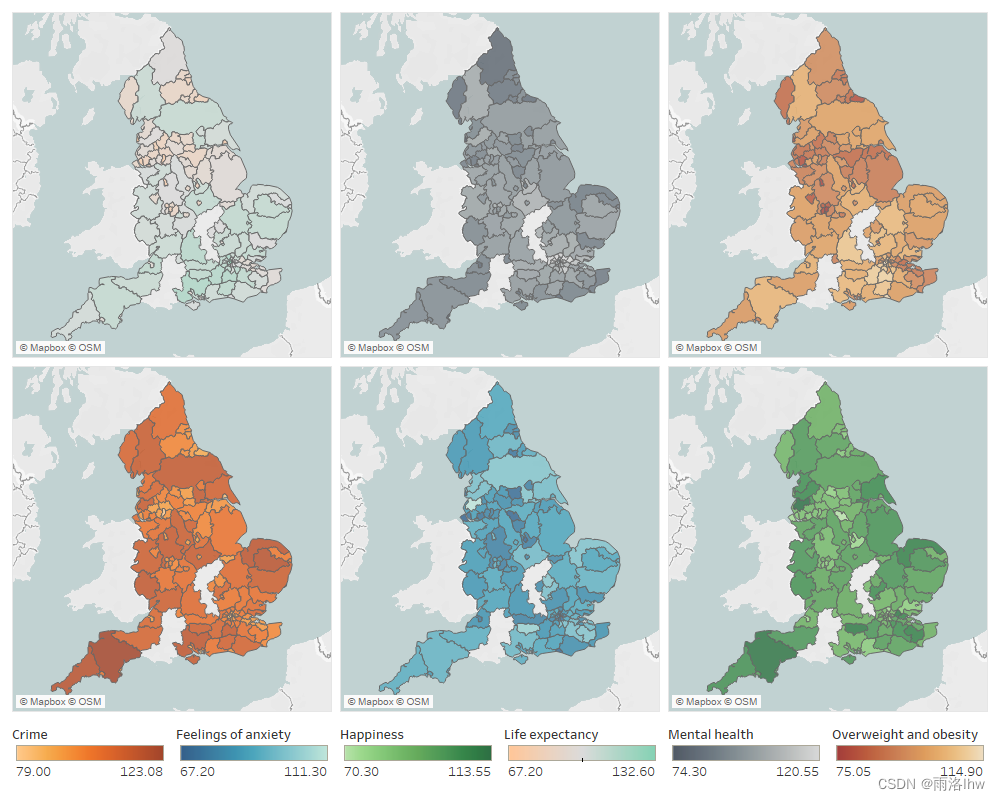
因为E题往往和地区有关,不论是22的森林,23的光污染,还是今年的自然灾害与保险,都是与地区有关,所以这种将数据用地图形式的热力图来表达的方法在E题中经常出现。画这种图用Python画还是挺简单的。
1.第一种方法:直接用Python库pyecharts.charts
这种画法比较简单,但是也有限制,图例的位置基本无法改变(或者可以改变但是我不会),其主要原理是我们所用的地区名称与Python库所含有的地区名称相匹配,然后将数据标在地图对应的位置上,所以csv文件中的要显示的地区的名称要正确,如果不确定可以先运行下面提供的代码(以世界地图为例),就可以找到对应的国家名字了,如果想要某个国家的地名可以将world_map.py中的world改成对应的国家就可以了。
![]()
(1)第一步:得到.csv文件
一般我们的得到的数据是Excel文件,我们需要将Excel形式的文件转化为.csv文件,如果已经是.csv文件就可以跳过这一步,直接运行第二步的代码代码如下
Excel_to_csv.py:
第一种生成在默认目录:
import pandas as pd
File_name =  'D:\python\py_project\ICM\excel_data.xlsx'
df = pd.read_excel(File_name) # 读取Excel表格中的数据
df.to_csv("csv_data3.csv", index=False) # 将 DataFrame 保存为 CSV 文件
第二种生成在指定的目录下:
import pandas as pd

# 指定 Excel 文件路径
file_name = 'D:\python\py_project\ICM\excel_data.xlsx'
df = pd.read_excel(file_name) # 读取 Excel 表格中的数据
output_file_path = 'D:\python\py_project\ICM\csv_data3.csv' # 指定输出 CSV 文件路径(包括目录)
df.to_csv(output_file_path, index=False) # 将 DataFrame 保存为 CSV 文件
运行结果 :
![]()
to_csv.py(将对应的列转换为csv文件):
# author:林鸿炜
# date:2024/2/12
import pandas as pd

# 提供的数据
data_str = """
entity	average rainfall (pre) mm/year
United States	0.091962617
China	0.111028037
India	0.321715232
Brazil	0.340582739
Russia	0.13464541
Germany	0.13260033
United Kingdom	0.152985159
France	0.168180317
Japan	0.372160528
Canada	0.08420011
Australia	0.059681143
South Africa	0.115448047
Mexico	0.079604178
South Korea	0.276525565
Indonesia	1

"""

# 将数据解析成列表形式
data_list = [line.split("\t") for line in data_str.strip().split("\n")]

# 将列表转换为 DataFrame
df = pd.DataFrame(data_list[1:], columns=data_list[0])

# 将 DataFrame 保存为 Excel 文件
# df.to_excel("excel_data.xlsx", index=False)
df.to_csv("csv_data.csv", index=False)
运行结果:
![]()
(2)运行画图代码world_map.py:
from pyecharts import options as opts
import pandas as pd
from pyecharts.charts import Map
import os

# 基础数据
data = pd.read_csv('entity_scores.csv')
A = data['Entity'].to_list()
B = data['Score'].to_list()

attr = A
value = B
data = []

for index in range(len(attr)):
    city_info = [attr[index], value[index]]
    data.append(city_info)

# 为没有数据的地方添加斜线图案
for country in list(set(attr)):  # Assuming 'attr' contains the list of countries/entities
    if country not in attr:
        data.append([country, None])

c = (
    Map()
    .add("", data, "world", is_map_symbol_show=False)  # Turn off map symbols世界地图
    .set_series_opts(
        label_opts=opts.LabelOpts(is_show=False),
        itemstyle_opts={
            "normal": {"areaColor": "#EFF1F3", "borderColor": "#404a59"},
            "emphasis": {"label": {"show": True, "color": "white"}},
        },
    )
    .set_global_opts(
        title_opts=opts.TitleOpts(
            title="Natural Disaster Risk Level",
            pos_bottom='bottom' , # 设置标题文本在标题框中的底部
            pos_left='center'  # Adjust title position to the center
        ), #  subtitle="Entity Scores"
        visualmap_opts=opts.VisualMapOpts(
            max_=max(value),
            min_=min(value),
            range_color=['#fffa76','#ff9300','#ff0518'],#'#F6CEF5', '#F7BE81', '#F78181'
            is_piecewise=True,  # Enable piecewise mode
            pieces=[
                {"min": min(value), "max": 0.26, "label": "Low Risk"},
                {"min": 0.26, "max": 0.395, "label": "Medium Risk"},
                {"min": 0.395, "max": max(value), "label": "High Risk"},
            ],
        ),
        legend_opts=opts.LegendOpts(
            pos_top='top',  # 调整图例位置至顶部
            pos_left='center' ,# 调整图例水平位置至中间
        ),
    )
    .render("world_map.html")
)

# Open HTML file
os.system("world_map.html")
运行结果:

保存图片:
在生成图片的界面中,右键 ,会出现保存的选项

(3)主要有三个地方需要修改:
1.图例的颜色:
![]()
这个颜色可以选择自己喜欢的颜色,如果不知道如何搭配,可以选取论文中的搭配,也可以自己在网站里选取搭配好的颜色。
论文中的颜色提取:
截图:
放到ps中提取(或者自己常用的提取颜色的软件):用拾色器来提取颜色

网站配色:ColorSpace - Color Palettes Generator and Color Gradient Tool
选择好想要的基准色,点击“Generate”就可以生成想要的配色了


2.图例的名称(图例的数量也是在这里改,加或减图例数量时记得加上对应的颜色个数)

3.标题的位置
如图,目前是底下居中,如果想改的话就是pos_weizhi=‘weizhi’(weizhi是对应位置的英文名)

2.第二种方法:
这个方法麻烦一点,需要自己下载地图的数据包,目前我只找到中国的地图数据的下载办法,但是也是有优点,就是它的可调度会更好,可以自己设置图片的大小,图例的位置等。
(1)得到.csv文件
方法同上。
(2)获取地图数据包.json文件
进入网站DataV.GeoAtlas地理小工具系列,下载对应的数据包


(3).运行代码
想要修改标题,图例,所用的颜色查看代码注释即可
# author:雨洛lhw
# date:2024/1/31
import geopandas as gpd
import pandas as pd
import matplotlib.pyplot as plt
import json
# 1. 读取地理数据
json_file_path = 'D:/MCM/数学建模/my_MCM/模拟赛资料/数据/map_data/中华人民共和国.json' # 中华人民共和国/
geoData = gpd.read_file(json_file_path)
with open(json_file_path, 'r', encoding='utf-8') as file:
    data = json.load(file)

# 显示 JSON 结构
print(json.dumps(data, indent=2))
# 2. 读取待合并的数据
yourDataFile = 'D:\python\py_project\ICM\data.csv'
yourData = pd.read_csv(yourDataFile)

# 3. 合并数据
commonID = 'common_id'
print("Columns in geoData:", geoData.columns)
print("Columns in yourData:", yourData.columns)

mergedData = geoData.merge(yourData, how='left', left_on='name', right_on='province')
#合并结果检查
print("Merged Data:")
print(mergedData.head())

# 4. 可视化数据
fig, ax = plt.subplots(figsize=(8, 8), frameon=False) # frameon 用于关闭坐标轴

# 只绘制population_density的数据

mergedData.plot(column='population_density', cmap='Purples', linewidth=0.8, edgecolor='0.8', legend=False, ax=ax) # 这就是从白色到紫色
# mergedData.plot(column='population_density', cmap='OrRd', linewidth=0.8, edgecolor='0.8', legend=False, ax=ax)
# # column='population_density'用于指定要在地图上使用的数据列,legend=True用于显示图例,cmap='OrRd'用于选择颜色映射(可以根据需要选择其他颜色映射),
# # linewidth和edgecolor用于设置地图边界的线宽和颜色。

# 添加图例,并指定位置和文本大小
# ax.legend(['Population Density'], loc='lower right', fontsize=10)


# 标签和其他设置
plt.xlabel('Longitude')
plt.ylabel('Latitude')

# 隐藏坐标轴
ax.set_axis_off()
plt.axis('off')

# 添加标题
plt.title('Population density of various provinces in China', y=-0.1)  # 设置y参数以调整标题的垂直位置
# 在plt.title()中,y参数控制标题的垂直位置,它表示标题的垂直偏移。具体来说,y=-0.1表示标题将垂直偏移到轴的下方。通常情况下,y的值在0和1之间,其中0表示轴的底部,1表示轴的顶部。负值(如y=-0.1)表示标题将偏移到轴的下方。这可以用来微调标题的位置,以便更好地适应图形。
# 在你的情况下,如果标题不显示,尝试使用y参数调整标题的位置。但请注意,使用plt.suptitle()时,y参数用于调整整个图形的标题的垂直位置,而使用plt.title()时,y参数用于调整特定子图的标题的垂直位置。
# 手动创建图例
# color_map = plt.cm.ScalarMappable(cmap='OrRd')  # 创建颜色映射对象
color_map = plt.cm.ScalarMappable(cmap='Purples')  # 创建颜色映射对象
color_map.set_array(mergedData['population_density'])  # 将数据映射到颜色映射
color_map.set_clim(vmin=mergedData['population_density'].min(), vmax=mergedData['population_density'].max())  # 设置颜色映射的范围
cbar = plt.colorbar(color_map, orientation='vertical', shrink=0.7, ax=ax)  # 创建颜色条
cbar.set_label('Population Density')  # 设置颜色条的标签
# color_map: 这是颜色映射对象,它指定了颜色映射的方式。
# orientation='vertical': 这指定了颜色条的方向,垂直方向表示颜色条将垂直显示在图像的一侧。
# shrink=0.7: 这是一个可选参数,它指定了颜色条的缩放比例,0.7意味着颜色条的长度将缩小为原始长度的70%。
# ax=ax: 这指定了颜色条应该在哪个轴上绘制,即在我们创建的图形ax上。
plt.show()
(4)运行结果:

(5)导出图片:

以上就是我所掌握的地图画法,希望能对大家有所帮助,同时建议美赛主攻E题的小伙伴学习一下这种以地图形式呈现数据得方法。如果有什么不懂得可以私信我或者直接chatgpt,私信都是会回复的哦 。


 6161
6161

 被折叠的 条评论
为什么被折叠?
被折叠的 条评论
为什么被折叠?
 到【灌水乐园】发言


