


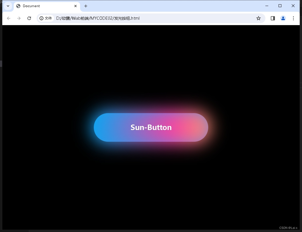
效果图:
<!DOCTYPE html>
<html lang="en">
<head>
    <meta charset="UTF-8">
    <meta name="viewport" content="width=device-width, initial-scale=1.0">
    <title>发光按钮</title>
    <link rel="stylesheet" href="./css/发光按钮.css">
</head>
<body>
    <div>sun-button</div>
</body>
</html>
body{
background-color:black;
}
div{
position:absolute;
top:50%;
left:50%;
transform:translate(-50%,-50%);
width:400px;
height:100px;
background-image:linear-gradient(135deg, #03a9f4,#f441a5,#ffeb3b,#09a8f4);
text-transform:capitalize;
color:white;
line-height:100px;
font-size:25px;
font-weight:600;
text-align:center;
border-radius:100px;
background-size:800%;
cursor:pointer;
}
div:hover{
animation-name:sun;
animation-duration:13s;
animation-iteration-count:infinite;
}
div:hover::before{
animation-name:sun;
animation-duration:14s;
animation-iteration-count:infinite;
}
div::before{
content:"";
position:absolute;
top:-10px;
right:-10px;
left:-10px;
bottom:-10px;
border-radius:100px;
background-image:linear-gradient(to right, #03a9f4,#f441a5,#ffeb3b,#09a8f4);
z-index:-1;
filter:blur(28px);
background-size:200%;
}
@keyframes sun{
100%{
background-position:-800% 0;
}
}


 265
265


 被折叠的 条评论
为什么被折叠?
被折叠的 条评论
为什么被折叠?
 到【灌水乐园】发言


