


组件分类
- 折叠类:下拉菜单、侧边菜单栏、折叠面板、树形控件
- 提示反馈类:通知框-提示框-确认框-对话框-抽屉;遮罩型-非遮罩型-顶部型-临近型
- 增强类:表单、表格、按钮、超链接
- 布局类:卡片、布局
- 组合类:面包屑、轮播图、放大镜、分页器、滚动条
ElementPlus引入
全局引入
import ElementPlus from 'element-plus'
import 'element-plus/theme-chalk/index.css'
app.use(ElementPlus)
按需引入
import 'element-plus/theme-chalk/base.css'
import 'element-plus/theme-chalk/el-button.css'
import { ElButton } from 'element-plus';
按需自动引入
// vite.config.ts
import { defineConfig } from 'vite'

//AutoImport+Components能按需自动引入ElementPlus组件、src目录下自定义的组件
import AutoImport from 'unplugin-auto-import/vite'
import Components from 'unplugin-vue-components/vite'
import { ElementPlusResolver } from 'unplugin-vue-components/resolvers'

export default defineConfig({
  // ...
  plugins: [
    // ...

    AutoImport({
      resolvers: [ElementPlusResolver()],
    }),
    Components({
      resolvers: [ElementPlusResolver()],
    }),
  ],
})


ELMessage等弹窗组件,要自行引入
AntDesign引入
5.8.5版本,按需引入组件即可;样式会自动引入
import { Button } from 'antd';
表单
概述
- 核心标签:form、button、input、错误格式提示框、icon图标
- 验证组合:输入框名称+input框+icon图标+错误提示框
- 验证组合功能:输入内容不符合格式,错误提示框会显示相应内容
- form组件功能:统一收集所有input框的数据;统一验证所有input框的格式
- 验证规则包括:官方提供的常用验证规则、自定义验证函数
代码1
<template>
<div class="header">
<h2>淘宝<br>TaoBao</h2>
<p>网站无障碍<br><a>文档图标</a> "登陆界面"改进意见</p>
</div>
<div class="main">
<div class="left">
<h2>淘宝APP<br>随时随地,想淘就淘</h2>
<a>点击下载<i>箭头图标</i></a>
</div>
<form v-on:submit="submit">
<div>
<span>用户名:</span>
<i class="iconfont icon-yonghu" style="padding-top:3px"></i>
<input type="text" v-model="userName.value" v-on:blur="validateUserName()">
</div>
<h6>{{ userName.errorMessage }}</h6>
<div>
<span>密码:</span>
<i class="iconfont icon-mima" style="padding-top:3px"></i>
<input type="password" v-model="password.value" v-on:blur="validatePassword()">
</div>
<h6>{{ password.errorMessage }}</h6>
<button type="submit">登陆</button>
</form>
</div>
</template>
<script setup>
import {reactive} from 'vue'
const userName=reactive({
isTure:false,
value:'',
errorMessage:''
})
const password=reactive({
isTure:false,
value:'',
errorMessage:''
})
function validateUserName(){
const {value}=username
if(value===''){
username.errorMessage='请输入用户名'
username.isTure=false
}else{
username.errorMessage=''
username.isTure=true
}
}
function validatePassword(){
const {value}=password
if(value===''){
password.errorMessage='请输入密码'
password.isTure=false
}else{
password.errorMessage=''
password.isTure=true
}
}
function submit(e){
e.preventDefault()
if(userName.isTure&&password.isTure){
console.log('输入格式都正确')
}
}
</script>
<style lang='less' scoped>
.header{
display: flex;
justify-content: space-between;
align-items: center;
height: 85px;
width: 1365px;
padding: 20px 50px;
h2{
font-weight: 800;
font-size: 23px;
color: #FF7828;
}
p{
font-size: 12px;
line-height: 24px;
}
}
.main{
display: flex;
justify-content: space-between;
align-items: center;
height: 540px;
width: 1365px;
padding: 110px 100px 100px 130px;
background-image: url('./images/登陆背景.jpg');
background-repeat: no-repeat;
background-size: 100% 100%;
.left{
color: #FFFFFD;
h2{
font-size: 23px;
font-weight: 800;
}
a{
font-size: 16px
};
}
form{
width: 300px;
padding-right: 40px;
padding-top: 40px;
background-color: #E9E9F2;
div{
display: flex;
justify-content: flex-end;
span{
margin-right: 10px;
}
}
h6{
height: 30px;
padding-left: 80px;
line-height: 30px;
color: red;
}
button{
margin-left: 80px;
margin-bottom: 20px;
height: 30px;
width: 180px;
border: 2px blue solid;
border-radius: 10px;
background-color: blue;
color: #FFFFFF;
font-size: 16px;
}
}
}
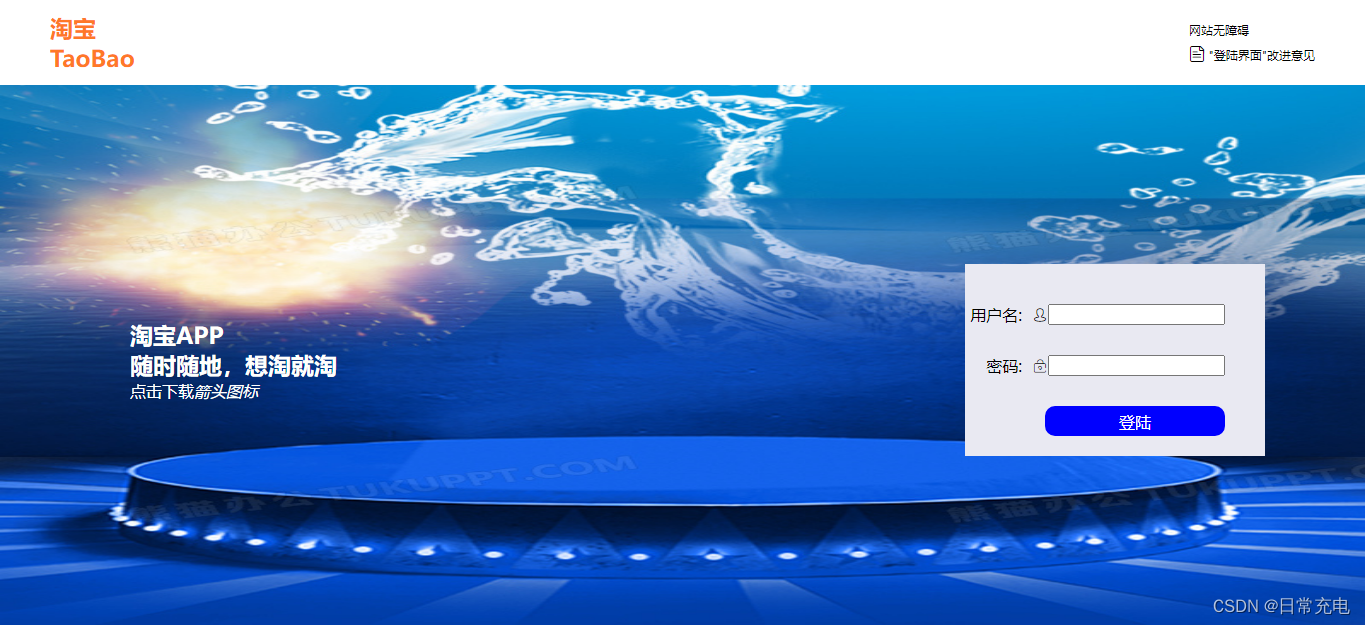
</style>效果图1
代码2
vue的双向数据绑定,能办到不依赖form组件,就能收集到数据
<template>
<el-row class="login_container">
基础的 24 分栏
五个响应尺寸:xs、sm、md、lg 和 xl
<el-col :span="12" :xs="0"></el-col>
<el-col :span="12" :xs="24">
model表单数据绑定的reactive对象
rules表单验证规则
<el-form class="login_form" :model="loginForm" :rules="rules" ref='form'>
<h1>Hello</h1>
<h2>欢迎来到硅谷甄选</h2>
el-form-item包裹输入框,内嵌错误提示框
prop属性对应验证规则rules中的属性
<el-form-item prop="username">
prefix-icon属性可以内嵌图标组件
<el-input :prefix-icon="User" v-model:model-value="loginForm.username"></el-input>
</el-form-item>
<el-form-item prop="password">
<el-input type="password" :prefix-icon="Lock" v-model:model-value="loginForm.password" show-password></el-input>
</el-form-item>
<el-form-item>
<el-button type="primary" size="default" class="login_btn" @click="login">登陆</el-button>
</el-form-item>
</el-form>
</el-col>
</el-row>
</template>
<script setup lang='ts'>
import {User,Lock} from "@element-plus/icons-vue"
import {reactive,ref} from 'vue'
import useUserStore from '@/store/modules/user'
import {useRouter} from 'vue-router'
import {ElNotification} from 'element-plus'
import 'element-plus/theme-chalk/el-notification.css'
import {getTime} from '@/utils/times'
const userStore=useUserStore()
const $router=useRouter()
let form=ref()
let loginForm=reactive({
username:'admin',
password:'111111'
})
自定义验证方法
rule:绑定数据的key
value:绑定数据的value
callback:无参数代表验证通过;有参数代表不通过,参数的值就是错误提示信息
const validatorUsername=(rule,value,callback)=>{
if(/^[0-9]+/.test(value)){
callback("开头不能用数字")
}
callback()
}
验证规则
组件库提供的规则:require、min、max、pattern
自定义规则:validator
错误提示信息:message
验证触发条件:trigger
let rules=reactive({
username:[
{required:true,min:2,max:10, message:'用户名2~6位',trigger:'blur'},
{validator:validatorUsername,trigger:'blur'}
],
password:[
{required:true,min:6,max:15, message:'密码6~15位',trigger:'blur'}
],
})
const login=async ()=>{
await form.value.validate()
try{
await userStore.userLogin(loginForm)
$router.push('/')
ElNotification({
title:'HI,'+getTime()+"好",
type:'success',
message:'欢迎回来'
})
}catch(error){
ElNotification({
type:'error',
message:error
})
}
}
</script>
<style scoped lang='scss'>
.login_container{
width: 100%;
height: 100vh;
background: url("@/assets/images/background.jpg") no-repeat;
background-size: cover;
}
.login_form{
position: relative;
top: 30vh;
width: 80%;
padding: 0 40px;
background: url("@/assets/images/login_form.png");
background-size: cover;
h1{
color: white;
font-size: 40px;
}
h2{
height: 50px;
line-height: 50px;
font-size: 20px;
color: white;
}
.login_btn{
width: 100%;
}
}
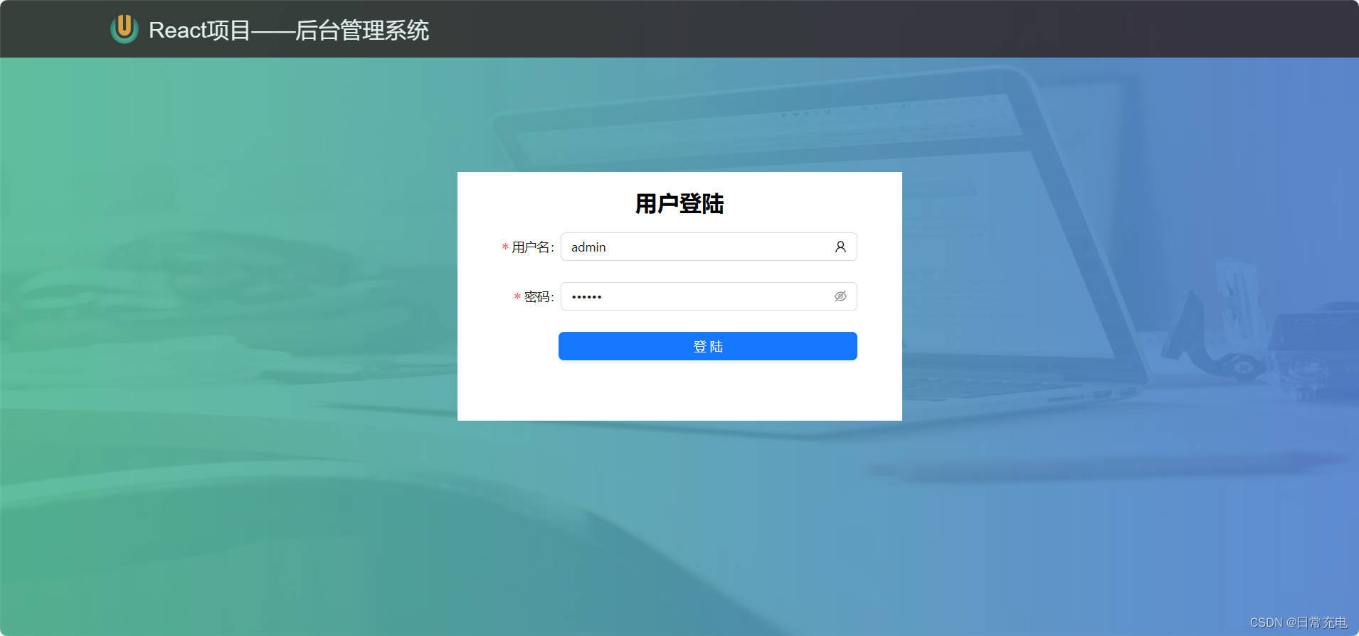
</style>效果图2

代码3
Form栅格:span<=>宽度;offset<=>左侧padding
import React,{useState} from 'react'
import Scss from './Login.module.scss'
import {Form,Input,Button} from 'antd'
import {UserOutlined} from "@ant-design/icons"
export default function Login() {
const onFinish = (values) => {
//values是一个对象,key是每一个input框的name属性,value是input框的内容
console.log('Success:', values);
};
const onFinishFailed = (errorInfo) => {
console.log('Failed:', errorInfo);
};
return (
<div className={Scss.container}>
<div className={Scss.header}>
<img src="/src/assets/logo.png" />
<div className="title">React项目——后台管理系统</div>
</div>
<div className={Scss.main}>
<Form className={Scss.form} labelCol={{span:4,offset:0}}
onFinish={onFinish} onFinishFailed={onFinishFailed}
>
<h3 className={Scss.title}>用户登陆</h3>
//name属性表示验证字段名称,rules定义验证规则
<Form.Item label="用户名" name="username"
rules={[{required: true,min:2,max:6,message:'请输入2~6位用户名'}]}
>
<Input suffix={<UserOutlined />} placeholder="请输入用户名" />
</Form.Item>
//name属性表示验证字段名称,rules定义验证规则
<Form.Item label="密码" name="password" //name属性表示验证字段名称
rules={[{required: true,min:6,max:16,message:'请输入6~16位密码'}]}
>
<Input.Password placeholder="请输入密码" visibilityToggle={true} />
</Form.Item>
//提交按钮:所有input框验证通过,调用onFinish;否则调用onFinishFailed
<Button type="primary" className={Scss.btn} htmlType="submit">登陆</Button>
</Form>
</div>
</div>
)
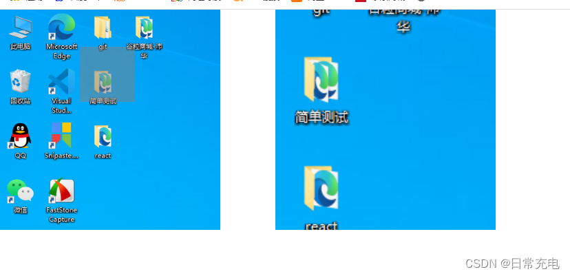
}效果图3
上传控件upload
浏览器端没有fs模块,想要读取本地文件upload控件是首选
- 点击按钮弹出dialog对话框
- 选择需要上传的文件
- 调用beforeUpload函数,判断上传文件的属性是否合理
- 将上传文件发送给action属性指定的服务器
- 调用uploaded函数,处理服务器的响应
分页器
概述
- 组成:前进按钮、后退按钮、页码按钮、输入页码框、商品总数、每页商品数
- 核心功能:点击页码按钮,返回当前页码和每页商品数
代码
<template>
  <div>
    <span @click="currentPage=currentPage-1">向前一页</span>
    <span v-show="currentPage-2>=1" @click="currentPage=currentPage-2">{{currentPage-2}}</span>
    <span v-show="currentPage-1>=1" @click="currentPage=currentPage-1">{{currentPage-1}}</span>
    <span>{{currentPage}}</span>
    <span v-show="currentPage+1<=maxPage" @click="currentPage=currentPage+1">{{currentPage+1}}</span>
    <span v-show="currentPage+2<=maxPage" @click="currentPage=currentPage+2">{{currentPage+2}}</span>
    <span @click="currentPage=currentPage+1">向后一页</span>
    <span>前往 <input type="text" @blur="toPage"> 页</span>
  </div>
</template>

<script>
  export default {
    data(){
      return {
        currentPage:1,
        totalItem:91,
        ItemsPerPage:5
      }
    },
    computed:{
      maxPage(){
        return Math.ceil(this.totalItem/this.ItemsPerPage)
      }
    },
    methods:{
      toPage(e){
        let {value}=e.target
        value=value*1
        if(isNaN(value)){
          return
        }else{
          this.currentPage=value
        }
        e.target.value=''
      }
    },
    watch:{
      currentPage(newVal){
        if(newVal<1){
          this.currentPage=1
        }
        if(newVal>this.maxPage){
          this.currentPage=this.maxPage
        }
        console.log(newVal)
      }
    }
  }
</script>

<style lang='less' scoped>
  span{
    margin: 0 5px;
    border: 2px blue solid;
    border-radius: 2px;
    padding: 5px 10px;
  }
  input{
    width: 40px;
  }
</style>
效果演示

放大镜
代码
<head>
    <style>
        *{
            margin: 0;
            padding: 0;
        }
        .main{
            display: flex;
        }
        .sImgBox{
            position: relative;
            width: 400px;
            height: 400px;
            margin-right: 100px;
        }
        .sImgBox img{
            width: 100%;
            height: 100%;
        }
        .sImgBox .lens{
            display: none;
            position: absolute;
            left: 0;
            top: 0;
            height: 100px;
            width: 100px;
            background-color: gray;
            opacity: 0.5;
            pointer-events: none; //遮罩层不停闪动,可以添加这个属性

        }
        .bImgBox{
            display: none;
            position: relative;
            width: 400px;
            height: 400px;
            overflow: hidden;
        }
        .bImgBox img{
            position: absolute;
            left: 0;
            top: 0;
            width: 800px;
            height: 800px;
        }
    </style>
</head>
<body>
    <div class="main" id="main">
        <div class="sImgBox">
            <img src="./400图片.png" id="sImg">
            <span class="lens" id="Len"></span>
        </div>
        <div class="bImgBox" id="bImg">
            <img src="./400图片.png" id="pic">
        </div>
    </div>
    <script>
        let main=document.getElementById('main')
        let sImg=document.getElementById('sImg')
        let Len=document.getElementById('Len')
        let bImg=document.getElementById('bImg')
        let pic=document.getElementById('pic')
        sImg.addEventListener('mouseenter',(e)=>{
            Len.style.display='block'
            bImg.style.display='block'
        })
        sImg.addEventListener('mouseleave',(e)=>{
            Len.style.display='none'
            bImg.style.display='none'
        })
        sImg.onmousemove=function(e){
            let x=e.clientX-main.offsetLeft-Len.offsetWidth/2
            let y=e.clientY-main.offsetTop-Len.offsetHeight/2
            if(x<0){
                x=0
            }
            else if(x>sImg.offsetWidth-Len.offsetWidth){
                x=sImg.offsetWidth-Len.offsetWidth
            }
            if(y<0){
                y=0
            }
            else if(y>sImg.offsetHeight-Len.offsetHeight){
                y=sImg.offsetHeight-Len.offsetHeight
            }
            Len.style.left=x+'px'
            Len.style.top=y+'px'
            pic.style.left=-x*2+'px'
            pic.style.top=-y*2+'px'
        }
    </script>
</body>
效果
轮播图
代码1
遮盖型轮播图
<head>
    <style>
        .slideshow {
            position: relative;
            margin: auto;
            width: 200px;
            height: 200px;
            overflow: hidden;
        }

        .slideshow img {
            position: absolute;
            top: 0;
            left: 0;
            width: 100%;
            height: 100%;
            opacity: 0;
            transition: opacity 1s ease-in-out;
        }

        .slideshow img.active {
            opacity: 1;
        }
    </style>
</head>
<body>
    <div class="slideshow">
        <img src="./用户头像.png" class="active">
        <img src="./游戏_填充.png">
        <img src="./直播.png">
    </div>
    <script>
        var images = document.querySelectorAll('.slideshow img');
        var currentImage = 0;
        setInterval(function () {
            images[currentImage].classList.remove('active');
            currentImage = (currentImage + 1) % images.length;
            images[currentImage].classList.add('active');
        }, 3000);
    </script>
</body>
代码2
移动型轮播图示例
<head>
    <title>移动型轮播图</title>
    <style>
        .container {
            position: relative;
            margin: auto;
            width: 200px;
            height: 200px;
            overflow: hidden;
        }

        .slider {
            position: absolute;
            top: 0;
            left: 0;
            width: 300%;
            height: 100%;
            display: flex;
            animation: slide 10s infinite;
        }

        .slide {
            flex: 1;
            height: 100%;
            background-color: #ccc;
            display: flex;
            align-items: center;
            justify-content: center;
            font-size: 48px;
            color: #fff;
        }

        .slide:nth-child(1) {
            background-color: #f00;
        }

        .slide:nth-child(2) {
            background-color: #0f0;
        }

        .slide:nth-child(3) {
            background-color: #00f;
        }

        @keyframes slide {
            0% {
                transform: translateX(0);
            }

            33.33% {
                transform: translateX(-100%);
            }

            66.66% {
                transform: translateX(-200%);
            }

            100% {
                transform: translateX(0);
            }
        }
    </style>
</head>
<body>
    <div class="container">
        <div class="slider">
            <div class="slide">1</div>
            <div class="slide">2</div>
            <div class="slide">3</div>
        </div>
    </div>
</body>
代码3
- 手动点击实现轮播图的跳转
- 有左右两个buttton切换按钮
- 每张图片对应一个的独有的小圆点
- 切换时,具有动画效果
<head>
    <style>
        *{
            margin: 0;
            padding: 0;
        }
        .container{
            position: relative;
            margin: auto;
            width: 200px;
            height: 200px;
            overflow: hidden;
        }
        #slider{
            display: flex;
            width: 600px;
            font-size: 20px;
            font-weight: 600;
            text-align: center;
            transition: all 2s;
        }
        .slide:nth-child(1){
            width: 200px;
            height: 200px;
            background-color: pink;
        }
        .slide:nth-child(2){
            width: 200px;
            height: 200px;
            background-color: blue;
        }
        .slide:nth-child(3){
            width: 200px;
            height: 200px;
            background-color: yellow;
        }
        #leftBtn{
            position: absolute;
            left: 0;
            top: 70px;
            height: 60px;
            width: 40px;
        }
        #rightBtn{
            position: absolute;
            left: 160px;
            top: 70px;
            height: 60px;
            width: 40px;
        }
        ul{
            display: flex;
            margin: auto;
        }
        li{
            margin: 0 10px;
            border: 1px solid blue;
            border-radius: 5px;
            height: 10px;
            width: 10px;
            list-style: none;
        }
    </style>
</head>
<body>
    <div class="container">
        <div id="slider">
            <div class="slide">1</div>
            <div class="slide">2</div>
            <div class="slide">3</div>
        </div>
        <button id="leftBtn">左</button>
        <button id="rightBtn">右</button>
        <ul id="circles">
            <li></li>
            <li></li>
            <li></li>
        </ul>
    </div>
    <script>
        const slider=document.getElementById('slider')
        const leftBtn=document.getElementById('leftBtn')
        const rightBtn=document.getElementById('rightBtn')
        const circles=document.getElementById('circles')
        const circleLis=circles.getElementsByTagName('li')

        let translateX=0
        leftBtn.onclick=function(){
            if(translateX<0){
                translateX=translateX+200
                slider.style.transform=`translateX(${translateX}px)`
            }
        }
        rightBtn.onclick=function(){
            if(translateX>-400){
                translateX=translateX-200
                slider.style.transform=`translateX(${translateX}px)`
            }
        }
        for(let i=0;i<circleLis.length;i++){
            circleLis[i].onclick=function(){
                translateX=-200*i
                slider.style.transform=`translateX(${translateX}px)`
            }
        }

    </script>
</body>
效果图
侧边导航栏
概述
非叶组件
- 能嵌套子组件
- 点击可以折叠子组件
- 标题内容和子组件两部分组成
叶组件
- 不能嵌套子组件
- 点击可以进行路由跳转
代码1
<template>
  <ul class="drawers">
    <li v-for="drawer in drawers">
        <h3 @click="drawer.showSubmenu=!drawer.showSubmenu">{{drawer.title}}</h3>
        <div
            v-for="submenu in drawer.submenu"
            v-show="drawer.showSubmenu">
            {{submenu}}
        </div>
    </li>
  </ul>
</template>

<script>
export default {
  data () {
    return {
        drawers:[
            {
                title:'一级标题一',
                submenu:['二级标题一','二级标题二','二级标题三'],
                showSubmenu:false
            },
            {
                title:'一级标题二',
                submenu:['二级标题一','二级标题二','二级标题三'],
                showSubmenu:false
            }
        ]
    };
  },
}
</script>

<style lang='less' scoped>
li{
    list-style: none;
}
</style>
代码2
element plus讲究标签嵌套
routes=[
	{
		title:'首页',
		icon:'HomeFilled',
		path:'/layout/home'
	},
	{
		title:'数据大屏',
		icon:'HomeFilled',
		path:'/bigscreen'
	},
	{
		title:'权限管理',
		icon:'HomeFilled',
		children:[
			{
				title:'用户管理',
				icon:'HomeFilled',
				path:'/layout/usermanager'
			},
			{
				title:'角色管理',
				icon:'HomeFilled',
				path:'/layout/rolemanager'
			},
			{
				title:'菜单管理',
				icon:'HomeFilled',
				path:'/layout/menumanager'
			},
		]
	},
	{
		title:'商品管理',
		icon:'HomeFilled',
		children:[
			{
				title:'品牌管理',
				icon:'HomeFilled',
				path:'/layout/brandmanager'
			},
			{
				title:'属性管理',
				icon:'HomeFilled',
				path:'/layout/attrmanager'
			},
			{
				title:'SPU管理',
				icon:'HomeFilled',
				path:'/layout/spumanager'
			},
			{
				title:'SKU管理',
				icon:'HomeFilled',
				path:'/layout/skumanager'
			}
		]
	},
]


<el-menu background-color="#001529" text-color="white">
    <Menu :menuList="routes"></Menu>
</el-menu>


Menu组件

<template>
    <template v-for="(item) in menuList" :key="item.path">
        <el-menu-item v-if="!item.children" :index="item.path" @click="goRoute">
            <el-icon>
                <component :is="item.icon"></component>
            </el-icon>
            <template #title>
                <span>{{ item.title }}</span>
            </template>
        </el-menu-item>
        <el-sub-menu v-else :index="item.title">
            <template #title>
                <el-icon>
                    <component :is="item.icon"></component>
                </el-icon>
                <span>{{ item.title }}</span>
            </template>
            <Menu :menuList="item.children"></Menu>
        </el-sub-menu>
    </template>
</template>

<script setup lang='ts'>
import { useRouter } from 'vue-router';
let $router=useRouter()
defineProps(['menuList'])
const goRoute=(item)=>{
    $router.push(item.index)
}
</script>

<script lang="ts">
export default {
    name: "Menu",
}
</script>
代码3
ant design偏向属性配置项
import React from 'react'
import { Layout, Menu } from 'antd'
const { Sider } = Layout
import Scss from './Sider.module.scss'
import {AppstoreOutlined,ContainerOutlined,
        DesktopOutlined,MailOutlined,MenuFoldOutlined,
        MenuUnfoldOutlined,PieChartOutlined
} from '@ant-design/icons';
import { useNavigate } from 'react-router';

const siderStyle = {
    textAlign: 'center',
    color: '#fff',
    backgroundColor: '#001529',
};
function getItem(label, key, icon, children, type) {
    return {key,icon,children,label,type}
}
const items = [
    getItem('首页', '', <PieChartOutlined />),
    getItem('用户管理', 'usermanager', <PieChartOutlined />),
    getItem('角色管理', 'rolemanager', <PieChartOutlined />),
    getItem('商品', 'sub1', <MailOutlined />, [
        getItem('品牌管理', 'brandmanager'),
        getItem('商品管理', 'goodsmanager'),
    ]),
    getItem('图形图表', 'sub2', <AppstoreOutlined />, [
        getItem('柱形图', 'bargraph'),
        getItem('折线图', 'linegraph'),
        getItem('饼图', 'piegraph'),
    ])
];

export default function () {
    const navigate=useNavigate()
    const clickMenuItem=(value)=>{
        navigate('/layout/'+value.key)
    }
    return (
        <Sider style={siderStyle}>
            <h1 className={Scss.title}>
                <img src="/src/assets/logo.png" />
                <span>硅谷后台</span>
            </h1>
            <Menu
                style={{textAlign:'left'}} mode='inline' theme='dark'
                items={items}
                onClick={clickMenuItem}
            />
        </Sider>
    )
}


 570
570


 被折叠的 条评论
为什么被折叠?
被折叠的 条评论
为什么被折叠?
 到【灌水乐园】发言


