


页面组件
1.组件的定义与属性
组件是页面视图层(wxml)的基本组成单元,组件组合可以构建功能强大的页面结构。
语法格式:
<xxx 属性名=“属性值”>……</xxx>
它们有共用的属性:
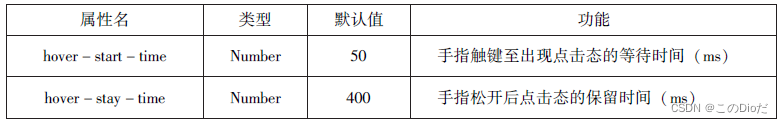
id、class、style、hidden、data-*、bind*/catch*。
1.id 组件的唯一表示,保持整个页面唯一,不常用
2.class 组件的样式类,对应 WXSS 中定义的样式
3.style 组件的内联样式,可以动态设置内联样式
4.hidden 组件是否显示,所有组件默认显示
5.data-*自定义属性,组件触发事件时,会发送给事件处理函数
6. bind*/catch* 组件的事件,绑定逻辑层相关事件处理函数
2.容器视图组件
容器视图组件是能容纳其他组件的组件,是构建小程序页面布局的基础组件,主要包括view、scroll-view和swiper 组件。
1)view
view组件是块级组件,没有特殊功能,主要用于布局展示,相当于HTML中的div,是布局中最基本的用户界面(User Interface,UI)组件,通过设置view的CSS属性可以实现各种复杂的布局。
代码:
wxml
<view style="text-align: center;">默认flex布局</view>
<view style="display: flex;">
  <view style="border: 1px solid #f00;flex-grow: 1;">1</view>
  <view style="border: 1px solid #f00;flex-grow: 1;">2</view>
  <view style="border: 1px solid #f00;flex-grow: 1;">3</view>
</view>
<view style="text-align: center;">上下混合布局</view>
<view style="display: flex;flex-direction: column;">
  <view style="border: 1px solid #f00;">1</view>
  <view style="display: flex;">
    <view style="border: 1px solid #f00;flex-grow: 1;">2</view>
    <view style="border: 1px solid #f00;flex-grow: 1;">3</view>
  </view>
</view>
<view style="text-align: center;">左右混合布局</view>
<view style="display: flex;">
  <view style="border: 1px solid #f00;flex-grow: 1;">1</view>
  <view style="border: 1px solid #f00;flex-grow: 1;flex-direction: column;">
    <view style="border: 1px solid #f00;flex-grow: 1;">2</view>
    <view style="border: 1px solid #f00;flex-grow: 2;">3</view>
  </view>
</view>
运行效果:

2)scroll-view

通过serol-view 组件可以实现下拉刷新和上拉加载更多,代码如下:
wxml
<view class="container" style="padding: 0rpx;">
<scroll-view scroll-top="{{scrollTop}}"scroll-y="true" style="height: {{scrollHeight}}px;" class="list" bind-scrolltolower="bindDownLoad" bindscrolltoupper="topLoad" bindscroll="scroll">
    <view class="item" wx:for="{{list}}">
      <image class="img" src="{{item.pic_url}}"></image>
      <view class="text">
       <text class="title">{{item.name}}</text>
       <text class="description">{{item.short_description}}</text>
      </view>
    </view>
  </scroll-view>
  <view class="body-view">
    <losding hidden="{{hidden}}" bindchange="loadingChange">
      加载中……
    </losding>
  </view>
</view>
js:
var url = "http://www.imooc.com/course/ajaxlist";
var page = 0;
var page_size = 5;
var sort = "last";
var is_easy = 0;
var lang_id = 0;
var pos_id = 0;
var unlearn = 0;
var losdMore = function(that){
  that.setData({
    hidden:false
  });
  wx.request({
    url: 'url',
    data:{
      page:page,
      page_size:page_size,
      sort:sort,
      is_easy:is_easy,
      lang_id:lang_id,
      pos_id:pos_id,
      unlearn:unlearn
    },
    success:function(res){
      var list = that.data.list;
      for(var i=0;i<res.data.list.length;i++){
        list.push(res.data.list[i]);
      }
      that.setData({
        list:list
      });
      page++;
      that.setData({
        hidden:true
      });
    }
  });
}
Page({
 data:{
   hidden:true,
   list:[],
   scrollTop:0,
   scrollHeigt:0
 },
 onLoad:function(){
   var that = this;
   wx.getSystemInfo({
     success:function(res){
       that.setData({
         scrollHeigt:res.windowHeight
       });
     }
   });
   loadMore(that);
 },
 bindDownLoad:function(){
   var that = this;
   loadMore(that);
   console.log("lower");
 },
 scroll:function(event){
   this.setData({
     scrollTop:event.detail.scrollTop
   });
 },
 topLoad:function(event){
   page = 0;
   this.setData({
     list:[],
     scrollTop:0
   });
   loadMore(this);
   console.log("lower");
 }
})
wxss
.userinfo{
  display: flex;
  flex-direction: column;
  align-items: center;
}
.userinfo-avatar{
  width: 128rpx;
  height: 128rpx;
  margin: 20rpx;
  border-radius: 50%;
}
.userinfo-nickname{
  color:#aaa;
}
.usermotto{
  margin-top: 200px;
}
scroll-view{
  width: 100%;
}
.item{
  width: 90%;
  height: 300rpx;
  margin: 20rpx auto;
  background: brown;
  overflow: hidden;
}
.item.img{
  width: 430rpx;
  margin-right: 20rpx;
  float: left;
}
.title{
  font-size: 30rpx;
  display: block;
  margin: 30rpx auto;
}
.description{
  font-size: 26rpx;
  line-height: 15rpx;
}
3)swiper
swiper组件可以实现轮播图、图片预览、滑动页面等效果。

实现轮播图代码如下
wxml
<swiper indicator-dots="true" autoplay="true" interval="5000" duration="1000">
  <swiper-item>
    <image src="/images/222.jpg" style="width: 100%;"></image>
  </swiper-item>
  <swiper-item>
    <image src="/images/屏幕截图 2024-03-06 193800.png" style="width: 100%;"></image>
  </swiper-item>
  <swiper-item>
    <image src="/images/屏幕截图 2024-03-06 193809.png" style="width: 100%;"></image>
  </swiper-item>
</swiper>
运行效果:

3基础内容组件
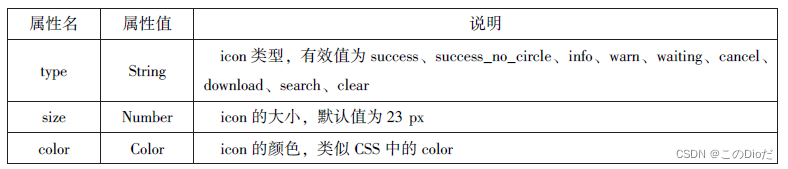
1)icon
icon组件即图标组件,通常用于表示一种状态,如success、info、warn、waiting、cancel等
示例代码:
wxml
<view>icon类型:
  <block wx:for="{{iconType}}">
    <icon type="{{item}}"/>{{item}}
  </block>
</view>
<view>icon大小:
  <block wx:for="{{iconSize}}">
    <icon type="success" size="{{item}}"/>{{item}}
  </block>
</view>
<view>icon颜色:
  <block wx:for="{{iconColor}}">
    <icon type="success" size="30" color="{{item}}"/>{{item}}
  </block>
</view>
js
data:{
  iconType:["success","success_no_circle","info","warn","waiting","cancel","download","search","clear"],
  iconSize:[10,20,30,40],
  iconColor:["#f00","#0f0","#00f"]
 }
运行效果

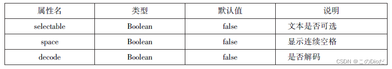
2)text
text 组件用于展示内容,类似HTML中的<span >,text 组件中的内容支持长按选中,支持转义字符“\”,属于行内元素。
示例代码
wxml
<block wx:for="{{x}}" wx:for-item="x">
<view class="aa">
<block wx:for = "{{1-x}}" wx:for-item="x">
<text decode = "{{true}}" space="{{true}}">
</text>
</block>
<block wx:for="{{y}}" wx:for-item="y">
<block wx:if="{{y<=2*x-1}}">
<text>*</text>
</block>
</block>
</view>
</block>
<block wx:for="{{x}}" wx:for-item="x">
<view class="aa">
<block wx:for="{{-5+x}}" wx:for-item="x">
<text decode="{{true}}" space="{{true}}">
</text>
</block>
<block wx:for="{{y}}" wx:for-item="y">
<block wx:if="{{y<=11-2*x}}">
<text>*</text>
</block>
</block>
</view>
</block>js
Page({
data:{
  x:[1,2,3,4,5],
  y:[1,2,3,4,5,6,7,8,9]
}
})
wxss
.aa{
  text-align: center;
}
运行效果

3)progress
progress 组件用于显示进度状态,如资源加载、用户资料完成度、媒体资源播放进度等progress属于块级元素
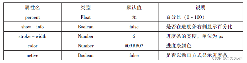
示例代码
wxml
<view>显示百分比</view>
<progress percent="80" show-info="80"></progress>
<view>改变宽度</view>
<progress percent="50" stroke-width="2"></progress>
<view>自动显示进度条</view>
<progress percent="80" active=""></progress>
运行效果

4表单组件
表单组件的主要功能是收集用户信息,并将这些信息传递给后台服务器,实现小程序与用户之间的沟通。表单组件不仅可以放置在<form/>标签中使用,还可以作为单独组件和其他组件混合使用。
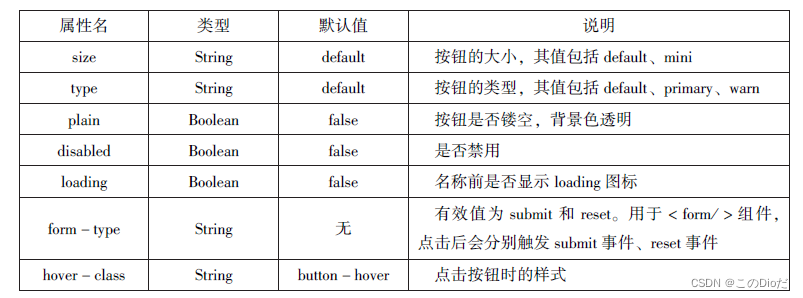
1)button
button 组件用来实现用户和应用之间的交互,同时按钮的颜色起引导作用
示例代码
wxml
<button type="default">type:default</button>
<button type="primary">type:primary</button>
<button type="warn">type:warn</button>
<button type="default" bindtap="buttonSize" size="{{size}}">改变size</button>
<button type="default" bindtap="buttonPlain" plain="{{plain}}">改变plain</button>
<button type="default" bindtap="buttonLoading" loading="{{loading}}">改变loading显示</button>
js
Page({
data:{
  size:"default",
  plain:"false",
  loading:"false"
},
buttonSize:function(){
  if(this.data.size=="default")
    this.setData({size:"mini"})
  else
    this.setData({size:"default"})
},
buttonPlain:function(){
  this.setData({plain:!this.data.plain})
},
buttonLoading:function(){
  this.setData({loading:!this.data.loading})
}
})
运行效果

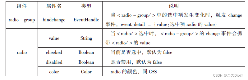
2)radio
单选框用来从一组选项中选取一个选项。
示例代码
wxml
<view>选择你喜爱的城市:</view>
<radio-group bindchange="citychange">
  <radio value="西安">西安</radio>
  <radio value="北京">北京</radio>
  <radio value="上海">上海</radio>
  <radio value="广州">广州</radio>
  <radio value="深圳">深圳</radio>
</radio-group>
<view>你的选择:{{city}}</view>
<radio-group class="radio-group" bindchange="radiochange">
  <label class="radio" wx:for="{{radios}}">
    <radio value="{{item.value}}" checked="{{item.checked}}"/>{{item.name}}
  </label>
</radio-group>
<view>你的选择:{{lang}}</view>
js
Page({
data:{
  radios:[
    {name:'java',value:'JAVA'},
    {name:'python',value:'Python',checked:'true'},
    {name:'php',value:'PHP'},
    {name:'swif',value:'Swif'},
  ],
  city:'',
  lang:''
},
citychange:function(e){
  this.setData({city:e.detail.value});
},
radiochange:function(event){
  this.setData({lang:event.detail.value})
}
})
运行效果

3)checkbox
复选框用于从一组选项中选取多个选项,小程序中复选框由<checkbox-group/>(多项选择器)和<checkbox>(多选项目)两个组件组合而成

示例代码
wxml
<view>选择你想要去的城市:</view>
<checkbox-group bindchange="cityChange">
  <label wx:for="{{citys}}">
    <checkbox value="{{item.value}}" checked="{{item.checkd}}">
      {{item.value}}
    </checkbox>
  </label>
</checkbox-group>
<view>您的选择是:{{city}}</view>
js
Page({
city:"",
data:{
  citys:[
    {name:"km",value:"昆明"},
    {name:"sy",value:"三亚"},
    {name:"zh",value:"珠海",checked:"true"},
    {name:"dl",value:"大连"}
  ]
},
cityChange:function(e){
  console.log(e.detail.value);
  var city = e.detail.value;
  this.setData({city:city})
}
})
运行效果

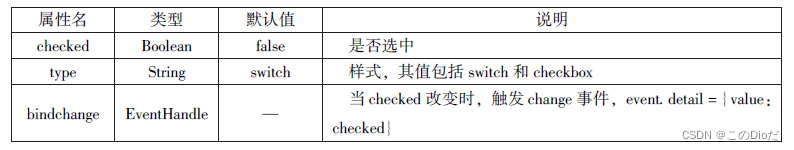
4)switch
switch组件的作用类似开关选择器
代码如下
wxml
<view>
  <switch bindchange="sw1">{{var1}}</switch>
</view>
<view>
  <switch checked bindchange="sw2">{{var2}}</switch>
</view>
<view>
  <switch type="checkbox" bindchange="sw3">{{var3}}</switch>
</view>
js
Page({
data:{
  var1:"关",
  var2:"开",
  var3:"未选",
},
sw1:function(e){
  this.setData({var1:e.detail.value?"开":"关"})
},
sw2:function(e){
  this.setData({var2:e.detail.value?"开":"关"})
},
sw3:function(e){
  this.setData({var3:e.detail.value?"开":"关"})
},
})
运行效果

5)slider
slider 组件为滑动选择器,,可以通过滑动来设置相应的值
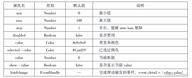
代码如下
wxml
<view>默认 min=0 max=100 step=1</view>
<slider></slider>
<view>显示当前值</view>
<slider show-value=""></slider>
<view>设置 min="0" max="200" step="10" show-value</view>
<view>滑动改变icon的大小</view>
<slider show-value bindchange="sliderchange"></slider>
<icon type="success" size="{{size}}"></icon>
js
data:{
  size:"20"
},
sliderchange:function(e){
  this.setData({size:e.detail.value})
}
运行效果

6)picker-view
picker-view 组件为嵌入页面的滚动选择器。 相对于picker 组件, picker-view 组件的列的个数和列的内容由用户通过< picker-view -column/ > 自定义设置

示例代码
wxml
<view>当前日期:{{year}}年{{month}}月{{day}}日</view>
<picker-view
indicator-style="height:50px;"
style="width:100%;height:300px;"
value="{{value}}"bindchange="bindChange">
<picker-view-column>
<view
wx:for="{{years}}"
style="line-height:50px">
{{item}}年
</view>
</picker-view-column>
<picker-view-column>
<view
wx:for="{{months}}"
style="line-height:50px">
{{item}}月
</view>
</picker-view-column>
<picker-view-column>
<view
wx:for="{{days}}"
style="line-height:50px">
{{item}}日
</view>
</picker-view-column>
</picker-view>
js
const date=new Date()
const years=[]
const months=[]
const days=[]
for(let i=1900;i<=2050;i++){
  years.push(i)
}
for(let i=1;i<=12;i++){
  months.push(i)
}
for(let i=1;i<=31;i++){
  days.push(i)
}
Page({
  data:{
    years:years,
    months:months,
    days:days,
    year:date.getFullYear(),
    month:date.getMonth()+1,
    day:date.getDate(),
    value:[118,0,0],
  },
  bindChange:function(e){
    const val=e.detail.value
    console.log(val);
    this.setData({
      year:this.data.years[val[0]],
      month:this.data.months[val[1]],
      day:this.data.days[val[2]]
    })
  }
})
运行效果

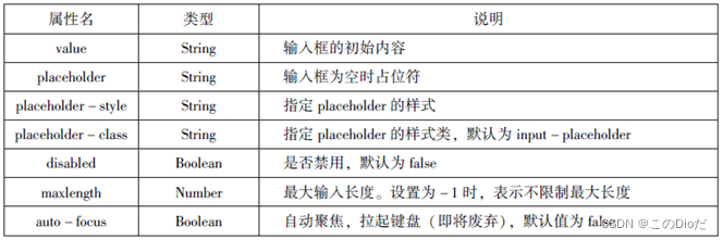
7)input
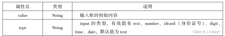

示例代码
wxml
<input placeholder="这是一个可以自动聚焦的input" auto-focus/>
<input placeholder="这个是只有在按钮点击的时候才聚焦" focus="{{focus}}"/>
<button bind:tap="bindButtonTap">使得输入框获取焦点</button>
<input maxlength="10" placeholder="最大输入长度为10"/>
<view class="section_title">你输入的是:{{inputValue}}</view>
<input bindinput="bindKeyInput" placeholder="输入同步到view中"/>
<input bindinput="bindReplaceInput" placeholder="连续两个1会变成2"/>
<input password type="number" placeholder="输入数字密码"/>
<input password type="text" placeholder="输入字符密码"/>
<input type="digit" placeholder="带小数点的数字键盘"/>
<input type="idcard" placeholder="带身份证输入键盘"/>
<input placeholder-style="color:red" placeholder="占位符字体是红色的"/>
js
Page({
  data:{
    focus:false,
    inputValue:""
  },
  bindButtonTap:function(){
    this.setData({
      focus:true
    })
  },
  bindKeyInput:function(e){
    this.setData({
      inputValue:e.detail.value
    })
  },
  bindReplaceInput:function(e){
    var value=e.detail.value
    var pos=e.detail.cursor
    if(pos!=-1){

      var left=e.detail.value.slice(0,pos)
       pos=left.replace(/11/g,'2').length
    }
     return{
      return:value.replace(/11/g,'2'),
      cursor:pos
    }
  }
})
运行效果

8)textarea
textarea组件为多行输入框组件,可以实现多行内容的输入

示例代码
wxml
<textarea bindblur="bindTextAreaBlur" auto-height placeholder="自动变高"></textarea>
<textarea placeholder="placeholder颜色是红色的"placeholder-style="color:red;"></textarea>
<textarea placeholder="这个只有在按钮点击的时候才聚焦"focus="{{focus}}"></textarea>
<button bind:tap="bindButtonTap">使得输入框获取焦点</button>
<form bindsubmit="bindFormSubmit">
<textarea placeholder="form中的textarea"name="textarea"></textarea>
<button form-type="submit">提交</button>
</form>
js
Page({
  data:{
    height:10,
    focus:false
  },
  bindButtonTap:function(){
    this.setData({
      focus:true
    })
  },
  bindTextAreaBlur:function(e){
    console.log(e.detail.value)
  },
  bindFormSubmit:function(e){
    console.log(e.detail.value.textarea)
  }
})
运行效果

9)label
label组件为标签组件, 用于提升表单组件的可用性
示例代码
wxml
<view><checkbox></checkbox>中国</view>
<view><label><checkbox></checkbox>中国</label></view>
<checkbox-group bindchange="cityChange">
<label wx:for="{{citys}}">
<checkbox value="{{item.value}}"checked='{{item.checked}}'>{{item.value}}</checkbox>
</label>
</checkbox-group>
<view>您的选择是:{{city}}</view>
js
Page({
  data:{
    citys:[
      {name:'km',value:'昆明'},
      {name:'sy',value:'三亚'},
      {name:'zh',value:'珠海',checked:'true'},
      {name:'dl',value:'大连'}
    ]
  },
  cityChange:function(e){
    console.log(e.detail.value);
    var city=e.detail.value;
    this.setData({city:city})
  }
})
运行效果

10)from
form 组件为表单组件, 用来实现将组件内的用户输入信息进行提交

示例代码
wxml
<form bindsubmit="formSubmit" bindreset="formReset">
<view>姓名:
<input type="text" name="xm"/>
</view>
<view>性别:
<radio-group name="xb">
<label>
<radio value="男" checked/>男</label>
<label>
<radio value="女"/></label>
</radio-group>
</view>
<view>爱好:
<checkbox-group name="hobby">
<label wx:for="{{hobbies}}">
<checkbox value="{{item.value}}"checked='{{item.checked}}'>{{item.value}}</checkbox>
</label>
</checkbox-group>
</view>
<button form-type="submit">提交</button>
<button form-type="reset">重置</button>
</form>
js
Page({
  hobby:'',
  data:{
    hobbies:[
      {name:'jsj',value:'计算机',checked:'true'},
      {name:'music',value:'听音乐'},
      {name:'game',value:'玩电竞'},
      {name:'swim',value:'游泳',checked:'true'}
    ]
  },
  forSubmit:function(e){
    console.log('form发生了submit事件,携带数据为:',e.detail.value)
  },
  formReset:function(){
    console.log('form发生了reset事件')
  }
 })
运行效果

5多媒体组件
多媒体组件包括image (图像)、audio (音频)、video(视频)、camera (相机) 组件,使用这些组件, 可以让页面更具有吸引力
1)image
image 组件为图像组件, 与HTML中的< img/ > 类似
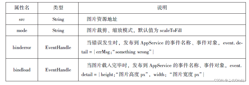
缩放模式
示例代码
wxml
<block wx:for="{{modes}}">
<view>当前图片的模式是:{{item}}</view>
<image mode="{{item}}"src="/images/222.jpg"style="width:100%,height:100%"/>
</block>
js
Page({
  data:{
     modes:['scaleToFill','aspectFit','aspectFill','widthFix']
   }
 })
运行效果

剪裁模式
示例代码
wxml
<block wx:for="{{modes}}">
<view>当前图片的模式是:{{item}}</view>
<image mode="{{item}}"src="/images/222.jpg"style="width:100%,height:100%"></image>
</block>
js
Page({
    data:{
      modes:['top','center','bottom','left','top_left','top_right','bottom_left','bottom_right']
    },
})
运行效果

2)audio
audio组件用来实现音乐播放、暂停等
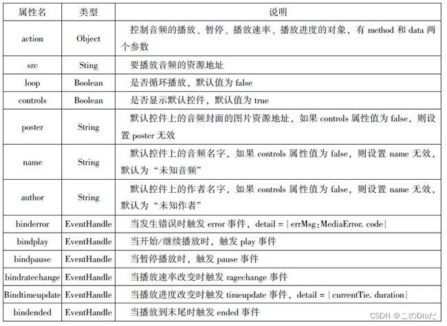
wxml
<audio src="{{src}}"action="{{action}}"poster="{{poster}}"name="{{name}}"author="{{author}}"loop controls></audio>
<button type="primary" bind:tap='play'>播放</button>
<button type="primary" bind:tap="pause">暂停</button>
<button type="primary" bind:tap="playRate">设置速率</button>
<button type="primary" bind:tap="currentTime">设置当前时间(秒)</button>
js
Page({
  data:{
    poster:'/images/222.jpg',
    name:'此时此刻',
    author:'许巍',
    src:'/music/ヰ世界情緒 - 鳥の詩.mp3'
  },
  play:function(){
    this.setData({
      action:{
        method:'play'
      }
    })
  },
  pause:function(){
    this.setData({
      action:{
        method:'pause'
      }
    })
  },
  playRate:function(){
    this.setData({
      action:{
        method:'setPlaybackRate',
        data:10
      }
    })
    console.log('当前速率:'+this.data.action.data)
  },
  currentTime:function(e){
    this.setData({
      action:{
        method:'setCurrentTime',
        data:120
      }
    })
  }
})
运行效果

3)video
video组件用来实现视频的播放、暂停等

代码如下
wxml
<video src="{{src}}"controls></video>
<view class="btn-area">
<button bind:tap="bindButtonTap">获取视频</button>
</view>
js
Page({
data:{
    src:'',
  },
  bindButtonTap:function(){
    var that=this
    wx.chooseVideo({
      sourceType:['album','camera'],
      maxDuration:60,
      camera:['front','back'],
      success:function(res){
        that.setData({
          src:res.tempFilePath
        })
      }
    })
  }
})
运行效果

4)camera
camera 组件为系统相机组件, 可以实现拍照或录像功能
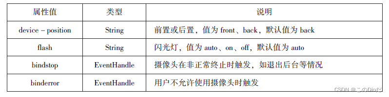
示例代码
wxml
<camera
device-position="back"
flash="off"
binderror="error"
style="width:100%;height:350px"></camera>
<button type="primary"bindtap="takePhoto">拍照</button>
<view>预览</view>
<image mode="widthFix" src="{{src}}"></image>
js
Page({
takePhoto(){
    const ctx=wx.createCameraContext()
    ctx.takePhoto({
      quality:'high',
      success:(res)=>{
        this.setData({
          src:res.tempImagePath
        })
      }
    })
  },
  error(e){
    console.log(e.detail)
  }
})
运行效果

6其他组件
1)map
map 组件用于在页面中显示地图或路径, 常用于LBS (基于位置服务) 或路径指引, 功能相对百度地图、高德地图较简单, 目前具备绘制图标、路线、半径等能力
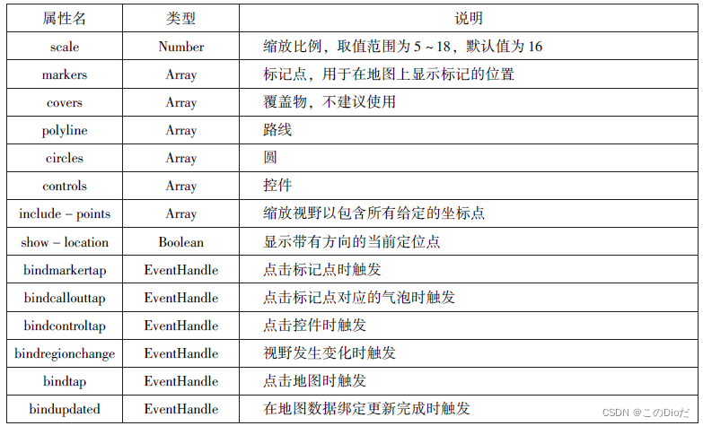


示例代码
wxml
Page({
 data:{
    markers:[{
      iconPath:"/pages/we.jpg",
      id:0,
      longitude:"108.9290",
      latitude:"34.1480",
      width:50,
      height:50
    }],
    polyline:[{
      points:[
        {
          longitude:"108.9200",
          latitude:"34.1400",
        },
        {
          longitude:"108.9200",
          latitude:"34.1500"
        },
        {
          longitude:"108.9200",
          latitude:"34.1700"
        }
      ],
      color:"#00ff00",
      width:2,
      dottedLine:true
    }],
    controls:[{
      id:1,
      iconPath:'/pages/xi.jpg',
      position:{
        left:0,
        top:300,
        width:30,
        height:30
      },
      clickable:true
    }]
  },
  regionchange(e){
    console.log(e.type)
  },
  markertap(e){
    console.log(e.markerId)
  },
  controltap(e){
    console.log(e.controlId)
  }
})
js
<map id="map"
longitude="115.89"
latitude="28.68"
scale="14"
controls="{{controls}}"
bindcontroltap="controlstap"
markers="{{markers}}"
bindmarkertap="markertap"
polyline="{{polyline}}"
bindregionchange="regionchange"
show-location style="width: 100%;height: 300px;"></map>
运行效果

2)canvas
canvas 组件用来绘制图形, 相当于一块无色透明的普通图布

实现绘图 示例代码
wxml
<canvas canvas-id="myCanvas"style="border:1px solid red"></canvas>js
Page({
  onLoad:function(options){
    var ctx=wx.createCanvasContext('myCanvas')
    ctx.setFillStyle('green')
    ctx.fillRect(10,10,200,100)
    ctx.draw()
  }
})
运行效果


 455
455


 被折叠的 条评论
为什么被折叠?
被折叠的 条评论
为什么被折叠?
 到【灌水乐园】发言


