


一、HTML
<div id="wrapper">
<div id="main">
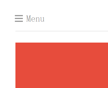
<div id="main-nav"><a href="" id="off-canvas-menu">Menu</a></div>
<div id="content">
<h1>Off-canvas menu</h1>
<p>Off-canvas menus are positioned outside of the viewport and slide in when activated. Setting up an off-canvas layout in HTML5 is super easy.</p>
</div>
</div>
<div id="side-nav"> <a href="" id="close-slide-nav">Close</a>
<ul>
<li>Home</li>
<li>Events</li>
<li>Store</li>
<li>Contact</li>
</ul>
</div>
</div>
二、CSS
@font-face {
font-family: 'icon-font';
src: url('font/flat-ui-icons-regular.ttf'), url('font/flat-ui-icons-regular.eot'), url('font/flat-ui-icons-regular.woff'), url('font/flat-ui-icons-regular.svg');
}
html, body {
margin: 0;
padding: 0;
font-size: 26px;
font-family: sans-serif;
height: 100%;
}
#wrapper {
width: 100%;
height: 100%;
overflow: hidden;
position: relative;
}
#main {
width: 100%;
padding: 50px;
box-sizing: border-box;
}
#main-nav {
border-bottom: 1px solid rgba(0,0,0,.2);
height: 60px;
}
#off-canvas-menu {
text-decoration: none;
color: #999;
text-indent: 1.2em;
font-size: 32px;
display: block;
line-height: 1;
position: relative;
}
#off-canvas-menu::after {
content: '';
position: absolute;
left: 0;
top: -4px;
width: .75em;
box-shadow: 0 10px 0 2px #999, 0 20px 0 2px #999, 0 30px 0 2px #999;
}
h1 {
color: #fff;
font-size: 81px;
text-transform: uppercase;
text-align: center;
}
p {
color: rgba(255,255,255,.7);
text-align: center;
}
#content {
background: #E74C3C;
padding: 80px 50px;
margin-top: 40px;
}
/*初始设置边导航移出页面*/
#side-nav {
width: 300px;
height: 100%;
background: #444;
position: absolute;
top: 0;
-webkit-transform: translateX(-300px);
-moz-transform: translateX(-300px);
-ms-transform: translateX(-300px);
-o-transform: translateX(-300px);
transform: translateX(-300px);
-webkit-transition: .5s ease all;
-moz-transition: .5s ease all;
-o-transition: .5s ease all;
transition: .5s ease all;
}
/*设置边导航移入页面*/
#side-nav.off-display {
-webkit-transform: translateX(0px);
-moz-transform: translateX(0px);
-ms-transform: translateX(0px);
-o-transform: translateX(0px);
transform: translateX(0px);
}
ul {
width: 100%;
margin: 0;
padding: 0;
border-bottom: 1px solid rgba(255,255,255,.2);
}
li {
border-top: 1px solid rgba(255,255,255,.2);
line-height: 60px;
height: 60px;
padding-left: 40px;
list-style-type: none;
color: #aaa;
}
li::before {
font-family: 'icon-font';
font-size: .85em;
margin-right: 20px;
}
li:nth-child(1)::before {
content: "\e62e";
}
li:nth-child(2)::before {
content: "\e62d";
}
li:nth-child(3)::before {
content: "\e640";
}
li:nth-child(4)::before {
content: "\e631";
}
#close-slide-nav {
text-decoration: none;
font-size: 20px;
color: #888;
display: block;
text-align: right;
margin: 20px;
}
#close-slide-nav::before {
font-family: 'icon-font';
content: "\e609";
font-size: 1em;
}
三、jQuery
$(document).ready(function() {
$('#off-canvas-menu,#close-slide-nav').click(function(event) {
event.preventDefault();
//触发边导航隐藏/显示
$('#side-nav').toggleClass('off-display');
});
});


 895
895

 被折叠的 条评论
为什么被折叠?
被折叠的 条评论
为什么被折叠?
 到【灌水乐园】发言


