


心疼了那么久,妻子还是尊重了我的选择,可我也决定要更多的时间来陪伴她,我的路还有很长,不用走的那么匆匆忙忙,错过那些路边风景的同时,甚至会遗忘了那个同行的人,少了那双扶持的手,走快了,摔的会很疼的。
闲话不多说了,继续记录,我原本想用js实现一个计算器的,但不曾想,只是做个界面就花了一段时间,还是对有些知识不够牢固。
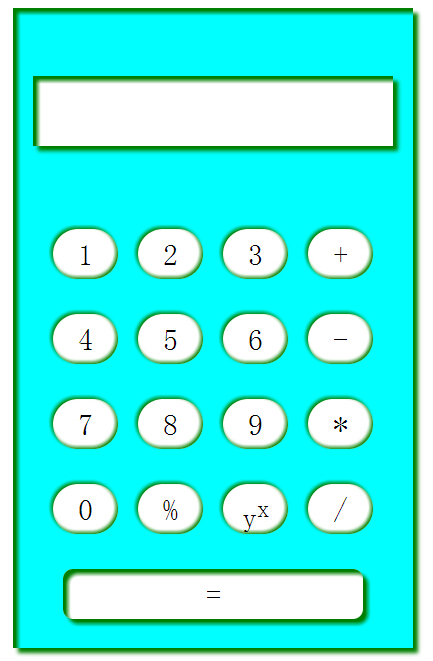
先来看看我做的界面,有些粗糙,可是完全用css写的哦
实际上这里面的应用到的都比较熟悉,但是在进行编写的时候还是耽搁了好长时间,这次时间主要耽误在了阴影部分上来了,这次就来记录下遗漏的这个点:
box-shadow:x-offset y-offset blur-radius spread-radius color inset;
这里的几个参数分别代表了什么呢,这里我们要首先理解阴影的原理,在这里我理解的是,是整个div位置的假移动,阴影就是假使按照给定的条件移动后可能的效果,因为是假设,所以是虚幻的,是影子,这样我们来看一下这几个参数,
前两个就是给定的移动条件,一个平面移动的角度,而紧随其后的两个就是移动多远,按当前角度移动要到达的目的地,而移动到指定的目的地了,这是一种可能性,我们用一种颜色来记录这种假定,这就有了color,而inset则是唯一值,唯一值的意思就是只有“写”和“不写”,没有其他可能性,而inset“写”的话代表了向里进行移动,而“不写”的话代表了向外移动。
这里再来记录一个地方,就是<sup></sup>的html标签,这个我在很容易写出来的时候,朋友给出了很惊讶,一副看到了好东西的样子,让我好笑的同时又添了一份自信,自己选的学习步骤还是很正确的,w3cshool确实没有白看啊
好,接下来是看一下实现的代码:
html语言:
 <center>
	<div id="back">
		<div id="monitor"></div>
		<div id="operateZone">
			<div class="row">
				<div id="one" class="button">1</div>
				<div id="two" class="button">2</div>
				<div id="three" class="button">3</div>
				<div id="add" class="button">+</div>
			</div>
			<div class="row">
				<div id="four" class="button">4</div>
				<div id="five" class="button">5</div>
				<div id="six" class="button">6</div>
				<div id="minus" class="button">-</div>
			</div>
			<div class="row">
				<div id="seven" class="button">7</div>
				<div id="eight" class="button">8</div>
				<div id="nine" class="button">9</div>
				<div id="time" class="button">*</div>
			</div>
			<div class="row">
				<div id="zero" class="button">0</div>
				<div id="left" class="button">%</div>
				<div id="power" class="button">y<sup>x</sup></div>
				<div id="divide" class="button">/</div>
			</div>
			<div class="row">
				<div id="equal">=</div>
			</div>
		</div>
	</div>
</center> <style type="text/css">
#back{
width:400px;
height:640px;
background:cyan;
-moz-box-shadow:5px 5px 15px #999 inset;
-webkit-box-shadow:5px 5px 15px #999 inset;
box-shadow:5px 5px 5px green,5px 5px 5px green inset;
}
#monitor{
width:360px;
height:70px;
background:#fff;
margin-top:50px;
-moz-box-shadow:5px 5px 15px #999 inset;
-webkit-box-shadow:5px 5px 15px #999 inset;
box-shadow:5px 5px 5px green,5px 5px 5px green inset;
}
#operateZone{
width:360px;
height:450px;
margin-top:50px;
}
.row{
width:360px;
height:70px;
margin-top:15px;
}
.button{
height:50px;
width:65px;
background:#fff;
float:left;
margin-left:20px;
border-radius:32.5px;
line-height:50px;
-moz-box-shadow:5px 5px 15px #999 inset;
-webkit-box-shadow:5px 5px 15px #999 inset;
box-shadow:-2px -2px 5px green,-2px -2px 5px green inset;
font-size:30px;
}
.button:hover{
height:50px;
width:65px;
background:#ddd;
float:left;
margin-left:20px;
border-radius:32.5px;
line-height:50px;
-moz-box-shadow:5px 5px 15px #999 inset;
-webkit-box-shadow:5px 5px 15px #999 inset;
box-shadow:-3px -3px 7px green,-3px -3px 4px green inset;
font-size:30px;
}
#equal{
width:300px;
height:50px;
background:#fff;
border-radius:10px;
line-height:50px;
-moz-box-shadow:5px 5px 15px #999 inset;
-webkit-box-shadow:5px 5px 15px #999 inset;
box-shadow:5px 5px 5px green,5px 5px 5px green inset;
font-size:30px;
}
</style>今天就先记录地这吧,步子还是不要迈太大,去休息,明天又是一个好心情。。。


 546
546

 被折叠的 条评论
为什么被折叠?
被折叠的 条评论
为什么被折叠?
 到【灌水乐园】发言


